Add support for conditional styling. This should include support for data binding in the fill and stroke properties of the element from the DefaultVisualStyle, or support for DefaultVisualStyleSelector, or another type of API.
Issue1) When no RenderTransformOrigin is set to ScaleAnimation, all slices should be scaled from the pie chart center point. Currently thiss is not true, to better reproduce it , set MaxScale > 1 and notice slices overlap each other at the end of the animation.
Issue2) When RenderTransformOrigin is set to , for example (0, 0), all slices should start animating from topleft corner of the chart. Currently only the first one is animated from top left and all others are animated from pie chart center.
Add a mechanism like a method override or a property that can alter this behavior. In this case, if the data item of the generated data point contains a null value, the visual element should be dropped (missing) as in the standard chart series.
When a chart have long labels on the X axis (like date and time) the zoom is not accurate on the horizontal extents with both mouse wheel and drag area.
The reason is probably that the screen coordinates of the selected area are not mapped correctly on the X axis. The mapping works fine for tooltip.
You can verify this behavior in the attached Solution. In the images you can see the selected area (01), that the zoomed area is a region with no points (02) and the actual position of the points.
You can easily implement it by subscribing to the MouseLeftButtonDown event of the chart series and change the series' Stroke or Fill property.
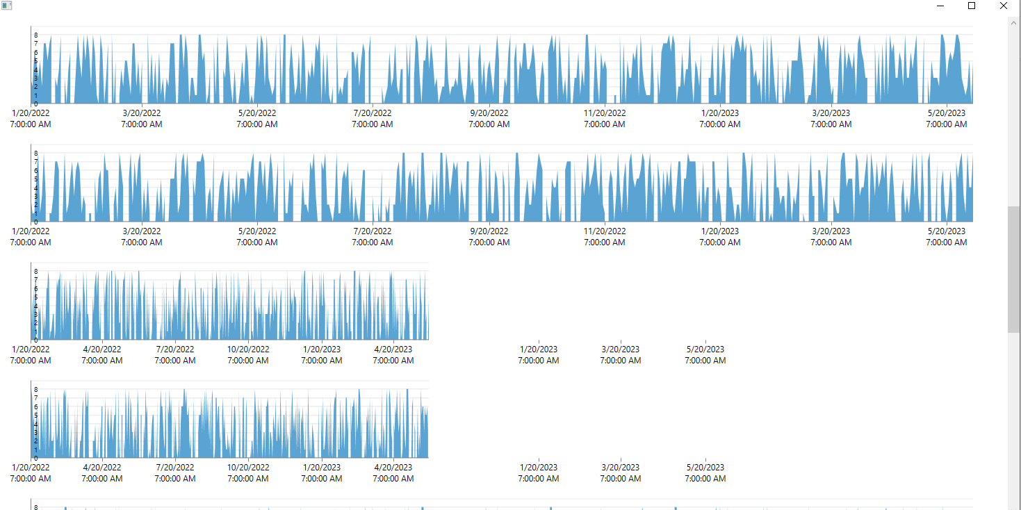
The problem arises when we have many graphs on one window and when we scroll to the bottom then to the middle of the window and then resize the width of the window, not all graphics dynamically resize, some harden to the previous size.
I am attaching a project in which you can reproduce the problem.
And I am attaching a video where the problem is clearly demonstrated.
Please solve the problem as soon as possible for our product it is critical!
The FadeOtherSeries hover mode doesn't work when the lightweight render options (Direct2D and Bitmap) are used.
You can find one way to work this around in the attached project.
The ToolTip's style is missing in the no xaml assemblies in Expression_Dark and Office2013 themes. A work-around is to manually include the tool tip's style (for example in the App.xaml).
Currently when sampling is used to generate the data points, the DataItem property of the DataPoint is null and there is no way to find out which data items have been used to generate the data point. A new property can be introduced (DataItems) which can contain the data items in mind.

Decline reason: This item is duplicate of the following one:
http://feedback.telerik.com/Project/143/Feedback/Details/113364-chartview-expose-the-data-items-when-sampling-is-used
Incorrect drawing of BarSeries with negative values and additional axis.

This happens when we have one series with only positive values and one with mixed values.

