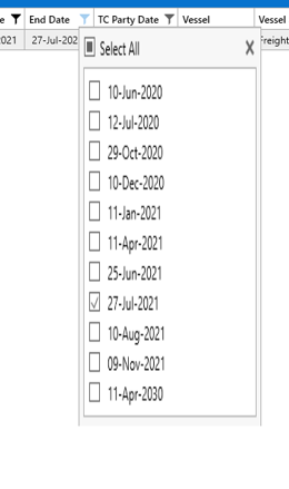
We are noticing inconsistent display issue when it comes to running this app via Citrix.
In particular the when we are using the Filter option on a grid screen, some times we get a partial display vs the Complete display. Please advise what we can do to ensure stable presentation
Correct
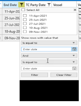
incorrect
When upgrading to UI for WPF R3 2021 (NuGet), we are unable to build our projects because of a broken reference to Microsoft.VisualStudio.DesignTools.Extensibility. We also noticed that for each dll, a corresponding *.DesignTools reference was added to the project when we did the update - maybe there is a connection?
How to reproduce
I was able to reproduce the problem by creating a new .NET Framework app (default VS template, .NET Framework 4.8) and adding the Telerik.Windows.Controls.for.Wpf nuget package (see attached screenshot). As soon as the package is added, I get the following IntelliSense warning:
Severity Code Description Project File Line Source Suppression State
Warning Unknown build error, 'Could not load file or assembly 'Microsoft.VisualStudio.DesignTools.Extensibility, Version=16.5.0.0, Culture=neutral, PublicKeyToken=b03f5f7f11d50a3a' or one of its dependencies. The located assembly's manifest definition does not match the assembly reference. (Exception from HRESULT: 0x80131040)' WpfApp5 Build
When trying to build the project, I get the following error:
Severity Code Description Project File Line Source Suppression State
Error Unknown build error, 'Cannot resolve dependency to assembly 'Microsoft.VisualStudio.DesignTools.Extensibility, Version=16.5.0.0, Culture=neutral, PublicKeyToken=b03f5f7f11d50a3a' because it has not been preloaded. When using the ReflectionOnly APIs, dependent assemblies must be pre-loaded or loaded on demand through the ReflectionOnlyAssemblyResolve event.' WpfApp5 Build
Manually adding the nuget package "Microsoft.VisualStudio.DesignTools.Extensibility" resolves the problem.
I would expect the telerik packages to reference the mentioned package as their dependency if it is required (allowing Visual Studio to resolve the missing reference automatically). If this is not possible for some reason, this should at least be noted in the documentation.
Regards
Simon Müller
Hofmann Fördertechnik GmbH
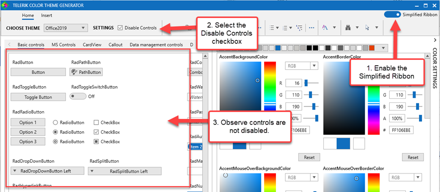
To reproduce:
- Open the Telerik Theme Color Generator application
- Click the "Disable Controls" checkbox
- => Observe the controls become disabled
- Switch to Simplified Ribbon
- Click the "Disable Controls" checkbox
- => Observe the controls are not disabled.
Screenshot:
When using a RadWindow with ResizeMode="CanMinimise" and RadWindowInteropHelper.ShowInTaskbar="True" the close button is moved to the left, which is an unexpected behaviour. Note this doesn't occur when the RadWindowInteropHelper is not used
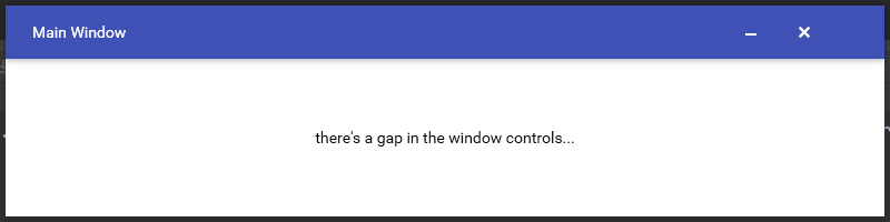
creating a new project with a single RadWindow will cause the window control buttons (close, maximise, minimise) to shift to the right when restored from minimised, resulting in the close button being pushed off the visible space at any size:
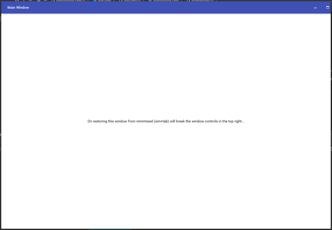
when RadWindowInteropHelper.ShowInTaskbar="True" is used the problem does not occur.
a replication project is attached but the Telerik assembly references will probably need to be reset (I tested back until 2021.1.1x release).
After defining my colors in the Telerik color theme generator vs wasn't recognizing the emitted code as valid. I had to explore the Intellisense suggestions and try different variations until I arrived at the correct solution:
I'm not sure if this has to do with versioning differences or is a general case. Regardless, I figured I'd let the Telerik team know.
Best,
Nick
            // Theme Editor Output
            VisualStudio2019.Palette.AccentColor = (Color)ColorConverter.ConvertFromString("#FFF5CC84");
            VisualStudio2019.Palette.AccentMainColor = (Color)ColorConverter.ConvertFromString("#FFAAC0FF");
            VisualStudio2019.Palette.AccentDarkColor = (Color)ColorConverter.ConvertFromString("#FF5F6FA4");
            VisualStudio2019.Palette.AccentSecondaryDarkColor = (Color)ColorConverter.ConvertFromString("#FF40508D");
            VisualStudio2019.Palette.AccentMouseOverColor = (Color)ColorConverter.ConvertFromString("#FFC4D5FF");
            VisualStudio2019.Palette.AccentFocusedColor = (Color)ColorConverter.ConvertFromString("#FFD2A85E");
            VisualStudio2019.Palette.AccentForegroundColor = (Color)ColorConverter.ConvertFromString("#FF5F6FA4");
            VisualStudio2019.Palette.ValidationColor = (Color)ColorConverter.ConvertFromString("#FFFF3333");
            VisualStudio2019.Palette.BasicColor = (Color)ColorConverter.ConvertFromString("#FF94A6CA");
            VisualStudio2019.Palette.SemiBasicColor = (Color)ColorConverter.ConvertFromString("#FFC0CAE9");
            VisualStudio2019.Palette.PrimaryColor = (Color)ColorConverter.ConvertFromString("#FFF2F5FC");
            VisualStudio2019.Palette.SecondaryColor = (Color)ColorConverter.ConvertFromString("#FFFFFFFF");
            VisualStudio2019.Palette.MarkerColor = (Color)ColorConverter.ConvertFromString("#FF1E1E1E");
            VisualStudio2019.Palette.MarkerInvertedColor = (Color)ColorConverter.ConvertFromString("#FFFFFFFF");
            VisualStudio2019.Palette.IconColor = (Color)ColorConverter.ConvertFromString("#FF414141");
            VisualStudio2019.Palette.AlternativeColor = (Color)ColorConverter.ConvertFromString("#FFF7F9FE");
            VisualStudio2019.Palette.MouseOverColor = (Color)ColorConverter.ConvertFromString("#FFFFF8DF");
            VisualStudio2019.Palette.ComplementaryColor = (Color)ColorConverter.ConvertFromString("#FFD9E0F8");
            VisualStudio2019.Palette.MainColor = (Color)ColorConverter.ConvertFromString("#FFFCFCFC");
            VisualStudio2019.Palette.HeaderColor = (Color)ColorConverter.ConvertFromString("#FF40568D");
            VisualStudio2019.Palette.DockingBackgroundColor = (Color)ColorConverter.ConvertFromString("#FF5F6FA4");
            VisualStudio2019.Palette.ReadOnlyBackgroundColor = (Color)ColorConverter.ConvertFromString("#FFFCFCFC");
            VisualStudio2019.Palette.ReadOnlyBorderColor = (Color)ColorConverter.ConvertFromString("#FF94A6CA");
            VisualStudio2019.Palette.DisabledOpacity = 0.3;
            VisualStudio2019.Palette.ReadOnlyOpacity = 0.6;

            // Fixed Output
            VisualStudio2019Palette.Palette.AccentColor = (Color)ColorConverter.ConvertFromString("#FF5399EE");
            VisualStudio2019Palette.Palette.AccentMainColor = (Color)ColorConverter.ConvertFromString("#FF5399EE");
            VisualStudio2019Palette.Palette.AccentDarkColor = (Color)ColorConverter.ConvertFromString("#FF233042");
            VisualStudio2019Palette.Palette.AccentSecondaryDarkColor = (Color)ColorConverter.ConvertFromString("#FF2E6FF2");
            VisualStudio2019Palette.Palette.AccentMouseOverColor = (Color)ColorConverter.ConvertFromString("#FF5399EE");
            VisualStudio2019Palette.Palette.AccentFocusedColor = (Color)ColorConverter.ConvertFromString("#FF2E6FF2");
            //VisualStudio2019Palette.Palette.AccentForegroundColor = (Color)ColorConverter.ConvertFromString("#FFBBD3F0");
            VisualStudio2019Palette.Palette.ValidationColor = (Color)ColorConverter.ConvertFromString("#FFFF3333");
            VisualStudio2019Palette.Palette.BasicColor = (Color)ColorConverter.ConvertFromString("#FFBBD3F0");
            VisualStudio2019Palette.Palette.SemiBasicColor = (Color)ColorConverter.ConvertFromString("#FFEAEFF6");
            VisualStudio2019Palette.Palette.PrimaryColor = (Color)ColorConverter.ConvertFromString("#FFEAEFF6");
            VisualStudio2019Palette.Palette.SecondaryColor = (Color)ColorConverter.ConvertFromString("#FFFFFFFF");
            VisualStudio2019Palette.Palette.MarkerColor = (Color)ColorConverter.ConvertFromString("#FF262626");
            VisualStudio2019Palette.Palette.MarkerInvertedColor = (Color)ColorConverter.ConvertFromString("#FFFFFFFF");
            VisualStudio2019Palette.Palette.IconColor = (Color)ColorConverter.ConvertFromString("#FF414141");
            VisualStudio2019Palette.Palette.AlternativeColor = (Color)ColorConverter.ConvertFromString("#FFF7F9FE");
            VisualStudio2019Palette.Palette.MouseOverColor = (Color)ColorConverter.ConvertFromString("#FF5399EE");
            VisualStudio2019Palette.Palette.ComplementaryColor = (Color)ColorConverter.ConvertFromString("#FFBED4F0");
            VisualStudio2019Palette.Palette.MainColor = (Color)ColorConverter.ConvertFromString("#FFFCFCFC");
            VisualStudio2019Palette.Palette.HeaderColor = (Color)ColorConverter.ConvertFromString("#FF233042");
            //VisualStudio2019Palette.Palette.DockingBackgroundColor = (Color)ColorConverter.ConvertFromString("#FF233042");
            VisualStudio2019Palette.Palette.ReadOnlyBackgroundColor = (Color)ColorConverter.ConvertFromString("#FFFCFCFC");
            VisualStudio2019Palette.Palette.ReadOnlyBorderColor = (Color)ColorConverter.ConvertFromString("#FF94A6CA");
            VisualStudio2019Palette.Palette.DisabledOpacity = 0.3;
            VisualStudio2019Palette.Palette.ReadOnlyOpacity = 0.6;
When the StyleManager is applied to the control, the IsRippleEnabled property is not respected.
When using OpenStreetMaps with APIKey (required for Cycle and Transport variations)
the key is not automatically passed to the builtin minimap and it shows 'Api Key Required' in some tiles.
I've downloaded the latest Sample Application for Terlerik UI for WPF R1 2021 SP1
When I try to select the RibbonView sample I get a MessageBox with message "Exception has been thrown by the target of an incovation" and the sample does not load. All other samples work fine.
We use a RadTileList as our main navigation component. Today we noticed that our app's memory consumption only ever increases when opening modules and never decreases when closing them. When tracing memory usage with DotMemory (using the Key retention paths feature), I noticed that the retention path to the leaked module viewmodels seems to be rooted in the RadTileList component (see the attached screen shot).
A few implementation details:
- We are wrapping our modules in a class called "OpenedModule" (as you might guess from the attached image)
- The RadTileList is databound to an ObservableCollection<OpenedModule> via its ItemsSource
- We do not use grouping
- Closing a module results in the module's "OpenedModule" instance being removed from the ObservableCollection
This is the xaml we use to instantiate the TileList:
<telerik:RadTileList
    x:Name="NavigationRadTileList"
    ItemsSource="{Binding OpenedModules, Mode=OneWay}"
    CanUserSelect="False"
    TilePlaceHolderSide="90"
    behaviors:DisableTileListRightClickBehavior.IsEnabled="True"
    ItemTemplate="{StaticResource NavigationTileListTemplate}">
    <telerik:RadTileList.Resources>
         <Style TargetType="{x:Type telerik:Tile}" BasedOn="{StaticResource NavigationTileStyle}" />
    </telerik:RadTileList.Resources>
</telerik:RadTileList>
Judging by the result from dotMemory, it looks like the TileGroup's children are somehow cached in an ordered list which is not updated when an item is removed?
Best Regards,
Simon Müller
Issue : Currently the Free Trial / Download page states "Over 120 UI controls" yet the product pages states "over 140".
Obviously "Over 120" is technically correct, however, 140 is more accurate, sounds better & increases consistency across the site.
The same issue also applies to the "UI for WinForms" description and its respective product page.
https://www.telerik.com/download


Sometimes RadVirtualGrid.ScrollRowIndexIntoViewAsync throws NullReferenceException.
Inside RadVirtualGrid.ScrollRowIndexIntoViewAsync the following method invoked:
this.MainPanel.ScrollRowIndexIntoViewInternal and this.MainPanel is Null, since RadVirtualGrid.Refresh() that was called previously makes MainPanel Null.
The Refresh method is public, so could be called anytime by mistake or not.
So, please fix one of those or even maybe both:
Refresh should not set MainPanel to Null.
Inside RadVirtualGrid.ScrollRowIndexIntoViewAsync check that this.MainPanel is not Null like you perform this check in most RadVirtualGrid methods.
Thank you in advance.
Maria Adamsky.
When the FluentPalette.Palette.ScrollBarsMode property is set to Normal, the ScrollViewer scrollbars overlap the content area. This should not happen.
To resolve this, set the ThemeHelper.ScrollBarsMode attached property of the ScrollViewer controls using an implicit style.
<Window.Resources>
	<Style TargetType="ScrollViewer">
		<Setter Property="helpers:ThemeHelper.ScrollBarsMode" Value="{telerik:FluentResource ResourceKey=ScrollBarsMode}"/>
	</Style>
</Window.Resources>