


RadComboBox dropdown list leave a blank after the last item!
look the attachment.
when use the RadTransitionControl's SlideAndZoomTransition effect for the RadTabControl, the radComboBox Multiple Selection will lost in the tabItem。
the radComboBox data is from the mvvm binding,after change the tabitem,the Multiple Selection become single selection.
the RadTabControl's style is following:
...
<ControlTemplate x:Key="TabControlTemplate" TargetType="telerik:RadTabControl">
<Grid>
<telerik:RadDockPanel LastChildFill="True">
<telerik:LayoutTransformControl x:Name="HeaderDockedElement" telerik:RadDockPanel.Dock="Top">
<Grid SnapsToDevicePixels="True">
<Border x:Name="HeaderBackground" Background="{TemplateBinding HeaderBackground}" Visibility="{TemplateBinding BackgroundVisibility}"/>
<telerik:RadDockPanel Panel.ZIndex="10">
<telerik:LayoutTransformControl x:Name="AdditionalContentTransform" Margin="0" telerik1:RadDockPanel.Dock="Right">
<ContentPresenter x:Name="AdditionalContentElement" Content="{TemplateBinding AdditionalContent}"/>
</telerik:LayoutTransformControl>
<ToggleButton x:Name="DropDownButtonElement"
Visibility="Collapsed"
telerik:RadDockPanel.Dock="Right"
Style="{TemplateBinding DropDownButtonStyle}"
ClickMode="Press"
IsChecked="{Binding IsDropDownOpen, Mode=TwoWay, RelativeSource={RelativeSource TemplatedParent}}">
<telerik:RadContextMenu.ContextMenu>
<telerikTabControl:DropDownMenu x:Name="DropDownMenuElement"
StaysOpen="False"
Placement="Bottom"
Style="{TemplateBinding DropDownStyle}"
ItemTemplate="{TemplateBinding ItemDropDownContentTemplate}"
ItemTemplateSelector="{TemplateBinding ItemDropDownContentTemplateSelector}"
DisplayMemberPath="{TemplateBinding DropDownDisplayMemberPath}"/>
</telerik:RadContextMenu.ContextMenu>
</ToggleButton>
<RepeatButton x:Name="LeftScrollButtonElement" Style="{StaticResource ScrollButtonStyle}">
<telerik:RadGlyph Glyph="{StaticResource GlyphArrowChevronLeft}"/>
</RepeatButton>
<RepeatButton x:Name="RightScrollButtonElement" Style="{StaticResource ScrollButtonStyle}" telerik:RadDockPanel.Dock="Right">
<telerik:RadGlyph Glyph="{StaticResource GlyphArrowChevronRight}"/>
</RepeatButton>
<ScrollViewer x:Name="ScrollViewerElement"
Style="{StaticResource EmptyScrollViewerStyle}"
VerticalScrollBarVisibility="Disabled"
BorderThickness="0"
IsTabStop="False"
HorizontalScrollBarVisibility="{Binding (ScrollViewer.HorizontalScrollBarVisibility), RelativeSource={RelativeSource TemplatedParent}}">
<ItemsPresenter/>
</ScrollViewer>
</telerik:RadDockPanel>
</Grid>
</telerik:LayoutTransformControl>
<Border x:Name="ContentBorder"
BorderBrush="{TemplateBinding BorderBrush}"
BorderThickness="{Binding RelativeSource={RelativeSource TemplatedParent}, Path=BorderThickness, Mode=TwoWay}"
Background="{TemplateBinding Background}"
Padding="{TemplateBinding Padding}">
<Grid>
<telerik:RadTransitionControl x:Name="ContentElement"
Visibility="{Binding RelativeSource={RelativeSource TemplatedParent}, Path=IsContentPreserved,Converter={StaticResource InvertedBooleanToVisibilityConverter}}"
Content="{TemplateBinding SelectedContent}"
ContentTemplate="{TemplateBinding SelectedContentTemplate}"
ContentTemplateSelector="{TemplateBinding SelectedContentTemplateSelector}"
Duration="00:00:00.350">
<telerik:RadTransitionControl.Transition>
<local:TransitionSetFP>
<local:TransitionSetFP.BackTransition>
<telerik:SlideAndZoomTransition SlideDirection="LeftToRight" MinZoom="1" StartSlideAt="0.01" MinAlpha="1"/>
</local:TransitionSetFP.BackTransition>
<local:TransitionSetFP.ForwardTransition>
<telerik:SlideAndZoomTransition SlideDirection="RightToLeft" MinZoom="1" StartSlideAt="0.01" MinAlpha="1"/>
</local:TransitionSetFP.ForwardTransition>
</local:TransitionSetFP>
</telerik:RadTransitionControl.Transition>
</telerik:RadTransitionControl>
<Grid x:Name="ContentElementsPanel" Visibility="{Binding RelativeSource={RelativeSource TemplatedParent}, Path=IsContentPreserved, Converter={StaticResource BooleanToVisibilityConverter}}"/>
</Grid>
</Border>
</telerik:RadDockPanel>
</Grid>
<ControlTemplate.Triggers>
<Trigger Property="DropDownDisplayMode" Value="Visible">
<Setter Property="Visibility" Value="Visible" TargetName="DropDownButtonElement"/>
</Trigger>
<MultiTrigger>
<MultiTrigger.Conditions>
<Condition Property="DropDownDisplayMode" Value="WhenNeeded"/>
<Condition SourceName="ScrollViewerElement" Property="ComputedHorizontalScrollBarVisibility" Value="Visible"/>
</MultiTrigger.Conditions>
<Setter Property="Visibility" Value="Visible" TargetName="DropDownButtonElement"/>
</MultiTrigger>
<Trigger Property="TabStripPlacement" Value="Top">
<Setter Property="BorderThickness" TargetName="ContentBorder" Value="{Binding RelativeSource={RelativeSource TemplatedParent}, Path=BorderThickness, Converter={StaticResource ThicknessToOrientedThicknessConverter}, ConverterParameter=LeftBottomRight}"/>
</Trigger>
<Trigger Property="TabStripPlacement" Value="Left">
<Setter TargetName="DropDownMenuElement" Property="HorizontalOffset" Value="0"/>
<Setter TargetName="DropDownMenuElement" Property="VerticalOffset" Value="-3"/>
<Setter Property="telerik:RadDockPanel.Dock" Value="Left" TargetName="HeaderDockedElement"/>
<Setter Property="telerik:RadDockPanel.Dock" Value="Left" TargetName="AdditionalContentTransform"/>
<Setter Property="telerik:RadDockPanel.Dock" Value="Left" TargetName="DropDownButtonElement"/>
<Setter Property="LayoutTransform" TargetName="HeaderDockedElement">
<Setter.Value>
<RotateTransform Angle="-90"/>
</Setter.Value>
</Setter>
<Setter Property="BorderThickness" TargetName="ContentBorder" Value="{Binding RelativeSource={RelativeSource TemplatedParent}, Path=BorderThickness, Converter={StaticResource ThicknessToOrientedThicknessConverter}, ConverterParameter=TopRightBottom}"/>
</Trigger>
<Trigger Property="TabStripPlacement" Value="Right">
<Setter TargetName="DropDownMenuElement" Property="HorizontalOffset" Value="0"/>
<Setter TargetName="DropDownMenuElement" Property="VerticalOffset" Value="3"/>
<Setter Property="LayoutTransform" TargetName="HeaderDockedElement">
<Setter.Value>
<RotateTransform Angle="90"/>
</Setter.Value>
</Setter>
<Setter Property="BorderThickness" TargetName="ContentBorder" Value="{Binding RelativeSource={RelativeSource TemplatedParent}, Path=BorderThickness, Converter={StaticResource ThicknessToOrientedThicknessConverter}, ConverterParameter=TopLeftBottom}"/>
</Trigger>
<Trigger Property="TabStripPlacement" Value="Bottom">
<Setter TargetName="DropDownMenuElement" Property="HorizontalOffset" Value="3"/>
<Setter Property="telerik:RadDockPanel.Dock" Value="Left" TargetName="AdditionalContentTransform"/>
<Setter Property="telerik:RadDockPanel.Dock" Value="Left" TargetName="DropDownButtonElement"/>
<Setter Property="LayoutTransform" TargetName="HeaderDockedElement">
<Setter.Value>
<RotateTransform Angle="180"/>
</Setter.Value>
</Setter>
<Setter Property="LayoutTransform" TargetName="AdditionalContentTransform">
<Setter.Value>
<RotateTransform Angle="180"/>
</Setter.Value>
</Setter>
<Setter Property="BorderThickness" TargetName="ContentBorder" Value="{Binding RelativeSource={RelativeSource TemplatedParent}, Path=BorderThickness, Converter={StaticResource ThicknessToOrientedThicknessConverter}, ConverterParameter=TopRightLeft}"/>
</Trigger>
</ControlTemplate.Triggers>
</ControlTemplate>
<Style TargetType="telerik:RadTabControl">
<Setter Property="mat:MaterialAssist.ShadowDepth" Value="Depth1"/>
<Setter Property="TextOptions.TextRenderingMode" Value="ClearType"/>
<Setter Property="BorderBrush" Value="{telerik1:FluentResource ResourceKey=BasicBrush}"/>
<Setter Property="HeaderBackground" Value="{telerik1:FluentResource ResourceKey=MainBrush}"/>
<Setter Property="BorderThickness" Value="1"/>
<Setter Property="Background" Value="{telerik1:FluentResource ResourceKey=PrimaryBackgroundBrush}"/>
<Setter Property="MinWidth" Value="5"/>
<Setter Property="MinHeight" Value="20"/>
<Setter Property="HorizontalContentAlignment" Value="Stretch"/>
<Setter Property="VerticalContentAlignment" Value="Stretch"/>
<Setter Property="IsTabStop" Value="False"/>
<Setter Property="FontFamily" Value="{telerik1:FluentResource ResourceKey=FontFamily}"/>
<Setter Property="FontSize" Value="{telerik1:FluentResource ResourceKey=FontSize}"/>
<Setter Property="Foreground" Value="{telerik1:FluentResource ResourceKey=MarkerBrush}"/>
<Setter Property="ItemsPanel">
<Setter.Value>
<ItemsPanelTemplate>
<Primitives:TabWrapPanel/>
</ItemsPanelTemplate>
</Setter.Value>
</Setter>
<Setter Property="DropDownButtonStyle" Value="{StaticResource DropDownButtonStyle}"/>
<Setter Property="DropDownStyle" Value="{StaticResource DropDownMenuStyle}"/>
<Setter Property="ScrollViewer.HorizontalScrollBarVisibility" Value="Auto"/>
<Setter Property="Template" Value="{StaticResource TabControlTemplate}"/>
</Style>
at the same time,when resize the right auto hide area towards the bigger,don't show the resize bar!
the place preview will flash.
the same time:the pointer tool/Text tool/Shape tool can't select exclusive,don't draw using the selected tool.
Testing in the RadColorEditor control:
looking the attachments,Select the two numbers on the left(the file "Select.png"),
then enter a number through the keyboard,just modified the number on the far left(the file "Input1.png").
But sometimes the two numbers that are selected are replaced,like the file "Input2.png".
Obviously the second case input experience is better!
Continuous restarts cause one of the two.

Exception when editing the template and showing the tooltip of the ValidationErrorElement
Workaround:
Replace the validation element:
<Grid x:Name="ValidationErrorElement" Visibility="Collapsed"><Grid.ToolTip>
<ToolTip x:Name="PART_ToolTip" Placement="Right" DataContext="{Binding RelativeSource={RelativeSource TemplatedParent}}">
<ToolTip.Template>
<ControlTemplate TargetType="{x:Type ToolTip}">
<Grid x:Name="RootVisual" HorizontalAlignment="Right" Margin="5,0" Opacity="0" RenderTransformOrigin="0,0">
<Grid.RenderTransform>
<TranslateTransform X="-25" x:Name="xform"/>
</Grid.RenderTransform>
<VisualStateManager.VisualStateGroups>
<VisualStateGroup x:Name="OpenStates">
<VisualStateGroup.Transitions>
<VisualTransition From="{x:Null}" GeneratedDuration="0" GeneratedEasingFunction="{x:Null}" Storyboard="{x:Null}" To="{x:Null}"/>
<VisualTransition From="{x:Null}" GeneratedDuration="0:0:0.2" GeneratedEasingFunction="{x:Null}" To="Open">
<Storyboard>
<DoubleAnimation Duration="0:0:0.2" To="0" Storyboard.TargetProperty="X" Storyboard.TargetName="xform">
<DoubleAnimation.EasingFunction>
<BackEase Amplitude="0.3" EasingMode="EaseOut"/>
</DoubleAnimation.EasingFunction>
</DoubleAnimation>
<DoubleAnimation Duration="0:0:0.2" To="1" Storyboard.TargetProperty="Opacity" Storyboard.TargetName="RootVisual"/>
</Storyboard>
</VisualTransition>
</VisualStateGroup.Transitions>
<VisualState x:Name="Closed">
<Storyboard>
<DoubleAnimation Duration="0" To="0" Storyboard.TargetProperty="Opacity" Storyboard.TargetName="RootVisual"/>
</Storyboard>
</VisualState>
<VisualState x:Name="Open">
<Storyboard>
<DoubleAnimation Duration="0" To="0" Storyboard.TargetProperty="X" Storyboard.TargetName="xform"/>
<DoubleAnimation Duration="0" To="1" Storyboard.TargetProperty="Opacity" Storyboard.TargetName="RootVisual"/>
</Storyboard>
</VisualState>
</VisualStateGroup>
</VisualStateManager.VisualStateGroups>
<Grid>
<Path Data="M4,0L0,4 4,8z" Fill="#FFDC000C" HorizontalAlignment="Left" Height="10" Stretch="None" VerticalAlignment="Top" Width="6"/>
<Border Background="#FFDC000C" Margin="4,0,0,0" Padding="1">
<TextBlock Foreground="White" MaxWidth="250" Margin="8,4" TextWrapping="Wrap" Text="{Binding ValidationErrors[0].ErrorContent}"/>
</Border>
</Grid>
<ContentControl/>
</Grid>
</ControlTemplate>
</ToolTip.Template>
</ToolTip>
</Grid.ToolTip>
<Border Background="Transparent" HorizontalAlignment="Right" Height="9" VerticalAlignment="Top" Width="9"/>
<Border BorderBrush="#FFDC000C" BorderThickness="1" CornerRadius="1"/>
<Path Data="M0,2L5,2 5,7z" Fill="#FFDC000C" HorizontalAlignment="Right" Height="7" VerticalAlignment="Top" Width="7"/>
</Grid>

It would be really great if the autocomplete box could handle the page up/down key to skip multiple entries at once. As we have like 200 entries in the list it would be a great advancement for the users using the keyboard.
Already tried your example from the forum but it is not functional.
All the best!
Hi Team,
Dennis Callahan from Telerik submitting this on behalf of Don -
If your team could create a theme for UI for WPF that mimicked the look of a UWP application and responded to the Windows 10 Light and Dark setting that would be excellent. I have not found such a theme in any of the products I have looked at so if Telerik could do it I think it might be the first.


When the FluentPalette.Palette.ScrollBarsMode property is set to Normal, the ScrollViewer scrollbars overlap the content area. This should not happen.
To resolve this, set the ThemeHelper.ScrollBarsMode attached property of the ScrollViewer controls using an implicit style.
<Window.Resources>
	<Style TargetType="ScrollViewer">
		<Setter Property="helpers:ThemeHelper.ScrollBarsMode" Value="{telerik:FluentResource ResourceKey=ScrollBarsMode}"/>
	</Style>
</Window.Resources>

As far as I know, there are no way to set the color of the title bar. As far as I know there are no properties "color" of the title bar.
Thanks
We use a RadTileList as our main navigation component. Today we noticed that our app's memory consumption only ever increases when opening modules and never decreases when closing them. When tracing memory usage with DotMemory (using the Key retention paths feature), I noticed that the retention path to the leaked module viewmodels seems to be rooted in the RadTileList component (see the attached screen shot).
A few implementation details:
- We are wrapping our modules in a class called "OpenedModule" (as you might guess from the attached image)
- The RadTileList is databound to an ObservableCollection<OpenedModule> via its ItemsSource
- We do not use grouping
- Closing a module results in the module's "OpenedModule" instance being removed from the ObservableCollection
This is the xaml we use to instantiate the TileList:
<telerik:RadTileList
    x:Name="NavigationRadTileList"
    ItemsSource="{Binding OpenedModules, Mode=OneWay}"
    CanUserSelect="False"
    TilePlaceHolderSide="90"
    behaviors:DisableTileListRightClickBehavior.IsEnabled="True"
    ItemTemplate="{StaticResource NavigationTileListTemplate}">
    <telerik:RadTileList.Resources>
         <Style TargetType="{x:Type telerik:Tile}" BasedOn="{StaticResource NavigationTileStyle}" />
    </telerik:RadTileList.Resources>
</telerik:RadTileList>
Judging by the result from dotMemory, it looks like the TileGroup's children are somehow cached in an ordered list which is not updated when an item is removed?
Best Regards,
Simon Müller
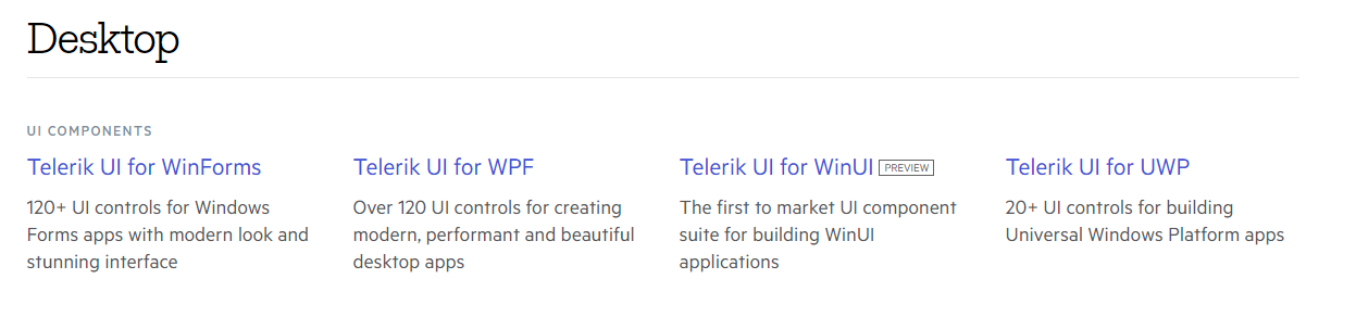
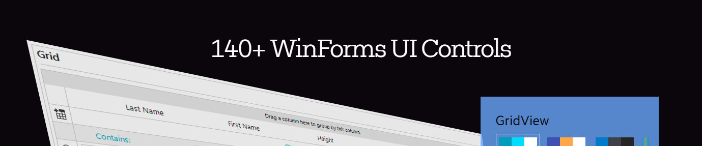
Issue : Currently the Free Trial / Download page states "Over 120 UI controls" yet the product pages states "over 140".
Obviously "Over 120" is technically correct, however, 140 is more accurate, sounds better & increases consistency across the site.
The same issue also applies to the "UI for WinForms" description and its respective product page.
https://www.telerik.com/download

Good afternoon,
When we add a new child element to the RadDiagram(see attach file), the diagram automatically optimizes their layout. After the chart is updated, the new element and its parent are automatically moved to the left side. How to make them stay in their places?
There is a small discussion of this problem on the forum.
Regards,
Andrei Silich
I've downloaded the latest Sample Application for Terlerik UI for WPF R1 2021 SP1
When I try to select the RibbonView sample I get a MessageBox with message "Exception has been thrown by the target of an incovation" and the sample does not load. All other samples work fine.