Allow changing the displayed value. This could be done by introducing a new property for the DataGrid columns (something like DistinctValuesDisplayPath).
Remove the space reserved for the sort indicator in the column header, when CanUserSort is False and therefore the sort indicator is not displayed. The current behavior prevents the user to easily center the header text.
To work this around, you can edit the ControlTemplate of DataGridColumnHeader. In the template, you can update the Visibility of the TextBlock with x:Name set to "SortIndicator" when CanUserSort is False.
The default behavior of the WinUI native Popup is to render within the bounds of its owner element. This means if the DataGrid reaches the end of the window and there is not enough space for the filtering control to draw, it will get clipped.
To avoid the clipping and allow the Popup to get displayed outside of the window, the ShouldConstrainToRootBounds property of the Popup should be set to false.
Add an API in the RadDataGrid control to allow setting the ShouldConstrainToRootBounds option of the Popup.
In the meantime, you can disable the Popup constrain via an implicit Style in App.xaml:
<Application.Resources>
    <ResourceDictionary>
        <ResourceDictionary.MergedDictionaries>
            <XamlControlsResources xmlns="using:Microsoft.UI.Xaml.Controls" />
            <ResourceDictionary Source="ms-appx:///Telerik.WinUI.Controls/Themes/Generic.xaml"/>
            <!-- Other merged dictionaries here -->
        </ResourceDictionary.MergedDictionaries>
        <Style TargetType="Popup">
            <Setter Property="ShouldConstrainToRootBounds" Value="False" />
        </Style>
        <!-- Other app resources here -->
    </ResourceDictionary>
</Application.Resources>
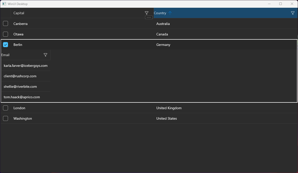
Hello, I tried to implement the sample application from your docs. (https://docs.telerik.com/devtools/winui/controls/raddatagrid/row-details)
But it seems to be not working, the detail area is not displayed completely. Only one column.
I have a similar behavior on another application.
Details:
- .NET 7
- Windows 11 Pro Version 23H2 (22631.3155)
- Telerik WinUI 2.9.0
IndexOutOfRangeException occurs in some situations when updating the ItemsSource collection of RadDataGrid. In order to reproduce the issue, the ItemsSource collection should be cleared by calling its Clear method. When you add a specific number of items after that the error occurs. The number of added items depends on the viewport's height.
To work this around, instead of calling the Clear() method of the ItemsSource collection, remove the items one by one.
var collection = (ObservableCollection<MyModel>)this.dg.ItemsSource;
 while (collection.Count > 0)
 {
     collection.RemoveAt(collection.Count - 1);
 }
The DataGrid ScrollBar is covered by the group header when grouping.
looking the attachment.
Currently, the Save and Cancel words in the inline editor buttons are using hardcoded strings. Add LocalizationManager support in order to allow easier customization when translating the application.
In the meantime, you can achieve this effect by extracting the templates of the buttons and replace the hardoced text with LocalizationManager.
<Application
x:Class="TelerikWinUIApp7.App"
xmlns="http://schemas.microsoft.com/winfx/2006/xaml/presentation"
xmlns:x="http://schemas.microsoft.com/winfx/2006/xaml"
xmlns:localPrimitives="using:Telerik.UI.Xaml.Controls.Grid.Primitives"
xmlns:primitivesCommon="using:Telerik.UI.Xaml.Controls.Primitives.Common"
xmlns:core="using:Telerik.Core"
xmlns:local="using:TelerikWinUIApp7">
<Application.Resources>
<ResourceDictionary>
<ResourceDictionary.MergedDictionaries>
<XamlControlsResources xmlns="using:Microsoft.UI.Xaml.Controls" />
<!-- Other merged dictionaries here -->
<ResourceDictionary Source="ms-appx:///Telerik.WinUI.Controls/Themes/Generic.xaml"/>
</ResourceDictionary.MergedDictionaries>
<!-- Other app resources here -->
<Style TargetType="localPrimitives:DataGridEditRow">
<Setter Property="CommitButtonStyle">
<Setter.Value>
<Style TargetType="primitivesCommon:InlineButton" BasedOn="{StaticResource EditRowButtonBaseStyle}">
<Setter Property="BorderThickness" Value="1 1 0 1" />
<Setter Property="ContentTemplate">
<Setter.Value>
<DataTemplate>
<StackPanel Orientation="Horizontal">
<TextBlock Text=""
FontFamily="{ThemeResource SymbolThemeFontFamily}"
VerticalAlignment="Center"
Margin="15 0 0 0"/>
<TextBlock core:LocalizationManager.Key="Save"
core:LocalizationManager.PropertyName="Text" Margin="8 0 15 0"/>
</StackPanel>
</DataTemplate>
</Setter.Value>
</Setter>
</Style>
</Setter.Value>
</Setter>
<Setter Property="CancelButtonStyle">
<Setter.Value>
<Style TargetType="primitivesCommon:InlineButton" BasedOn="{StaticResource EditRowButtonBaseStyle}">
<Setter Property="BorderThickness" Value="0 1 1 1" />
<Setter Property="ContentTemplate">
<Setter.Value>
<DataTemplate>
<StackPanel Orientation="Horizontal">
<TextBlock Text=""
FontFamily="{ThemeResource SymbolThemeFontFamily}"
VerticalAlignment="Center"
Margin="15 0 8 0"/>
<TextBlock core:LocalizationManager.Key="Cancel"
core:LocalizationManager.PropertyName="Text" Margin="0 0 15 0" VerticalAlignment="Center"/>
</StackPanel>
</DataTemplate>
</Setter.Value>
</Setter>
</Style>
</Setter.Value>
</Setter>
</Style>
</ResourceDictionary>
</Application.Resources>
</Application>
If you have already selected item(s) and then click on a new one to select it without holding Shift or Ctrl, the previous selection is cleared. This action should raise SelectionChanged with items in the RemovedItems collection of the event arguments. You can see this behavior in the native ListBox control. Also, this is how the RadDataGrid control is behaving in Single SelectionMode.
However, currently, if the SelectionMode is set to Extended, the RemovedItems collection doesn't contain any items.
The following exception is thrown when expanding row details with a height larger than the row height:
ArgumentOutOfRangeException: "Non-negative number required."
Hi Support
I'm using RadDataGrid on several pages in my application. There a pages where the scrollbar does not appear. On some pages it works.
The structure of the pages is similar. What are your suggestions to look for.
Regards,
Hans

