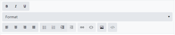
When you put a TelerikEditor in a Telerik Form the Format dropdown gets stretched, which forces it onto its own line which doesn't look as good.
If I place the DateRangePicker inside a TelerikForm, the start and end input fields are stacked vertically.
If I were to place the control just inside a div, they are arranged horizontally.
How can I get the control to arrange itself horizontally when inside a form?
---
ADMIN EDIT
Here is a reproducible that begins with a short CSS workaround (remove the style to see the issue):
<style>
    .k-form .k-daterangepicker-wrap .k-floating-label-container {
        display: inline-block;
        width: auto;
    }
</style>


<div class="demo-section k-form k-form-vertical">
    <div class="k-form-field">
        <label for="outbound-date" class="k-label k-form-label">Travel Date</label>
        <div class="k-form-field-wrap">
            <TelerikDateRangePicker @bind-StartValue="@StartValue"
                                    @bind-EndValue="@EndValue"
                                    StartId="outbound-date">
            </TelerikDateRangePicker>
        </div>
    </div>
    <div class="k-form-field">
        <p>The selected travel date is: <strong>@StartValue.Value.ToLongDateString()</strong> and <strong>@EndValue.Value.ToLongDateString()</strong></p>
    </div>
</div>

<div class="demo-section">
    <h4><label for="outbound-date">Book your flight tickets</label></h4>

    <TelerikDateRangePicker @bind-StartValue="@StartValue"
                            @bind-EndValue="@EndValue"
                            StartId="outbound-date">
    </TelerikDateRangePicker>

    <div class="mt-lg">
        <h6 class="kd-demo-heading mt-sm">Selected Dates</h6>
        <div><strong>Departure: </strong> @StartValue?.ToString("dd MMM yyyy")</div>
        <div><strong>Return: </strong> @EndValue?.ToString("dd MMM yyyy")</div>
    </div>
</div>

@code {
    public DateTime? StartValue { get; set; } = new DateTime(2020, 4, 3);
    public DateTime? EndValue { get; set; } = new DateTime(2020, 4, 10);
}
---
Line 56: box-flex: 1;
kendoui.for.jquery.2020.3.1021.commercial-source\src\styles\mobile\common\buttongroup.less
Line 31: margin-collapse: separate;
kendoui.for.jquery.2020.3.1021.commercial-source\src\styles\mobile\common\scroller.less
Line 103: margin-collapse: separate;
kendoui.for.jquery.2020.3.1021.commercial-source\src\styles\web\common\mixins.less
Line 54:
.flex-align(@alignment) {
flex-align: @alignment;
}
Bug report
Reproduction of the problem
- Open the following Demo with one of the SASS themes.
- Open the filter menu for the ProductName column
Current behavior
There is an additional border around the search input. The border appears when Sass is used.
Expected/desired behavior
The additional border should be removed.
Environment
- Kendo UI version: 2020.3.915
- Browser: [all]
This can be currently observed here: https://demos.telerik.com/kendo-ui/window/events
The "g" in the window title is truncated.
The problem is easily reproduced using the widget demo page https://demos.telerik.com/kendo-ui/dropdowntree/index
Simply switch to the High Contrast theme; the k-widget element is lacking the border-radius style hence looks different to the other widgets.
It looks like the k-dropdowntree class is missing from the following style rule:
.k-autocomplete, .k-block, .k-calendar-container, .k-colorpicker, .k-combobox, .k-datepicker, .k-datetimepicker, .k-drag-clue, .k-dropdown, .k-dropdown-wrap, .k-editor-inline, .k-grid .k-filter-options, .k-grouping-header .k-group-indicator, .k-inline-block, .k-list-container, .k-multiselect, .k-notification, .k-numeric-wrap, .k-numerictextbox, .k-picker-wrap, .k-slider-selection, .k-slider-track, .k-split-button, .k-textbox, .k-tile, .k-timepicker, .k-tooltip, .k-touch-scrollbar, .k-treeview .k-in, .k-upload, .k-window, .k-window-action, .k-window-titleless .k-window-content {
    border-radius: 13px
}
Bug report
Reproduction of the problem
Dojo example.
Current behavior
The mobile material theme does not apply specific styles to a button that has the "km-primary" class. Compare to the Nova mobile theme, which does have specific rules that use ".km-primary" selector.
Expected/desired behavior
CSS rules that use the ".km-primary" selector should be added to the theme.
Environment
- Kendo UI version: 2019.2.619
- jQuery version: x.y
- Browser: [all]
1 - when use bootstrap v4 theme, ddl does not handle long names gracefully, please find in attachment example in bootstrap v4 & silver themes, also here are the dojo exaples
v4: https://dojo.telerik.com/
silver: https://dojo.telerik.
2 - for grid and separate controls validation message has diff view
https://dojo.
should be the same
Currently, using npm install --save @progress/kendo-theme-material will get the standard Material Design theme for use across the React Components, but why is Material Black not available this way? (npm install --save @progress/kendo-theme-materialBlack)