If I place the DateRangePicker inside a TelerikForm, the start and end input fields are stacked vertically.
If I were to place the control just inside a div, they are arranged horizontally.
How can I get the control to arrange itself horizontally when inside a form?
---
ADMIN EDIT
Here is a reproducible that begins with a short CSS workaround (remove the style to see the issue):
<style>
    .k-form .k-daterangepicker-wrap .k-floating-label-container {
        display: inline-block;
        width: auto;
    }
</style>


<div class="demo-section k-form k-form-vertical">
    <div class="k-form-field">
        <label for="outbound-date" class="k-label k-form-label">Travel Date</label>
        <div class="k-form-field-wrap">
            <TelerikDateRangePicker @bind-StartValue="@StartValue"
                                    @bind-EndValue="@EndValue"
                                    StartId="outbound-date">
            </TelerikDateRangePicker>
        </div>
    </div>
    <div class="k-form-field">
        <p>The selected travel date is: <strong>@StartValue.Value.ToLongDateString()</strong> and <strong>@EndValue.Value.ToLongDateString()</strong></p>
    </div>
</div>

<div class="demo-section">
    <h4><label for="outbound-date">Book your flight tickets</label></h4>

    <TelerikDateRangePicker @bind-StartValue="@StartValue"
                            @bind-EndValue="@EndValue"
                            StartId="outbound-date">
    </TelerikDateRangePicker>

    <div class="mt-lg">
        <h6 class="kd-demo-heading mt-sm">Selected Dates</h6>
        <div><strong>Departure: </strong> @StartValue?.ToString("dd MMM yyyy")</div>
        <div><strong>Return: </strong> @EndValue?.ToString("dd MMM yyyy")</div>
    </div>
</div>

@code {
    public DateTime? StartValue { get; set; } = new DateTime(2020, 4, 3);
    public DateTime? EndValue { get; set; } = new DateTime(2020, 4, 10);
}
---
Bug report
Reproduction of the problem
Dojo example.
Current behavior
The mobile material theme does not apply specific styles to a button that has the "km-primary" class. Compare to the Nova mobile theme, which does have specific rules that use ".km-primary" selector.
Expected/desired behavior
CSS rules that use the ".km-primary" selector should be added to the theme.
Environment
- Kendo UI version: 2019.2.619
- jQuery version: x.y
- Browser: [all]
The problem is easily reproduced using the widget demo page https://demos.telerik.com/kendo-ui/dropdowntree/index
Simply switch to the High Contrast theme; the k-widget element is lacking the border-radius style hence looks different to the other widgets.
It looks like the k-dropdowntree class is missing from the following style rule:
.k-autocomplete, .k-block, .k-calendar-container, .k-colorpicker, .k-combobox, .k-datepicker, .k-datetimepicker, .k-drag-clue, .k-dropdown, .k-dropdown-wrap, .k-editor-inline, .k-grid .k-filter-options, .k-grouping-header .k-group-indicator, .k-inline-block, .k-list-container, .k-multiselect, .k-notification, .k-numeric-wrap, .k-numerictextbox, .k-picker-wrap, .k-slider-selection, .k-slider-track, .k-split-button, .k-textbox, .k-tile, .k-timepicker, .k-tooltip, .k-touch-scrollbar, .k-treeview .k-in, .k-upload, .k-window, .k-window-action, .k-window-titleless .k-window-content {
    border-radius: 13px
}
Bug report
On screens with smaller sizes not all tools in the Spreadsheet Toolbar are visible. The tools overlap the overflow button and thus cannot be selected.
Reproduction of the problem
- Run the following demo and reduce the window width
Current behavior
On wider screens all tools are visible:

On narrower screens only some tools are visible and the overflow button is overlapped:

or completely hidden:
Expected/desired behavior
The overflow button should be visible so all Spreadsheet tools are accessible.
Environment
- Kendo UI version: 2020.3.118
- Browser: [all]
In some cases the text for the selected items does not display properly. Some letters, for example g, get their bottom cut off. This behaviour can be observed on for.ex. the Telerik page https://docs.telerik.com/blazor-ui/components/multiselect/overview The picture below was taken on the latest Edge browser, 1080p screen, 100% zoom level. Funnily enough, changing the zoom level either way makes the text fit in the selected items.
How can I increase the space for the text in the selected items so it's less likely to be cut off?
Line 56: box-flex: 1;
kendoui.for.jquery.2020.3.1021.commercial-source\src\styles\mobile\common\buttongroup.less
Line 31: margin-collapse: separate;
kendoui.for.jquery.2020.3.1021.commercial-source\src\styles\mobile\common\scroller.less
Line 103: margin-collapse: separate;
kendoui.for.jquery.2020.3.1021.commercial-source\src\styles\web\common\mixins.less
Line 54:
.flex-align(@alignment) {
flex-align: @alignment;
}
Ellipsis missing on month view
---
ADMIN EDIT
The Ellipsis icon is invisible in Material and Default, partially hidden in Bootstrap. The Show More button is invisible in Material. You can see the issues in the following demo: https://demos.telerik.com/blazor-ui/scheduler/month-view
Here is a workaround to make the Ellipsis icon visible which indicates a button in Material too:
<style>
    button.k-more-events > .k-icon.k-i-more-horizontal {
        top: initial;
        bottom: 0;
        transform: translate(-50%);
    }
</style>
I made a repl to show the issue: https://blazorrepl.telerik.com/GcaGvdaw31AartTh17
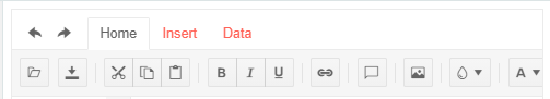
The 3 differently sized text area's render with almost the same size. Inspecting the elements, the textarea is wrapped in a span which is given a k-input-[sm/md/lg] class, and the text area is given minorly different padding for each. This works fine for TextBox, but not what you would expect from textarea.
I would expect textarea to render 1 line for sm, 2 lines for md, and 4 lines for lg, or something similar. The padding is a fairly useless difference here for a text area.
Adding the form-control class from bootstrap to a textarea causes worng appearance especially when I have autosize set to true.
---
ADMIN EDIT
Here is a workaround:
<style>
    span.k-textarea.form-control {
        border: 0;
        box-shadow: none;
        width: 100%;
        height: auto;
    }

        span.k-textarea.form-control textarea {
            border: 1px solid rgb(206, 212, 218) !important;
            border-radius: 0.25rem !important;

        }
</style>

<TelerikTextArea @bind-Value="@theValue" Class="form-control" AutoSize="true" />

@*<textarea class="form-control" @bind="theValue"></textarea>*@

@code{
    string theValue { get; set; } = "one\ntwo\nthree\nfour";
}
---
In the attached sample you will see that the textbox (the second input) is 2px taller than the numeric textbox (the first input). Both of them are several pixels taller than the combo box and date picker.
---
ADMIN EDIT
Related to this issue in the themes repo about improving bootstrap integration.
A workaround can be adding specific height to the widgets you use through the bootstrap classes, for example:
<style>
    input.k-textbox.form-control,
    k-datetimepicker.form-control,
    .k-widget.k-combobox.k-header.form-control {
        height: calc(2.25rem) !important;
    }
</style>

<div class="container-fluid border pt-md-3">
    <div class="row">
        <h5 class="pl-3 pb-3">nach Geschäftsfall suchen</h5>
    </div>
    <EditForm Model="SuchParameter" OnValidSubmit="HandleValidSubmit">
        <DataAnnotationsValidator />
        <div class="row  mb-1">
            <div class="col-md-4">
                <label for="fallJahr">Fall-Jahr</label>
            </div>
            <div class="col-md-8">
                <TelerikNumericTextBox Id="fallJahrTelerik" @bind-Value="SuchParameter.Jahr" Class="form-control" Arrows="false" />
            </div>
        </div>
        <div class="row  mb-1">
            <div class="col-md-4">
                <label for="fallNummer">Fall-Nr.</label>
            </div>
            <div class="col-md-8">
                <TelerikTextBox Id="fallNummer" @bind-Value="SuchParameter.Nummer" Class="form-control" />
            </div>
        </div>

        <div class="row  mb-1">
            <div class="col-md-4">
                <label for="geschaeftsArt">Geschäftsart</label>
            </div>
            <div class="col-md-8">
                <TelerikComboBox Id="geschaeftsArt" ValueChanged="@( (string c) => OnGeschaeftsArtChanged (c))" Value="selectedGeschaeftsArt" ValueField="Art" TextField="Art" ValueExpression="@( () => selectedGeschaeftsArt )"
                                 Data="@GeschaeftsArten" Placeholder="Geschäftsart auswählen" ClearButton="true" Width="100%"
                                 Class="form-control"/>
            </div>
        </div>
        <div class="row  mb-1">
            <div class="col-md-4">
                <label for="posteingang">Posteingang </label>
            </div>
            <div class="col-md-8">
                <TelerikDateTimePicker Id=posteingang @bind-Value="@selectedTime" Format="dd.MM.yyyy" Width="100%"
                                       Class="form-control"></TelerikDateTimePicker>
            </div>
        </div>

        <button type="submit" class="btn btn-block btn-primary">Suchen</button>
        <ValidationSummary />
    </EditForm>
</div>

@code{
    public class TheFormModel
    {
        public int Jahr { get; set; }
        public string Nummer { get; set; }
    }

    public class ComboModel
    {
        public string Art { get; set; }
    }

    TheFormModel SuchParameter { get; set; } = new TheFormModel();
    string selectedGeschaeftsArt { get; set; }
    List<ComboModel> GeschaeftsArten { get; set; } = Enumerable.Range(1, 5).Select(x => new ComboModel { Art = $"Art {x}" }).ToList();
    DateTime selectedTime { get; set; }

    void HandleValidSubmit()
    {

    }

    void OnGeschaeftsArtChanged(string v)
    {
        selectedGeschaeftsArt = v;
    }
}
---
Hello,
I prepared a demo https://dojo.telerik.com/EYeYUSUw/6
Also applies to the latest default sass theme but probably to many more.
As you can see, the master grid its 'content row' hover effect is being applied to even the header of the detail grid and there is no way to resolve that unwanted effect apart from adding more styling tedious rules.
The resolution is so simple:
.k-grid tbody tr:hover, .k-grid tbody tr.k-state-hover {
    background-color: #e6e6ea;
}
Should be
.k-grid tbody > tr:hover, .k-grid tbody > tr.k-state-hover {
    background-color: #e6e6ea;
}
I did not search for the source files/lines what might need to change - easy to find in your current version.
There could be many more of these simple improvements which would save many hours on ours side!
Regards,
Jan
It would be awesome to have "style hooks" for all components - this can be implemented through css variables/properties and would allow for things like dynamic theming including support for dark mode etc.
Because css variables/properties can be read and written through javascript this would open up several new ways for dynamic layouts.
CSS variable/properties are supported on all current browsers except IE 11, and it is possible to implement them with a gracefull fallback.
Currently, using npm install --save @progress/kendo-theme-material will get the standard Material Design theme for use across the React Components, but why is Material Black not available this way? (npm install --save @progress/kendo-theme-materialBlack)
When you put a TelerikEditor in a Telerik Form the Format dropdown gets stretched, which forces it onto its own line which doesn't look as good.
Bug report
Reproduction of the problem
- Open the following Demo with one of the SASS themes.
- Open the filter menu for the ProductName column
Current behavior
There is an additional border around the search input. The border appears when Sass is used.
Expected/desired behavior
The additional border should be removed.
Environment
- Kendo UI version: 2020.3.915
- Browser: [all]
A new Kendo UI theme which is in compliance with and extends Zurb Foundation styles -> http://foundation.zurb.com/sites/docs/kitchen-sink.html