In Sass is possible to define à variable like this
$primary: red;
$primary-filter: rgba($primary, .5);
But this possibility is not supprted by ThemeBuilder
It may be usefull for variation of same color in theme whit only one variable to adjust.
Sometimes, when using the Export Font Icons functionality of the ThemeBuilder Plugin for Figma, the export freezes with "Sending data to server: 0%":
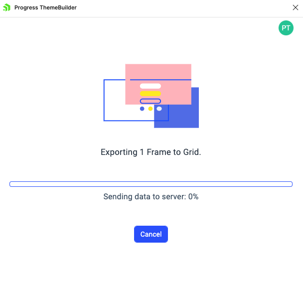
This is due to how Figma handles the export of icons.
Consider implementing a mechanism for indicating the problematic icons so that users can remove/update them and make them eligible for export.
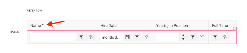
Currently, there are no templates for modifying the sort icons of the filter cells of the TreeList component. There is a template for the Filter Row, which refers to the Grid component. However, the part with the sort icon is not connected to the Grid, as modifying it there doesn't reflect the change in the TreeList.
Consider exposing a templates for these icons.
We recently upgraded our theme builder to ultimate so we could migrate our theme builder project from R1 2023 to Q4 2024. After we did this there were some small changes we needed to fix but after that we followed all the normal installation procedures.
We are running angular 18 and have updated all kendo components to the latest versions.
After installing the new theme we also added/changed the way we imported the theme package following the documentation (using @use).
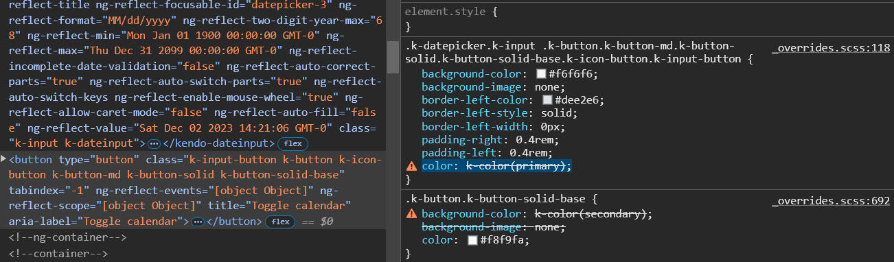
Most everything looks good but there is one large issue with several of our components and that is the kendo theme mixin "k-color" is not working.
In several places there is no color or background color being set on the component(s). When i inspect the style i see color: k-color(primary); is not working. dev tools states that the variable is wrong. i can only assume the mixin is not imported/being used.
Image of my description
When exporting only selected components, it would be incredibly beneficial if ThemeBuilder could automatically generate separate override files specifically for those components. This approach would keep the codebase more modular, improve performance, and better serve applications relying only on certain Kendo components.
Requested through 1674517
Consider exposing a styling template for the PropertyGrid component
https://demos.telerik.com/kendo-ui/propertygrid/index
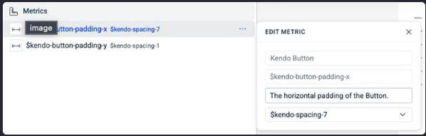
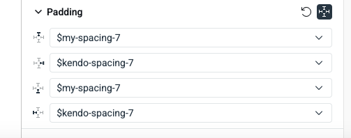
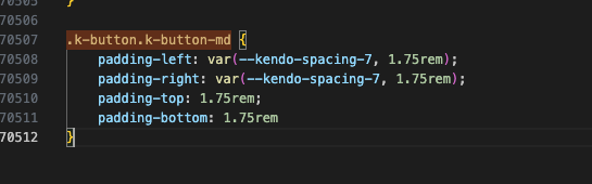
Consider making the generated CSS to contain CSS variables instead of compiled CSS. Currently, that is possible only when using direct variables like $kendo-spacing-1.
However, with the current state (Q1 2025), ThemeBuilder will produce compiled value in the CSS when the variables are non-direct (refer to the first screenshot). In the example below the $kendo-spacing-7 is costom added to the $kendo-button-padding-x and as a result, will be compiled as a value
or when the variable is custom-created (second screenshot).
In the example, below the kendo-spacing-7 is used directly and is generated as variable, but $m y-variable is compiled as a value.
Requested through t.1679417
Expose styling templates for the Wizard components available in the Kendo/Telerik suites
https://github.com/telerik/kendo-themes/tree/develop/tests/wizard
https://demos.telerik.com/blazor-ui/wizard/overview
https://www.telerik.com/kendo-react-ui/components/form/wizard
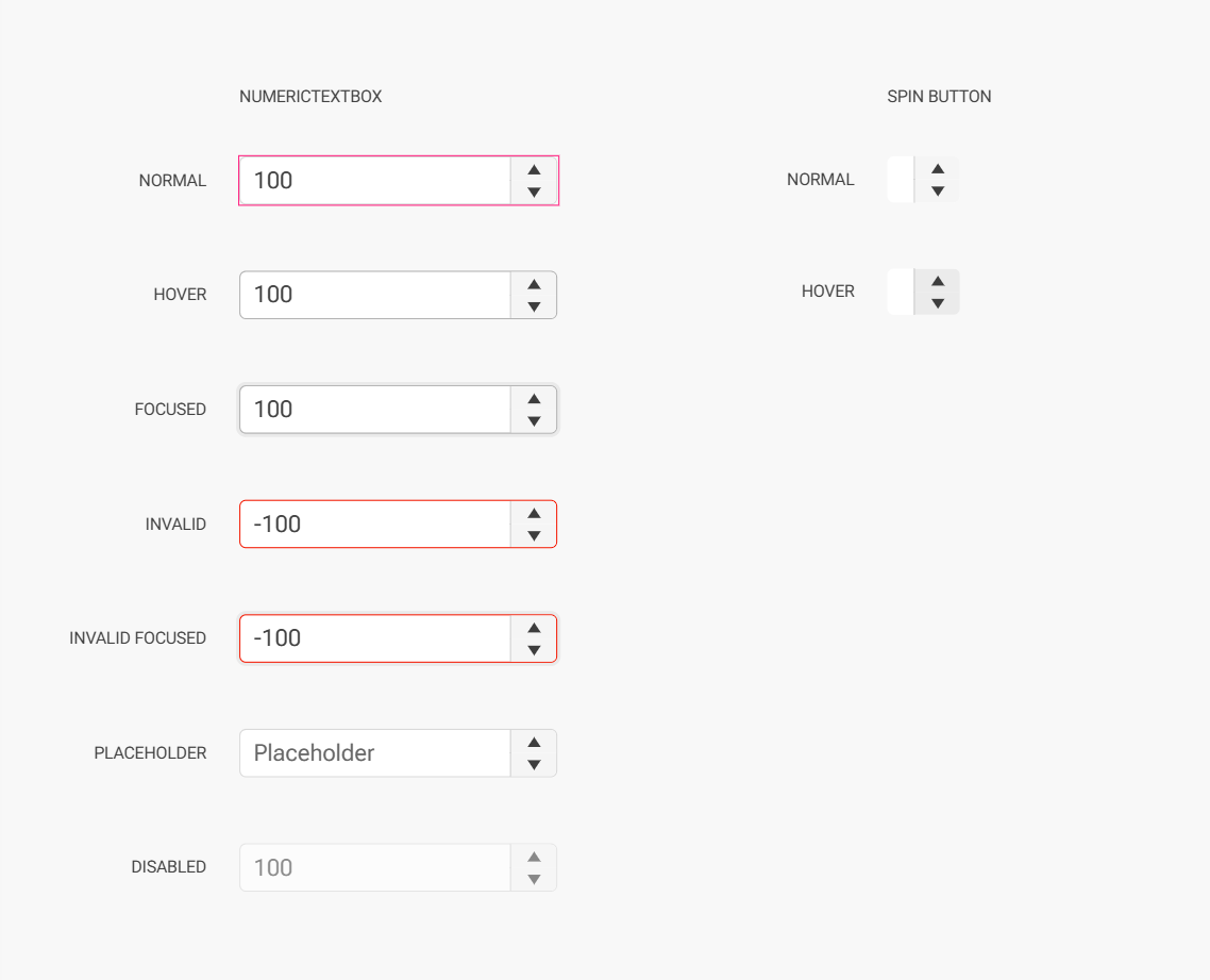
Hi,
right now you are not able to style the adornments for example of a numeric textbox in ThemeBuilder.
It would be nice if that could be added.
Thanks,
Nina
This is an incredibly important feature for a tool like a "ThemeBuilder" to do. There are too many colors for someone to easily swap out, which makes the tool hard to manage for color. I know we can use another tool to create color palettes and then plug it in, but honestly this is one of the top things a ThemeBuilder should do.
It should make swapping color categories simple by allowing you to select the colors for primary, danger, warning, tertiary, info, etc. and then the tool generates a color palette within the color family automatically. Then, if the user does not like any of the colors automated, they could manually swap them out like they do today.
Consider adding support for compiling Typography or Effects variables in ThemeBuilder to CSS variables (in the compiled CSS).
Currently, only color and metrics variables are compiled to CSS variables.
Requested through t.1702497
Consider supporting extended collections in Figma.
Currently, the Themebuilder plugin for Figma can export only variables from the main collections.
More about the extended collections (available only with Figma Enterprise) here:
https://help.figma.com/hc/en-us/articles/36346281624471-Extend-a-variable-collection
Requested through t.1713217
Hello,
We want to create a custom Material theme for our ASP.NET Core web application. We are using the Sass Theme Builder but can only select predefined color swatches for the "Material" base theme. We would like to be able to set custom colors per "subject" just like you can with the "Default" and "Bootstrap" theme.
Is this possible or are you blocking this on purpose for some reason?
Thank you in advance.
Issue:
The text for the onlabel and offlabel is not shown because the ".k-switch-label-on, .k-switch-label-off" is showing "display: none" and other issues you'll see when testing. Appears that the SASS Theme Builder doesn't take into consideration the OnLabel and OffLabel parameters.
SASS Theme CSS: line 12087-12096
.k-switch-label-on,
.k-switch-label-off {
display: none;
position: absolute;
top: 50%;
-webkit-transform: translateY(-50%);
-ms-transform: translateY(-50%);
transform: translateY(-50%);
overflow: hidden;
}
Code:
<TelerikSwitch class="ml-2" @bind-Value="@isDark" Width="80px" OnLabel="Dark" OffLabel="Light" OnChange="ThemeHandler" />
Add ability to style the table headers in Scheduler

The style for dialog actions is exported with the following selector
.k-dialog-wrapper .k-window.k-dialog .k-window-actions.k-dialog-actions.k-actions.k-actions-stretchedThis is not applied when I switch actions bar to a different layout than the default
<DialogActionsBar layout="start">
</DialogActionsBar>.k-actions-stretchedThemebuilder used to export non compiled css
Now it's only compiled, and it's not easily plug and play with my current npm bundler.
Please bring back option to export non-compiled css
Consider the option to expose predefined classes of HTML elements from the Kendo themes. This would allow atomic customization and mapping to other imported variables (like ones imported from Figma designs).
For example:
An option to style the H1 header from the Kendo theme, which has the .k-h1 class.