Greetings,
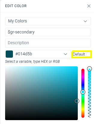
I would like to delete the custom font named Roboto_embedded from one of my ThemeBuilder projects (ID: ...580b) but I cannot do it.
I also noticed I cannot edit this specific custom font either.
I don't really know how this happened. Maybe that comes from the fact that at some point, I tried creating a CSS font stack in the $kendo-default-typography variable? I noticed the behavior of ThemeBuilder was strange when I tried to do that.
Consider having the option to trigger the automatic migration (for ThemeBuilder Ultimate and Enterprise) and Export options simultaneously for multiple projects.
Benefits as pointed out by a user:
""...
I'd rather start a batch job performing all of those tasks (it might even be a dry run just pointing out issues) and generate some "editor-readable" results)I can then review all of the outputs in a single step, adapt those with issues, or exclude them from the next batch run, which would automatically migrate all of the projects without issues. The workflow would boil down to those themes with issues (which is perfectly fine). Right now, I have to go through all of this manually, which takes a considerable amount of time... "
Request Feature...
Either: 1) Give Access To Common SASS modules/methods.
If I am using a primary color for my themebuilder customization and define it as
$my-primary-color = #2a3bd1,
give me the ability to use functions in sass like
- lighten($my-primary-color, 20%) or
- color.change($my-primary-color, $saturation: 50).
- However you do it
Or: 2) Provide swatches using the current theme colors on color picker.
Or create swatches from the current theme color in the color picker to use as starting points when picking another color representing hover or selected or disabled, etc.
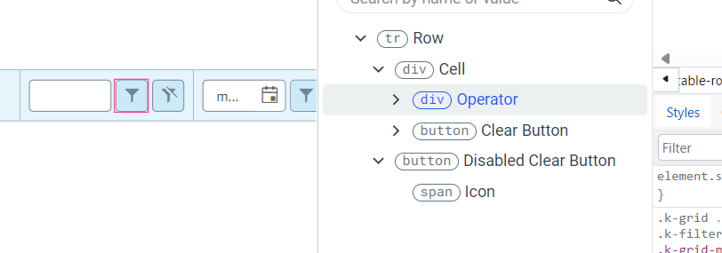
Currently, you can style only the Operator and the Clear buttons components inside the FilterRow Cell template. It would be great to have the ability to style the rest of the components (e.g. Inputs, NumericTextBox, etc.)
Currently, in ThemeBuilder, you can't style DropDownList, which uses groups.
https://demos.telrik.com/kendo-ui/dropdownlist/grouping
https://www.telerik.com/kendo-react-ui/components/dropdowns/combobox/grouping/
Consider the option to expose a template that will allow adding custom styles for DropDownList with grouping.
Requested through t.1645162
Consider exposing a template that will allow styling the (Optional) text span from ThemeBuilder.
Currently, as a workaround users must explicitly set the styles through the following selectors:
.k-stepper .k-step-label-optional {
    color: red;
    background-color: yellow;
    font-size: 18px;
    font-style: normal;
}
Requested through t.1648985
Consider the option to support absolute paths for background-image in the Style Editor.
This will enable users to visualize the background-image changes directly in ThemeBuildeer (currently the only option is to export the theme and load the changes in the end application).
Alternatively, consider the option to provide a space for loading images with relative paths (fir fast preview in ThemeBuilder).
Consider providing partial exports for the SCSS when working with the Kendo Fluent theme. Partly exports are available for all other flavors except for the Fluent theme.
+1 from t.1652071
When an element is selected in ThemeBuilder, it shows its Parts and Properties on the right and a Live Preview at the bottom. I would really benefit from seeing the HTML code/markup (snippet), e.g. `<button kendoButton themeColor="primary" fillMode="flat">Button</button>`. I'm trying to decipher what attributes I should be using by looking at the applied classes, but it's not always 1-to-1 or clear.
I need to be able to enter `rem` (or even `em`) values for metrics like `padding`.
Currently, in ThemeBuilder there is a template that allows you to style the icon of a header cell that is filterable.
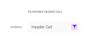
However, we need to be able to style the icon in a header cell that triggers the ColumnMenu (the more icon)

https://demos.telerik.com/aspnet-core/grid/column-menu
https://www.telerik.com/kendo-react-ui/components/grid/interactivity/column-menu/
requested through t.1655985
It would be helpful to add a feature to ThemeBuilder that allows users to create theme variable modes based on typography variables, similar to the existing feature that lets them create themes based on color and metrics.
This will enable users to generate different themes within a single project by simply changing the fonts used.
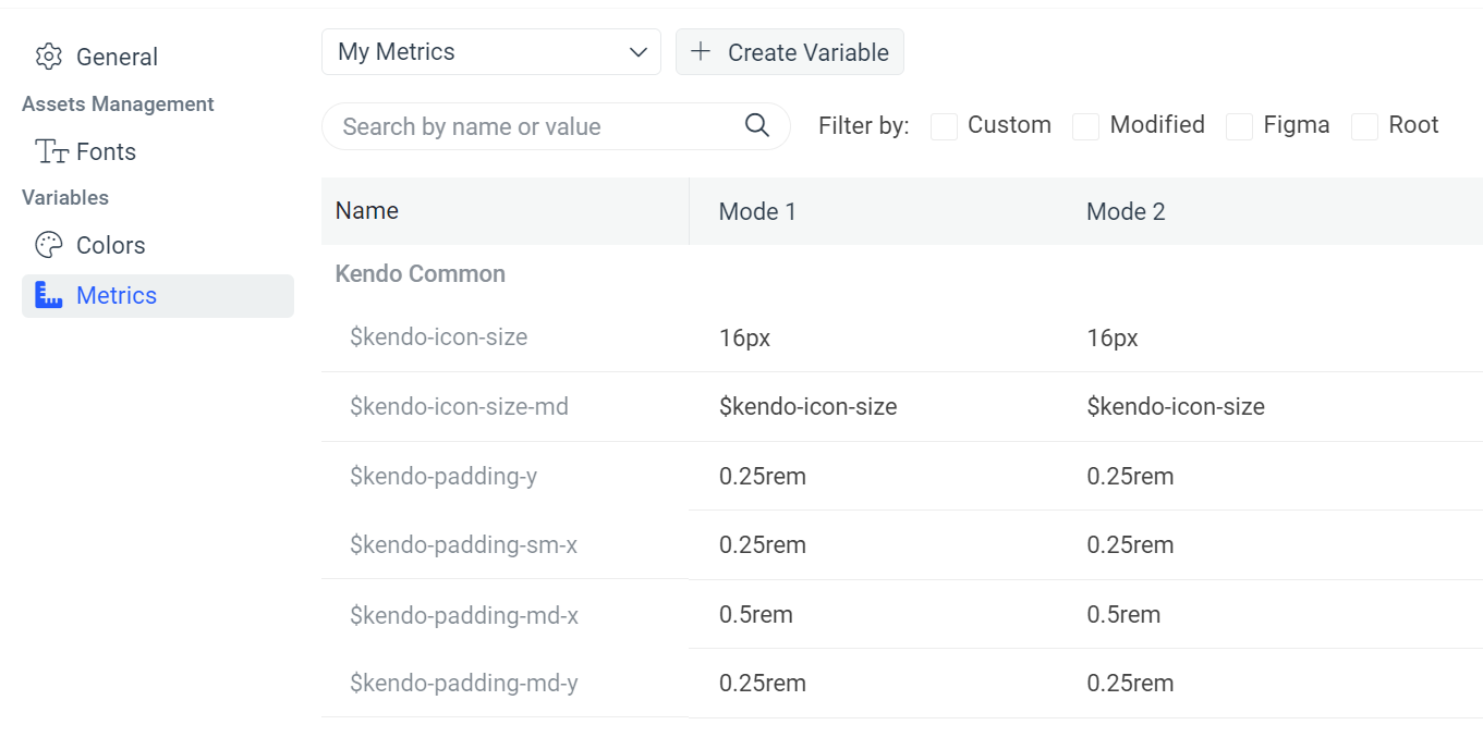
Requested through t.1656320
Currently, in ThemeBuilder, the generated styles for the Telerik/Kendo component Breadcrumb are only for the collapse mode "wrap". However, in Telerik UI for Blazor, Kendo UI for Angular, and others, the Breadcrumb component supports different collapse mode values, such as "auto" and "none":
https://docs.telerik.com/blazor-ui/components/breadcrumb/collapse-modes
https://www.telerik.com/kendo-angular-ui/components/navigation/breadcrumb/collapse-modes/
Consider providing templates to allow the generation of styles for other collapse modes.
Requested through t.1660021
Consider generating utility classes for variables to apply and reuse styles easily. For example, the user defines a color variable in ThemeBuilder called "component," and this makes ThemeBuilder generate utility classes:
.k-color-component {
  color: #ffeb3b;
}
.\!k-color-component {
  color: #ffeb3b !important;
}
.k-bg-component {
  background-color: #ffeb3b;
}
.\!k-bg-component {
  background-color: #ffeb3b !important;
}
These utility classes can then be applied and reused in code outside of ThemeBuilder:
<div class="k-color-component"></div>
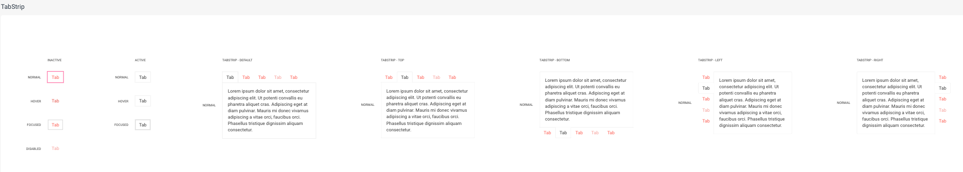
Currently, ThemeBuilder exposes templates for the states of the TabStrip items. However, the changes apply to all positions of the TabStrip. This is inconvenient if you want to apply changes only to one of its positions. Also, these items' states have specific styles coming with the keyword "!important", which the default templates do not override.
Consider exposing templates for these states based on the position of the TabStrip component.
Requested through t.1666111.
_tokens.scss
tb-custom-primary: #014d5b !default; //Is the value if not defined in final scss
tb-primary: tb-custom-primary;
-----------------------------------------------
index.scss
$tb-custom-color: #34b232; //Now I can define the final value for variable
@import '_tokens'
it would be useful to add it in ThemeBuilder UI.