Unplanned
Last Updated: 19 Jul 2023 18:45 by Clint
Created by: Clint
Comments: 0
Category: Chart
Type: Feature Request
0
Allow the RadLegend to dynamically show/hide the chart series through checkboxes in the legend items.
Unplanned
Last Updated: 13 Jul 2023 11:48 by ADMIN
Created by: Marion
Comments: 1
Category: Chart
Type: Bug Report
0

Hi Team,

If you create a ScatterPointSeries, the RadLegend does not pick up the series DisplayName value. A replication project is attached, but here's a screenshot to quickly illustrate the behavior:
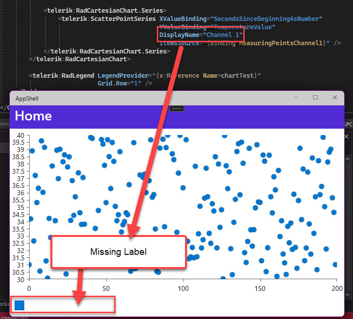
Thank you,

Marion

Unplanned
Last Updated: 30 Jun 2023 09:54 by Steve
When setting the Stroke of the ScatterLineSeries to something other than the default, the RadLegend icon color does does not sync to match.
 
Unplanned
Last Updated: 30 Jun 2023 07:46 by Steve

when using the flowing setup: 

<telerik:RadCartesianChart.ChartBehaviors>
                    <telerik:ChartSelectionBehavior x:Name="selection"
                                                    SeriesSelectionMode="None"
                                                    DataPointSelectionMode="Single"
                                                SelectionChanged="selection_SelectionChanged"/>
</telerik:RadCartesianChart.ChartBehaviors>

the selection behavior on data point does not fire on WInUI on Cartesian series. It works for PieSeries. 

Unplanned
Last Updated: 19 Apr 2023 11:48 by Anne
Created by: Anne
Comments: 0
Category: Chart
Type: Feature Request
1
I want to set textcolor to the text inside the trackball and apply background color to it. 
Unplanned
Last Updated: 02 Mar 2023 15:10 by Daniel
Add support for reordering the series in the PieChart.
Unplanned
Last Updated: 02 Mar 2023 15:06 by Daniel
PieChart should provide customization properties for its Series Labels like FontSize, FontAttributes, property for LabelPosition, FontFamily, TextColor, etc.
Unplanned
Last Updated: 02 Mar 2023 15:02 by Daniel
Created by: Daniel
Comments: 0
Category: Chart
Type: Feature Request
2
Add support for selecting a slice of the PieChart from the code - behind.
Unplanned
Last Updated: 20 Jan 2023 16:05 by John
Created by: John
Comments: 0
Category: Chart
Type: Feature Request
1

Hi team,

Currently, I can only set LegendItemFontColor and LegendItemFontSize. I would like to be able to set LegendItemFontFamily

Thank you,

John

Unplanned
Last Updated: 20 Jan 2023 16:00 by John
Created by: John
Comments: 0
Category: Chart
Type: Feature Request
1

Hi Team,

I would like to be able to set different cap styles on the bars, like the RadGauge allows you to do on Indicators. For example, I want rounded corners.

Thank you,

John

Unplanned
Last Updated: 02 Jan 2023 09:44 by Sebastian

On some chart series like, bar, line, scatter line, etc, the y axis line is hidden. make it visible, as it is on Android and Windows. 

Current solution is to use the chart handler changed and set YAxis.Style.LineHidden to false.

public partial class MainPage : ContentPage
{
    public MainPage()
    {
        InitializeComponent();

        this.chart.HandlerChanged += this.Chart_HandlerChanged;
    }

    private void Chart_HandlerChanged(object sender, EventArgs e)
    {
        this.UpdateChart();
    }

    private void UpdateChart()
    {
        var platformView = this.chart.Handler.PlatformView;
#if IOS || MACCATALYST
        var platformChart = (Telerik.Maui.Controls.Compatibility.ChartRenderer.iOS.TKExtendedChart)platformView;
platformChart.YAxis.Style.LineHidden = false;
#endif
    }
}

Unplanned
Last Updated: 21 Dec 2022 10:39 by Dustin
Created by: Angus
Comments: 1
Category: Chart
Type: Feature Request
2
I need to show multiple series in the graph controlled by some other switch / check box list that selects which series to show on the graph.
Unplanned
Last Updated: 08 Dec 2022 17:52 by Clint
Created by: Sebastian
Comments: 1
Category: Chart
Type: Feature Request
3
I would like to visualize a secondary vertical Axis for the series. 
Unplanned
Last Updated: 05 Dec 2022 15:23 by Clint
Created by: Clint
Comments: 0
Category: Chart
Type: Feature Request
4
Add a title for the horizontal and vertical axis.
Unplanned
Last Updated: 24 Nov 2022 11:33 by Clint
Created by: Clint
Comments: 0
Category: Chart
Type: Feature Request
1

Add an option to define chart title. 

 Currently we can achieve this by adding a label on the top/bottom of the chart.

Example:

<Grid RowDefinitions="Auto,*">
    <Label Grid.Row="0" Text="Chart title"/>
    <telerik:RadCartesianChart x:Name="chart" Grid.Row="1" AutomationId="chart">
        <telerik:RadCartesianChart.BindingContext>
            <local:ViewModel />
        </telerik:RadCartesianChart.BindingContext>
        <telerik:RadCartesianChart.HorizontalAxis>
            <telerik:CategoricalAxis />
        </telerik:RadCartesianChart.HorizontalAxis>
        <telerik:RadCartesianChart.VerticalAxis>
            <telerik:NumericalAxis />
        </telerik:RadCartesianChart.VerticalAxis>
        <telerik:RadCartesianChart.Series>
            <telerik:BarSeries CategoryBinding="Category"
                                ValueBinding="Value"
                                ItemsSource="{Binding Data}" />
        </telerik:RadCartesianChart.Series>
    </telerik:RadCartesianChart>
</Grid>

Unplanned
Last Updated: 07 Oct 2022 08:49 by Angus
Created by: Angus
Comments: 2
Category: Chart
Type: Feature Request
1

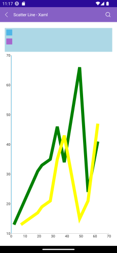
I would like to use line style instead of colour to distinguish between the different series on my chart as below. 

Is this possible?

From the docs it looks like we can only customise stroke colour and thickness. 

Thanks =)

Unplanned
Last Updated: 07 Oct 2022 08:47 by Angus
Created by: Angus
Comments: 1
Category: Chart
Type: Feature Request
1


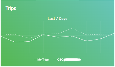
Can the Legend be identical to the LineSeries, not only by colour, but also by style?

Unplanned
Last Updated: 05 Sep 2022 13:17 by Sergio
Created by: Sergio
Comments: 0
Category: Chart
Type: Feature Request
3

Can I customize the text inside the bar?

- Text Color, Position, FontSize, etc.

Unplanned
Last Updated: 24 Aug 2022 14:19 by Valliappan
Created by: Valliappan
Comments: 0
Category: Chart
Type: Feature Request
1
Currently the legend icon is displayed as square. Provide an option to change it to circle for example. 
Unplanned
Last Updated: 23 Aug 2022 15:01 by Hanoch
Created by: Hanoch
Comments: 0
Category: Chart
Type: Feature Request
4
I want to suit each line series tooltip border color to match the chart palette color