Can I customize the text inside the bar?
- Text Color, Position, FontSize, etc.
Hi Team,
Currently on Android, the Chart renderers do not setup the XValueBinding and YValueBinding correctly if the property name is a nested property. This results in an UnhandledException at runtime
You can reproduce the issue using .NET MAUI RC2 and Telerik UI for MAUI 0.8.0, with the following implementation:
- Create a File > New .NET MAUI RC2 project (VS 2022 Preview 5)
- Setup MainPage using the following code
XAML
<?xml version="1.0" encoding="utf-8" ?>
<ContentPage xmlns="http://schemas.microsoft.com/dotnet/2021/maui"
             xmlns:x="http://schemas.microsoft.com/winfx/2009/xaml"
             xmlns:telerikChart="clr-namespace:Telerik.XamarinForms.Chart;assembly=Telerik.Maui.Controls.Compatibility"
             x:Class="MauiApp1.MainPage">

    <telerikChart:RadCartesianChart MinimumHeightRequest="300">
        <telerikChart:RadCartesianChart.HorizontalAxis>
            <telerikChart:NumericalAxis LabelFitMode="MultiLine" />
        </telerikChart:RadCartesianChart.HorizontalAxis>
        <telerikChart:RadCartesianChart.VerticalAxis>
            <telerikChart:NumericalAxis />
        </telerikChart:RadCartesianChart.VerticalAxis>

        <telerikChart:RadCartesianChart.Series>
            <telerikChart:ScatterSplineSeries XValueBinding="NumericalData.XData" YValueBinding="NumericalData.YData" ItemsSource="{Binding Data1}" />
        </telerikChart:RadCartesianChart.Series>
    </telerikChart:RadCartesianChart>
</ContentPage>
Code-behind
namespace MauiApp1;

using System.Collections.ObjectModel;

public partial class MainPage : ContentPage
{
    public MainPage()
    {
        InitializeComponent();
        Data1 = GetNumericData1();
        BindingContext = this;
    }

    public ObservableCollection<Item> Data1 { get; set; }

    public static ObservableCollection<Item> GetNumericData1()
    {
        var data = new ObservableCollection<Item>
        {
            new Item { NumericalData = new NumericalData { XData = 2, YData = 13 } },
            new Item { NumericalData = new NumericalData { XData = 19, YData = 31 } },
            new Item { NumericalData = new NumericalData { XData = 22, YData = 33 } },
            new Item { NumericalData = new NumericalData { XData = 28, YData = 35 } },
            new Item { NumericalData = new NumericalData { XData = 33, YData = 46 } },
            new Item { NumericalData = new NumericalData { XData = 38, YData = 34 } },
            new Item { NumericalData = new NumericalData { XData = 49, YData = 66 } },
            new Item { NumericalData = new NumericalData { XData = 55, YData = 24 } },
            new Item { NumericalData = new NumericalData { XData = 62, YData = 41 } },
        };
        return data;
    }
}

public class NumericalData
{
    public double XData { get; set; }
    public double YData { get; set; }
}

public class Item
{
    public NumericalData NumericalData { get; set; }
}
Thank you!
Martin
I would like to use line style instead of colour to distinguish between the different series on my chart as below.

Is this possible?
From the docs it looks like we can only customise stroke colour and thickness.
Thanks =)
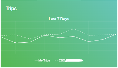
Can the Legend be identical to the LineSeries, not only by colour, but also by style?
Add an option to define chart title.
Currently we can achieve this by adding a label on the top/bottom of the chart.
Example:
<Grid RowDefinitions="Auto,*">
    <Label Grid.Row="0" Text="Chart title"/>
    <telerik:RadCartesianChart x:Name="chart" Grid.Row="1" AutomationId="chart">
        <telerik:RadCartesianChart.BindingContext>
            <local:ViewModel />
        </telerik:RadCartesianChart.BindingContext>
        <telerik:RadCartesianChart.HorizontalAxis>
            <telerik:CategoricalAxis />
        </telerik:RadCartesianChart.HorizontalAxis>
        <telerik:RadCartesianChart.VerticalAxis>
            <telerik:NumericalAxis />
        </telerik:RadCartesianChart.VerticalAxis>
        <telerik:RadCartesianChart.Series>
            <telerik:BarSeries CategoryBinding="Category"
                                ValueBinding="Value"
                                ItemsSource="{Binding Data}" />
        </telerik:RadCartesianChart.Series>
    </telerik:RadCartesianChart>
</Grid>
Hi Team,
I would like to be able to set different cap styles on the bars, like the RadGauge allows you to do on Indicators. For example, I want rounded corners.
Thank you,
John
Hi team,
Currently, I can only set LegendItemFontColor and LegendItemFontSize. I would like to be able to set LegendItemFontFamily
Thank you,
John
Minor ticks are available for Telerik WPF chart: https://docs.telerik.com/devtools/wpf/controls/radchartview/features/minor-ticks-and-stripes
The VisibleRange property can hold the actual visible minimum and maximum of the axis while the chart is being zoomed and panned.
Let's say I set the number of labels to 4 on that axis (see attached pic). It would then be up to the axis to auto generate the labels depending on the data and zoom. There would always be four labels shown on the axis regardless of zoom so the user could always have context regardless of the zoom. The labels would just change to reflect what is currently being viewed at the current zoom level.