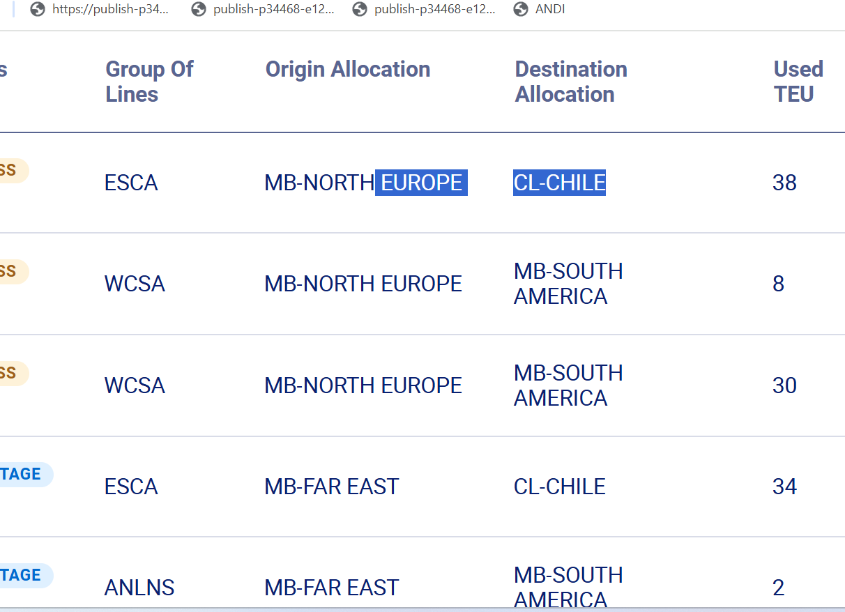
When starting he component, to load the initial value, the Api returns the id selected as a string ("2") and DropDownList does not display the selected option. Changing the value to an integer (2) displays it correctly.
This issues requires changing the values before padding them to component, but I would that the component parse automatically the comparision, or allow us handle the strict comparision
The axisRanges property of the zoom event when you zoom on a chart object is empty, It should contain the ranges of the axes in the zommed area.
I would like to suggest adding a seamless typing feature in the Kendo Vue DateInput component, enabling automatic navigation between each section (day, month, year, hour, minute) without requiring separators or manual navigation.
✳️ Expected Behavior:
When typing a date and/or time, such as 20/04/1997 14:35, the cursor should automatically move to the next segment when the expected number of digits is reached:
For dates:
- Typing 20 → cursor jumps to month.
- Typing 04 → cursor jumps to year.
- Typing 1997→ date completed.
For times:
- Typing 14 → cursor jumps to minutes.
- Typing 35 → time completed.
👉 User flow example:
20 -> (day filled, move to month)
04 -> (month filled, move to year)
1997 -> (year filled, move to hour)
14 -> (hour filled, move to minute)
35 -> (minute filled)
✅ This would apply to all DateInput modes:
- Date only.
- Time only.
- DateTime combined.
❌ Current Situation in Kendo Vue DateInput:
- Manual use of arrows or mouse to move between segments.
- Need to type separators (
/,:, etc.) explicitly. - No automatic focus jump when a section is completed.
✅ Requested Feature:
- A prop to enable/disable automatic segment navigation in DateInput.
- Applies to both date and time segments, depending on the configured format.
🛑 Why it matters:
- Faster and more fluid typing experience.
- Matches native behaviors found in <input type="date">or
<input type="time">in many browsers. - Important for data-heavy environments (administrative forms, back-office systems, repetitive entry).
- Accessibility-friendly: reduces the need for manual cursor manipulation.
⚙️ Additional context:
After discussing this with your team, I understand that this behavior is not currently planned and custom implementations are challenging to achieve.
Still, exposing this behavior as an optional prop would allow those who need this fluid UX to benefit from it, without affecting existing users.
Thank you very much for considering this suggestion!
When enabling the columnMenu of a Grid, it should be hidden by default on all expand type columns (when using grouping or detail row). It makes no sense for it to appear in the headers for these columns as the sorting and filtering functions do nothing.
I'm aware the columnMenu can be enabled on individual columns, rather than the entire Grid, but the menu should not appear for columns where it has no purpose.
I know this exists: https://www.telerik.com/kendo-vue-ui/components/knowledge-base/scheduler-highlight-today-date-in-all-views
This breaks my scheduler unfortunately. I don't really have time to create a stackblitz and follow it further.
I think the slot with the current Date should have the class k-today out of the box.
https://www.telerik.com/kendo-angular-ui/components/grid/api/stringfiltercellcomponent#filterdelay
Describe the bug
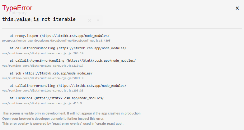
DropdownTree component throws an error when user opens dropdown menu when they selected an item already, if valueRender prop is configured.
To Reproduce
Steps to reproduce the behavior:
- Open this example - https://codesandbox.io/p/sandbox/3tmtkk?file=%2Fsrc%2Fmain.vue
- Select any item from DropdownTree. No errors would be thrown.
- Try to press on dropdown tree to open dropdown menu again.
- User will see this error instead of dropdown tree menu opening.
Hi Team,
In Grid, Using optical mouse When Moving left to right or vice versa I should be able to move the grid as happening for top to bottom. In the attached video I have first used optical mouse and then Next I have used from laptop(Not optical mouse).
NOTE: When Mouse click and drag I must be able to drag from left to right or vice versa.
Kindly look at the behavior and let me know the solution for this issue.
I'm using the PanelBar component as a Navigation sidebar in my app. As this is navigation bar, I would like to be able to change the <span> element which houses the title prop, to be an <a> tag. I can see how this is possible for child items, but I cannot figure out how to do this for top level items.
Request:
Either be able to pass through a prop to change the type of element which wraps the title prop.
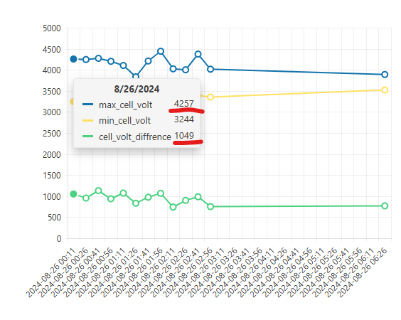
About the line chart component If you use the "baseUnit:fix" property, there may be a difference between the data displayed in the marker tooltip and the actual data.
The data that reproduces the behavior is shown below.
https://stackblitz.com/edit/4d7wyn-buonwc?file=src%2Fmain.vue
The first value of the array data is shown below, but it may not match what is displayed on the graph or may not match other data such as the end.
I would like a fix or a feature that matches the data in the points plotted in the three vertical columns of the graph with the data in each array.
max_cell_volt: 4226
min_cell_volt: 3244
cell_volt_diffrence: 982Greetings,
I hope this message finds you well.
I would like to request a new feature for the Kendo Vue Dropdown List component: the ability to disable selected items directly within the dropdown list configuration. This functionality is already available for Kendo React users, as outlined in your documentation:
Disabled Items in Kendo React DropdownList.
Why This Feature is Valuable for Kendo Vue Users
Consistency Across Frameworks
Many users work across multiple frameworks, including React and Vue. Consistency in feature availability ensures a seamless transition and experience for developers leveraging Kendo UI in different projects.Improved User Experience
Disabling items within the dropdown is a common requirement in dynamic forms and data-driven applications. For example, when users are selecting items from a list, disabling already-selected options prevents confusion and enhances usability by guiding them effectively.Reduced Development Overhead
While developers can currently implement this feature manually in Vue, a built-in option would significantly reduce the amount of custom code required. This aligns with the Kendo philosophy of providing robust, ready-to-use components that save time and effort.Enhanced Accessibility
A built-in disabled item option ensures proper handling of accessibility concerns, such as ARIA attributes, keyboard navigation, and screen reader compatibility. This would help developers create inclusive and accessible applications without requiring additional customizations.Competitive Edge
Offering this functionality natively in Kendo Vue would strengthen the feature parity between your React and Vue libraries, making Kendo UI even more appealing to developers evaluating dropdown components across frameworks.
Proposal
Introduce a configuration option, similar to the one in Kendo React, that allows users to disable specific items in the Vue Dropdown List component. This feature could be implemented by providing a function or property to dynamically determine which items should be disabled based on their state or other criteria.
Add HTMLElement autofocus property support for input components like Input, Textbox etc... See https://developer.mozilla.org/en-US/docs/Web/API/HTMLElement/autofocus
Currently, unable to apply autofocus as an attribute to Input (separately or as part of a Form).


