Problem
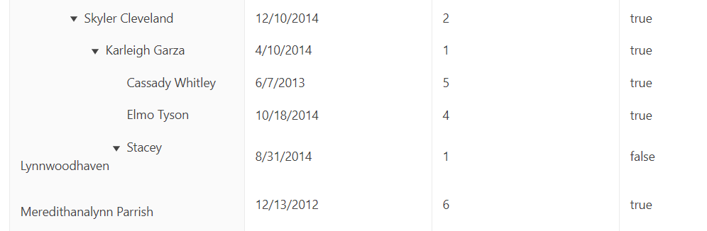
The Treelist expandable cells are indented for each level. When a name is too long, however, the indentation and spacing are difficult to read and throw off the grid's design (Codesandbox link):
Solution
We don't frequently run into this issue, and we've now got a common component for this cell redesign, but it would be nice if it worked like this out of the box:
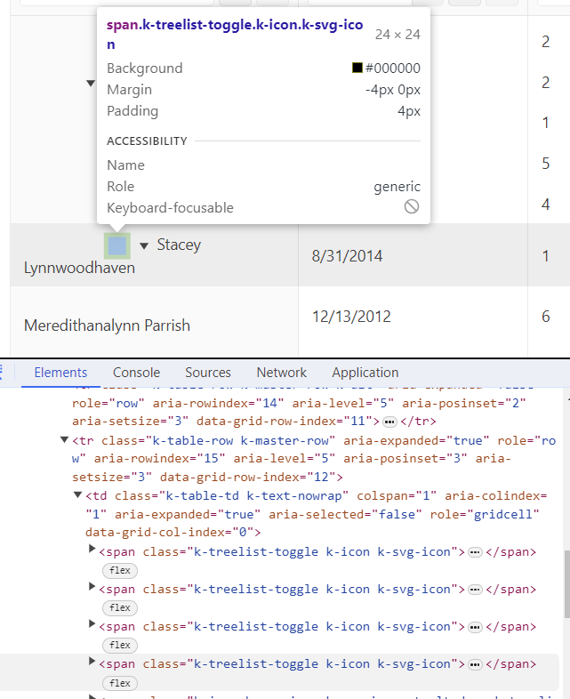
- Utilize padding on the cell instead of empty icon boxes (screenshot of DOM below) ==> this would prevent the text overflow from falling onto the next line as the padding will force the overflow text to stay indented by a certain amount. This would fix the design of the Stacey Lynnwoodhaven text and the Meredithanalynn Parrish text
Thank you,
Janki
the new feature request would be to increase the sensibility for markers beyond the points shape limit, as drawn below:
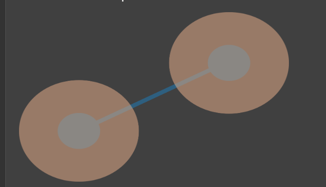
If sensibility areas are distinct and user click on point or in its surronding sensibility area, user will get point marker with point value.
Thus, this feature should ease point marker selection, without the need to tap the exact point with great accuracy.
Currently, if the data array being passed to a ListView component is empty you will only see the list view's headers and a blank list view.
It'd be nice if I could provide a message or something to display when the list view is empty.
I can choose to display a message manually right now, instead of the list view, but then I lose the ListView header columns.
It'd be nice to see the ListView columns with the empty message below them.
Unfortunately, for KendoReact there is no such an option accessible for the "sortable" property of the data grid. We would really like to customize multi-column sorting fuctionality of our grids by the way that it is possible for Kendo UI for Angular, so we are requesting to add/make public option "multiSortKey" of the "sortable" property.
We are not able to find where is stored the information about which events are selected. We have found information about overloading the Scheduler prop editItem with a CustomEditItem and overriding this event to detect when a task is selected.
const handleClickAction = (event) => [
{
type: event.syntheticEvent.shiftKey
? ITEMS_SELECT_ACTION.add
: ITEMS_SELECT_ACTION.select,
},
];
With this we could detect when a certain event is selected. But we are still missing the part about when they are unselected. If we click outside the events, we get the selection removed, but we have no way to detect the event of this, and therefore we can't update our list of selections.
Can you give us support on how we can get the information about the selections, and keep it updated at all times? Thank you,
Unfortunately, for KendoReact there is no such an option accessible for the "sortable" property of the data grid. We would really like to customize multi-column sorting fuctionality of our grids by the way that it is possible for Kendo UI for Angular, so we are requesting to add/make public option "multiSortKey" of the "sortable" property.
I think this would be a great feature to have out-of-the-box, and hopefully it's something easy to add from your end. UX-wise, it's really difficult to wrap your head around a non-alphabetized list, especially when the list is used for the special purpose of filtering -- you now have to filter down the list before you can filter the grid itself, which adds more overhead for the user.
I understand that Excel is not the end-all and be-all, but Excel also sorts it by default:
Full discussion can be found here - https://www.telerik.com/forums/how-to-make-gridcolumnmenucheckboxfilter-be-alphabetical-order
Feature Request
Currently, KendoReact TreeList doesn't offer a built-in way to achieve selection behavior where selecting a parent node automatically selects all its children, and vice versa (deselecting all children deselects the parent). This feature would be highly beneficial for use cases involving hierarchical data structures where managing parent-child selection is crucial.
Proposal
Introduce a new option for the selectable prop, potentially named propagateSelection or recursiveSelection (similar to applyCheckIndeterminate provided in the TreeView component ). When set to true, it activates the desired behavior where selecting a parent selects all children, and deselecting all children deselects the parent.
Related GitHub item - https://github.com/telerik/kendo-react/issues/2174
- open the given URL using valid credentials.
- Navigate to 'Reply' button and invoke it.
- Navigate to 'table' button and invoke it.
- Now, try to navigate to table cells to select the size of the table and observe
Actual Result:
After invoking 'table' button, user is unable to select the size of the table i.e, Keyboard focus is not going to 'Insert row and column cell components.
Tab index property is not defined.
Expected
Control(s) must be accessible to keyboards and other assistive technology. Common causes of this problem include a) the element does not have a proper role assigned, b) the element needs tab-index="0" attribute to be focusable, or c) the component is not registering keypresses.
User should be able to navigate to insert row and column cell components to select the size of the table.
User Impact
When interactive components are not accessible, assistive technology users are blocked, which leads to everything from inaccessible content, features, and functionality, up to entire applications or sites.
The GridHelper is defined in a separate file, and this is the way we can use it - https://www.telerik.com/kendo-react-ui/components/grid/getting-started/gridhelper/
However, I prefer if it is exported from the Grid package, and is maintained from there.
in the provided video, an example of the unordered list has been taken up. But the same is applicable to the numbered list as well.
When a user tries to add a new point to an unordered list in a new line and then clicks the backspace, the unordered list remains. Pressing 'Enter' to start a new line shows the unordered list bullet points again.
Can we update it so that on Pressing backspace to remove the unordered/ordered list should delete it entirely and should not leave any highlighting in the description box editor field.
video : https://www.loom.com/share/480debbe4f2648339ecb80cd9b6ed853?sid=3914f5dc-f477-4afd-a55d-df4a26603da7
please go through video where i have provided , example of current behavior and expected behavior
The KendoReact Spreadsheet component has been released.
There are a few features that are missing compared to the jQuery version, and filtering rows based on column filters is one of them.
Until this feature is added (along with context menus), we won't be able to use the Spreadsheet component for what we need to build, so we will have to continue wrapping the jQuery component. The object provided by the spreadsheet ref can filter programatically based on the (undocumented in KendoReact's docs) `range.filter()` method, but this would take a lot of time to implement what the jQuery version already has.
How to get a selected object for AutoComplete's onChange(...)?
<AutoComplete data={[{id:10, name:"test"}]} textField="name"/>
When typing into a date picker and trying to type Feb 29th, 2024 (or any other leap year ofc) the date is updated incorrectly by the kendo date picker validation. As the user types the year their previous entry of 29 is updated to 28. This should update check should probably not occur until the user is done updating the input. If there is some fix or workaround we can do on our end to resolve this issue please let us know
Here's a video of the bug in our application
However, I was also able to reproduce the exact same behavior even in the documentation:
Today this is how a radiobutton is structured.
An improvement would be to nest the input inside the label, so it does what i said above, eg. :
<label>
<input type="checkbox" id="myCheckbox" name="myCheckbox">
Click me to toggle the checkbox
</label>
This would greatly enhance UX and is very common in web development.