We would like a virtualization of the timeline: https://www.telerik.com/kendo-react-ui/components/scheduler/api/TimelineViewProps/
We use the timeline for planning, when we have many rows with many columns it becomes slow.
Especially in combination with drag & drop hooks: https://www.telerik.com/kendo-react-ui/components/common/drag-and-drop/
Hello.
I have a spreadsheet containing some number of sheets. I would like to implement a function that would print the active sheet. Is there such a possibility?
const spreadsheetRef= React.useRef(null)
}
return (
)
}
In the jQuery version of the scheduler, there is an option to disable snapping and to allow free move of the events.
How to achieve this behaviour in the React version?
I'd like to turn off even/odd row highlighting for the Grid and use cell border instead.
I can do it by learning kendo css classes and override particular properties for certain classes but... I have many different vendors for different components and it's so a pitty to learn all the css classes hell...
It'd be supper cool to have something like turnOffAlternation/alternatingRows and showCellBorder/showBorders attributes on the Grid.
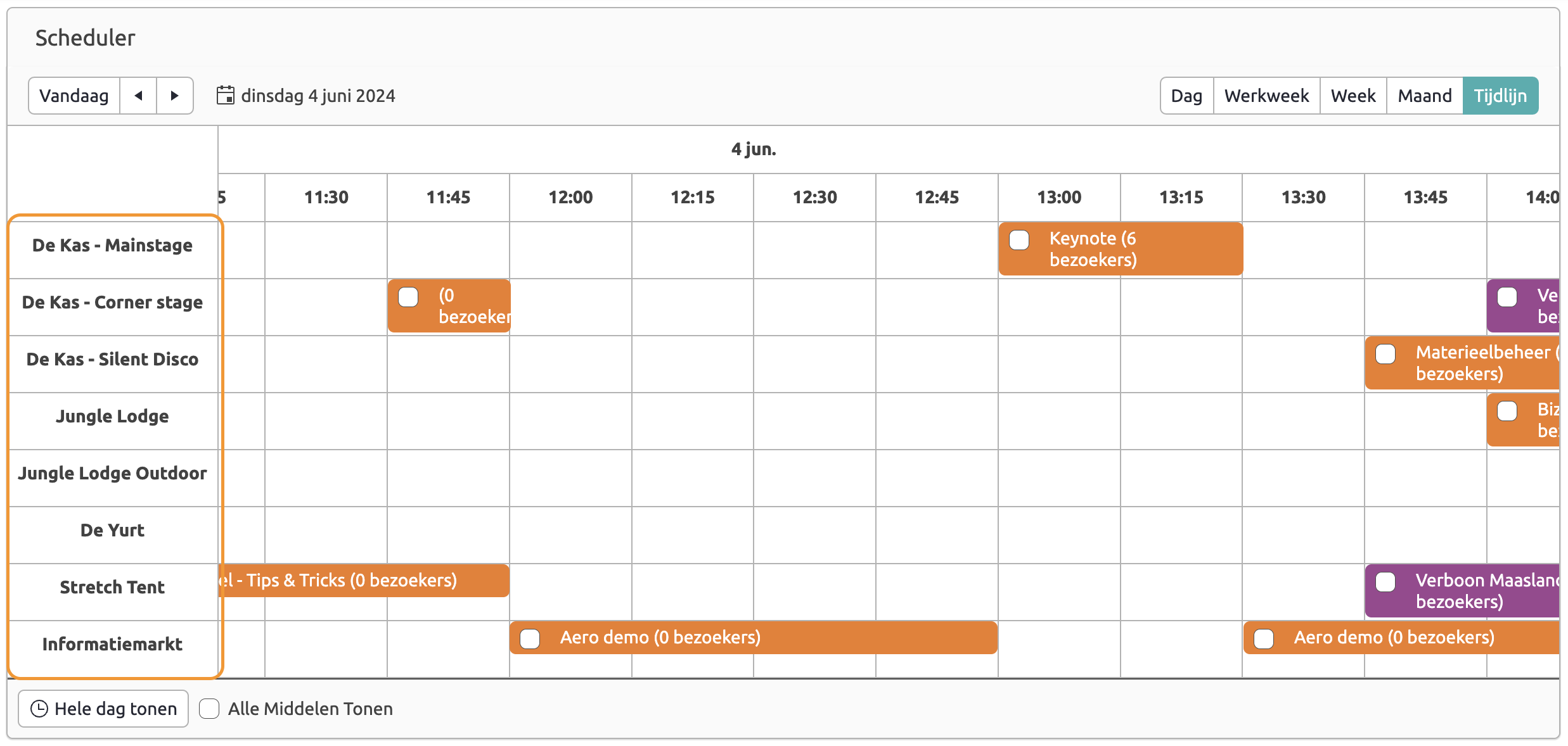
In the timeline view of a scheduler control we would like to be able to reorder the resources in the left-hand column so I can logically group them.
Hi Team,
For MenuItem target="_blank" feature is not there. Please enable the same. which will be helpful as menu is the face of app.
Regards,
Revanth
Hello there,
So, I am creating component that uses AutoComplete and I have one question. Do you think you can include some sort of onSelect event when we actually change the value of component from one of the list in the popup? For now, I introduced itemRender function that renders custom item in the popup list and that item have onClick event which is the function that I call when some item is clicked from the list, but for example I don't have support when I press Enter keyboard. In my opinion it would be logical to have some sort of onSelect event that would cover this problem - in that case I don't need to have additional logic for clicking item in the popup.
Greetings,
Matija
Currently (as visible in grid demos), touch drag scroll in mobile (responsive) mode is not working when rows selection is enabled.
There is no known workaround since the complexity of implementing custom row renderer with all the intricacies of the grid's behaviour would be a huge task.
The client's facing issue is that when using a KendoReact grid on mobile device, they can't easily scroll the grid rows data by touch drag scrolling the rows.
I am using the Splitter component and it would be great if the Splitter allows the user to set its width (or other dimensions) in rems (e.g. 20rem).
For example:
Hi,
I would like to be able to specify a Grid Column template for the data without having to replicate the entire cell and its properties. Please see below for justification:
Consider the following example of KendoReact Grid Cell customisation: https://www.telerik.com/kendo-react-ui/components/grid/styling/#toc-adding-custom-cells
Following this approach results in the loss of a lot of properties from the grid cell compared with 'default' cells e.g.
<td colspan="1" class="" role="gridcell" aria-colindex="1" aria-selected="false" data-grid-col-index="0">Chai</td>
<td style="background-color: rgba(55, 180, 0, 0.32);">18 <span class="k-icon k-i-sort-asc-sm"></span></td>
These properties are important for many reasons including accessibility. There is another example of KendoReact Grid Cell customisation that preserves these properties here: https://www.telerik.com/kendo-react-ui/components/grid/cells/#toc-customization
e.g.
<td colspan="1" class="" role="gridcell" aria-colindex="4" aria-selected="false" data-grid-col-index="3">39</td>
<td colspan="1" role="gridcell" aria-colindex="5" aria-selected="false" data-grid-col-index="4" style="color: red;">false</td>
However, there is a considerable amount of code required to achieve this:
const CustomCell = (props) => {
  const field = props.field || "";
  const value = props.dataItem[field];
  const navigationAttributes = useTableKeyboardNavigation(props.id);
  return (
    <td
      style={{
        color: value ? props.myProp[0].color : props.myProp[1].color,
      }}
      colSpan={props.colSpan}
      role={"gridcell"}
      aria-colindex={props.ariaColumnIndex}
      aria-selected={props.isSelected}
      {...{
        [GRID_COL_INDEX_ATTRIBUTE]: props.columnIndex,
      }}
      {...navigationAttributes}
    >
      {value === null ? "" : props.dataItem[field].toString()}
    </td>
  );
};
I would like to be able to define a template for a cell without having to specify these properties every time.
Kind regards,
David
Hi,
I'm in need of the dropdown feature in spreadsheet cells. I had been using the Kendo Spreadsheet React Wrapper which had the dropdown feature but since the latest update to Kendo React Spreadsheet I have been facing issues. Please try to get this feature as soon as possible and I'm sure this will be helpful for other users, too.
Thank you.
https://www.jqwidgets.com/jquery-widgets-demo/demos/jqxgrid/index.htm#demos/jqxgrid/dropdowngrid.htm