Allow customization of the top-right icon in the Adaptive View header (DatePicker and DateTimePicker)
Hi,
Is there any way to configure the horizontal spacing of the Kendo React OrgChart? When I render the chart there are huge gaps in between the cards.. I have enclosed a screenshot below. It appears that the space given to each "column" is the same (is determined by the "widest" column, on the left in my diagram).
This is really unpleasant and unusable. I see from Google searches that the Kendo jQuery component suffers the same problem. I really hope you can help me resolve this or publish a fix soon. This OrgChart component is one of the reasons I purchased the suite, and it is disappointing to uncover this problem after my trial.
thanks, Derek
Good morning,
I have seen a component within the Angular library that I would like to include in my project using React. The link to it is here:
https://www.telerik.com/kendo-angular-ui/components/dropdowns/dropdownlist/add-new-item
Are you able to advise on how I could implement this please?
Best wishes,
Molly
Please consider adding support for virtualization (e.g., virtual settings or similar) to the GridColumnMenuCheckboxFilter so that it can efficiently handle large datasets without performance hits.
Benefits:
- Better performance with large datasets
- Consistent UX with existing Kendo filtering components
- Reduced need for custom workarounds
Hi,
Add this feature.
Add the option to remove or modify the Check All option in the Grid CheckBoxFilterMenu.
Description:
In our application, we use Kendo React Form. When the user submits the form, we call an async API in the onSubmit handler. We want to prevent users from clicking the submit buttons (including custom buttons in our office ribbon) while the API call is in progress, and only re-enable them after the API call completes (either success or failure).
Currently, formRenderProps.allowSubmit only reflects the form’s validation state, not the async submission state. This means users can click the submit buttons multiple times while the API call is pending.
Expected Behavior:
• There should be a built-in way (e.g., a submitting or loading flag in formRenderProps) to indicate when the form is in the process of submitting, so we can disable submit buttons during this time.
• Alternatively, the form should automatically prevent further submissions until the async onSubmit completes.
Questions:
• Is there a recommended way to handle this scenario with Kendo React Form?
• If not, can you consider adding a submitting or loading state to formRenderProps for this purpose?
Example:
<Form
  onSubmit={async (data, closeAfterSave) => {
    // API call here
  }}
  render={formRenderProps => (
    <button
      disabled={!formRenderProps.allowSubmit || formRenderProps.submitting}
      onClick={() => formRenderProps.onSubmit(false)}
    >
      Save
    </button>
  )}
/>
Hello,
My development team is working with a business that has a design requirement for each calendar in the MultiViewCalendar component to have its own month and year label.
From what I can tell by looking at the documentation for this component, the MultiViewCalendar does not support defining labels that can be placed above each individual calendar. It only supports showing a single label that is a range from the start month + start year to the end month + end year.
I attached a screenshot of how our current UI looks using this component.
In this example, we would love to be able to attach a label of March 2025, April 2025, May 2025, and June 2025 above each calendar, rather than only being able to show a label of March 2025 - June 2025 above the first calendar.
Please let me know if you have any questions or concerns regarding this request. Thanks for your time.
Best,
Tyler Earls
By default the Slider displays a tooltip containing "Drag" on hover. Is it possible to change the text of this tooltip?
I've checked the documentation, but the Slider component doesn't have a prop for setting or styling the tooltip.
Wrapping a Tooltip Component around the Slider didn't work either.
The current workaround is to clone the initialValues manually outside the Form component using the standard JS function structuredClone.
 const handleFormRef = useCallback<RefCallback<FormHandle>>(form => {
    if (form) {
        form.values = structuredClone(initialValues);
    }
}, []);

<KendoForm ref={handleFormRef} />Hi,
I would like to put forward a feature request to allow the panel bar items to be mounted when the panel bar itself mounts, irrelevant of whether it has been opened or not.
I'm looking for something like the keepItemsMounted property https://www.telerik.com/kendo-react-ui/components/layout/panelbar/mounted-items, but without the condition that a panel bar has to be opened at least once for them to stay mounted.
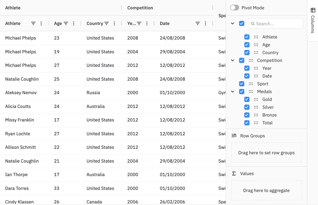
Add a Column Configurator that can be used to set the displayed columns and create multi-column headers


