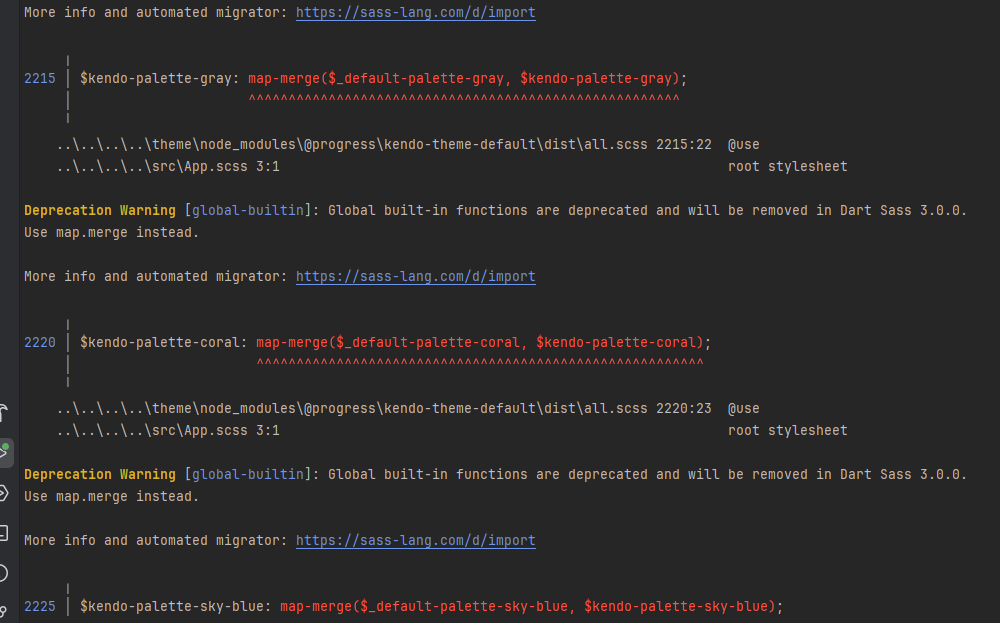
Please upgrade KendoReact so it can work with the latest Vite, React and scss/sass packages without deprecation warnings and errors.
Also fix the React version dropdown in this feedback form. It doesn't show React 19 as an option.
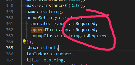
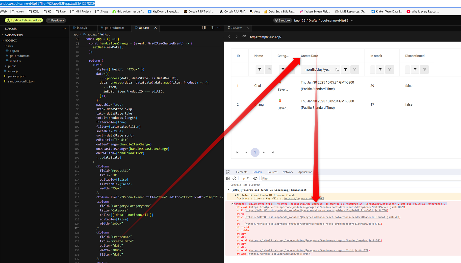
in latest v9.3.1 it appears GridFilterCell isn't passing properties shaped as 'isRequired' on DatePicker popupSettings
this does seem to be a regression because i just recently noticed it in latest upgrade which we need for other bug fixes.
i pursued patching myself by populating animate in GridFilterCell.mjs which seemed to work but then i got warning for the next required property "appendTo". however, populating appendTo yields warning "Warning: Failed prop type: Invalid prop `appendTo` supplied to `Kendo React Popup`. Validation failed." so it's not easily reconcilable that way... therefore i tried removing isRequired on all 3 DatePicker popupSettings properties which of course avoided warnings and i didn't see any negative side effects.
here is a codesandbox repro minimally tweaked to include a date field from kendo grid's "getting started" demo: https://codesandbox.io/p/sandbox/cool-sanne-d4tp85
admittedly this is just a warning but it does create unnecessary noise in browser debug which detracts from issues truly requiring attention during development.
screenshot with the warning from that demo repro:
I have attached files, in which there is an app bar content there is a dropdown in the dropdown there are four elements, in that I need four drawer container on the left side as I attached by clicking the single dropdown, how can I attach 4 drawer container in a single project
Thank you
Environment (OS, Application, Versions)
- OS: Windows 11 Enterprise 22H2 (OS build: 22621.1992)
- Browser: Chrome Version 115.0.5790.102 (Official Build) (64-bit)
- URL: Column Menu - Kendo React (telerik.com)
- Matrix: Chrome+ JAWS.
Repro Steps
- Open URL: Column Menu - Kendo React (telerik.com)
- Navigate to context menu controls available on column headers of Basic usage table.
- Verify if context menu is accessible using keyboard.
Actual Results
The 'context menu' controls available on the column headers under the basic usage table are not accessible using the keyboard.
Expected Results
The 'context menu' controls available on the column headers under the basic usage table should be accessible using the keyboard.
On this page: https://www.telerik.com/kendo-react-ui/getting-started/
On this section: "Add a KendoReact Data Grid"
When I launch the app as usual:
```sh
yarn start
```
Then the browser page includes this error:
```
Compiled with problems:
ERROR in ./.yarn/__virtual__/@progress-kendo-react-data-tools-virtual-df92d36fcf/0/cache/@progress-kendo-react-data-tools-npm-5.2.0-8d098f65a0-5d68752aaa.zip/node_modules/@progress/kendo-react-data-tools/dist/es/columnmenu/ColumnMenuFilterForm.js 19:0-55
Module not found: Error: @progress/kendo-react-data-tools tried to access @progress/kendo-react-buttons (a peer dependency) but it isn't provided by your application; this makes the require call ambiguous and unsound.
Required package: @progress/kendo-react-buttons
Required by: @progress/kendo-react-data-tools@virtual:79c9c696d5f1e6f4dd730946c0d2912611551a498926b146bcbdd9d142588c5f4c2333469b63e7a9a2bdd1f0f1313d0d70b72cc8dbcafcc20e21e6b9790f6068#npm:5.2.0 (via /Users/joel/git/joelparkerhenderson/demo/demo-react-kendo/.yarn/__virtual__/@progress-kendo-react-data-tools-virtual-df92d36fcf/0/cache/@progress-kendo-react-data-tools-npm-5.2.0-8d098f65a0-5d68752aaa.zip/node_modules/@progress/kendo-react-data-tools/dist/es/columnmenu/)
Ancestor breaking the chain: demo-react-kendo@workspace:.
…
```
The solution that works for me...
Add the package:
```sh
yarn add @progress/kendo-react-popup
````
Edit `src/App.js` and add this line:
```js
import '@progress/kendo-react-popup';
```
When I press on a day from the past the DatePicker automatically scrolls to the next/previous year. Please check the attached video.
Is there any workaround for this issue ?
here's a simple repro project minimally tweaked from an original kendo demo:
https://codesandbox.io/p/sandbox/suspicious-lovelace-8nmzgj?file=%2Fpackage.json
just start dragging a column resize handle and you should see the "jitter" right away. in our experience, the jitter is so pronounced that resizing columns is no longer practically usable.
please note this bug is definitely related to putting the kendo grid inside of a css-grid, see that definition in the parent <div style>
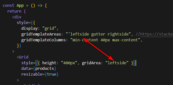
as you may imagine, we use css-grid for our overall page layout which i believe is still modern best practice and we really hope you can fix this regression within that usage context.
note, the bug manifests regardless of the gridTemplateAreas or gridTemplateColumns, you can eliminate those entirely and it's still present.
there seems to be an issue when changing the value of a DateTimePicker from null to a Date object and the specified format includes seconds.
Reproduction:
1. Open https://stackblitz.com/edit/react-hnfuerwc?file=app%2Fapp.tsx
2. Choose a value from the DateTimePicker
Actual Behaviour
The chosen value does not show up in the input box. Works OK in 8.5.0
Expected Behaviour
The chosen value should appear in the input box
Browser
Chrome, version 131.0.6778.205
OS
Windows 11
Hi,
Please see the following example of the Upload component being used to transfer a single file to a byte array:
https://stackblitz.com/edit/react-u2kbu9?file=app/main.tsx
Notice that all packages are latest including react 18 but I have not switched to the new createRoot API, and as per react documentation "Until you switch to the new API, your app will behave as if it’s running React 17" - this warning can be seen in the console window. When you upload a file, the FileReader onprogress and onload events result in the file being successfully uploaded with 100% progress. You can see current state and new state of all events in the console window.
Now please see the exact same example but switched to the new createRoot API:
https://stackblitz.com/edit/react-y8fuya?file=app%2Fmain.tsx
Notice that the warning is no longer visible in the console window. When you upload a file, the FileReader onprogress and onload events result in the file being successfully uploaded but the file progress is overwritten. You can see current state and new state of all events in the console window - the new state from the onProgress event is lost, and the new state in the onStatusChange event reports zero progress.
I believe this is because of automatic batching in React 18.
Kind regards,
David
Step by step instructions on how to reproduce the problem
Try entering a negative value in the filter column using the StackBlitz example here https://stackblitz.com/edit/react-dx7cna?file=app/main.jsx
This works using "ES" as locale (your example) https://stackblitz.com/run/?file=app/main.jsx
Github issue here https://github.com/telerik/kendo-react/issues/897
We have two issues with grid with virtual scroll.
Both are registered on github.
First one is really blocking us: https://github.com/telerik/kendo-react/issues/1010
Second one we found on Safari, it's also very critical for our customers: https://github.com/telerik/kendo-react/issues/1013
Version: 4.7.0. Please note that version specified in Additional information does not make sense as we use Kendo React not Kendo UI.
Can you help us somehow?
When a user focus an empty DatePicker input using tab, the caret starts at the end (right side) of the input.
We need it to start at the left side, so the user can type without having to go all the way back to the left.
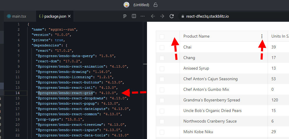
here is a quick repro: https://stackblitz.com/edit/react-dfwz3q?file=package.json
in package.json just switch @progress/kendo-react-grid from 4.10.0 back to 4.9.0 and the column menu renders.
bug still present up through 4.11, 4.12, and @latest 4.13
Dear Kendo,
I'm currently working on a data grid that has virtual scrolling enabled. When a user is scrolling fairly quickly, the screen will constantly flash white. See video in attachment.
I see this same behaviour in the example provided in the docs here: https://stackblitz.com/run/?file=app%2Fmain.jsx although it is slightly less noticeable.
What can we do to fix this?
Thanks in advance.
Kind regards,
Peter
How to reproduce (video attached):
1) open combobox
2) scroll to end of the item list
3) select last item 4999
4) open combobox again
Expected behavior: I would like to see the item list.
Actual behavoir: I see white area.
https://www.telerik.com/kendo-react-ui/components/dropdowns/combobox/virtualization/#toc-basic-configuration
https://www.telerik.com/kendo-react-ui/components/dropdowns/multiselect/virtualization/#toc-basic-configuration
https://www.telerik.com/kendo-react-ui/components/dropdowns/dropdownlist/virtualization/#toc-basic-configuration
Current Behaviour
When I lock columns In data grid with resizable columns - for example 1st and 3th and resize the 1st one - after we scroll horizontally the 3th column goes on top of the 1st column. This happens when we haven't set a width prop.
Expected Behaviour
Resized columns not overflowing on each other when scrolling horizontally and don't have width prop.
MInimal Reproduction
I'm providing a reproduction from Kendo React code examples.
https://stackblitz.com/edit/react-xvxy59?file=app%2Fmain.jsx
Hi,
Not sure what the preferred way to report a problem is. I have posted it on GitHub as well:
https://github.com/telerik/kendo-react/issues/1519
Could someone help me out with this issue?
Thank you in advance.

