Hi,
I would like to be able to specify a Grid Column template for the data without having to replicate the entire cell and its properties. Please see below for justification:
Consider the following example of KendoReact Grid Cell customisation: https://www.telerik.com/kendo-react-ui/components/grid/styling/#toc-adding-custom-cells
Following this approach results in the loss of a lot of properties from the grid cell compared with 'default' cells e.g.
<td colspan="1" class="" role="gridcell" aria-colindex="1" aria-selected="false" data-grid-col-index="0">Chai</td>
<td style="background-color: rgba(55, 180, 0, 0.32);">18 <span class="k-icon k-i-sort-asc-sm"></span></td>
These properties are important for many reasons including accessibility. There is another example of KendoReact Grid Cell customisation that preserves these properties here: https://www.telerik.com/kendo-react-ui/components/grid/cells/#toc-customization
e.g.
<td colspan="1" class="" role="gridcell" aria-colindex="4" aria-selected="false" data-grid-col-index="3">39</td>
<td colspan="1" role="gridcell" aria-colindex="5" aria-selected="false" data-grid-col-index="4" style="color: red;">false</td>
However, there is a considerable amount of code required to achieve this:
const CustomCell = (props) => {
  const field = props.field || "";
  const value = props.dataItem[field];
  const navigationAttributes = useTableKeyboardNavigation(props.id);
  return (
    <td
      style={{
        color: value ? props.myProp[0].color : props.myProp[1].color,
      }}
      colSpan={props.colSpan}
      role={"gridcell"}
      aria-colindex={props.ariaColumnIndex}
      aria-selected={props.isSelected}
      {...{
        [GRID_COL_INDEX_ATTRIBUTE]: props.columnIndex,
      }}
      {...navigationAttributes}
    >
      {value === null ? "" : props.dataItem[field].toString()}
    </td>
  );
};
I would like to be able to define a template for a cell without having to specify these properties every time.
Kind regards,
David
Hello,
We are encountering an issue with duplicate entries in our Kendo Grid with drag & drop functionality. When the grid is scrolled, clicking on any of the header cells multiple times results in the first entry being duplicated. This problem occurs on the example provided on your website as well: Kendo React Grid Row Reordering
Reproduction Steps:
- Scroll down within the grid.
- Click on any header cell multiple times.
- Scroll back to the top of the grid.
You will notice that the first entry is duplicated multiple times. It appears that the reorder logic is being triggered when a header cell is pressed.
We are using version 6.1.0. Please refer to the attached video for a visual representation of the issue.
Thank you for your assistance.
Hi
Please build a React component for TreeMap similar to https://demos.telerik.com/aspnet-ajax/treemap/overview/defaultcs.aspx
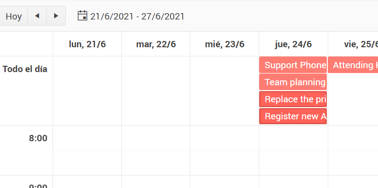
We are not able to find where is stored the information about which events are selected. We have found information about overloading the Scheduler prop editItem with a CustomEditItem and overriding this event to detect when a task is selected.
const handleClickAction = (event) => [
{
type: event.syntheticEvent.shiftKey
? ITEMS_SELECT_ACTION.add
: ITEMS_SELECT_ACTION.select,
},
];
With this we could detect when a certain event is selected. But we are still missing the part about when they are unselected. If we click outside the events, we get the selection removed, but we have no way to detect the event of this, and therefore we can't update our list of selections.
Can you give us support on how we can get the information about the selections, and keep it updated at all times? Thank you,
- open the given URL using valid credentials.
- Navigate to 'Reply' button and invoke it.
- Navigate to 'table' button and invoke it.
- Now, try to navigate to table cells to select the size of the table and observe
Actual Result:
After invoking 'table' button, user is unable to select the size of the table i.e, Keyboard focus is not going to 'Insert row and column cell components.
Tab index property is not defined.
Expected
Control(s) must be accessible to keyboards and other assistive technology. Common causes of this problem include a) the element does not have a proper role assigned, b) the element needs tab-index="0" attribute to be focusable, or c) the component is not registering keypresses.
User should be able to navigate to insert row and column cell components to select the size of the table.
User Impact
When interactive components are not accessible, assistive technology users are blocked, which leads to everything from inaccessible content, features, and functionality, up to entire applications or sites.
The KendoReact Spreadsheet component has been released.
There are a few features that are missing compared to the jQuery version, and filtering rows based on column filters is one of them.
Until this feature is added (along with context menus), we won't be able to use the Spreadsheet component for what we need to build, so we will have to continue wrapping the jQuery component. The object provided by the spreadsheet ref can filter programatically based on the (undocumented in KendoReact's docs) `range.filter()` method, but this would take a lot of time to implement what the jQuery version already has.
How to get a selected object for AutoComplete's onChange(...)?
<AutoComplete data={[{id:10, name:"test"}]} textField="name"/>Today this is how a radiobutton is structured.
An improvement would be to nest the input inside the label, so it does what i said above, eg. :
<label>
<input type="checkbox" id="myCheckbox" name="myCheckbox">
Click me to toggle the checkbox
</label>
This would greatly enhance UX and is very common in web development.
https://stackblitz.com/edit/react-ze6brv?file=app%2Fmain.tsx
Environment (OS, Application, Versions):
OS Version: 22H2 (OS Build 25352.1)
Edge Dev: Version 121.0.2277.112 (Official build) (64-bit)
Repro Steps:
1. Open https://codepen.io/oneID/pen/LYaGREP and turn on NVDA.
2.Navigate to Populate grid and activate it using enter key.
3.Navigate to Expand button under domain in export to excel table.
4.Verify if the accessible name and role for the expand button is correct or not.
Actual Results:
Accessible name for the 'expand' button is not correct, Expand button is defined as link.
Expected Results:
Accessible name of 'expand' button should be sufficient for screen reader user. Accessible name should contain value available in domain as well.
Role should be defined as 'Button' as its behaving as button.
This is a bug on your documentation website.
Go to https://www.telerik.com/kendo-react-ui/components/grid/ for example to see that the side panel on the left is empty in an Edge browser. It flickers then it disappears.
It works fin in Chrome and Firefox.
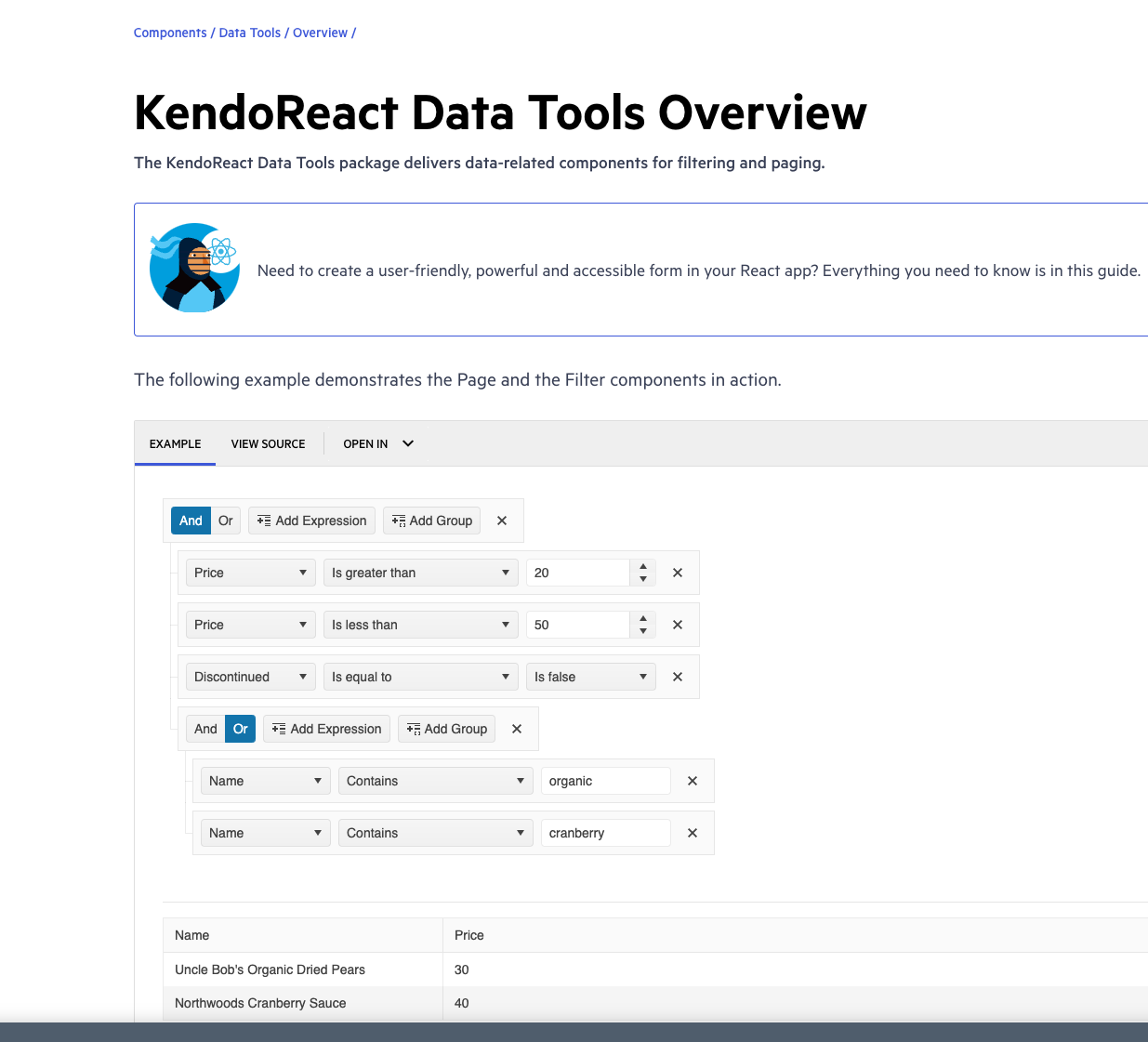
In the kendo-react-data-tools component, we want to introduce the Autocomplete behavior in Fields.
For example, in the https://www.telerik.com/kendo-react-ui/components/datatools/ link, only 3 fields ( like Name, Price and Discontinued ) were used.
In our application, we have more than 100 fields and the user has to scroll all the way down to pick the required field for applying the filter.
Would love a prop to hideHeader on KendoReact grids!
For the same reasons that were enumerated in this 2017 Kendo Angular thread: https://github.com/telerik/kendo-angular/issues/285
- For shared grids that only need 1 header row
- For small grids that have sorting/filtering controls outside of the grid header
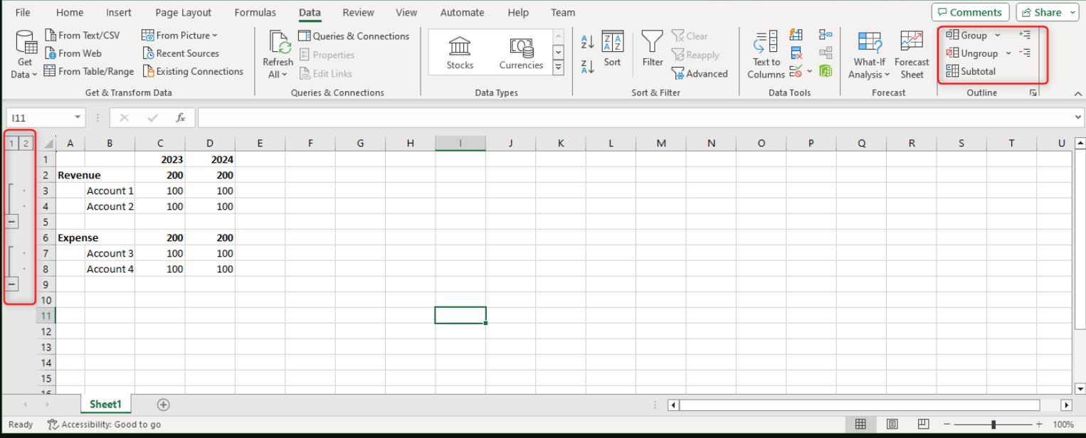
In Excel, you can group / ungroup rows AND columns. This is particularly useful for income statement reports. It would be great if Spreadsheet component can support the rendering of groups created in Excel and also allow groups to be created with the component.
Dear Sir/Madam,
I would like to disable the right part of a split button dynamically, so something like
<SplitButton rightDisabled={true} items={items} text="Disabled Button" />Obviously, when the value rightDisabled changes to false, the right part should be enabled again.
Regards,
Peter
When a Taskboard column overflows vertically or the columns overflow horizontally, there is no way for the user to drag a task card in a position that is not visible at the start of the drag in one smooth motion and one has to resolve to multiple drag 'n' drops and subsequent manual scrolls. Ideally when a card is being dragged over the borders of the overflown container, it should automatically scroll to bring the invisible elements into the viewport. Video of current behaviour is attached below, together with the requested behaviour.


