It should have the following functionalities:
Please add the “add widget” functionality as the jQuery version has.
Please add the “remove widget” functionality as the jQuery version has.
https://demos.telerik.com/kendo-ui/tilelayout/add-remove
Hi Team,
I have the following Feature Request:
### Current Behavior
When the 'disabled' attribute is true for a TreeView node, the entire node is disabled, preventing the user from selecting, expanding and checking.
### Desired Behavior
To be able to specify what functionality of the node to disable, select and/or expand and/or check or all.
### Use case
1) A TreeView displays a list of Countries that when;
1.1) expanded, displays a list of provinces as items.
1.2) selected, filters a list of cities in a different component by the selected node (country or province)
1.3) checked, indicates business coverage for that region.
My use case dictates that once an area has been checked it cannot be unchecked. But the same node whose checked state must be disabled, still needs to be expandable and selectable for the above reasons, for viewing purposes.
I can't find anything on your website or on the internet that explains how to navigate a Kendo React ListBox control using the keyboard.
Can you point me in the right direction on this issue?
Thanks.
Ruslan Lyga
Add a Breadcrumb component.
Similar to what we have in Kendo UI for jQuery:
https://demos.telerik.com/kendo-ui/breadcrumb/index
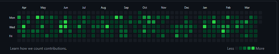
Add KendoReact PivotGrid.
Currently, there is only a wrapper:
https://docs.telerik.com/kendo-ui/third-party/react#pivotgrid
This component purpose is similar to the GitHub commits graph:
Hi,
I am using the date range picker component and it works fine.
But I want to add time select feature to date range picker.
I did not see this feature when I examined the document.
Link : https://www.telerik.com/kendo-react-ui/components/dateinputs/daterangepicker/
Please your support
Best Regards,
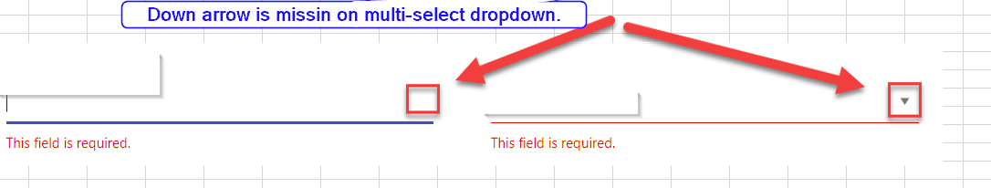
Hi,
Please add down arrow to multi-select dropdown similar to combobox or dropdownlist.
Hi we are wanting to use the scheduler and control the display of overlapping items differently than the default. Are there any resources you could point me to that explain how two items scheduled over the same time interact or can be customized?
If we wanted for the items to be z-indexed over each other instead of shown side-by-side, is that possible?
Hi
I have been using Kendo React Scheduler and soon going to integrate it with our product.
I came across a use-case/functionality requirement. Currently, with the Month View, when we have too many events in the view, we have the functionality of drilling down into the day view by clicking on three dots (I will refer to this as "View More" functionality). Very helpful indeed.
My use-case was when in the week view, we still have limited space per day in small dimensions for the calendar which can lead to the squashed arrangement of events on the time scale as well in the all-day section.
So I was thinking if we could have the same "View More" functionality in Week view as follows:
- Specifying the max number of events to be displayed for all-day view will render those events plus any additional like a "View More" functionality to drill down into Day view.
- Specifying the max number of events to be displayed for the same time frame will render those events plus any additional like a "View More" functionality to drill down into Day view.
Let me know if any other concerns or ideas around this may arise.
Thanks
Aman Gupta
Add a shared note property for the Chart.
This property should allow rendering a note for multiple series items similar to the shared tooltip funtionality.
Hi Team,
I have found an issue in the Grid Component that I think needs some attention, see below.,
## Current behavior
My GridColumns are not styling correctly when i hide/show them based on an edit state (for example). Some that have no width restrictions will the shortened then not lengthed.
## Current Version
KendoReact 4.8.0
## Expected behavior
If I hide/show a GridColumn, its width should not affect other GridColumns, only the Grid overall.
## Minimal reproduction of the problem with instructions
Example: https://stackblitz.com/edit/react-ngpvuj?file=app%2Fmain.jsx
Instructions:
1. View how age is the only column visible with a width attr
2. Click "Switch Mode" and notice how 'Id' is not added, but a width of 80 is now applied to the 'lastname' column, the same width as age
3. Click "Switch Mode" back to view, and see how id is removed and a width of 60 is applied to the 'firstname' column.
## Investigation:
Some investigation in the DOPM revealed that the issue is centred around the <colgroup> of the Grid's <table>:
- step 2 does the following to the <col>s in the <colgroup>
- add a new col to the beginning with a width, for the Id column
- add a new col to the end with a width, for the Age column
- DOES NOT clear the width of the col group that used to be the age column
- step 3
- Simply removes the last <col> in the group. Does not affect hte attributes of the remaining <col>s
I hope this was informative and can be resolved soon.
Kind Regards,
Grant
Add more animation options to the KendoReact Chart rendering.
For example, we can add the following type of animation:
The new suggested animation type should change smoothly the Y values of the line, that is an animation of the line from its old points to its new points."
This should result in the lines (series) animating not the entire Chart.
MaterialUI exposes a `ListBoxComponent` prop on their dropdown components (https://material-ui.com/api/autocomplete/) it would be nice to have that exposed on the kendo multiselect as well.
Use cases include:
- simplifying styling
- Custom scroll bars for the dropdown
- Open the https://answers.microsoft.com/en-us/msoffice/ using valid credentials.
- open any related article.
- Navigate to 'Reply' button and invoke it.
- Navigate to 'ordered list' button and invoke it.
- Navigate to the edit region and type some ordered list items.
- Now, Navigate to the ordered list items and listen to Narrator announcement.
Actual Result:
On navigating to ordered list items with arrow keys, Narrator is only announcing first letters of the text and while navigating with 'caps-arrow' keys, Narrator is only announcing position details of the list items.
Note: this issue is not observed with nvda
Nvda version: 2020.2
Expected
On navigating to ordered list items with 'arrow keys' or using 'caps-arrow' keys, Narrator should announce the whole text of the list item including position details.
User Impact
Knowing how many items are in a list is extremely useful to assistive technology users as they can know if they should attempt to skip the list, navigate to the end, help them recall placement of certain items, or orient themselves within the list.
- open the given URL using valid credentials.
- Navigate to 'Reply' button and invoke it.
- Navigate to 'Insert image' button and invoke it.
- Now Run the fast pass using Accessibility Insights for web and observe the failure 'Nested- interactive'.
Actual results:
Expected results:
Interactive control elements have focusable descendants.
User Impact:
When interactive elements have an incorrect name and role, it is difficult for people using assistive technology (like screen readers) to understand the purpose of control and its relationship to other content. Knowing the role for a control helps users know what will happen when that object has focus and is selected, as well as what keyboard shortcuts to use when interacting with the control.
Hi,
I'm trying to validate the file names that are being
uploaded using Kendo react Upload component. But the validation message I
set is not displaying next to the file just the way the following
messages are displayed.
File type not allowed.
Invalid file(s). Please check file upload requirements.
File size too large.
File size too small.
For reproducing the steps here is the code pen. If you try to upload any file which contains 2019 should show the validation error message.
https://stackblitz.com/edit/react-3x6dal-p7uycz?file=app/main.js
Could you please consider this request as a new feature?
Hi Team,
I'm facing below issue when manually enter the value in the datepicker.
Control : DatePicker
<DatePicker defaultValue={value} format="dd/MM/yyyy" />
Step 1: Manually I'm trying to enter the data as 01/01/2021 and clicked outside the datepicker control ( now the focus is out of the datepicker ).
Step 2: Now try to change the date (day) by entering "2". (Our Expectation is system should display the date as 02/01/2021 instead it is appending the date and displaying as 12/01/2021)
Every time system is expecting the user to clear the existing value and then enter the new value.
Can you take this as feature request. Value should not get append to existing value. It should overwrite.
Reference Ticket URL : https://www.telerik.com/forums/datepicker-when-user-enter-the-date-manually-the-value-getting-appended-with-the-previous-value
If this is taken as feature request when will it get delivered.