Hi,
Unfortunately, the KendoReact PivotGrid sorting is currently supported only for string values. This means that even if you set the field type to "date", the sorting will still be applied as if the field were a string. You can see that in this example: https://dojo.telerik.com/oZoTuMIC/55
Please extend your sorting mechanism so that the sorting covers types such as dates and numbers too. Please also consider the user's language when implementing this sorting. We receive date fields in the format yyyy-mm-dd and they should then be displayed in the user language in the UI. For example in German dd.mm.yyyy (i.e. 21.11.2021) or in English 11/21/2021. And please offer this feature for local data binding too.
Regards,
Oliver
Feature request
I am using the `AutoComplete` component to implement a search input and I want to be notified when the user selects an item (via mouse click or keyboard navigation) from the popup list.
I found an undocumented prop `handleItemSelect` on the `AutoCompleteHandle` ref object, and used it to implement my feature successfully.
Please can you expose `handleItemSelect` as an event on the `AutoCompleteProps` API.
Hello,
I'm trying to implement an accessible table using your Grid React component. The idea is for the users to be able to navigate the table using the keyboard if need be. Because we are a government contractor we have to make our product accessible and, testable using the Government issued tool for testing, ANDI.
When I use a normal table, I can implement scopes in the table header, either for the column or the row and thus create relationships between headers and cells as well as, use the keyboard to navigate the entire table.
When the same table is implemented with the Grid component, there are no scopes in the header then again, both header and body are separate even though they reside inside a div with role=grid on it which in turn, contains two divs, one for the header and one for the body each in turn, implementing a table: one for what would be the headers and one for what would be the body. I'm attaching screenshots even though I'm sure you know the product.
The fact that both the <thead> and the <tbody> reside in different places, even though they are within the grid, makes it impossible to add associations furthermore, we're using a data-table and the grid. I tried using different props but, as long as both the header and the body are separate, the ANDI tools can't find the table.
Question is, is there a way to make this table truly accessible just as a one created using the semantic table tags?
Hello,
Our team is using MobX-State-Tree (MST) and KendoReact TreeList control with virtual scrolling enabled. According to documentation MST model stores data as an observable array (https://mobx-state-tree.js.org/API/#array and https://mobx.js.org/api.html#observablearray).
The MST model’s field ‘tree’ is not a regular array, but a LegacyObservableArray.
From UI standpoint:
initially all tree nodes are collapsed
user clicks on i.e. 3rd tree node
selection is not displayed on any tree node (3rd node expected to be selected)
user expands 1st tree node - selection is set on the 3rd tree node
The following warning appears in the browser console.
Warning: Failed prop type: Invalid prop `data` of type `object` supplied to `TreeList`, expected `array`.
in TreeList (created by wrappedComponent)
in wrappedComponent (created by wrappedComponent)
in div (created by wrappedComponent)
in div (created by wrappedComponent)
in wrappedComponent
Model is defined as:
const TreeViewModel = types
.model('TreeViewModel', {
selectedItemUUID: types.maybe(types.string),
tree: types.optional(types.array(TreeNodeModel), []),
isLoaded: types.maybe(types.optional(types.boolean, false)),
treeTypes: types.optional(types.array(TreeNodeTypeModel), []),
})
.views((self) => ({
get treeCollection(): any {
return self.tree;
},
}))
Component is defined as:
return (<>
{!viewModel.isLoaded && loadingPanel}
<div className='treeListContainer' ref={stageCanvasRef}>
{treeListContainerHeight && <TreeList
style={{ maxHeight: `${treeListContainerHeight}px`, overflow: 'auto', }}
data={viewModel.treeCollection}
expandField={expandField}
subItemsField={subItemsField}
columns={columns}
selectedField={selectedField}
rowHeight={40}
scrollable="virtual"
/>}
</div>
</>);
The following workaround allows converting an observable array to a regular array.
.views((self) => ({
get treeCollection(): any {
return JSON.parse(JSON.stringify(self.tree)); // or self.tree.slice()
},
}))
This solution affects performance due to array copy.
Besides this TreeList uses an array copy. User’s selection and expanding don’t trigger related changes in the initial observable array in the model.
Related event handlers (i.e. onSelectionChange, onExpandChange) should be extended to make appropriate changes in the MST model.
Can you please extend KendoReact controls to support observable arrays?
Is there a better solution?
I have need for a Captcha component for a public-facing form. Most of the Telerik products include a captcha component, but not KendoReact.
Can we expect this to be added at some point?
Hello,
I am using React Multiselect in my project. I need every item in the multiselect component selectable with checkboxes and multiselect itself filterable. It would be very nice if you add this features to Multiselect component as built in. There is a workaround which I share links below for this but we need to do all this stuff manually.
1. Checkboxes:
2. Filterable
Thanks
Despite having a similar intention (typing and selecting), the components MultiSelect and ComboBox look and behave quite differently:
- The ComboBox has a button on the right side and only opens when this button is clicked or when the user types in the input field.
- The MultiSelect has no such button but opens when clicking inside the input field.
It would be great if the MultiSelect component also has a button on the right and only opens when the button is clicked or when the user starts typing in the input field.
In Kendo angular you can tell the tooltips to flip when they collide with the edge of the viewport:
https://stackblitz.com/edit/angular-gaezr2?file=app/app.component.ts
A problem with angular is it can't detect a collision in both directions. In the above example, the top tooltip only flips downwards but not to the right.
As for Kendo React there is less control. It seems to always want to "fit" with no option to flip when a collision happens. I have prepared 3 examples below. for position left, right and default:
https://stackblitz.com/edit/react-vfdvtk?file=app/main.jsx
Steps:
1. Create web component with shadow-root.
2. Attach all.css styles behide shadow root.
3. Add compoent with icon from WebComponentIcon font.
Result:
Icon are not displayed properly.
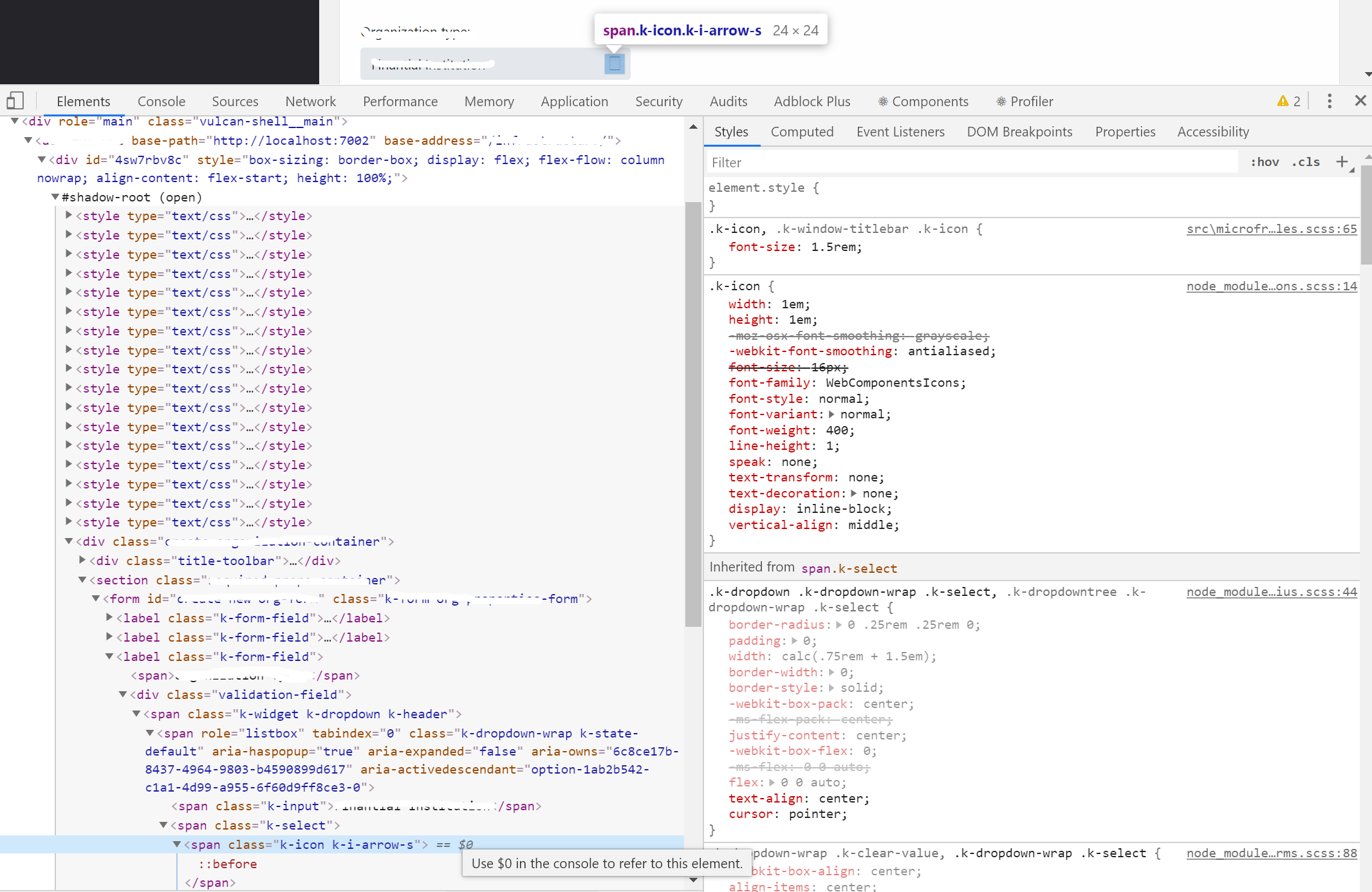
UPDATE: This is live code I prepared for you: https://stackblitz.com/edit/react-ts-dhhsaz?file=index.tsx
I get error:
 Invalid hook call. Hooks can only be called inside of the body of a function component. This could happen for one of the following reasons:
1. You might have mismatching versions of React and the renderer (such as React DOM)
2. You might be breaking the Rules of Hooks
3. You might have more than one copy of React in the same app
But error appears to be inside KendoDrawer component. I can't figure out what is wrong. This is my component:
import React, { useState } from 'react';
import { withRouter, useLocation, useHistory } from 'react-router-dom';

import { Drawer, DrawerContent } from '@progress/kendo-react-layout';
import { Button } from '@progress/kendo-react-buttons';


export const SidebarDrawer = (props:any) => {

    const items = [
        { text: 'Povezivanje', icon: 'k-i-inbox', selected: true, route: '/povezivanje' },
        { separator: true },
        { text: 'Notifications', icon: 'k-i-bell', route: '/notifications' },
        { text: 'Calendar', icon: 'k-i-calendar', route: '/calendar' },
        { separator: true },
        { text: 'Attachments', icon: 'k-i-hyperlink-email', route: '/attachments' },
        { text: 'Favourites', icon: 'k-i-star-outline', route: '/favourites' }
    ];

    const [expanded, setExpanded] = React.useState(true);
    const [position, setPosition] = React.useState(true);
    const [selectedId, setSelectedId] = React.useState(items.findIndex(x => x.selected === true));

    let positionMode = position ? 'start' : 'end';

    const handleSelect = (ev:any) => {
        setSelectedId(ev.itemIndex);
        setExpanded(false);
    };

    const handleClick = () => { setExpanded(prevState => !prevState); };

    const handleChange = () => { setPosition(prevState => !prevState); };

    const drawerProps = {
        expanded: expanded,
        position: positionMode,
        mode: 'push',
        items: items.map(
            (item, index) => ({ ...item, selected: index === selectedId })),

        onSelect: handleSelect,
    }

    return (
        <Drawer {...drawerProps}>
            <DrawerContent>
                {props.children}
            </DrawerContent>
        </Drawer >
    );

};

export default withRouter(SidebarDrawer);
And this is how I use it inside App component:
import React, { useState } from 'react';
import { hot } from 'react-hot-loader';
import { Button } from '@progress/kendo-react-buttons'
import { Grid, GridColumn, GridDetailRow, GridToolbar } from '@progress/kendo-react-grid';
import '@progress/kendo-theme-bootstrap/dist/all.css';

import 'bootstrap/dist/css/bootstrap.min.css';
import { Drawer, DrawerContent } from '@progress/kendo-react-layout';
import { BrowserRouter as Router, Route, Switch } from 'react-router-dom';

import urlConstants from 'ClientApp/constants/urlConstants'
import { Connecting } from '../containers/connecting/Connecting';
import SidebarDrawer from 'ClientApp/components/SidebarDrawer/SidebarDrawer';

export const App: React.FC = () => {


    return (
        <React.Fragment>
            <Router>
                <SidebarDrawer>
                    <Switch>
                        <Route exact={true} path="/" component={Connecting} />

                    </Switch>
                </SidebarDrawer>
            </Router>
        </React.Fragment>
            )
}

export default hot(module)(App);Hi,
I'm working on a grid which has an action cell with buttons, which of course i dont want to export, but when i try to pass a custom column configuration to the export it fallbacks to the grid's one.
I made further investigation on the kendo-react-private repository and i found out that effectively there's a preference for the grid columns rather than custom
more precisely on kendo-react-private>packages>excel>src>ExcelExport.tsx (line 201~206)
const columns = this.extractColumns(
            gridColumns ||
            externalColumns ||
            this.props.columns ||
            React.Children.toArray(children)
        );
this is the piece of code i was talking about.
as you can see if gridColumns has a value is preferred rather than externalColumns
it would be nice to have a property onto the grid column definition stating if that column should be exported or not (best case)
or just preferring externalColumns to gridColumns (base case)
Hi
Would it be possible to add an option/prop to the KendoReact spreadsheet component to make the whole workbook or specific sheets read-only, instead of specifying cell ranges?
This would make it easier when users need to view a file/spreadsheet without editing it.
Thanks
My team is using KendoReact Gantt to build a web app for manage/planning task in Scrum
It is nice to have feature which display and customizable the current time marker on Gantt.
Integrated tooltip to react data grid, but when I drag & drop column header to group it by column, It displays the tooltip text instead of column field title