Add an optional row-based keyboard navigation mode for the KendoReact Grid where Arrow Up and Arrow Down move focus between entire rows instead of individual cells.
URL: https://codesandbox.io/p/sandbox/objective-blackburn-jvz3py
User Impact:
- Open URL: https://codesandbox.io/p/sandbox/objective-blackburn-jvz3py in the latest chrome browser.
- Code sandbox page will appear.
- Press tab key from the top of the page to "https://jvz3py.csb.app/" edit field on right side to reach the Bar chart.
- Press tab key to move focus between bar charts and press arrow keys to navigate through the bar chart points.
- Verify on pressing tab keys whether the keyboard focus order is logical while navigating the "Upload" controls of Bar chart components.
*** Support ticket created by Telerik by Progress staff ***
*** Please follow-up with additional details, if necessary. Thank you. ***
The KendoReact Scheduler currently does not provide a supported way to display only all-day events while hiding all time slots when using vertical resource grouping (Week or Timeline-based views). It would be beneficial if we had a mechanism for implementing an all-day–only Scheduler view that supports vertical resource grouping, renders multi-day events as a single continuous bar across consecutive days, and preserves the existing Scheduler structure and interactions.
It would be beneficial for GridToolbarColumnsChooser to offer customization options that allow developers to control which columns can be shown or hidden.
The Data Grid does not work properly with large datasets. In the example below with one million records, it is impossible to scroll to the bottom of the grid.
Firefox: Rows fail to render after scrolling past approximately 200,000 rows.Chrome: Rows do render, but the skip parameter never exceeds 745,645 even when the scrollbar is at the bottom, preventing access to the remaining ~254,000 records.
This contradicts the documentation's claim that the grid "scales from hundreds to millions of records while maintaining a responsive user experience."
https://stackblitz.com/edit/react-aaxnyzxm?file=app%2Fapp.tsx
When using KendoReact Grid with multiple grouping levels, the Grid automatically adds horizontal indentation inside <td> elements to represent group hierarchy.
While this behavior is expected, there is no public API to control, customize, or disable this indentation.
As grouping depth increases, this extra space causes layout issues, unexpected horizontal overflow, and breaks strict or custom design systems.
Is there a reason why this spacing is not configurable?
Are there plans to expose an official option (e.g. groupIndent / groupPadding) or any supported API to manage grouped row indentation?
Example:
Description
User Impact:
Screen reader users will miss important descriptive details on the pager section, making navigation unclear.
This can lead to confusion and difficulty in understanding page context or available actions.
Plan
KendoReact
Steps To Reproduce
Open the URL: https://www.telerik.com/kendo-react-ui/components/grid in edge browser in windows.
'React Data Grid Overview' page will be open.
Press tab key to navigate to the pager section.
Verify whether screen reader is announcing descriptive information on the pager section in windows or not.
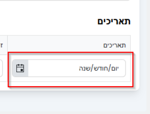
DateTimePicker - TRL support in case of no value - "שנה/חודש/יום" instead of "יום/חודש/שנה" when the format is YYYY/MM/DD
The Kendo Form component internally uses a FormContext which is ued by FormElement and Field. However this Context is not exported in @progress/kendo-react-form
Please export this context. It would really help with the usability of the Form component for complex forms. There are things in the FormContext that are not available in the formRenderProps.
Alternatively, put everything from the context into the FormRenderProps. These don't seem like they needed to be 2 different objects.
Specifically with the Context you can see what fields have been `touched`, `visited` and `modified`. But with the render props you only get a boolean if any field has been touched, visited or modified; not the names of the fields.
Be able to to modify the cut-off point depending on what baseUnit is selected in a chart time series.
e.g.
Given the following data points:
Data = [
Friday 10th Oct: 123,
Saturday 11th Oct: 54,
Sunday 12th Oct: 77,
…,
Tuesday 20th January: 10,
]
If baseUnit = year
Currently what happens is:
1st Jan -> 1st Jan -> 1st Jan
What we want:
10th Oct -> 10th Oct -> 10th Oct
If baseUnit = month
Currently what happens is:
1st Oct -> 1st Nov -> 1st Dec
What we want:
10th Oct -> 10th Nov -> 10th Dec -> etc
*Edge case of 29th, 30th, and 31st:
Default to last day of the month
Oct 31st -> Nov 30th -> Dec 31st
If baseUnit = week
Currently what happens is:
Sunday 5th Oct -> Sunday 12th Oct -> Sunday 19th Oct
What we want:
Friday 10th Oct -> Friday 17th Oct -> Friday 24th Oct -> etc
If baseUnit = day
This is our minimum unit so everything works
In our software we want to create a filter with MultiSelectTree. The hierarchy is this: LV1 -> LV2 -> LV3. In the database the data is assigned to LV3. If the component is loaded with lot of LV3 items then selecting the parent LV2 node will result a very long tag list in the textbox part of the MultiSelectTree which is not user friendly. In this case I expect selecting the LV2 node will check the LV3 subnodes also but the textbox part has only that LV2 tag as selected. So the checkboxes should remain the same textbox should display the selected parent only.
Other cases:
- when LV1 is selected, then every children will be checked but textbox should display only the selected location
- when 99 of 100 LV3 items are checked then LV2 parent is not fully checked so textbox should display only the bins but only the first N items then use ... characters.
With the ArcGauge component, when you set the rangeLineCap to something other than 'butt' (ie: round or square), the indicator does not line up with the tick lines. This leads to misleading values. Please look at this StackBlitz:
https://stackblitz.com/edit/react-itztql
This will show the comparison between round and butt rangeLineCaps.
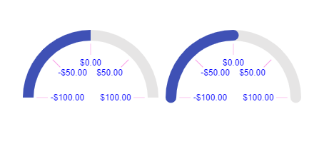
From the screenshot as well, the ArcGauge on the right looks like the value is greater than 0, resulting in the user being mislead on the result.
We are using a customized ChartToolTip with button in our bar chart. However the tab order is not correct for multiple charts. The expect behavior we were told by our accessibility testing team is first chart -> button on tooltip -> second chart -> button on tooltip and so on. The actual behavior is tab shortcut will switch between charts then back to the first chart tooltip element.
MAS Reference:
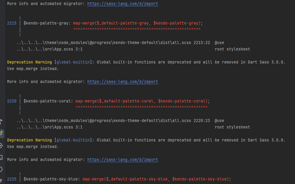
Please upgrade KendoReact so it can work with the latest Vite, React and scss/sass packages without deprecation warnings and errors.
Also fix the React version dropdown in this feedback form. It doesn't show React 19 as an option.
Provide a set of utility functions for safely creating, traversing, updating, and deleting filters inside nested CompositeFilterDescriptor trees.