

Hi,
We have requirement of date picker display quarters view . please see the below example
http://jsfiddle.net/4mwk0d5L/1/
Regards,
Susanta

I would like to request the data-query package support filtering on OData collections using lamdba functions. Given a Collection with the existing operators, the filter string outputted by `toODataString` should be OData v4 compliant.
Example: Project is a collection. A user filters to see all General projects which outputs { field: 'Project', operator: 'eq', value: 'General' }.
Recommendation: Supply another key that dictates the lamdba operator and property field to use.
{ field: 'Project', operator: 'eq', value: 'General', lambda: 'any', collectionField: 'Name' } -> $filter=Project/any(x:x/Name eq 'General')
The above can work with inner functions like contains.
{ { field: 'Project', operator: 'contains', value: 'gen', ignoreCase: true, lambda: 'any', collectionField: 'Name' } -> $filter=Project/any(x:contains(tolower(x/Name),'gen'))
Hey
Small question: it is exists some approach to make Tabs in TabStrip reordable ?
Best
Serge
It will be very useful if we can get the new component for IPV4/IPV6 input fields. Especially networking related products, I see lot of use cases.
I need to not restrain the window, in the element that was contained in the code.
Just like it was possible in the jQuery version (https://docs.telerik.com/kendo-ui/api/javascript/ui/window/configuration/draggable.containment),
this feature is a must.
Otherwise, I am being forced to keep my Window on the "top level" element, just so that I can have it not be constrained in the nested element...
The problem with this, is that the Window looks totally out of place, if I need more windows, I will need them all there and it's logic is not clear. The are many issues with that approach...
Please provide a temporary workaround if possible, thanks!
Request:
- provide a boolean property "virtualScrolling" on component GridColumnMenuCheckboxFilter which allows rendering a large list of filter options without delay
Discussion:
- https://www.telerik.com/forums/gridcolumnmenucheckboxfilter-virtual-scrolling
Use case:
- there are a lot of options to filter already in memory
- the filter dropdown has to open quickly (it opens slowly now, because there are so many options)
- after opening, the user sees a huge list (i.e. a long scrollbar)
- so he starts making the list of options smaller using the search input
Here's a screenshot with 100 options.
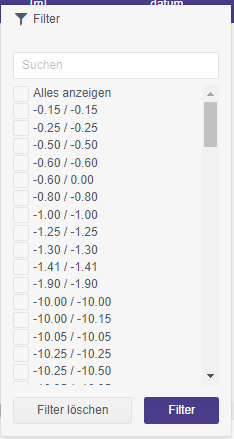
Alternatives:
From a developer point of view I think a scrollable filter is the most convenient way to handle the problem.
An alternative would be to provide a handler whenever the user selects a combobox in the GridColumnMenuCheckboxFilter. Then we could cut the number of options after a threshold and an option / combobox labelled "show more". When this is clicked, the filter options are re-rendered, the lists gets longer - and the user will get annoyed and will making the list of options smaller using the search input.
An other alternative would be to have a possiblity to force the user right away to use the search box. Instead of showing the list of checkboxes a text would be shown: "1258 options. Please refine your search input." But this would be a more invasive option.
Provide built-in scrolling of the Chart.
It should work similar to the pannable but allows scrolling with the mouse wheel instead of zooming.
The required end result is similar to this:
https://stackblitz.com/edit/react-rgpxmk-nrntv1?file=app/main.jsx

The Angular ButtonGroup has a 'selection' property that is not present in the React ButtonGroup.
This functionality would be nice to have in React.
The following code snippet is the temporary fix that has been provided to me by support to mimic Angulars functionality in React.
import React from 'react';
import ReactDOM from 'react-dom';

import { Button, ButtonGroup } from '@progress/kendo-react-buttons';

class ButtonGroupContainer extends React.Component {
  state = {
    selected: null
  }
  groupButtonClick = (e) => {
    this.setState({
      selected: e.target.id
    })
  }

  isSelected = (index) => {
    return index === parseInt(this.state.selected) ? true : false
  };

  render() {
    return (
      <div className="row">
        <div className="col-xs-12 col-sm-6 example-col">
          <ButtonGroup>
            <Button togglable={true} id={1} selected={this.isSelected(1)} onClick={this.groupButtonClick}>
              Bold
                     </Button>
            <Button togglable={true} id={2} selected={this.isSelected(2)} onClick={this.groupButtonClick}>
              Italic
                     </Button>
            <Button togglable={true} id={3} selected={this.isSelected(3)} onClick={this.groupButtonClick}>
              Underline
                     </Button>
          </ButtonGroup >
        </div>
      </div>
    )
  }
}
ReactDOM.render(
  <ButtonGroupContainer />,
  document.querySelector('my-app')
);
Currently, this is possible with CSS animation only:
https://github.com/telerik/kendo-react/issues/326
Hi
We use the directory upload feature in our MVC app using Kendo. We are now redeveloping the app using React but this feature is missing.
Is this feature on the roadmap for a future update (soon)?
Kind regards
Rakesh
I discovered a lack of parity between the React and Angular implementations of the TabStrip/TabStripTab components. Specifically, in the React version the "title" prop determines the contents inside the resulting <k-link> CSS class, whereas the Angular version allows you to set a template, for more complex tab header components.
This became an issue for me, because we have overridden the CSS for a custom progress tracker component built on the tab strip in an Angular implementation. I am now tasked with replicating the component in React, but had to resort to my own TabStrip/TabStripTab classes, instead of being able to use your components. (My goal is to be able to use the existing CSS, maintained by our UX team, out of the box.)
Hope that made sense. Feel free to contact me if it's not clear what I'm asking for, or if there is already a solution to this. Thanks!
React version:

Angular Version:

https://docs.telerik.com/kendo-ui/api/javascript/ui/grid/configuration/columns.hidden
While export and save PDF are extremely useful features that Kendo React UI provides.
I would like to have option to generate Password protected PDF.
Add render function/prop for the ColorPicker popup.
This will allow rendering custom elements inside the ColorPicker Popup.
Hi,
Good day!
Thanks for this wonderful library - we actually have a paid license in using ReactKendo.
Just a concern, because right now we are using TypeScript for us to improve our code quality but most of the Components in KendoReact is using any and not even allowing to pass a generic type.
Like for example in using KendoGrid - the data has `any` property so when rowClick is triggered, it returns `any` data type for `dataItem`
So what I did was, I wrapped the KendoGrid Component that would allow Type-Safety and override the `onRowClick` and any other functions that involve sending `dataItem` property.
Thanks!
Best Regards,
Lee
in React Dialog, the Dialog or the overlay, need to be focused for the Escape Key to work and close the dialog, whereas in the jQuery Dialog, it works globally without a specific focus...
The KendoReact Tooltip component only displays tooltips on hover (the showTooltip method is called on the onMouseOver and onMouseLeave events). It would be ideal if the showTooltip method was also called on the onFocus event as well, making the user experience the same for keyboard-only users.
Most other UI libraries treat hover/focus the same for consistency and accessibility.
Bootstrap requires it:
https://getbootstrap.com/docs/4.1/components/tooltips/#making-tooltips-work-for-keyboard-and-assistive-technology-users
Material UI allows you to disable focus interaction, but the default is that focus is handled the same as hover:
https://material-ui.com/api/tooltip/#props