This support ticket is a feature request for a React version of the DropDownTree component: https://demos.telerik.com/kendo-ui/dropdowntree/index
For now I've hacked together something using a span styled like the collapsed DropDownTree, a React Popup and a React TreeView. It would be great if this control could be adapted for React and added to the dropdowns package. Unless there is an easy way to accomplish this using the React Dropdown and the React Treeview?
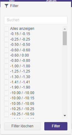
Add the ability to customize the Filter component elements.
For example:
1) Customize the fields' DropDownList.
2) Customize the Add expression button. It could be used to open a Dialog with a list of expressions.
Hi,
I'm using the tabstrip control for a complex form for the user to fill out. I am trying to find a way to preload all contents of each tab in the tabstrip to ensure all the controls are rendered. This is required for my validations to work correctly.
I did not see any property on the Tab or TabStrip control to achieve this. Am I missing something?
Regards,
Ruud
Request:
- provide a boolean property "virtualScrolling" on component GridColumnMenuCheckboxFilter which allows rendering a large list of filter options without delay
Discussion:
- https://www.telerik.com/forums/gridcolumnmenucheckboxfilter-virtual-scrolling
Use case:
- there are a lot of options to filter already in memory
- the filter dropdown has to open quickly (it opens slowly now, because there are so many options)
- after opening, the user sees a huge list (i.e. a long scrollbar)
- so he starts making the list of options smaller using the search input
Here's a screenshot with 100 options.
Alternatives:
From a developer point of view I think a scrollable filter is the most convenient way to handle the problem.
An alternative would be to provide a handler whenever the user selects a combobox in the GridColumnMenuCheckboxFilter. Then we could cut the number of options after a threshold and an option / combobox labelled "show more". When this is clicked, the filter options are re-rendered, the lists gets longer - and the user will get annoyed and will making the list of options smaller using the search input.
An other alternative would be to have a possiblity to force the user right away to use the search box. Instead of showing the list of checkboxes a text would be shown: "1258 options. Please refine your search input." But this would be a more invasive option.
https://demos.telerik.com/kendo-ui/timeline/index
Provide built-in scrolling of the Chart.
It should work similar to the pannable but allows scrolling with the mouse wheel instead of zooming.
The required end result is similar to this:
https://stackblitz.com/edit/react-rgpxmk-nrntv1?file=app/main.jsx
The Angular ButtonGroup has a 'selection' property that is not present in the React ButtonGroup.
This functionality would be nice to have in React.
The following code snippet is the temporary fix that has been provided to me by support to mimic Angulars functionality in React.
import React from 'react';
import ReactDOM from 'react-dom';

import { Button, ButtonGroup } from '@progress/kendo-react-buttons';

class ButtonGroupContainer extends React.Component {
  state = {
    selected: null
  }
  groupButtonClick = (e) => {
    this.setState({
      selected: e.target.id
    })
  }

  isSelected = (index) => {
    return index === parseInt(this.state.selected) ? true : false
  };

  render() {
    return (
      <div className="row">
        <div className="col-xs-12 col-sm-6 example-col">
          <ButtonGroup>
            <Button togglable={true} id={1} selected={this.isSelected(1)} onClick={this.groupButtonClick}>
              Bold
                     </Button>
            <Button togglable={true} id={2} selected={this.isSelected(2)} onClick={this.groupButtonClick}>
              Italic
                     </Button>
            <Button togglable={true} id={3} selected={this.isSelected(3)} onClick={this.groupButtonClick}>
              Underline
                     </Button>
          </ButtonGroup >
        </div>
      </div>
    )
  }
}
ReactDOM.render(
  <ButtonGroupContainer />,
  document.querySelector('my-app')
);
Currently, this is possible with CSS animation only:
https://github.com/telerik/kendo-react/issues/326
Hi
We use the directory upload feature in our MVC app using Kendo. We are now redeveloping the app using React but this feature is missing.
Is this feature on the roadmap for a future update (soon)?
Kind regards
Rakesh
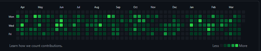
This component purpose is similar to the GitHub commits graph:
This is similar to the DateInput functionality to move between the different sections with the arrow keys.
This functionality should be optional, not always on.
Hi there,
I would like know how can we customize the TimePicker of the DateTime picker?
We can perform the customization of calendar as guided by the link below.
My question is how can I customize the Time Picker of the Datetime Picker since I can't find the time picker relevant props from the DateTimePickerProps?
Thank you!
Hello,
The Form component does not allow me to submit unless I modify the initial values. We have a Form that is provided with initial values that may not need to be modified by the user first - the data is all valid and acceptable. The user, currently, would need to purposefully modify one of the Field values in order to get the Form to realize that it can be submitted.
I'm aware of the submit click event but that event does not perform any validation.
I believe there needs to be some middle area where the Form can be provided initial values and be allowed to submit without having to modify the form first.
I have created a code sample showing the scenario below ...
https://stackblitz.com/edit/react-wf5veh-reyjj3?file=app/main.jsx
Thank you
Hi Team,
I have the following Feature Request:
### Current Behavior
When the 'disabled' attribute is true for a TreeView node, the entire node is disabled, preventing the user from selecting, expanding and checking.
### Desired Behavior
To be able to specify what functionality of the node to disable, select and/or expand and/or check or all.
### Use case
1) A TreeView displays a list of Countries that when;
1.1) expanded, displays a list of provinces as items.
1.2) selected, filters a list of cities in a different component by the selected node (country or province)
1.3) checked, indicates business coverage for that region.
My use case dictates that once an area has been checked it cannot be unchecked. But the same node whose checked state must be disabled, still needs to be expandable and selectable for the above reasons, for viewing purposes.
Our customers use case would require multiple tasks on same row in the Gantt diagram. Is this possible to implement somehow by customizing the Gantt diagram? Customer feels having each task on its own row wastes vertical space since the tasks are usually back to back.
Hi,
Hope you are doing good.
We have requirement that, there are some cards (Each cards are separate component like chart, grid, etc). Also have separate multiple grids like 2*2, 4*4. We need to drag the cards and drop it in any of the grid.
For your ref, the feature is somewhat like this https://demos.telerik.com/kendo-ui/cards/drag-and-drop .
Please let me the example. Also revert me if you have any doubts.
Thanks,
Gokul
Hello,
I am creating a list of rows using the Sortable control. The issue that I am running into is when I grab an item and want to move it further down the list, then what shows on the page, the list will not scroll. Once I get to the bottom of the list I can not move the item further, without droping it and manually scrolling. Is there a way around this?
You can see what I am talking about by going to your sample (Under "Events" header): https://www.telerik.com/kendo-react-ui/components/sortable/
Shrink the page to where items stack and the list goes off the page. Try to take the top item and place it on the bottom. What I would hope it would do is automatically scroll the page once you reach the bottom, but it doesn't.
Thanks,
Matt Heuerman
DealerCarSearch