We currently use grouping in the Kendo Grid, however the groups are always sorted alphabetically by the name of the group.
In our case, we want the groups to be sorted another way: an order value that corresponds to the group name.
To do this, it would be good if we could specify a comparison function, and have it take a object we provide (a map between the group name and order value).
We currently work around this by prepending a character to the group name to have it sort correctly (see screenshot). As you can see, it's not very appealing.
We are using @progress/kendo-react-grid@4.6.0
Hi,
I would like to be able to specify a Grid Column template for the data without having to replicate the entire cell and its properties. Please see below for justification:
Consider the following example of KendoReact Grid Cell customisation: https://www.telerik.com/kendo-react-ui/components/grid/styling/#toc-adding-custom-cells
Following this approach results in the loss of a lot of properties from the grid cell compared with 'default' cells e.g.
<td colspan="1" class="" role="gridcell" aria-colindex="1" aria-selected="false" data-grid-col-index="0">Chai</td>
<td style="background-color: rgba(55, 180, 0, 0.32);">18 <span class="k-icon k-i-sort-asc-sm"></span></td>
These properties are important for many reasons including accessibility. There is another example of KendoReact Grid Cell customisation that preserves these properties here: https://www.telerik.com/kendo-react-ui/components/grid/cells/#toc-customization
e.g.
<td colspan="1" class="" role="gridcell" aria-colindex="4" aria-selected="false" data-grid-col-index="3">39</td>
<td colspan="1" role="gridcell" aria-colindex="5" aria-selected="false" data-grid-col-index="4" style="color: red;">false</td>
However, there is a considerable amount of code required to achieve this:
const CustomCell = (props) => {
  const field = props.field || "";
  const value = props.dataItem[field];
  const navigationAttributes = useTableKeyboardNavigation(props.id);
  return (
    <td
      style={{
        color: value ? props.myProp[0].color : props.myProp[1].color,
      }}
      colSpan={props.colSpan}
      role={"gridcell"}
      aria-colindex={props.ariaColumnIndex}
      aria-selected={props.isSelected}
      {...{
        [GRID_COL_INDEX_ATTRIBUTE]: props.columnIndex,
      }}
      {...navigationAttributes}
    >
      {value === null ? "" : props.dataItem[field].toString()}
    </td>
  );
};
I would like to be able to define a template for a cell without having to specify these properties every time.
Kind regards,
David
Hi,
I am using the date range picker component and it works fine.
But I want to add time select feature to date range picker.
I did not see this feature when I examined the document.
Link : https://www.telerik.com/kendo-react-ui/components/dateinputs/daterangepicker/
Please your support
Best Regards,
Hi support,
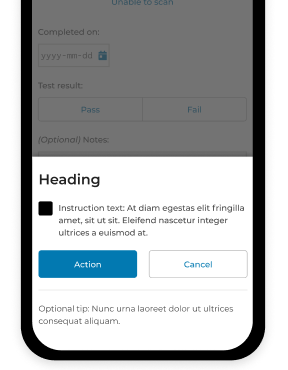
I would like to know what's the best way to set the modal dialog to the bottom of the page, and add animation for it to slide up to open and slide down to close.
Thanks!
Hello,
I would like this feature https://docs.telerik.com/kendo-ui/knowledge-base/add-event-programatically?_ga=2.240140043.929456162.1660247660-2049658922.1660247660 to be available in KendoReact.
1. I need to be able to open the "create a new appointment dialog" from the scheduler programmatically.
2. Additionally, opening an existing event programmatically would also be a requirement.
The use case for #2 is so I can open an event directly from a link (e.g. use query params with an eventId, load it into the scheduler, and then open the edit dialog; all programmatically).
Thanks!
We'd liked to have a wrapped loader similar to other third party loaders.
The code should be something like this:
<Loader show={props.isLoading} message={'loading'}>
  <SomeComponent />
</Loader>
Other solutions are also acceptable. The requirement is that the loader is positioned above the main component without having it rerender or reposition.
Hi,
Please check this example
https://stackblitz.com/edit/react-bri58e?file=app%2Fmain.jsx
We wanted to break the page once its started overlapping the footer.
I have need for a Captcha component for a public-facing form. Most of the Telerik products include a captcha component, but not KendoReact.
Can we expect this to be added at some point?
Hello,
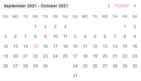
My development team is working with a business that has a design requirement for each calendar in the MultiViewCalendar component to have its own month and year label.
From what I can tell by looking at the documentation for this component, the MultiViewCalendar does not support defining labels that can be placed above each individual calendar. It only supports showing a single label that is a range from the start month + start year to the end month + end year.
I attached a screenshot of how our current UI looks using this component.
In this example, we would love to be able to attach a label of March 2025, April 2025, May 2025, and June 2025 above each calendar, rather than only being able to show a label of March 2025 - June 2025 above the first calendar.
Please let me know if you have any questions or concerns regarding this request. Thanks for your time.
Best,
Tyler Earls
Currently there is no way to get multi-column headers on Kendo UI's React . please make this feature like jQuery
When the grid is being initiated, the columns passed into the grid as children will be filtered by "child.type === GridColumn" to check whether it is indeed a GridColumn. With React Hot Loader, each React element will be modified to be a ProxyFacade, and the Grid will not recognize its children anymore.
It will be very useful if we can get the new component for IPV4/IPV6 input fields. Especially networking related products, I see lot of use cases.
Multi-selecting rows using the mouse selection doesn't work for React Kendo Grid.
With the kendo grid wrapper for React we were able to multi-select rows using the mouse selection in the grid bounds.
Currently, the only approach is to loop the data and set the desired text as a field value.
Add support for styled components.
This will allow lazy loading for the styles depending on the used features of a component to reduce the styles sheet size.
This can be done from the file browser or using drag and drop.
I need to not restrain the window, in the element that was contained in the code.
Just like it was possible in the jQuery version (https://docs.telerik.com/kendo-ui/api/javascript/ui/window/configuration/draggable.containment),
this feature is a must.
Otherwise, I am being forced to keep my Window on the "top level" element, just so that I can have it not be constrained in the nested element...
The problem with this, is that the Window looks totally out of place, if I need more windows, I will need them all there and it's logic is not clear. The are many issues with that approach...
Please provide a temporary workaround if possible, thanks!