Hi,
We have requirement of date picker display quarters view . please see the below example
http://jsfiddle.net/4mwk0d5L/1/
Regards,
Susanta
https://demos.telerik.com/kendo-ui/numerictextbox/events
We would like this as we need to distinguish between a change due to a user typing and a change due to a spin.
To hack around this we will probably need to create a DOM event on click on the spin buttons or something
Hello team,
We work on a product that features a large set of input components that are based on the Kendo inputs and dropdowns. We have custom designs that require us to customize the Popups of comboboxes, multi-selects, color pickers, etc with specific layout and styling, open/close animations, blur handling and keyboard interactions (e.g. closing on Esc). This is done fairly easy with the Date Input components (DatePicker, DateTimePicker, DateRangePicker, TimePicker) as they expose such property:
popup?: React.ComponentType<PopupProps>;
However most other controls that use a Popup internally expose just PopupSettings that is not enough for us even with the "appendTo" option.
We would be happy to see a similar ability (as in Date Inputs) to inject the Popup component in:
- Components in the "@progress/kendo-react-dropdowns" package.
Most of them simply reuse the same ListContainer component that renders the Popup. - ColorPicker in the "@progress/kendo-react-inputs" package.
I guess that customizing the popup in the DropDownButton, FloatingActionButton and SplitButton would also be nice to have but for those CSS styling does good enough job for us.
Regards
We are not able to find where is stored the information about which events are selected. We have found information about overloading the Scheduler prop editItem with a CustomEditItem and overriding this event to detect when a task is selected.
const handleClickAction = (event) => [
{
type: event.syntheticEvent.shiftKey
? ITEMS_SELECT_ACTION.add
: ITEMS_SELECT_ACTION.select,
},
];
With this we could detect when a certain event is selected. But we are still missing the part about when they are unselected. If we click outside the events, we get the selection removed, but we have no way to detect the event of this, and therefore we can't update our list of selections.
Can you give us support on how we can get the information about the selections, and keep it updated at all times? Thank you,
In our unit tests, we sometimes want to be able to use the ByTestId methods of the React Testing Library to find bits of DOM created by a Kendo component. However, setting a data-testid attribute (or really any data- attribute) on a Kendo component does not always result in the attribute appearing anywhere in the final DOM.
To demonstrate, below is a test suite (also included in the zip) where I tried putting a data-testid attribute on the Kendo components Input, TextArea, Checkbox, Slider, SliderLabel, MultiSelect, and DatePicker, then checked if the attribute appeared in the rendered DOM. The tests for Input, TextArea, and Checkbox are successful. The ones for Slider, SliderLabel, MultiSelect, and DatePicker are not.
import { render, screen } from '@testing-library/react';
import { Input, TextArea, Checkbox, Slider, SliderLabel } from '@progress/kendo-react-inputs';
import { MultiSelect } from '@progress/kendo-react-dropdowns';
import { DatePicker } from '@progress/kendo-react-dateinputs';

// SUCCEEDS
describe('Kendo Input', () => {
    it('supports data attributes', () => {
        render(
            <Input data-testid="the-input" />
        );

        const input = screen.queryByTestId('the-input');
        expect(input).toBeTruthy();
    });
});

// SUCCEEDS
describe('Kendo TextArea', () => {
    it('supports data attributes', () => {
        render(
            <TextArea data-testid="the-text-area" />
        );

        const textarea = screen.queryByTestId('the-text-area');
        expect(textarea).toBeTruthy();
    });
});

// SUCCEEDS
describe('Kendo Checkbox', () => {
    it('supports data attributes', () => {
        render(
            <Checkbox label={"Chad"} data-testid="the-checkbox" />
        );

        const checkbox = screen.queryByTestId('the-checkbox');
        expect(checkbox).toBeTruthy();
    });
});

// FAILS
describe('Kendo Slider & SliderLabel', () => {
    it('supports data attributes', () => {
        render(
            <Slider min={1} max={2} data-testid="slider-root">
                <SliderLabel position={1} data-testid="slider-label-1">One Fish</SliderLabel>
                <SliderLabel position={2} data-testid="slider-label-2">Two Fish</SliderLabel>
            </Slider>
        );

        const sliderRoot = screen.queryByTestId('slider-root');
        const sliderLabel1 = screen.queryByTestId('slider-label-1');
        const sliderLabel2 = screen.queryByTestId('slider-label-2');

        // test them all at once so we can know the full scope of our failure/success
        expect({
            sliderRoot,
            sliderLabel1,
            sliderLabel2
        }).toMatchObject({
            sliderRoot:   expect.anything(), // don't be null or undefined
            sliderLabel1: expect.anything(), // don't be null or undefined
            sliderLabel2: expect.anything()  // don't be null or undefined
        });
    });
});

// FAILS
describe('Kendo MultiSelect', () => {
    it('supports data attributes', () => {
        render(
            <MultiSelect data-testid="the-multi-select" />
        );

        const multiselect = screen.queryByTestId('the-multi-select');
        expect(multiselect).toBeTruthy();
    });
});

// FAILS
describe('Kendo DatePicker', () => {
    it('supports data attributes', () => {
        render(
            <DatePicker data-testid="the-date-picker" />
        );

        const datepicker = screen.queryByTestId('the-date-picker');
        expect(datepicker).toBeTruthy();
    });
});
Hi Team,
We need a break (<br>) tag on pressing enter key instead of paragraph tag in React Editor. Currently break tag comes on pressing Shift + Enter keys. We want a mechanics to override default functionality of enter from paragraph to break tag.
Regards,
Abhinav
Hi Team,
This feature request follows on from my Forum post (https://www.telerik.com/forums/scheduler-support-to-multiple-slot-selection).
It would be great if we had more control over slot selection, like:
- Turn off selection;
- Select multiple slots;
- Being able to Access the selected slots to use as start and end date/time in EditSlot.
Kind Regards,
Grant
Hi Team,
For MenuItem target="_blank" feature is not there. Please enable the same. which will be helpful as menu is the face of app.
Regards,
Revanth
Dear Telerik Support Team,
Our development team relies on Telerik Kendo DevCraft Ultimate, specifically the Kendo React components, for our projects. We have a suggestion that would greatly improve our developer experience.
When using MUI components, we appreciated the seamless integration with VSCode. Hovering over an MUI component name would display a tooltip with a brief description and a clickable link to the MUI API documentation. This feature allowed us to quickly access examples and API details.
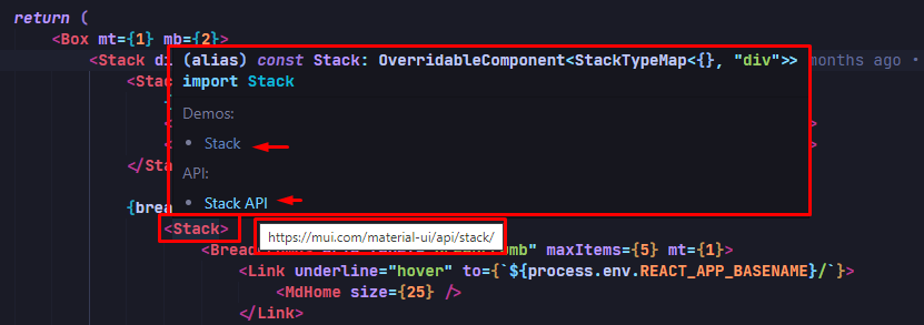
MUI with VSCode
Unfortunately, this feature is absent in Kendo React. We lack a tooltip popup with a direct link to the online Kendo React API documentation. Consequently, it has become challenging for our developers to find examples and access component documentation without manual searches.
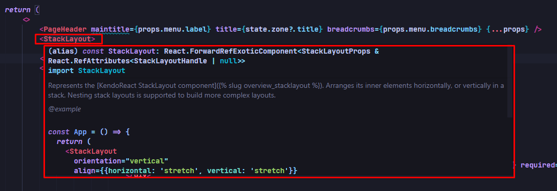
KendoReact with VSCode
We kindly request an enhanced API integration in Kendo React. Adding a tooltip popup with a brief description and clickable link to the online Kendo React API documentation would greatly streamline our workflow, saving us time and improving productivity.
Thank you for your continuous support and commitment to the developer community. We eagerly await your positive response and hope to see this feature included in the Kendo React ecosystem.Best regards,
When typing into a date picker and trying to type Feb 29th, 2024 (or any other leap year ofc) the date is updated incorrectly by the kendo date picker validation. As the user types the year their previous entry of 29 is updated to 28. This should update check should probably not occur until the user is done updating the input. If there is some fix or workaround we can do on our end to resolve this issue please let us know
Here's a video of the bug in our application
However, I was also able to reproduce the exact same behavior even in the documentation:
It would be beneficial if we could pass inline functions for the selectMessageUI. Observe in the following example that you cannot pass an inline function to selectMessageUi the same way you can for onBlur and onChange:
https://stackblitz.com/edit/react-1lvt8y8d
In our software we want to create a filter with MultiSelectTree. The hierarchy is this: LV1 -> LV2 -> LV3. In the database the data is assigned to LV3. If the component is loaded with lot of LV3 items then selecting the parent LV2 node will result a very long tag list in the textbox part of the MultiSelectTree which is not user friendly. In this case I expect selecting the LV2 node will check the LV3 subnodes also but the textbox part has only that LV2 tag as selected. So the checkboxes should remain the same textbox should display the selected parent only.
Other cases:
- when LV1 is selected, then every children will be checked but textbox should display only the selected location
- when 99 of 100 LV3 items are checked then LV2 parent is not fully checked so textbox should display only the bins but only the first N items then use ... characters.
I have grid with 1000 items. On every small change to my models, like selection or expand, I am getting every table cells being re-mounted, instead of re-rendered (imagine how many of them is currently with 1000 rows). I have tried to use shouldComponentUpdate to optimize my rendering, but grid component just removes old cell and mounts new one, instead of rerender.
Hi, is there a way i can customize the paging options style? The default is we have the page selection on the left, number of Items per page selection in the middle and the total records info on the right. I would like to just reverse it. I tried a display flex on the container and a flex-direction: reverse but it reverses the paging icons also. Please advise.
A custom render method for the paging component or a wrapper around the paging buttons would be ideal so as to do a flex-reverse to play around with the styles.
I would like to request the data-query package support filtering on OData collections using lamdba functions. Given a Collection with the existing operators, the filter string outputted by `toODataString` should be OData v4 compliant.
Example: Project is a collection. A user filters to see all General projects which outputs { field: 'Project', operator: 'eq', value: 'General' }.
Recommendation: Supply another key that dictates the lamdba operator and property field to use.
{ field: 'Project', operator: 'eq', value: 'General', lambda: 'any', collectionField: 'Name' } -> $filter=Project/any(x:x/Name eq 'General')
The above can work with inner functions like contains.
{ { field: 'Project', operator: 'contains', value: 'gen', ignoreCase: true, lambda: 'any', collectionField: 'Name' } -> $filter=Project/any(x:contains(tolower(x/Name),'gen'))
Hi
Please build a React component for TreeMap similar to https://demos.telerik.com/aspnet-ajax/treemap/overview/defaultcs.aspx
Hey
Small question: it is exists some approach to make Tabs in TabStrip reordable ?
Best
Serge