What I would like to see is a full height Panel anchored to the body tag similar to a drawer, but the panel would allow me to set the Title, Close Button, and Content manually. My intent is to create forms in the panel or to use the panel to display details of a single row of data. What you have appears to be geared towards navigation or the display of discrete data only.
<Panel
isOpen={boolean}
hasCloseButton={boolean}
isBlocking={boolean}
footerIsSticky={boolean}
titleIsSticky={booelan}
width={number or string}
panelPosition={"start", "end" - similar to flex positions
header={JSX.Component or string}
title={JSX.Component or string}
/>
<Content>{Placeholder for Content}</Content>
<Footer>{Placeholder for Footer Content}</Footer>
</Panel>
The layout would be
------- Top Sticky
Header Close Icon
</hr>
Title (could be in the sticky or not)
------ End Top Sticky
Content - Scrollable
Footer
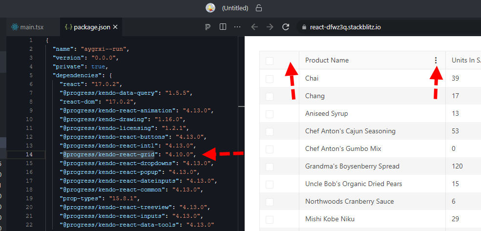
here is a quick repro: https://stackblitz.com/edit/react-dfwz3q?file=package.json
in package.json just switch @progress/kendo-react-grid from 4.10.0 back to 4.9.0 and the column menu renders.
bug still present up through 4.11, 4.12, and @latest 4.13

we have X(cross) for combo box but it is not coming for datetime picker
Issue #1
Given:
Controlled TextaArea componenet with autoSize and rows properties.
const App = () => {
  const [state, setState] = useState();

  return (
    <TextArea
      value={state}
      onChange={(e) => setState(e.value)}
      autoSize={true}
      rows={2}
    />
  );
};
When:
Add couple text lines to extend TextArea size and remove these empty lines in any way
Then:
Content from TextArea field is removed but TextArea height stays the same, doesn't come back to it's initial value. It's different comparing to example from your docs where example contains uncontrolled component.
Issue #2
Given:
Controlled TextaArea componenet with autoSize and rows properties.
const App = () => {
  const [state, setState] = useState();

  return (
    <TextArea
      value={state}
      onChange={(e) => setState(e.value)}
      autoSize={true}
      rows={4}
    />
  );
};
and styles like these
.k-textarea textarea {
  border: 1px solid blue;
}
When:
Start typing anything
Then:
Height of textarea component is decreasing
Issue #1
Given:
Controlled TextaArea componenet with autoSize and rows properties.
const App = () => {
  const [state, setState] = useState();

  return (
    <TextArea
      value={state}
      onChange={(e) => setState(e.value)}
      autoSize={true}
      rows={2}
    />
  );
};
When:
Add couple text lines to extend TextArea size and remove these empty lines in any way.
Then:
Content from TextArea field is removed but TextArea height stays the same, doesn't come back to it's initial value. It's different comparing to example from your docs where example contains uncontrolled component.
Issue #2
Given:
Controlled TextaArea componenet with autoSize and rows properties.
const App = () => {
  const [state, setState] = useState();

  return (
    <TextArea
      value={state}
      onChange={(e) => setState(e.value)}
      autoSize={true}
      rows={4}
    />
  );
};
and styles like these
.k-textarea textarea {
  border: 1px solid blue;
}
When:
Start typing anything
Then:
Height of textarea component is decreasing
Hello,
Our team is using MobX-State-Tree (MST) and KendoReact TreeList control with virtual scrolling enabled. According to documentation MST model stores data as an observable array (https://mobx-state-tree.js.org/API/#array and https://mobx.js.org/api.html#observablearray).
The MST model’s field ‘tree’ is not a regular array, but a LegacyObservableArray.
From UI standpoint:
initially all tree nodes are collapsed
user clicks on i.e. 3rd tree node
selection is not displayed on any tree node (3rd node expected to be selected)
user expands 1st tree node - selection is set on the 3rd tree node
The following warning appears in the browser console.
Warning: Failed prop type: Invalid prop `data` of type `object` supplied to `TreeList`, expected `array`.
in TreeList (created by wrappedComponent)
in wrappedComponent (created by wrappedComponent)
in div (created by wrappedComponent)
in div (created by wrappedComponent)
in wrappedComponent
Model is defined as:
const TreeViewModel = types
.model('TreeViewModel', {
selectedItemUUID: types.maybe(types.string),
tree: types.optional(types.array(TreeNodeModel), []),
isLoaded: types.maybe(types.optional(types.boolean, false)),
treeTypes: types.optional(types.array(TreeNodeTypeModel), []),
})
.views((self) => ({
get treeCollection(): any {
return self.tree;
},
}))
Component is defined as:
return (<>
{!viewModel.isLoaded && loadingPanel}
<div className='treeListContainer' ref={stageCanvasRef}>
{treeListContainerHeight && <TreeList
style={{ maxHeight: `${treeListContainerHeight}px`, overflow: 'auto', }}
data={viewModel.treeCollection}
expandField={expandField}
subItemsField={subItemsField}
columns={columns}
selectedField={selectedField}
rowHeight={40}
scrollable="virtual"
/>}
</div>
</>);
The following workaround allows converting an observable array to a regular array.
.views((self) => ({
get treeCollection(): any {
return JSON.parse(JSON.stringify(self.tree)); // or self.tree.slice()
},
}))
This solution affects performance due to array copy.
Besides this TreeList uses an array copy. User’s selection and expanding don’t trigger related changes in the initial observable array in the model.
Related event handlers (i.e. onSelectionChange, onExpandChange) should be extended to make appropriate changes in the MST model.
Can you please extend KendoReact controls to support observable arrays?
Is there a better solution?
Looking at the JSDoc for for `toDataSourceRequestString` and `toDataSourceRequest`, they both appear to have JSDoc above them, showing the parameter as:
* @param {DataRequestState} state - The state that will be serialized.Should this actually have `@param {DataSourceRequestState}`?
A few suggestions for the React Grid (as of v5.0.1) to help devs conform to accessibility compliance...
1) Standard HTML tables can contains a <caption> element, which screenreaders will use as the descriptive name of the table. Kendo Grid does not appear to have any way to name the table.
2) Related to number 1, other ways to assign a descriptive name to a table may be to include a `title`, `aria-label` or `aria-describedby` attributes, but none of these work on <Grid>. They are not rendered into the HTML if passed as props.
3) Allow GridCell and other Cell components to take `children` to render. The current documentation generally advises us to override the `cell={}` prop on a GridColumn for custom cell rendering. What is not listed in the docs is that doing what seems like the obvious thing:
<GridColumn cell={() => <td>myContent</td>} />
actually breaks accessibility. At a minimum the cell MUST get the attributes
role={'gridcell'}
aria-colindex={props.ariaColumnIndex}
to have the table actually be represented correctly in most screen readers. The Kendo <GridCell> component would normally add these, but only renders the field from the dataItem. It can only render custom data if the `render` prop is set, in which case it yet again does not render the `<td role= aria-colindex=` portions on it's own.
What I'm getting at is, everyone who ever wanted to render a custom cell in Keno Grid always had to make their own cell component that added at least the `role` and `aria-colindex` attributes, and if they didn't, they probably unknowingly broke accessibility.
Kendo could make this clearer in the docs (including the accessibility page for the Grid), and could easily alter GridCell to render `children` if they are passed. Then we could do:
<GridColumn cell={<GridCell><button>yay</button></GridCell>} />and have the rendered HTML:
<td colSpan="1" style="" class="" role="gridcell" aria-colindex="1" aria-selected="false"><button>yay</button></td>I think in GridCell this would be as easy as changing:
        defaultRendering = (
          <td
            colSpan={props.colSpan}
            style={props.style}
            className={className}
            role={'gridcell'}
            aria-colindex={props.ariaColumnIndex}
            aria-selected={props.isSelected}
            {...{[GRID_COL_INDEX_ATTRIBUTE]: props.columnIndex}}
            {...navigationAttributes}
          >
            {dataAsString}
</td> defaultRendering = (
<td
colSpan={props.colSpan}
style={props.style}
className={className}
role={'gridcell'}
aria-colindex={props.ariaColumnIndex}
aria-selected={props.isSelected}
{...{[GRID_COL_INDEX_ATTRIBUTE]: props.columnIndex}}
{...navigationAttributes}
>
{children || dataAsString}
</td>
All of the Kendo components that "hide" content (tab views, collapse panels, etc) don't actually hide any content. They require us to not render any children.
<ExpansionPanel
  {expanded === item.id && (
    <ExpansionPanelContent>
This just strikes me as an odd design decision. I guess I don't understand the point of these components if they don't do the 1 thing they are supposed to do; hide portions of the content.
Un-rendering the content is usually not desirable. The contents are often still important. Possibly for SEO purposes, A11y, or if they are part of a Form:
<Form
  render={() => {
    <FormElement>
      <ExpansionPanel>
        {expanded === item.id && (
          <ExpansionPanelContent>
            <Field
                name={"firstName"}
                component={Input}
                validator={() => 'always invalid'}
              />
          </ExpansionPanelContent>
      </ExpansionPanel>
    </FormElement>
  }}
/>
This makes the Form valid as long as the panel is collapsed.
Can check out how Bootstrap collapse panels work to see how most people would expect these components to behave. The contents is rendered into the DOM and JS and CSS are used to hide it. There should be a way to achieve this same behavior with Kendo.
As a workaround I end up having to do my own CSS/SASS to hide the contents
.k-expander {
  .k-expander-content-wrapper {
    height: 0;
    overflow: hidden;
  }

  &.k-expanded {
    .k-expander-content-wrapper {
      height: auto;
    }
  }
}
Hello
Currently, the KendoReact Grid can only select all columns as shown in this demo:
https://www.telerik.com/kendo-react-ui/components/grid/selection/#toc-customizing-the-selection
We wish to be able to select only specific columns programmatically.
There is an inconsistency with the DateRange picker in the way element focus is set when closing the date selection popup by mouse vs keyboard. When using the mouse to close the date range selection popup, element focus becomes lost/reset.
You can simulate this from the example page https://www.telerik.com/kendo-react-ui/components/dateinputs/daterangepicker/
Steps to simulate good behavior (this works correctly):
* click the 'from' input text element (causes the popup to open and the text input to have focus)
* press 'escape' to close the popup (the popup is closed, and the 'from' input element retains focus)
* press 'tab' (focus moves to the 'to' text input element)
Steps to simulate behavior that could be improved:
* click or tab into the 'from' input element (causes the popup to open and the text input to have focus)
* click (with the mouse) outside the popup to close it (the popup is closed, and focus appears to be lost.)
* press 'tab' (focus moves to the 'from' input element again because we are back at the beginning of the tab order list)
This input can lead you into a tab order loop if you mix pressing 'tab' to advance focus, and using the mouse to click to close the date selection popup.
Feature request: when clicking to close the popup, element focus should be retained in the 'from' or 'to' text input; whichever had focus before the popup close, the same as pressing 'escape' to close the popup.
I use a Datepicker with 'he' loclae. It works fine, but the week's days are displayed from left to right instead of right to left as expected.
I tried to add className = 'k-rtl' but it did not help.
Is there a way to change that?
Here is a demonstration of the problem:
https://stackblitz.com/edit/react-vkzwzo?file=app%2Fmain.jsx
Set up a TimePicker with a `min` and `max`. For example
            min={new Date(0, 0, 0, 0, 0)}
            max={new Date(0, 0, 0, 5, 0)}
Click on the text input to focus the 'hours' portion.
Roll the mouse scrollwheel up/down to change the hours.
You can 'scroll' past 5:00 and set the time to anything above the max.
You can also use the keyboard to enter any number outside the min/max.
Is this the expected behavior? Do we always have to add our own validation to check the min/max ourselves?
A TimePicker control will take all scroll events if the mouse cursor is over it, whether the element has focus or not, and prevent the scroll from bubbling up to the page. This prevents a page from scrolling as soon as the mouse cursor touches a TimePicker.
Using Kendo rect v5.1.0 in FireFox v98 on OSX. (Issue does not happen in Chrome)
You can view the problem in the demo page: https://www.telerik.com/kendo-react-ui/components/dateinputs/timepicker/
Just try to scroll down the view, and as soon as the TimePicker is under the mouse cursor, the page can no longer be scrolled until you move the cursor off the control.
On this page: https://www.telerik.com/kendo-react-ui/getting-started/
On this section: "Add a KendoReact Data Grid"
When I launch the app as usual:
```sh
yarn start
```
Then the browser page includes this error:
```
Compiled with problems:
ERROR in ./.yarn/__virtual__/@progress-kendo-react-data-tools-virtual-df92d36fcf/0/cache/@progress-kendo-react-data-tools-npm-5.2.0-8d098f65a0-5d68752aaa.zip/node_modules/@progress/kendo-react-data-tools/dist/es/columnmenu/ColumnMenuFilterForm.js 19:0-55
Module not found: Error: @progress/kendo-react-data-tools tried to access @progress/kendo-react-buttons (a peer dependency) but it isn't provided by your application; this makes the require call ambiguous and unsound.
Required package: @progress/kendo-react-buttons
Required by: @progress/kendo-react-data-tools@virtual:79c9c696d5f1e6f4dd730946c0d2912611551a498926b146bcbdd9d142588c5f4c2333469b63e7a9a2bdd1f0f1313d0d70b72cc8dbcafcc20e21e6b9790f6068#npm:5.2.0 (via /Users/joel/git/joelparkerhenderson/demo/demo-react-kendo/.yarn/__virtual__/@progress-kendo-react-data-tools-virtual-df92d36fcf/0/cache/@progress-kendo-react-data-tools-npm-5.2.0-8d098f65a0-5d68752aaa.zip/node_modules/@progress/kendo-react-data-tools/dist/es/columnmenu/)
Ancestor breaking the chain: demo-react-kendo@workspace:.
…
```
The solution that works for me...
Add the package:
```sh
yarn add @progress/kendo-react-popup
````
Edit `src/App.js` and add this line:
```js
import '@progress/kendo-react-popup';
```
On this page: https://www.telerik.com/kendo-react-ui/getting-started/
On this section: "Add a KendoReact Data Grid"
On this page: https://www.telerik.com/kendo-react-ui/getting-started/
On this section: "Add a KendoReact Data Grid"
When I launch the app as usual:
```sh
yarn start
```
Then the browser page includes this error:
```
Compiled with problems:
ERROR in ./.yarn/__virtual__/@progress-kendo-react-data-tools-virtual-df92d36fcf/0/cache/@progress-kendo-react-data-tools-npm-5.2.0-8d098f65a0-5d68752aaa.zip/node_modules/@progress/kendo-react-data-tools/dist/es/columnmenu/ColumnMenuFilterForm.js 19:0-55
Module not found: Error: @progress/kendo-react-data-tools tried to access @progress/kendo-react-buttons (a peer dependency) but it isn't provided by your application; this makes the require call ambiguous and unsound.
Required package: @progress/kendo-react-buttons
Required by: @progress/kendo-react-data-tools@virtual:79c9c696d5f1e6f4dd730946c0d2912611551a498926b146bcbdd9d142588c5f4c2333469b63e7a9a2bdd1f0f1313d0d70b72cc8dbcafcc20e21e6b9790f6068#npm:5.2.0 (via /Users/joel/git/joelparkerhenderson/demo/demo-react-kendo/.yarn/__virtual__/@progress-kendo-react-data-tools-virtual-df92d36fcf/0/cache/@progress-kendo-react-data-tools-npm-5.2.0-8d098f65a0-5d68752aaa.zip/node_modules/@progress/kendo-react-data-tools/dist/es/columnmenu/)
Ancestor breaking the chain: demo-react-kendo@workspace:.
```
The solution that works for me...
Add the package:
```sh
yarn add @progress/kendo-react-buttons
````
Edit `src/App.js` and add this line:
```js
import '@progress/kendo-react-buttons';
```
The yarn example says...
```sh
yarn create react-app my-app
```
... which is old syntax and should not be used because of bugs.
Solution: update that line to use yarn download-and-execute (dlx) like this:
```sh
yarn dlx create-react-app my-app
```
On this page: https://www.telerik.com/kendo-react-ui/getting-started/
There's a syntax mismatch in end-of-line semicolons.
This line ends with a semicolon:
```js
import '@progress/kendo-theme-default/dist/all.css';
```
This line does not end with a semicolon:
```js
import { Calendar } from '@progress/kendo-react-dateinputs'
```
All teams that I know of consider it to be an error to do both ways in the same file.
The solution is to pick one way then be consistent. The broader solution is to use a linter, such as ESLint, that can process the code to ensure you're using your expected syntax and formatting.
Hi there,
I can see there is a column chooser component for the Angular Data Grid e.g. https://www.telerik.com/kendo-angular-ui/components/grid/columns/menu/#toc-column-chooser-item but there is not an equivalent for the React Data Grid (unless you code it yourself).
The DevExpress React Grid does have this feature https://devexpress.github.io/devextreme-reactive/react/grid/docs/guides/column-visibility/ so we were wondering if such a thing is planned React Data Grid?
Thanks very much,
James