Be able to to modify the cut-off point depending on what baseUnit is selected in a chart time series.
e.g.
Given the following data points:
Data = [
Friday 10th Oct: 123,
Saturday 11th Oct: 54,
Sunday 12th Oct: 77,
…,
Tuesday 20th January: 10,
]
If baseUnit = year
Currently what happens is:
1st Jan -> 1st Jan -> 1st Jan
What we want:
10th Oct -> 10th Oct -> 10th Oct
If baseUnit = month
Currently what happens is:
1st Oct -> 1st Nov -> 1st Dec
What we want:
10th Oct -> 10th Nov -> 10th Dec -> etc
*Edge case of 29th, 30th, and 31st:
Default to last day of the month
Oct 31st -> Nov 30th -> Dec 31st
If baseUnit = week
Currently what happens is:
Sunday 5th Oct -> Sunday 12th Oct -> Sunday 19th Oct
What we want:
Friday 10th Oct -> Friday 17th Oct -> Friday 24th Oct -> etc
If baseUnit = day
This is our minimum unit so everything works
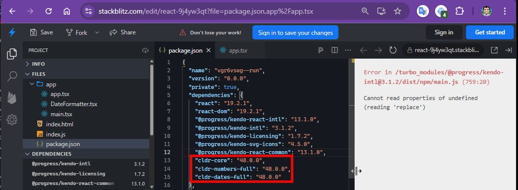
The examples from https://www.telerik.com/kendo-react-ui/components/intl/i18n/loading-data work with cldr* packages up to version 47.0.0. The Current version 48.0.0 causes an error:
Cannot read properties of undefined (reading 'replace')
Description
User Impact:
Screen reader users will miss important descriptive details on the pager section, making navigation unclear.
This can lead to confusion and difficulty in understanding page context or available actions.
Plan
KendoReact
Steps To Reproduce
Open the URL: https://www.telerik.com/kendo-react-ui/components/grid in edge browser in windows.
'React Data Grid Overview' page will be open.
Press tab key to navigate to the pager section.
Verify whether screen reader is announcing descriptive information on the pager section in windows or not.
When using KendoReact Grid with multiple grouping levels, the Grid automatically adds horizontal indentation inside <td> elements to represent group hierarchy.
While this behavior is expected, there is no public API to control, customize, or disable this indentation.
As grouping depth increases, this extra space causes layout issues, unexpected horizontal overflow, and breaks strict or custom design systems.
Is there a reason why this spacing is not configurable?
Are there plans to expose an official option (e.g. groupIndent / groupPadding) or any supported API to manage grouped row indentation?
Example:
It would be beneficial for GridToolbarColumnsChooser to offer customization options that allow developers to control which columns can be shown or hidden.
*** Support ticket created by Telerik by Progress staff ***
*** Please follow-up with additional details, if necessary. Thank you. ***
The KendoReact Scheduler currently does not provide a supported way to display only all-day events while hiding all time slots when using vertical resource grouping (Week or Timeline-based views). It would be beneficial if we had a mechanism for implementing an all-day–only Scheduler view that supports vertical resource grouping, renders multi-day events as a single continuous bar across consecutive days, and preserves the existing Scheduler structure and interactions.
*** Please follow-up with additional details, if necessary. Thank you. ***
The following options are available in the jQuery version:
Insert Comment
Insert Hyperlink
Insert Image
In KendoReact Spreadsheet:
These features are currently not available.
Query:
Are there any APIs or extension points to support these insert operations?
Is there a roadmap for introducing these capabilities?
Currently, using npm install --save @progress/kendo-theme-material will get the standard Material Design theme for use across the React Components, but why is Material Black not available this way? (npm install --save @progress/kendo-theme-materialBlack)
If you create a react grid without any GridColumn components and then add those components later, the added columns do not show and the grid is empty. It appears, after a quick look that the columns have a width of 0 pixels. They exist in the html, just not displayed.
See https://codesandbox.io/s/mmr894nllp as an example of the problem. This example starts with a populated grid. You can add columns and data using the buttons above the grid. This works fine. If you then "Reset" the grid with the button, which removes all data, any attempt to add columns and data will show a blank grid.
Thanks,
Joe
We are evaluating the React Grid component for our application and need to be able to have rows that span all columns. To do this, I have created a rowRender function that, for some rows, will render a single <td> element with the colspan set to 100%. The row renders fine, but the other rows, that have multiple <td> elements do not all render correctly. For my test application, they will render with a width of 8 pxs. On resize of a column, they will almost render correctly.
Here are some pictures of the issue in our test code.
https://drive.google.com/open?id=1bMwlUi7-7QiVHc6lubPiz45svHG1FSnS
I have created a sandbox that sort of reproduces the bug. https://codesandbox.io/s/w73v0x0mz8
If you select the "Show Full Row", the row with Id 999 will convert to a single <td> element with colspan='100%'. You will notice how after doing so, the last three columns collapse to a small number of pixels.
Thanks
Joe
Typing 111 in DatePicker results in skipping the day part. The third 1 is set to the year portion.
It is reproduced in our demo as well:
https://www.telerik.com/kendo-react-ui/components/dateinputs/datepicker/
Steps to Reproduce:
1) Open https://www.telerik.com/kendo-react-ui/components/dateinputs/datepicker/ in the Chrome browser
2) Click on the calendar icon, click on 'month/Year' in the calendar header e.g. March 2019
3) Click on the 'Year' in the calendar header i.e. 2019
4) further Click on the Year Range i.e 2010-2019
5) Year range will display from 2000 - 2090, Select year 2010
Wrong Year range (2090 - 2099) will display when clicked on 2010.
This is working properly in the Firefox browser and I observed the issue in Chrome.
Currently, ComboBox generates a UUID and uses it as the input tag's id property (e.g. <input id="2e048165-6468-46c0-ba39-c47b12c7fcf2" />).
As a developer, I want to be able to set my own custom id so that I can set my own label tag as a sibling to the ComboBox component.
For example, I would like this to be possible:
<label for="hello">Hello World</label>
<ComboBox id="hello" />
There is a label prop offered on ComboBox which works fine but it does not let me specify the label tag with custom class names, styling, etc.
This new id prop should be optional and ComboBox can keep using the same technique it does when no id prop is passed to it.
The Switch layout is misaligned on IE 11.

This is reproducible in our demos as well.
GitHub issue: https://github.com/telerik/kendo-react/issues/220
AutoComplete component name attribute is not set.
GitHub item: https://github.com/telerik/kendo-react/issues/221
Workaround: https://stackblitz.com/edit/react-dawzkj?file=app/main.js
DropDownList and MulstiSelect do not open on click(IE 11).
They do open sometimes, but it seems random.
They do open when using the keyboard.
When rendering an AutoComplete, I get the following warning:
Warning: Failed prop type: Invalid prop `children` supplied to `Popup`.
in Popup (created by ListContainer)
in ListContainer (created by AutoComplete)
in span (created by AutoComplete)
in AutoComplete
I have tried this in the simple case below:
ReactDOM.render(<AutoComplete
className="form-control"
required={true}
validationMessage="Location Required." />,
document.getElementById('root'));