Despite having a similar intention (typing and selecting), the components MultiSelect and ComboBox look and behave quite differently:
- The ComboBox has a button on the right side and only opens when this button is clicked or when the user types in the input field.
- The MultiSelect has no such button but opens when clicking inside the input field.
It would be great if the MultiSelect component also has a button on the right and only opens when the button is clicked or when the user starts typing in the input field.
Hi Team,
we are looking the similar functionality in React Grid? Could you implement this feature in feature releases?
Kendo jQuery UI : https://docs.telerik.com/kendo-ui/api/javascript/ui/grid/configuration/pageable.refresh
pageable: {
refresh: true,
},
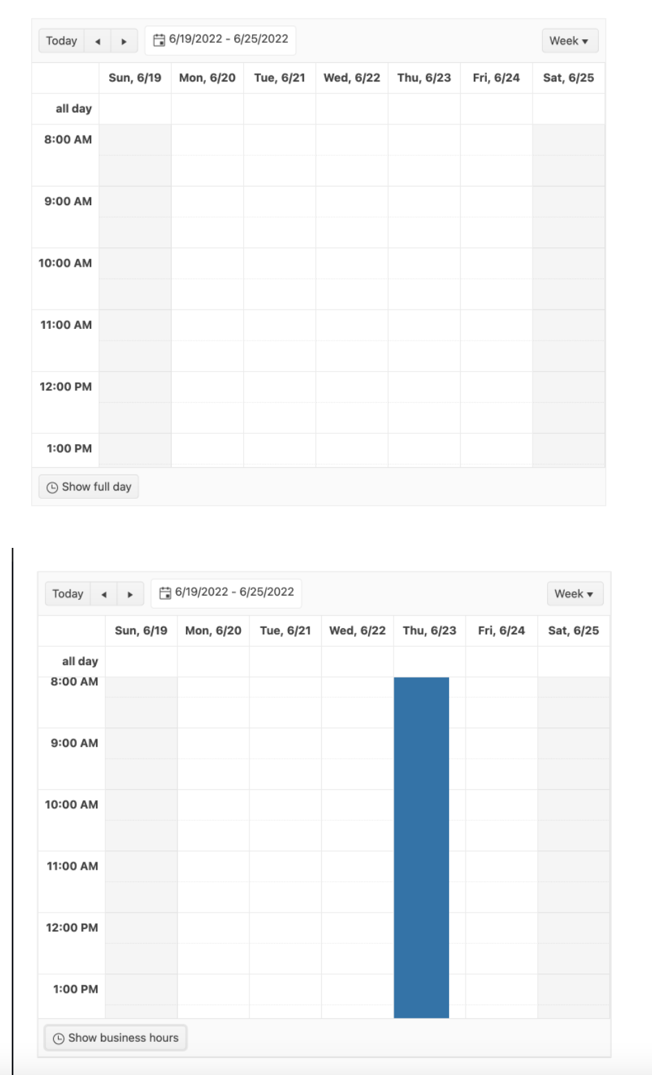
Currently, the Scheduler events are always placed between the beginning and the end of a slot, no matter if the event actually starts or ends at the slot times. So if an event for example starts at 10:10, the event is placed at the 10:00 slot line and not a little further down below, or if it ends at 11:50 the event end is placed at the 12:00 slot line. I'm talking here especially about the WeekView and the DayView.
This is not accurate enough for some events. Like for example in MS Outlook, if a event doesn't start at the full hour, the graphical representation shows it according to the start time and not at the full hour (see screenshots). We would like to request to make it possible to place events on the Scheduler so that the graphical representation of the event reflects the actual start and and time.
While I was able to calculate a margin for the event start to move it to a more accurate position, it was not possible to also set the height of the event to a calculated positition because the Scheduler doesn't allow this. According your support (see here), an event always has to end at a full slot time and can't be placed somewhere else. Calculating these things on our own brings a whole lot of other problems though (like placing overlapping events correctly, etc.) so that it would be great if the Scheduler had a setting to allow exact positioning according to times.
As in the JQuery version, it would be good to have the option of setting min screen width for grid column like below.

https://docs.telerik.com/kendo-ui/api/javascript/ui/grid/configuration/columns.minscreenwidth#columns.minScreenWidth
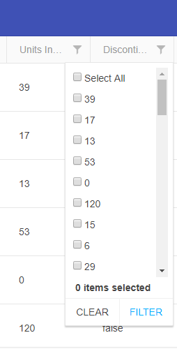
Currently the GridFilterCell OnChange returns a subset of a FilterDescriptor (A value an an Operator to run on the value), which allows a custom filter cell to create one filter rule (FilterDescriptor). However, the CompositeFilterDescriptor structure allows a lot more flexibility. `month == 'January' OR 'March' OR 'May'`. If the GridFilterCell could be passed a CompositeFilterDescriptor instead of the current subset, then a custom filter cell could be much more powerful.
In an orders grid for instance, with a status of Pending, Paid, Shipped, and Delivered a "Show/Hide Shipped" button would exclude or include the Shipped and Delivered orders when clicked. Or a list of checkboxes to choose the statuses you want to see (like the JQuery Grids support).
TL;DR: There is currently no way to re-implement multi-checkboxes or other complex filtering interfaces with the Kendo React Grid without re-implementing all of the filtering logic manually from scratch, as the Existing filter cells don't support this and a custom GridFilterCell can't be configured to return that logic in a single FilterDescriptor.
This will be useful in cases where the end-user has to transfer large data sets into the application faster.
I would like to request a mode for the Kendo React Date and Time Inputs that would allow the use of a mask like that of the MaskedTextBox - allowing the user to type freely without having to make use the arrow keys for each individual date/time part.
Add virtualization to the TreeView component to handle large trees.
Each node should be possible to have open at all time.
Each node should have the possibility to be selectable with a checkbox.
Hi,
Currently, we're facing a performance issue in react scheduler, when it has more grouping items(i.e. browser hangs indefinitely). I'm requesting the feature based on the below ticket
https://www.telerik.com/account/support-tickets/view-ticket/1513927
It would be great to have a TreeList component similar in appearance and behavior to the jQuery TreeList (https://demos.telerik.com/kendo-ui/treelist/index), but with the kind of support for virtual scrolling built into the native KendoReact Grid component.
A React wrapper exists for the jQuery TreeList, but it still doesn't play nicely with React, and in any case only supports paging for displaying large data sets, which is inherently not intuitive for displaying tree structures where parent / child hierarchies might span multiple pages.
My sense is this native component would basically be the Grid, but with support for hierarchical data, including drag-and-drop re-ordering of parent / child relationships.
Thanks for considering this feature.
Currently, they are only expandable downwards.
It should have the following functionalities:
Please add the “add widget” functionality as the jQuery version has.
Please add the “remove widget” functionality as the jQuery version has.
https://demos.telerik.com/kendo-ui/tilelayout/add-remove
We are migrating our legacy application which uses Telerik for Silverlight to react application with KendoReact controls. I am converting one screen which uses RadTreeView which gives us Drag and Drop with Reordering feature. Now, in KendoReact, TreeList control does not provide both the features.
Here is what we get when we start dragging item in Silverlight control:
I am expecting the same behavior in KendoReact: TreeList as we have to achieve the same behavior in our react application. This link has some discussion with support team.
Thanks,
React v18 has been released.
It appears that KendoReact only supports up to v17 (dependency conflicts if you try to use v18).
Can you please add support for React v18?
Thanks!
The feature request:
Kendo react scheduler: in a week/work week view if an event created with start time at 01:00 and ends at 23:00 for example and displayed only working hours:
the event will not visible until we enable all days hours visible:
The issue is described here:
The footer cell is not accessible. I cant be navigated with the keyboard and isn't read out by the screen reader. Ideally, we would have all the attributes that the header and content cells have to make this work in the same way.