is that possible to change the background line (grid )
how can I change the color of the grid or invisible in the kendo UI chart
Hi, I am Lavanya
I am using kendo UI past few days the react-coffee warehouse is very useful to learn . But the finance application is in typescript so unable to learn the whole application. so kindly give any sample application in js or jsx .if possible.
thanks
Steps to reproduce:
- Create a notification and a button to toggle it
- Run a screen reader such as NVDA or JAWS
- Toggle the notification to appear
Expected result: The text in the notification is read by the screen reader when the notification appears
Actual result: The notification text is not read out
in the kendo UI react chart I need the average line, max line, and min line targeting some value
Please suggest which features to use with respect to the above requirements, if available.
How to reproduce (video attached):
1) open combobox
2) scroll to end of the item list
3) select last item 4999
4) open combobox again
Expected behavior: I would like to see the item list.
Actual behavoir: I see white area.
https://www.telerik.com/kendo-react-ui/components/dropdowns/combobox/virtualization/#toc-basic-configuration
https://www.telerik.com/kendo-react-ui/components/dropdowns/multiselect/virtualization/#toc-basic-configuration
https://www.telerik.com/kendo-react-ui/components/dropdowns/dropdownlist/virtualization/#toc-basic-configuration
https://stackblitz.com/edit/react-haejnu?file=app%2Fmain.tsx%3AL115
It is a common use case to provide Grid's dataItemKey property to make sure changes are properly reflected per documentation - https://www.telerik.com/kendo-react-ui/components/grid/api/GridProps/#toc-dataitemkey
However, when this accessor property is provided (usually a unique ID on all groups and items), Kendo uses it instead of its default auto-incremented `'ai' + absoluteIndex` key to index the <GridRow /> for each group's header and footer - giving them the same value and causing React to throw multiple warning about duplicate keys. This makes it unreliable to specify dataItemKey property when using the grouping feature with aggregate footers as it messes up with React's reconciliation mechanism.
Hello,
There is a very serious bug in the Kendo React date picker component: the month of January is simply not displayed
The issue can be witnessed on your demo page:
https://www.telerik.com/kendo-react-ui/components/dateinputs/datepicker/
Just open the picker and you'll see January is not there
Hi,
Can We have an admin Dashboard for KendoReact? which has some ready components Like NavBar on top and Left, Dark and Light mode, RTL, and LTR Layouts and Forms with all input Components
I Have More projects in this React MUI Admin Dashboard and now it's very hard for me to use the KendoReact Components here.
if we Have KendoReact Admin Dashboard like that it will be easy to use KendoReact components there.
Thanks
1) Drag a window to a tabstrip and drop the window on the tab area.
2) The window should dock into the tabstrip as extra tab.
I want the kendo tooltip should show on trend line points and when I move from that point it should not visible. it is visible when I am in the chart area and it hides when I leave the chart area, but I want it should hide when I leave the line point.
Hi Team,
This feature request follows on from my Forum post (https://www.telerik.com/forums/scheduler-support-to-multiple-slot-selection).
It would be great if we had more control over slot selection, like:
- Turn off selection;
- Select multiple slots;
- Being able to Access the selected slots to use as start and end date/time in EditSlot.
Kind Regards,
Grant
Add a disabled property to ListBox and ListboxToolbar.
Listbox
- onItemClick should be disabled.
- onHover should be turned off.
ListBoxToolbar
- All tool-buttons should be disabled.
- onToolClick should be disabled.
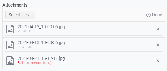
The KendoReact `Upload` component displays a "file validation message" when an upload/save attempt fails, as can be seen in the following screenshot.
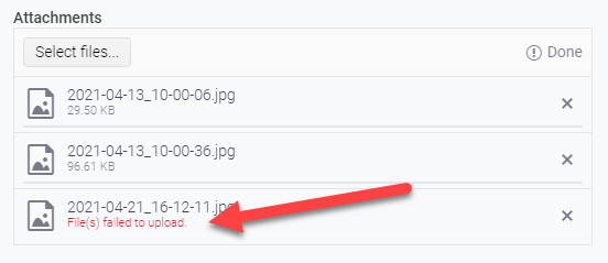
This message is provided by the `getFileValidationMessage()` method of the `UploadListSingleItem` class and is triggered when the passed parameter, `isUploadFailed` is `true`.
`isUploadFailed` is determined by the method `getFileStatus()` provided by the local-to-the-Upload-component utils file. This method is returning `isUploadFailed` as true only when the compared file status is set to `UploadFileStatus.UploadFailed`.
This is wonderful when uploading/saving - and it's great to show the user that something failed during the attempted upload/save.
I request similar functionality when performing file removal so we could similarly alert the user that the attempted removal of the file failed. Something similar to the below:
Hello,
we are using kendo-react-pdf and I am trying to see if it can generate tagged PDFs to make it accessible. Or can you tell me if there is another kendo pdf component that is capabable of creating these tags?
thanks so much,
Rebecca
Hi Team,
If you take a look at my demo, I have 2 scheduler events, and I've created a custom SchedulerItem that renders the background of one of them to be blue.
When dragging the items around, the dragItem mains the same color with a bit of opacity, cool.
When resizing, the orange (?) one works great, this is the default color theme. However when I resize the blue one, while resizing, the resizeItem is an opaque blue, but the SchedulerItem underneath reverts back to the original default color scheme thereby mixing the colors.
Please advise.
Thanks,
Grant
Hi,
Please see the following example of the dropdownlist with bootstrap theme applied:
https://stackblitz.com/edit/react-ejxe44?file=index.html
I have updated the bootstrap cdn to latest. Notice that bootstrap styling is applied to the dropdowns including focus shadowing.
Now please see the exact same example but with theme customisation using a custom scss file:
https://stackblitz.com/edit/react-tuq49c-g6ofwn?file=index.scss
Notice that bootstrap styling is no longer applied to the dropdowns, which do not have focus shadowing.
Kind regards,
David
Hi,
Please see the following example of the Upload component being used to transfer a single file to a byte array:
https://stackblitz.com/edit/react-u2kbu9?file=app/main.tsx
Notice that all packages are latest including react 18 but I have not switched to the new createRoot API, and as per react documentation "Until you switch to the new API, your app will behave as if it’s running React 17" - this warning can be seen in the console window. When you upload a file, the FileReader onprogress and onload events result in the file being successfully uploaded with 100% progress. You can see current state and new state of all events in the console window.
Now please see the exact same example but switched to the new createRoot API:
https://stackblitz.com/edit/react-y8fuya?file=app%2Fmain.tsx
Notice that the warning is no longer visible in the console window. When you upload a file, the FileReader onprogress and onload events result in the file being successfully uploaded but the file progress is overwritten. You can see current state and new state of all events in the console window - the new state from the onProgress event is lost, and the new state in the onStatusChange event reports zero progress.
I believe this is because of automatic batching in React 18.
Kind regards,
David
Hi Team,
There is some unexpected behavior when resizing events after switching the Scheduler to 'Show Full Day'. Take a look at my sandbox, you'll notice, its barely anything, let alone anything fancy.
Replicate:
1. Create a new event that starts at 8am.
2. Switch the view to 'Show Full Day'
3. Using the start time resize handle and drag it up, to start earlier. And you will notice the dragItem actually drags down, and when you release the handle, the event appears in the correct place
This will only happen on the first resize when switching to 'Show full day'. You can replicate it more by switching back and forth between full day and business hours.
Similar Scenarios include:
1. Placing the event to end at 8am, switching to business hours and back, then drag the end time down, the dragItem will be positioned to start at 8am, but say its 7am and you will see the rest.
2. Placing the event to overlap 8am, will yield both problems.
Again this only happens on the first resize after switching views, and I've only tested it in DayView, so it might affect WeekView as well. There appears to be no issue when events overlap the endWorkTime.
Thanks,
Grant
It would be nice if ListView could have the option of actually being a list (ul, ol or dl) element. In many cases, I believe this would be more semantically correct and it would help screen readers understand more about the content. My suggestion would to make this configurable if possible. I've seen some libraries allow you to pass in the element type so you can override / change the markup and I think this would be nice to have here (and possibly other places).
There is an issue with ComboBox remote virtualization. This is reproducible on https://www.telerik.com/kendo-react-ui/components/dropdowns/combobox/filtering/#toc-filtering-with-remote-data-and-virtualization
Scroll slowly till almost the end of the list. Pay attention to the name: Paula Parente
Notice that the name keeps repeating after scrolling as the scroll goes back and forth. You'll need to scroll a few times more before the scroll continues to load
other items.