As present in other Kendo suites:
https://docs.telerik.com/kendo-ui/controls/filemanager/overview
Hi team,
Im my example (see here), I've added a 'name' attribute to the 'Persons' resource data, and changed the textField mapping to use the 'name' field, however the scheduler is still displaying the results of the 'text' attribute.
Leading me to think that the scheduler is hardcoded to only look for the text attribute, because if its changed/removed, the scheudler does not display anything, regardless of what the 'textField' value is.
Please advise.
Thanks,
Grant
Environment (OS, Application, Versions)
- OS: Windows 11 Enterprise 22H2 (OS build: 22621.1992)
- Browser: Chrome Version 115.0.5790.102 (Official Build) (64-bit)
- URL: Column Menu - Kendo React (telerik.com)
- Matrix: Chrome+ JAWS.
Repro Steps
- Open URL: Column Menu - Kendo React (telerik.com)
- Navigate to context menu controls available on column headers of Basic usage table.
- Verify if context menu is accessible using keyboard.
Actual Results
The 'context menu' controls available on the column headers under the basic usage table are not accessible using the keyboard.
Expected Results
The 'context menu' controls available on the column headers under the basic usage table should be accessible using the keyboard.
Hi.
The Calendar component does not allow for selecting multiple dates or range selection. Only single selection of dates is possible.
As implemented in the MultiViewCalendar component, it should be possible out of the box to add a "mode" attribute and set it to "multiple" or "range". This would make the two components more consistent and aligned.
Thanks,
Regards,
Bernd
The KendoReact Spreadsheet component has been released.
There are a few features that are missing compared to the jQuery version, and filtering rows based on column filters is one of them.
Until this feature is added (along with context menus), we won't be able to use the Spreadsheet component for what we need to build, so we will have to continue wrapping the jQuery component. The object provided by the spreadsheet ref can filter programatically based on the (undocumented in KendoReact's docs) `range.filter()` method, but this would take a lot of time to implement what the jQuery version already has.
I have need for a Captcha component for a public-facing form. Most of the Telerik products include a captcha component, but not KendoReact.
Can we expect this to be added at some point?
Title:
[Answers Community: Ask a question]: Unable to navigate and access the 'Remove' button using keyboard.
Test Environment:
Windows 11 OS version:22H2 22621.1992
Edge Version 114.0.1823.82(Official build) (64-Bit)
Repro-Steps:
1. Open https://www.telerik.com/kendo-react-ui/components/upload/url.
2. Navigate to 'select files..' button using arrow key and invoke it using enter key.
3. Upload any file.
4. Now try to navigate using tab key and access 'Remove' button using keyboard and check whether its accessible or not using keyboard.
Actual Result:
Unable to navigate and access the 'Remove' Button using keyboard.
Expected Result:
User should be able to navigate and access the 'Remove' button using keyboard.
User Impact:
User with motor impairments who rely on keyboard will not be able to access 'Remove' button if user is not able to navigate to the button using keyboard.
React Server Components allow the developer to mix the fast server-side rendering with the interactivity of client-side JavaScript.
So far modern JS frameworks were explicitly operating on the client (with SSR being an optional feature). With server-components it's the opposite - RS Cs introduce a new mental model for building hybrid applications that leverage both the server and the client.
The main advantages of the React Server Components are that:
- Initial page load is faster;
- You can move the data fetching to the server;
- You can keep the large dependencies on the server;
- The client-side JavaScript bundle size is reduced;
Hi.
I would like to request the support of JsonSchema when creating a Form with the KendoReact Form component.
Maybe something along the lines of react-jsonschema-form, only with integration of the Kendo Form components, like inputs, dropdowns, buttons and other components that are possible to be used in a form.
The reason for the request is that we would like to be able to build our forms dynamically based on jsonSchema information that comes from a backend.
Thanks,
Greetings,
Bernd
Hi
Would it be possible to add an option/prop to the KendoReact spreadsheet component to make the whole workbook or specific sheets read-only, instead of specifying cell ranges?
This would make it easier when users need to view a file/spreadsheet without editing it.
Thanks
My team is using KendoReact Gantt to build a web app for manage/planning task in Scrum
It is nice to have feature which display and customizable the current time marker on Gantt.
Hi,
I'm working on a grid which has an action cell with buttons, which of course i dont want to export, but when i try to pass a custom column configuration to the export it fallbacks to the grid's one.
I made further investigation on the kendo-react-private repository and i found out that effectively there's a preference for the grid columns rather than custom
more precisely on kendo-react-private>packages>excel>src>ExcelExport.tsx (line 201~206)
const columns = this.extractColumns(
            gridColumns ||
            externalColumns ||
            this.props.columns ||
            React.Children.toArray(children)
        );
this is the piece of code i was talking about.
as you can see if gridColumns has a value is preferred rather than externalColumns
it would be nice to have a property onto the grid column definition stating if that column should be exported or not (best case)
or just preferring externalColumns to gridColumns (base case)
Integrated tooltip to react data grid, but when I drag & drop column header to group it by column, It displays the tooltip text instead of column field title
Dear Telerik Support Team,
Our development team relies on Telerik Kendo DevCraft Ultimate, specifically the Kendo React components, for our projects. We have a suggestion that would greatly improve our developer experience.
When using MUI components, we appreciated the seamless integration with VSCode. Hovering over an MUI component name would display a tooltip with a brief description and a clickable link to the MUI API documentation. This feature allowed us to quickly access examples and API details.
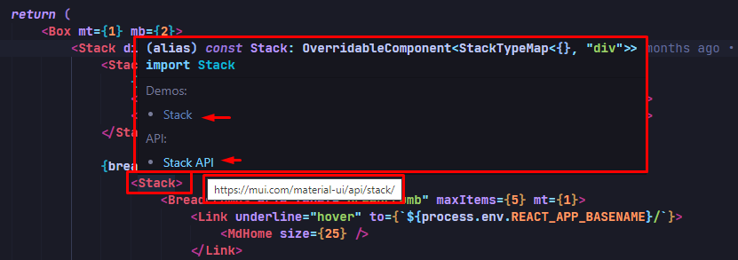
MUI with VSCode
Unfortunately, this feature is absent in Kendo React. We lack a tooltip popup with a direct link to the online Kendo React API documentation. Consequently, it has become challenging for our developers to find examples and access component documentation without manual searches.
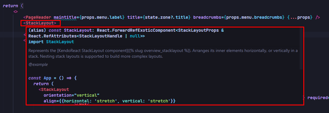
KendoReact with VSCode
We kindly request an enhanced API integration in Kendo React. Adding a tooltip popup with a brief description and clickable link to the online Kendo React API documentation would greatly streamline our workflow, saving us time and improving productivity.
Thank you for your continuous support and commitment to the developer community. We eagerly await your positive response and hope to see this feature included in the Kendo React ecosystem.Best regards,