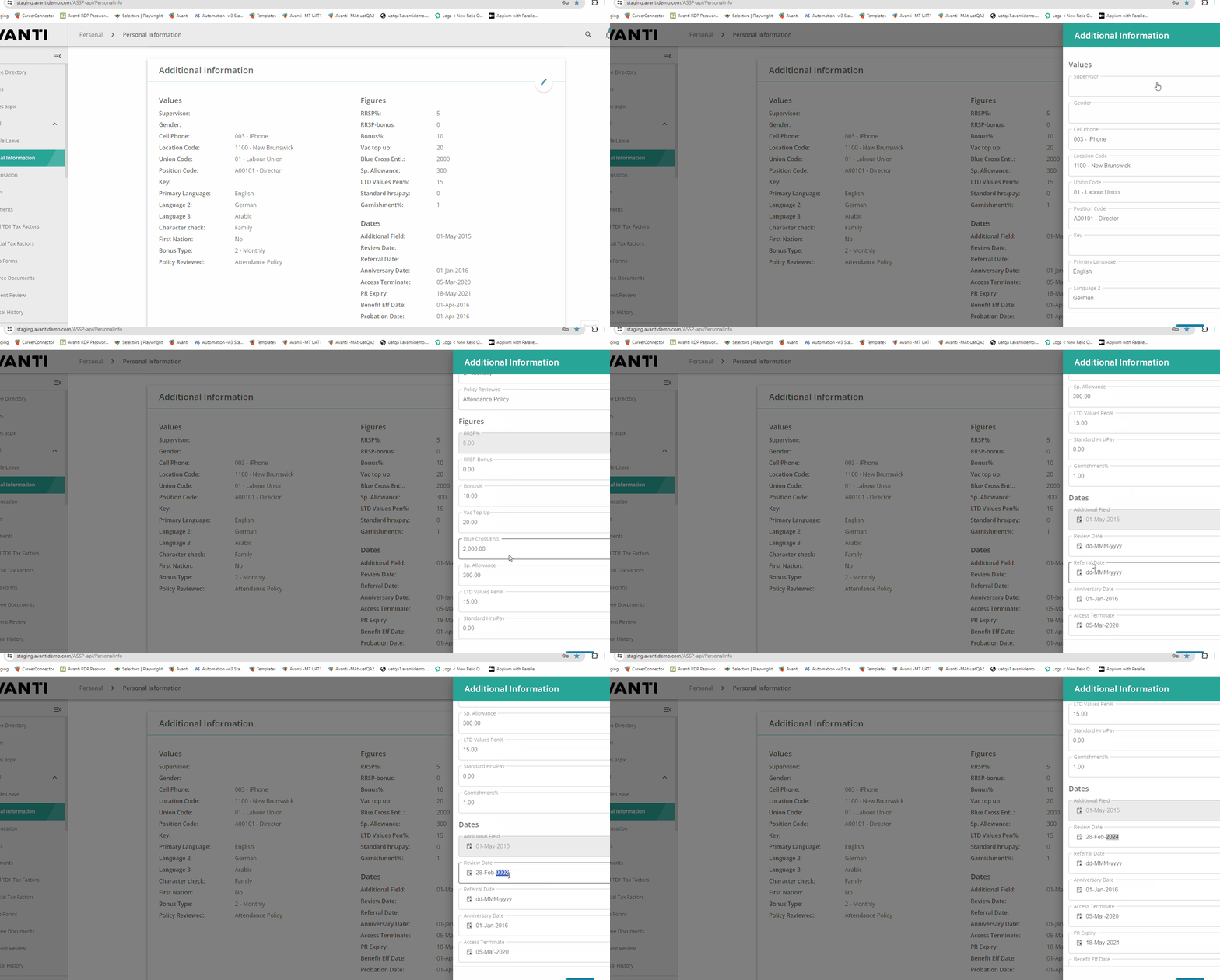
I'm in need of the format Year/WeekOfTheYear/DayOfTheWeek for the date range picker. Ex. 2024/44/3, meaning the year 2024 week 44 day Wednesday.
This is not supported currently, please vote for it's implementation if format support has been an issue for you too.
This is familiar from Windows Explorer or, for example, the various lists in Microsoft Outlook. There should be an option for this behavior in the DataGrid.
Currently this behavior is different in the DataGrid.
- Open URL: React Charts Library & StockChart - StockChart - KendoReact Docs & Demos (telerik.com in Edge browser.
- "Kendo React Stock Chart Overview" chart will appear.
- Navigate to the second chart present under Example using tab key.
- Now verify whether the single Pointer options alternative is provided for adjusting the graph points or not.
Test Environment:
- Open URL: https://www.telerik.com/kendo-react-ui/components/charts/chart/elements/axes/#toc-displaying-time-series
- Kendo React home page will appear.
- Navigate to the "Displaying Time Series" bar graph using tab key.
- Navigate using arrow keys through the chart controls.
- Verify whether the Screen reader is announcing the complete data points information of the "Displaying time Series" bar graph or not.
Hi!
I have noticed that keyboard navigation doesn't work in the filter editor components inside the Filter component
Reproduction:
- Open https://stackblitz.com/edit/react-rvwjsm?file=index.html
- Choose "name" or "price" from the first dropdown
- Type anything in the input field
- Try to change the cursor position in the field using arrow keys - doesn't work
Is there a way to enable it or go around it?
We use the PopOver component to create a menu that is more then just a list of links (i.e. a Jumbo Navigation including images, etc.).
Unfortunately the PopOver has no built-in functionality to automatically close it when the user clicks outside of the PopOver, so this has to be implemented manually.
So the request is to add a parameter to the PopOver component that allows to automatically close the popover when the user clicks outside of it when it's open.
Hello,
We've been using StockChart with Navigator to display a count trend. However, we have an accessibility bug reported on using that component due to single pointer options alternative is not provided for adjusting the graph points. Currently user can only achieve that through dragging. Do we support props that will display input box to resolve this accessibility issue?
MAS reference: https://aka.ms/MAS2.5.7
We are using a customized ChartToolTip with button in our bar chart. However the tab order is not correct for multiple charts. The expect behavior we were told by our accessibility testing team is first chart -> button on tooltip -> second chart -> button on tooltip and so on. The actual behavior is tab shortcut will switch between charts then back to the first chart tooltip element.
MAS Reference:
I have noticed that whenever you want to upload multiple photos at once, using this React Upload Component & Events - KendoReact Docs & Demos (telerik.com) component the previews of the images uploaded bounce/ shake around. I've tried this on multiple browsers and they all have the same bouncing effect for the image previews. For a single photo it doesn't do it but once multiple images are added, it will do it.
Dear sir/madam,
We noticed an error when setting the "defaultShowWorkHours" to false, it still shows the work hours as the default.
Check the Codesandbox
Expected behavior when you set "defaultShowWorkHours" to false, it shows the full day timeline
Hi, Keyboard navigation using "page down" and "page up keys" doesn't work.
Here is a stackblitz where the problem can be reproduced: https://stackblitz.com/edit/react-q9n5fe?file=app%2Fmain.tsx
Reproduction steps:
- Click inside the grid
- Press "Page down" or "Page up" - doesn't work
It only works when:
- Click outside of the grid
- click on vertical scroll bar without selecting any grid cell.
- Press"Page down" or "Page up" - it works.
Best Regards
Hubert
Hello,
We are encountering an issue with duplicate entries in our Kendo Grid with drag & drop functionality. When the grid is scrolled, clicking on any of the header cells multiple times results in the first entry being duplicated. This problem occurs on the example provided on your website as well: Kendo React Grid Row Reordering
Reproduction Steps:
- Scroll down within the grid.
- Click on any header cell multiple times.
- Scroll back to the top of the grid.
You will notice that the first entry is duplicated multiple times. It appears that the reorder logic is being triggered when a header cell is pressed.
We are using version 6.1.0. Please refer to the attached video for a visual representation of the issue.
Thank you for your assistance.
Today this is how a radiobutton is structured.
An improvement would be to nest the input inside the label, so it does what i said above, eg. :
<label>
<input type="checkbox" id="myCheckbox" name="myCheckbox">
Click me to toggle the checkbox
</label>
This would greatly enhance UX and is very common in web development.
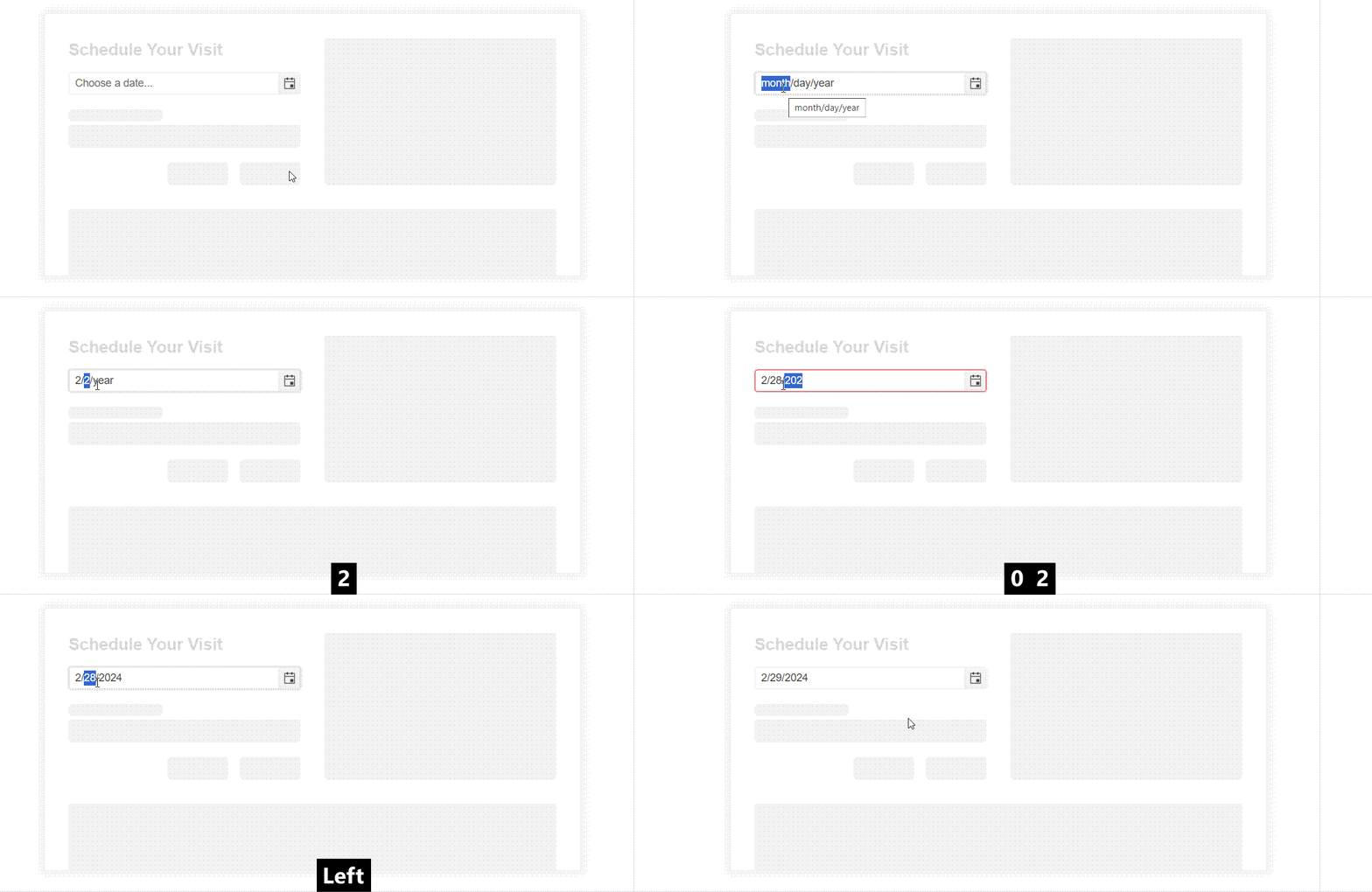
When typing into a date picker and trying to type Feb 29th, 2024 (or any other leap year ofc) the date is updated incorrectly by the kendo date picker validation. As the user types the year their previous entry of 29 is updated to 28. This should update check should probably not occur until the user is done updating the input. If there is some fix or workaround we can do on our end to resolve this issue please let us know
Here's a video of the bug in our application
However, I was also able to reproduce the exact same behavior even in the documentation:


