Hello Team,
I've gone through a requirement like Multicolumn combo box should allow to multiple selection, but it's not available as of now, could you guys please consider it as feature request, MultiColumn should allow multiple selection.
Multiselect with Multicolumn combo box | View Ticket | Your Account
Thanks & Regards -
Revanth
Hi,
I would appreciate if the GridColumnMenuCheckboxFilter will expose an event that can be intercepted when clicking the three dots.
Thank you.
Regards.
As per the subject. This can be observed in the following StackBlitz which is forked from the Telerik documentation on resizing with three small changes:
- Remove style={{ height: '400px' }} from the Grid component in app.tsx
- Remove height: 100%; from my-app style in index.html
- Remove height: 100%; from html, body style in index.html
https://stackblitz.com/edit/react-vajzshwv?file=app%2Fapp.tsx,index.html
Logged as a bug because there is nothing in the documentation stating that a height for the Grid or Grid container must be set in order for this to work. If this is a documentation issue rather than a code issue, please advise the recommended approach for using the Grid resizable property.
Hi Team,
We are using data-grid along with excel export for showing lakhs of data (sometimes over 20 lakhs) in our app and over 80 columns. We found a the TIME TAKEN is over 2.5 mins for over 10 lakhs (rows*cols) data. We have tried the KendoOmxml with kendo saveAs function from file-saver as well.
I have tried with server-side export instead of client-side aslo and still it's the same behavior. In my observation I am suspecting the below line.
component.toDataUrl().then((dataURL) => {Here component is the reference of ExportExcel component. After getting dataURL I am calling save api to download the file. But toDataUrl() function is taking the whole time. Is there any way we can get this base64 dataURL faster?
You can refer to the codeSandbox Link. We have 80 columns(including duplicates), while importing productsSmall.json file which contains 77 rows, export excel is working well and good. But when you change the import to productsLarge.json file which contains 10,000 rows (if cannot be seen, please copy paste the dummy data from attached file with even more usual amount of data we use in our app), the screen is stuck or takes too much time to get process complete and sometimes it throws error(maybe because of codesandbox incapability).
Stackblitz link (if codesandbox hangs more) https://stackblitz.com/edit/react-q5wlpg-4bs2zc?file=app%2Fmain.tsx
We have a large number of customers requesting this feature to be fast. Please let us know with an optimized solution.
Regards,
Manjula
Drag-and-Drop editing is a very usefull and required functionality in a lot of enterprise apps (Move/resize tasks along the timeline, adjust completion percentage, dependencies editing).
We noticed these features are (maybe partially) available in the Kendo Gantt components for (at least) jQuery and Angular.
Are there plans to introduce similar functionality in the KendoReact Gantt component? If so, could you share a timeline for implementation? Or maybe you can suggest some workarounds?
We’d greatly appreciate your insights on this point, as it's critical to our evaluation process.
- Same issue is observed for the below two dialogs.
- Visually appearing heading 'Import Workspace' is not defined as heading programmatically. [Path: Home page-->activate 'Hamburger' menu-->Import workspace--> Popup] (Refer Attachment: Note_1_Visually appearing heading 'Create Workspace' is not defined as heading.png.)
- Visually appearing heading 'Create Workspace' is not defined as heading programmatically. [Path: Home page-->activate 'Hamburger' menu-->Add new workspace--> Popup] (Refer Attachment: Note_2_Visually appearing heading 'Import Workspace' is not defined as heading.mp4).
- Turn on Accessibility insights for web extension.
- Navigate to the headings toggle control and turn it on.
- Open the URL: Agora Home Page (PPE) in latest edge browser.
- 'Agora home page (PPE)' will be displayed.
- Navigate to 'Add a widget' control using tab key and activate it using enter key.
- Navigate to 'Mark down' control in the list displayed using tab key and activate it using enter key.
- 'Create text widget' dialog gets displayed.
- Observe and verify whether visually appearing heading text 'Create Text Widget' is programmatically defined as heading or not.
- Same issue repro on heading 'Workspaces & Dashboards' [appears on Home --> Header--> Hamburger menu--> Popup] (Refer Attachment: Note_1_Same issue repro on heading 'Workspaces & Dashboards'..mp4).
- Heading hierarchy is not sequential in the Home page.
- Turn on Accessibility insights for web extension.
- Navigate to the headings toggle control and turn it on.
- Open the URL: Agora Home Page (PPE) in latest edge browser.
- 'Agora home page (PPE)' will be displayed.
- Navigate to 'Hamburger' menu control using tab key and activate it using enter key.
- 'Workspace and dashboards' popup will be displayed.
- Navigate to 'Add dashboard' control in the list displayed using tab key and activate it using enter key.
- 'Create Dashboard' dialog gets displayed.
- Observe and verify whether visually appearing heading text 'Create Dashboard' in the dialog is not programmatically defined as heading or not.
- This issue is observed with all three screen readers.
- Same issue is observed in chrome browser as well.
- Name is not properly defined for once control. Screen reader is narrating the name twice for the once control as "Once check box not checked report frequency: once"
Path: Home > Header > Reports > Schedule a report button > Schedule a Report pop-up.
Refer Attachment: Name is not properly defined for once control.png
- Turn on Screen Readers:
- Narrator: Win + Shift + Enter
- NVDA: Ctrl + Alt + N
- JAWS: Ctrl + Alt + J
- Verbosity:
- Narrator: Default
- JAWS: Beginner, Highest
- NVDA: Default
- Open the URL: Agora Home Page (PPE) in latest edge browser.
- Press tab key to move to the 'Alerts' control present in the page and activate it using enter key.
- 'Alert Definitions' page gets displayed.
- Press tab key to move to the 'Functions? Filter' control and activate it using 'Enter key'.
- Navigate through the radio buttons in the displayed popup using arrow keys and verify whether screen reader is announcing incorrect name for the radio buttons present in the filter dropdown in windows or not.
- This issue is observed with all three screen readers.
- Same issue is observed in chrome browser as well.
- Turn on Screen Readers:
- Narrator: Win + Shift + Enter
- NVDA: Ctrl + Alt + N
- JAWS: Ctrl + Alt + J
- Verbosity:
- Narrator: Default
- JAWS: Beginner, Highest
- NVDA: Default
- Open the URL: Agora Home Page (PPE) in latest edge browser.
- Press tab key to move to the 'Save as' control present in the page and activate it using enter key.
- Save as dialog gets displayed.
- Press tab key to move to the 'workspace to be saved as in' edit field and activate it using 'Alt + down arrow key'.
- Enter any invalid data in the search edit field.
- Now Verify whether screen reader is announcing the search result information on giving invalid data in the search edit field in windows or not.
Hi Team,
I am writing to inquire about modifying the default behaviour of the Kendo UI Menu component. The sub-menu items are displayed when hovering over the parent menu item. However, I require the sub-menu items to be visible only when the parent menu item is clicked.
Desired Behavior:
Sub-menu items should remain hidden by default.
Clicking on the parent menu item should expand the sub-menu and display the child items.
Clicking on another parent menu item should collapse the previously expanded sub-menu and expand the new one.
Implementation Challenges:
I have explored the Kendo UI documentation and API, but I am unable to find a direct configuration option to achieve this desired behaviour.
Could you please provide guidance on how to modify the Kendo UI Menu component to display sub-menu items only on click of the parent menu item?
Please let me know if you require any further information or if there are any examples available that demonstrate this functionality.
Reference URL - https://stackblitz.com/edit/react-zugkrezk?file=app%2Fapp.jsx,app%2Fapp.css
Reference Ticket - https://www.telerik.com/account/support-center/view-ticket/1679073
Thank you for your time and assistance.
Mahesh
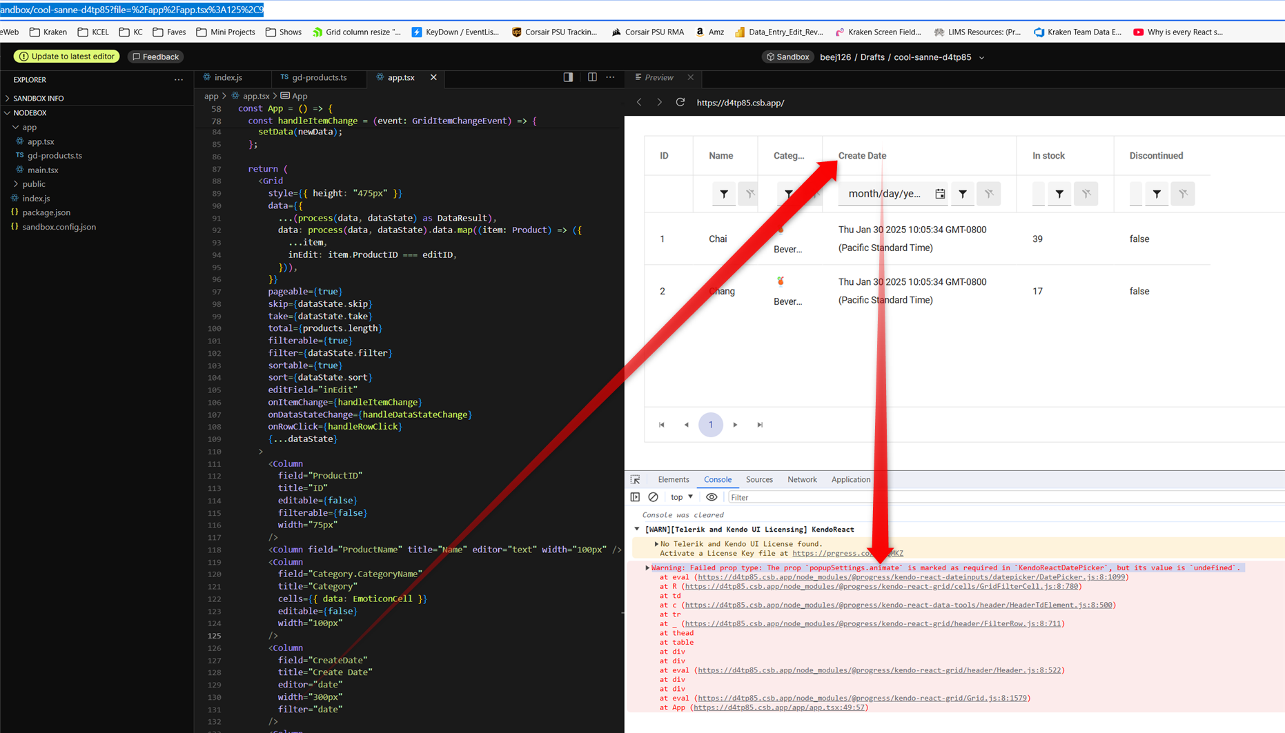
in latest v9.3.1 it appears GridFilterCell isn't passing properties shaped as 'isRequired' on DatePicker popupSettings
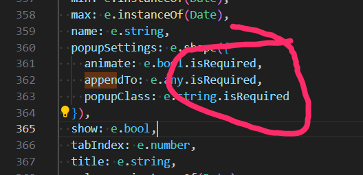
this does seem to be a regression because i just recently noticed it in latest upgrade which we need for other bug fixes.
i pursued patching myself by populating animate in GridFilterCell.mjs which seemed to work but then i got warning for the next required property "appendTo". however, populating appendTo yields warning "Warning: Failed prop type: Invalid prop `appendTo` supplied to `Kendo React Popup`. Validation failed." so it's not easily reconcilable that way... therefore i tried removing isRequired on all 3 DatePicker popupSettings properties which of course avoided warnings and i didn't see any negative side effects.
here is a codesandbox repro minimally tweaked to include a date field from kendo grid's "getting started" demo: https://codesandbox.io/p/sandbox/cool-sanne-d4tp85
admittedly this is just a warning but it does create unnecessary noise in browser debug which detracts from issues truly requiring attention during development.
screenshot with the warning from that demo repro:
there seems to be an issue when changing the value of a DateTimePicker from null to a Date object and the specified format includes seconds.
Reproduction:
1. Open https://stackblitz.com/edit/react-hnfuerwc?file=app%2Fapp.tsx
2. Choose a value from the DateTimePicker
Actual Behaviour
The chosen value does not show up in the input box. Works OK in 8.5.0
Expected Behaviour
The chosen value should appear in the input box
Browser
Chrome, version 131.0.6778.205
OS
Windows 11
here's a simple repro project minimally tweaked from an original kendo demo:
https://codesandbox.io/p/sandbox/suspicious-lovelace-8nmzgj?file=%2Fpackage.json
just start dragging a column resize handle and you should see the "jitter" right away. in our experience, the jitter is so pronounced that resizing columns is no longer practically usable.
please note this bug is definitely related to putting the kendo grid inside of a css-grid, see that definition in the parent <div style>
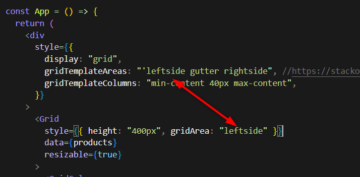
as you may imagine, we use css-grid for our overall page layout which i believe is still modern best practice and we really hope you can fix this regression within that usage context.
note, the bug manifests regardless of the gridTemplateAreas or gridTemplateColumns, you can eliminate those entirely and it's still present.
It would be ideal if toODataString could take an additional parameter that:
- Takes a collection of expressions,
- Each expression takes an Operator and Value,
- Each expression returns a string or undefined, where the latter suggests we wish to suppress this expression.
Hello! Is it possible to not show a room if there is no meeting on that day while simultaneously showing it on a different person because they have a meeting on that day? In the image below, I edited the data so Peter no longer had a meeting in room 2. Is it possible to get it to show Peter with just the meeting room(s) that they has data for, while keeping Alex with all the rooms that they have data for?
Peter -> Meeting Room 1
Alex -> Meeting Room 1 AND Meeting Room 2
I think this would be a great feature to have. Lets say I have 100 students and/or 100 meeting rooms and all have a different days/times when they are needed. If there was a way to show ONLY what is being booked, or show ONLY what is free, that would be a fantastic feature for users and developers alike.
https://stackblitz.com/edit/react-fuflvh-dwgfvu?file=app%2Fapp.tsx
A json-file is needed to use localization in Kendo React. It's a lot of work to maintain these files when there are new versions. It's difficult to know which keys have been added, changed or removed.
Another better way might be that you collect the translation for different languages and let us download them. That way you can also keep them up to date.