The Tooltip component has a className property. Providing a class name there does not seem to apply the class to the DOM element. See my below code and attached screenshot ...
            <div className="col">
              <label className="d-block">Name</label>
              <Input value={name} required={true} onChange={handleNameChange} />
              <Tooltip className="d-inline">
                <i className="k-icon k-i-info" title="The name of the Taxonomy" />
              </Tooltip>
            </div>
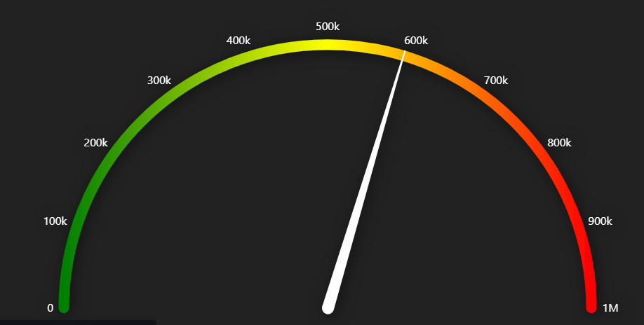
I am trying to create a radial gauge with gradient fill but I don't see any help regarding this. Please see the below image of what actually I am looking for.
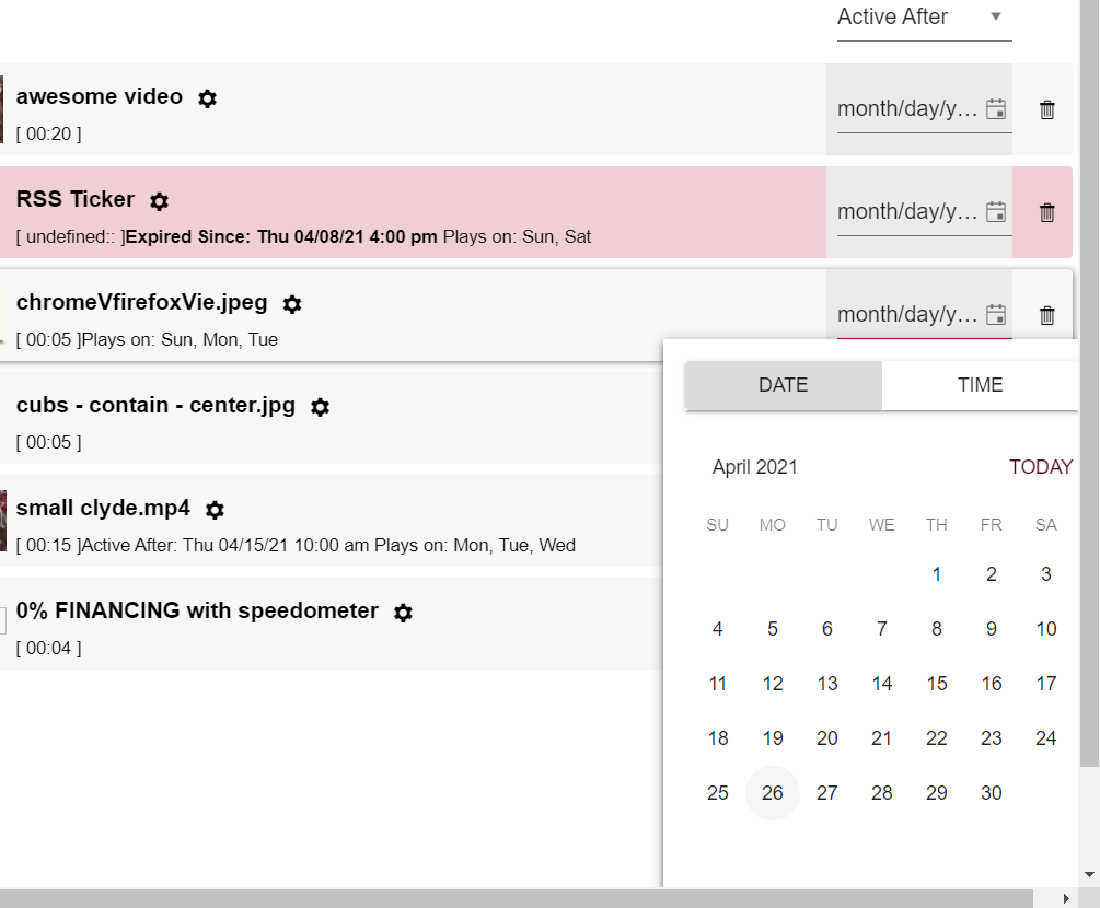
DateTimePicker opens above or below the link to open it, however when it's in the middle of a page, it will choose to open below and sometimes require scrolling to see all the buttons.
Would be better, if it were to open offscreen, it should be "pinned" to the bottom edge. Same for right/left/top borders of the screen.
Certain containers also make it impossible to scroll down to see the buttons, so that creates a real problem. The above proposal would fix this.
using fairly vanilla implementation of the component:
<DateTimePicker
      defaultValue={new Date(ActivationDate.toString())}
      onChange={handleActivationChange}
      width={'8rem'}
/>Step by step instructions on how to reproduce the problem
Try entering a negative value in the filter column using the StackBlitz example here https://stackblitz.com/edit/react-dx7cna?file=app/main.jsx
This works using "ES" as locale (your example) https://stackblitz.com/run/?file=app/main.jsx
Github issue here https://github.com/telerik/kendo-react/issues/897
The event parameters should be similar to the onSeriesClick event
Description:
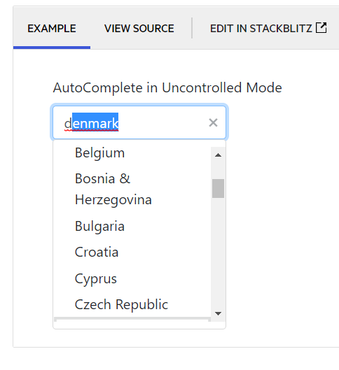
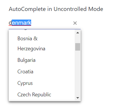
When typing into a React autocomplete with the "suggest" prop, the component does not always display the suggestion in the dropdown. It appears that in Chrome, only the very top of the suggestion is visible in the dropdown, while in Edge, it isn't at all.
Reproduction Steps:
- Navigate to https://www.telerik.com/kendo-react-ui/components/dropdowns/autocomplete/suggestions/
- Type "d" into the AutoComplete in Uncontrolled Mode example
Browser:
- Chrome -- Version 89.0.4389.114 (Official Build) (64-bit)
- Edge -- Version 89.0.774.68 (Official build) (64-bit)
Expected Behavior:
- The suggestion is fully visible in the dropdown
Observed Behavior:
- The suggestion is either not visible, or only partially visible
Screenshots:
Chrome:
Edge:
Hi,
Currently, we're facing a performance issue in react scheduler, when it has more grouping items(i.e. browser hangs indefinitely). I'm requesting the feature based on the below ticket
https://www.telerik.com/account/support-tickets/view-ticket/1513927
Description:
When the NumericTextBox is set to "c0" format and has a value of 0 ($0), it doesn't capture the first digit entered.
Reproduction Steps:
- Set the field value to 0 ($0)
- Hit "Tab" to blur the field
- Hit "Shift-Tab" to focus the field (field contents will be highlighted)
- Enter "123"
- Repeat steps 2 through 4
Browser:
Chrome -- Version 89.0.4389.114 (Official Build) (64-bit)
Expected Behavior:
- After step 4, field shows "$123"
- After step 5, field shows "$123"
Observed Behavior:
- After step 4, the field shows "$230"
- After step 5, the field (correctly) shows "$123"
Notes:
- This bug seems to occur when the field has a value of 0 ($0) before gaining focus
- This doesn't occur when the specified format is "c2" or "n0"
Code Snippet:
<NumericTextBox format="c0" />Similar to how a series is highlighted when clicked, the category can also be highlighted when the bar/column on that category is clicked.
This component purpose is similar to the GitHub commits graph:

Hi Team,
We are trying to implement infinite scrolling for server data to our combobox based on virtual.
Do you have any event in combobox to handle on scroll.
Please help us with any examples you have on this topic. preferably using hooks.
This has to be similar to what we have in Kendo UI for jQuery:
https://demos.telerik.com/kendo-ui/dropdowntree/checkboxes


