Hi Team,
I would like request adding automatic line breaks for Kendo UI Charts to help avoid lengthy labels.
Thanks!
Hi Team,
I would like to request a way to set the color/type of a series so if it makes a condition, the color/type would change. For example, if the series count reaches a certain amount, change the color of the line, and the type to dash. Perhaps setting the Series.Line.Color as a function would be great.
Thank you!
Hi Team,
Currently, the Kendo UI Chart's legend labels and Drawing API offers font property, which includes style, size and family only, as described in CSS documentation. Needs underline and strikethrough, which are considered "decorations" on the font in CSS, but seems like since these attributes exist already in editor, the code is around there somewhere. Would like to see either font include support for those attributes or another "decorations" attribution (or maybe underline attribute and strikethrough attributes if that's easier for people to understand).
Thank you!
In the Kendo UI Chart Widget, if labels are too close to each other, they end up overlapping, making the labels unreadable (as visible in the attached screenshot), thus rendering the widget unusable.
It would be really useful to have implemented a feature similar to Smart Labels (included in the WPF version and also documented in the attached screenshot)
Hi,

For example, if you look at this chart in 10 days zoom view, you will notice they skip the weekends, means, they are not drawing empty data points for weekends. It is normal requirements for candle charts in stock market.

https://mbshighway.com/features/interactive-charts
In Excel, there is an option for Sparkline to set a marker for the highest point, lowest point, first point, last point, and negative point.
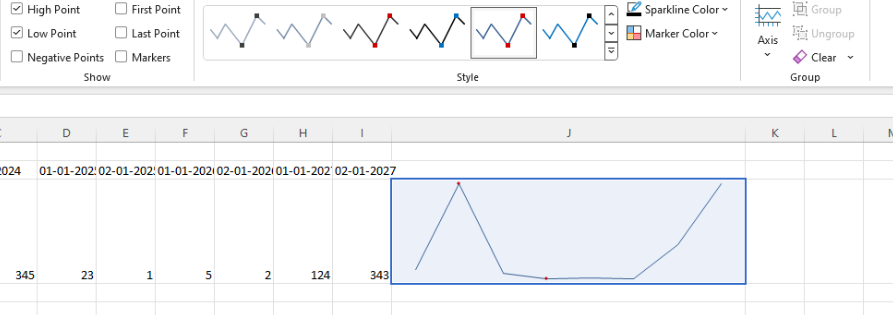
I know that it is possible to customize the appearance of the markers using the markers.visual. However, I would like to have the option as a built-in configuration to ensure better performance.
Currently each of the labels for the:
- Axises
- Legend
- Tooltip
- Chart Title
Provide their own "font" property setting. However, it would be beneficial if there is a default configuration that can apply a font for each of the aforementioned Chart Label compartments.
Several forum posts have mentioned that the best way to customize a legend is to hide Kendo's and make our own. I would be so great if we could just customize the legend similarly to most other areas of the chart that can be customized.
Hi Team,
I would like to request the functionality to plot a chart with panes side-by-side instead of only top to bottom.
Thank you!
We already have click events for the plot area, axis labels, etc., but a click event for the chart title is conspicuously absent.

I have received development requests that would require this, but currently have no available workaround to allow it.
Hi Team,
I would like to request the Kendo UI Chart to be able to use the defined culture for localization. Currently in my application, the date is showing as English formatting(1/30) instead of German(30.1) unless I specify the categoryAxis.labels.dateFormats configuration as seen in this Dojo.
Maybe include a culture property like the theme property?
Thank you for the consideration!
The Kendo Chart supports the baseUnit: "fit" property that displays as many categories as possible. This is useful when there are thousands of data points across many years.
When the data is "fit", the last date may not be displayed(because of the aggregation). I want to have the ability to display the last data point and date(category) as standalone and not a part of the aggregate.
Hi Team,
I'd like to request the CategoryAxis.Justified property be supported for other series types of the Kendo UI Chart. In my case, this would be beneficial since I have a combination of a line and box plot Kendo UI Chart.
Thank you!
Hi Team,
I'd like to request an easy, built-in way in which a user can split grouped data of a Kendo UI Chart by a specific datafield. For example, let's say I have 2 groups, and each had their own series to be utilized. But those series would have their own series by another dataField. I'd like to show the root group, but display the child series.
Thank you!
Hi Team,
I'd like to request the functionality to add positioning and alignment to the Kendo UI Chart's API for the Tooltip.
For example, I have a 100% stacked chart. Having the tooltip aligned all the way to the right instead of being able to anchor it to the middle of the data just feels weird for our purposes. I was hoping to inquire if there was another way that I may be missing to align the tooltip nicely.
Thank you!
Hi Team,
I would like to request the functionality to be able to align a Kendo UI Chart (such as a column chart) with a Kendo UI Grid. This would used when resizing components to allow for the appearance to match.
Thank you!
Hi Team,
I would like to request the CategoryAxis to be sortable for the user to manipulate.
Thank you!
There are a few bits that Telerik cant do at the moment, such as colour above the target line.
It would be nice to have a how-to section on migration and development.
Thanks
Doug
Would it be possible to change the position of the navigator ?

It would be nice to be able to choose between top and bottom.