The problem can be seen in the following Dojo:
https://dojo.telerik.com/uQeduJAG
When the Donut Chart has a section with value = 0, the color of that point is displayed inside the donut.
We are using asp mvc, but the but it is completely reproduceable with only jquery as shown in the file attached.
When using a scatter chart with a date axis any zooming with the mouse wheel will crash most if not all browsers.
At the very least current versions of chrome (97.0.4692.99), firefox (96.0.1) and edge (97.0.1072.62).
Hi Team,
I'd like to request the CategoryAxis.Justified property be supported for other series types of the Kendo UI Chart. In my case, this would be beneficial since I have a combination of a line and box plot Kendo UI Chart.
Thank you!
Hi Team,
I'd like to request an easy, built-in way in which a user can split grouped data of a Kendo UI Chart by a specific datafield. For example, let's say I have 2 groups, and each had their own series to be utilized. But those series would have their own series by another dataField. I'd like to show the root group, but display the child series.
Thank you!
Hi Team,
I'd like to request the functionality to add positioning and alignment to the Kendo UI Chart's API for the Tooltip.
For example, I have a 100% stacked chart. Having the tooltip aligned all the way to the right instead of being able to anchor it to the middle of the data just feels weird for our purposes. I was hoping to inquire if there was another way that I may be missing to align the tooltip nicely.
Thank you!
Hi Team,
I would like to request the functionality to be able to align a Kendo UI Chart (such as a column chart) with a Kendo UI Grid. This would used when resizing components to allow for the appearance to match.
Thank you!
Hi,
When creating a stacked bar chart in KendoUI 2020.3.915 I noticed the following rendering error:
In case one of the categories is much higher than the other, the x-axis will start at a value other than zero.
This behavior might be desired to zoom in on the exact values.
The issue here is that the steps on the x-axis might repeat multiple times for the same x-value.
(96%, 96%, 97%, 97%, 98%, 98%...)
This increases with a bigger difference between the chart values.
I created a example and it happens even in the latest version:
https://dojo.telerik.com/AVeVuZig
Hi Team,
I would like to request the CategoryAxis to be sortable for the user to manipulate.
Thank you!
There are a few bits that Telerik cant do at the moment, such as colour above the target line.
It would be nice to have a how-to section on migration and development.
Thanks
Doug
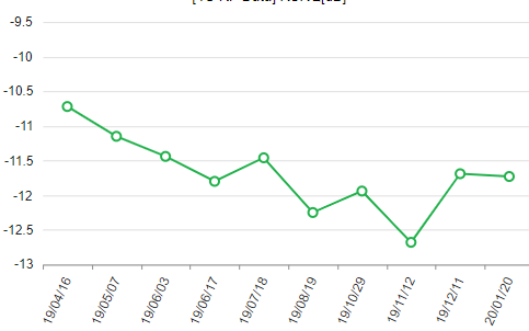
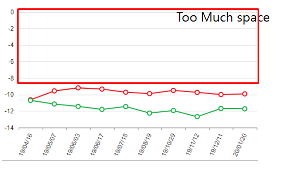
When the data values are all negative, if you create a line graph using kendo chart function, Autoscale on the Y axis is not applied properly. Please check if there is any possible solution.
The two attached figures are normally auto scaled, but the charts that combine the two graphs are not auotoscale normal.
Chart1
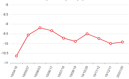
Chart2
issue chart
When I create a chart with multiple axis, if an axis has negative values and others don't, the zero is wrong positioned on the Y axis with negative values. Currently it can only be positioned manually with min and max values. It would be great a new option to do it automatically. Example: http://dojo.telerik.com/IYavE
Update your stock chart with Financial indicators, like SMA, EMA, VWAP and many more. These indicators are useful in trading analysis.
It'd be useful to have more things built into DataViz to allow for keyboard accessibility and screenreader usage of the charts.
Your silverlight Timebar is Briliant.

I suggest you implement something like that(maybe a litle less complex) in KendoUI.
Would it be possible to change the position of the navigator ?

It would be nice to be able to choose between top and bottom.
allow zooming on both axes separately and together
ex. scroll over chart - zoom both axes (unless any of axes locked)
      scroll/drag category axis - Y axis locked zoom
      scroll/drag value axis - X axis locked zoom

Zoom to default - dblclick on chart.. or button or whatever
I would like to be able to see each of the y-axis values plotted along, for example, each of the values of a line or stacked chart, at all times.
It would be nice be able to have a "broken" value axis on charts. Particularly bar charts, but it may apply to others.

Something to this effect: http://peltiertech.com/images/2011-11/Ybroken.png
Hi,
What I am looking for is a "better" way of carrying out the manual calculation for label skipping:
http://www.telerik.com/forums/how-to-access-charts-(chartarea)-width-to-calculate-labels-step(x)

Preference would be similar functionality to the categoryAxis itself (autoBaseUnitSteps/baseUnitStep/maxDateGroups) but it would only affect the labelling without aggregating the data.

Assuming similar functionality to CategoryAxis using a step of "auto" the maxDateGroups should also have an "auto" setting that would adjust the max groups so that the labels never overlap.

Thanks