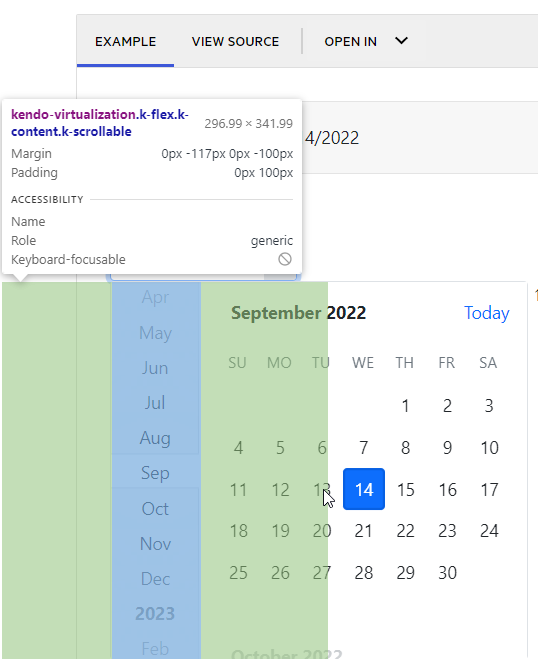
when someone clicks on a date in the middle of the component, it will scroll the component instead of selecting the date.
This occurs in chrome and edge. In firefox this issue is not observed.
Steps:
1. Open a datepicker (https://www.telerik.com/kendo-angular-ui/components/dateinputs/datepicker/)
2. Hover over tuesday (bootstrap theme), between tuesday and wednesday in default theme.
3. Click on the date.
4. The component scrolls instead of selecting the date.
The cursor also changes from pointer to default. It seems another component is on top of the tuesday column.
I found a bug in your last update in this package:
https://www.npmjs.com/package/@progress/kendo-angular-dialog
The bug causes the modal not to show up.
In this bug you need to allways start the HTML files with the tag <kendo-dialog> and end the files </kendo-dialog> to fix the problem, which did not happen in previous versions of the package.
This bug is an issue because not even your tutorials work because of this.
Will you fix this?
Best regards André Lourenço
I am trying to access the documentation for Kendo UI for Angular and I am getting a redirect error in the browser (Chrome and Firefox), specific to the Kendo Grid documentation for filtering:
https://www.telerik.com/kendo-angular-ui/components/grid/data-operations/filtering/
On a feedback portal search and paging is not working.
Open feedback portal and enter search criteria with more then five item. example
When you want to view result for second page, search is not preserved (it is empty).
https://stackblitz.com/edit/angular-niog8n-eldomz?file=app%2Fapp.component.ts
Recurrency "End On" date in datepicker is different with RecurrencyRule's one.
Steps to reproduce:
open series from the example, set Recurrency's End selector to date option, set date to Sep 9th.
Actual result: recurrency rule contains UNTIL=20200910T000000Z.
Save and open series again: recurrency's End date is now Sep 10th.
Changing it to Sep 9th and saving brings no changes.
I very recently tried to update kendo UI to the latest version (from kendo-default-theme 4.23.0 to latest), and ran into a lot of problems, caused by the fact that I don't use the precompiled css theme styles. (removing the "node_modules/@progress/kendo-theme-default/dist/all.css" from the styles array in angular.json)
It is very opaque which styles needs to be imported for which module, and in what order they to be imported, since that seems to matter too.
Especially because there are no documentation for this at all.
For example, to get the styles for the new kendo-textbox component, the following needs to be imported in the styles.scss, AND in that specific order.
button needs to be first, and forms has to be before textbox and input
@import '~@progress/kendo-theme-default/scss/button/_index.scss';
@import '~@progress/kendo-theme-default/scss/forms/_index.scss';
@import '~@progress/kendo-theme-default/scss/textbox/_index.scss';
@import '~@progress/kendo-theme-default/scss/input/_index.scss';
which means that none of the following will compile:
@import '~@progress/kendo-theme-default/scss/forms/_index.scss';
@import '~@progress/kendo-theme-default/scss/button/_index.scss';
@import '~@progress/kendo-theme-default/scss/input/_index.scss';
@import '~@progress/kendo-theme-default/scss/textbox/_index.scss';
@import '~@progress/kendo-theme-default/scss/button/_index.scss';
@import '~@progress/kendo-theme-default/scss/input/_index.scss';
@import '~@progress/kendo-theme-default/scss/forms/_index.scss';
@import '~@progress/kendo-theme-default/scss/textbox/_index.scss';
As i see it there are two reasonable ways to solve this, where the first obviously results in the best user experience:
- Refactor the styles "modules" to be 1:1 with either the angular module or the specific component, so using one module/component results in a single SCSS import only
- Create documentation that very explicitly states what files to import and in what order they need to be imported when using compiled SCSS
Hi All,
Anyone can help us to figure it out?
Currently, We are using Angular Kendo Gird package, and got issue for tooltip message for Gird.
When We mouse move over 3 dots for grid column menu, we would get strange tooltip message, for details , please check it from attachment.
My Email:liji.tao@teranet.ca
Thanks
Liji
We are upgrading from @progress/kendo-angular-grid 4.8.0 to 7.4.2 and are running into an issue where a `kendo-grid-command-column` on a non-reorderable single column-sortable grid has gained the `pointer: cursor` CSS style where it did not previously.
The kendo documentation also shows this behavior, implying clicking on the command column header will do something when it will not, unlike the other columns. https://www.telerik.com/kendo-angular-ui/components/grid/editing/inline-editing/#toc-using-reactive-forms
kendo-angular-grid 4.8.0:
kendo-angular-grid 7.4.2:
When setting the [zoom] value in TypeScript the drop down value does not reflect this and remains at the default of 125% even though the PDF is zoomed in/out.
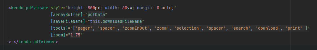
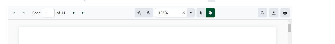
Adjusting the zoom level using the buttons then "corrects" the issue and it displays the right value.
https://stackblitz.com/edit/angular-mqywpa?file=src%2Fapp%2Fupload.component.ts
When using kendoTooltip directive on the upload component - tooltips are positioned in invalid position somewhere on the app.
cancel, delete, retry tooltips.
Dear Kendo-Supportteam,
We are experiencing an issue with the Editor component.
It turns out that setting the iframe input to false causes the paste event to be triggered twice.
Once as documented before the valueChange event and once seemingly as the native paste event after valueChange.
There are multiple issues resulting from this.
- Calling preventDefault on the initial event also does NOT prevent the native event from triggering directly after. Only the following events from the Editor itself are prevented.
- As the next event is the actual native event of type ClipboardEvent, the interface is different from what the type definitions suggest. Leading to errors, if the attached method tries to just call isDefaultPrevented on the event.
It is quite easy to reproduce this from your event demonstration examples by just setting the iframe input to false and maybe also trying to call isDefaultPrevented in the respective paste event handler.
Kind Regards,
Hannah
When virtual is true for a multiselect and checkboxes are set to true, there is a bug which results in multiple items being selected.
To reproduce, one needs to scroll down a long list of items. The amount to scroll seems random but might have something to do with the itemHeight setting. When clicking directly inside the checkbox, two items are selected at once - the item selected, and one other seemingly random item. This does not happen if the click selection event happens inside the item, but not the checkbox.
I have reproduced this inside this code sandbox: https://codesandbox.io/p/sandbox/mystifying-shirley-2qxn32
When both virtual scrolling and grouping are enabled via the kendoGridGroupBinding directive, and the Grid is navigable, focus is trapped in the header row when down or up arrow is pressed:
https://stackblitz.com/edit/angular-icxejq?file=app/app.component.ts
Focus any content cell
Press up/down - focus goes to the header cell of the respective column and is trapped in the header row
The example does not work:
https://www.telerik.com/kendo-angular-ui/components/tooltip/how-to/show-grid-cells-content/
I want to filter the scheduler data but I had to add the OwnerId property to the node package interface in order to be able to do so... yet the sample data provided in the examples does include the ownerId, so im guessing all that needs to be done is to add it to the interface.
Hi,
We encountered a problem when using kendo-sortable component in IE11. If we use this component anywhere on the page, all input fields on the page become unclickable. It seems to happen in the last version of this control (maybe because of a global click event listener? )
Hope you can help with this issue.
You can check out the following Stackblitz example which is based on your basic usage example: https://angular-t7vi5k.stackblitz.io/
Thanks in advance and happy holidays,
Shai Aharoni
https://angular-dxhzju.stackblitz.io
a. In "Show business hours" mode open event creating dialog and set start-end time that is outside of business hours specified, e.g. 07.00-07.30 when business hours are 08.00-20.00.
b. Press Save buttom.
c. Switch to "Show full day" mode.
Actual result - event is not shown.
Event appears only after, e.g. , pressing next arrow button and then pressing back arrow button.
https://stackblitz.com/edit/angular-dxhzju
1. Change scheduler timezone in combobox
2. Change view selector to "Month", for example.
Result: provided colors from resources aren't appied anymore.
Hello,
Currently, the kendo theme for bootstrap overrides the default bootstrap custom component styles.
For example, the kendo checkbox has a default #FFF background but the bootstrap custom checkbox has a grey-ish background, which is always the same as the disabled style.
$custom-control-indicator-bg <--- this should be #FFF
Could this be changed back to the default bootstrap values?
Kendo version :
@progress/kendo-angular-buttons: 5.4.1
How to reproduce :
- Add a kendo dropdown button with some items
- Use appendTo='component' popupSetting
- Bind itemClick and close events
Stackblitz example : https://stackblitz.com/edit/kendo-dropdownbuttons-keyboardnavigation?file=app/app.component.ts
What happens :
- If you use arrows to navigate through items, is always skip one item.
- If you use enter or space to select item, the popup close and reopen immediately.
- If you prevent close as in the stackblitz example : enter and space will fire twice the itemClick event.