Hi Team
It would be very helpful if Grid allow to prevent focus on cell out-of-box, at the moment, we have to handle focusin event then set focus to other cell, however when using navigation keys or shortcut key, we need to handle differently depend on which cell should be focus next.
Hello Telerik,
We have implemented a custom reusable filter cell component similar to the example of the multi-select checkbox example from the docs. The difficulty using that example however, is that when the filter is updated, the other filters in the grid are removed due to the use of filterservice.filter. Because the CompositeFilterDescriptor can contain both filters and composite filters, why does the base filter cell component's base methods not allow a CompositeFilterDescriptor to be provided to the UpdateFilter method?
    protected filterByField(field: string): FilterDescriptor;
    protected filtersByField(field: string): FilterDescriptor[];
    protected removeFilter(field: string): CompositeFilterDescriptor;
    protected updateFilter(filter: FilterDescriptor): CompositeFilterDescriptor;
    protected applyFilter(filter: CompositeFilterDescriptor): void;
Our method for implementing the multi-checkbox filter cell was to build a composite filter using 'Or' logic and each selected value added as a filter descriptor with operator 'eq' and the selected item value as the value of the filter, and use a similar strategy as the base filter cell component to add this composite filter to the filter service's composite filter.
  private getSelectedFilters(values: Item[]): CompositeFilterDescriptor {
    const selected: FilterDescriptor[] = values.map((value) => {
      return {
        field: this.field,
        operator: 'eq',
        value: value.value,
      };
    });
    return {
      filters: selected,
      logic: 'or',
    };
  }

  public onChange(values: Item[]): void {
    this.selectedValues = values;
    const root = this.filter || {
      filters: [],
      logic: 'and',
    };
    this.removeFilter(this.field);

    if (values !== null && values.length !== 0) {
      root.filters.push(this.getSelectedFilters(values));
    }
    this.filterService.filter(root);
  }
If the base filter cell component allowed the CompositeFilterDescriptor type or the FilterDescriptor type in the updateFilters method, we could simplify the logic in our filter cell component to be similar to the patterns shown in the drop-down list filter component example, as shown below, but with a composite filter descriptor such as the one generated by the above getSelectedFilters function.
this.applyFilter(
      value === null // if value of the default item
        ? this.removeFilter(this.valueField) // remove the filter
        : this.updateFilter({
            // otherwise add/modify the filter for the field with the value
            field: this.valueField,
            operator: 'eq',
            value,
          })
    ); // and update the root filter
I think this would be a beneficial addition to the Kendo Angular2 product, as it would enable many more reusable filter components to be created more easily and also simplify/ enhance some of the existing examples you provide. If you would like more information or the full multiselect-filter component, I would be happy to supply it.
Thank you!
Can you add "extra" field to FilterableSettings to allow the user to set extra globally for all columns in a grid?
https://www.telerik.com/kendo-angular-ui/components/grid/api/FilterableSettings/
Currently, if I want to set extra to false for a column, I need to do something like this:
<kendo-grid-column field="ProductName" title="Product Name">
   <ng-template kendoGridFilterMenuTemplate let-filter let-column="column" let-filterService="filterService">
     <kendo-grid-string-filter-menu [extra]="false" [column]="column" [filter]="filter" [filterService]="filterService">
     </kendo-grid-string-filter-menu>
   </ng-template>
</kendo-grid-column>
But it would be simpler if we can do filterable:{extra:false} just like Kendo UI for jQuery. https://docs.telerik.com/kendo-ui/api/javascript/ui/grid/configuration/filterable.extra
Hello,
You have this jQuery example: Binding to Kinvey Backend Services. Do you have a similar example for Angular? I cannot find one.
Thank you.
Basically whats described in this issue right here: https://github.com/telerik/kendo-angular/issues/2093
It would be nice if column group visibility could be toggleable via the column chooser.
If not, a more elegant workaround would be to indicate in the column chooser that certain columns are part of column groups. The way it is now is too clunky and unclear.
For example, I have the following column groups:
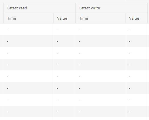
But the above columns show up in the column chooser like so:

It would be nice if the column group name was at least prepended to child columns in the column chooser to at least indicate that it's part of a group. For example, it would show as follows instead:
[x] Latest read - Time
[x] Latest read - Value
[x] Latest write - Time
[x] Latest write - Value
Thanks so much.
Our application uses grouped grids but doesn’t use the built-in collapse feature. We instead hide the collapse arrow to disable the option. This leaves an empty space to the left of the parent grid label (where the collapse arrow would normally sit) and an empty column on the left side of all child grids. We’re looking for a more “official” and supported way of achieving the effect that removing ‘[group]=“groups”’ currently achieves. We’d like to minimize the amount of nonstandard code we’re introducing to our Kendo implementation as well as minimize unintended consequences of altering the grid code.
Checkbox multiple selection allows selecting ranges with Shift modifier
https://docs.telerik.com/devtools/wpf/controls/radgridview/features/search-as-you-type
But when virtual scrolling is enabled, pagination does not work with actual "pages" in terms of `skip` always being a multiple of `pageSize`. Instead, it relies on the `skip` and `take/pageSize` numbers to determine the next portion of data (it does not match with fixed ranges like 1-100, 101-200, etc., being "page1", "page2"...). This makes it hard to use virtual scrolling in combination with ASP.NET Core API, as there is no helper method that is compatible with the virtual scrolling mechanism.
The developer needs to use regular paging, or pass the `skip` and `take` properties in raw format to the server and create custom logic which to determine the portion of data that needs to be returned to the client.
http://docs.telerik.com/kendo-ui/controls/data-management/grid/how-to/various/drag-and-drop-rows-between-two-grids
Previously igrid 5.0.0 introduced sortable column headers and their contents being wrapped in spans with inner cell and link classes
<span class="k-cell-inner">
       <span class="k-link>......
now after upgrading to 11.2.0 it looks like ALL column headers get this additional element nesting even if they aren't sortable which is greatly affecting how column headers display since .k-link has a display: flex value. As well as many other styles.
Before
After
There are also "link" like styles applied to any and every column even if it doesn't sort giving the false impression that a column header is clickable.
This can be seen from kendo's own stackblitz for the grid https://stackblitz.com/edit/angular-lyxxa7?file=src%2Fapp%2Fapp.component.ts where if you inspect the header elements you'll see they've been wrapped in the sortable span elements. If this is intentional to wrap all column headers in we'll just have to work around it but we're curious if applying the sortable styling to ALL column headers was done on purpose or a bug.
On grid with 50 rows and 100 columns, autoFitColumns method freezes browser and annoying "Page unresponsive" is shown to the user. Please make function responsive.
Based on high Chrome CPU usage I think method could be ran in background thread. Probably Web workers would be appropriate for this task. This may help.
In the jQuery version of the Angular Grid, it was possible to add row templates to a grid which was useful because you could set attributes directly to the tr.

In my case, I have a scenario where I want to add a title attribute for tooltips for the whole row, not just individual cells.

I can provide a function for rowClasses, which is great, but it would be nice if there was a similar function I could use to add other attributes as well directly to the tr.

At the moment my work around is to add the title to every column individually, but that's not ideal as it affects the positioning of the tooltip etc
Hi Dimiter,
I have experience creating column groups at the top of a kendo grid, but I would now like to do something similar with row groups. I have attached a screenshot of an example of what I would like to accomplish. Is this possible with Kendo Grid?