As described here:
https://github.com/telerik/kendo-angular/issues/2809#event-3148229980
We are asking to add a simple css class to every master row opened. We have just to change stile every time row has detail open.
Thanks
Hi there
I am wondering if there is a way to customize the column labels / titles used in the column-chooser component.
I'm using the grid component with columns and column-groups (see example below) and would like to reflect the title of the group in the column-chooser's list as well.
Right now the chooser shows two checkboxes per group "Amount", "Weight" "Amount", "Weight" but does not reflect the group title...
Users might not be sure which "Amount" or which "Weight" is affected by which checkbox (in fact in my real world application there may be even more than 2 Productgroups in a row).
@Component({
    selector: 'my-app',
    template: `
      <kendo-grid [data]="data">
         <ng-template kendoGridToolbarTemplate>
            <kendo-grid-column-chooser></kendo-grid-column-chooser>
         </ng-template>
         <kendo-grid-column field="Field1"></kendo-grid-column>
         <kendo-grid-column field="Field2" [hidden]="true"></kendo-grid-column>
         <kendo-grid-column-group title="Productgroup A">
           <kendo-grid-column title="Amount" field="groupA.amount"> </kendo-grid-column>
           <kendo-grid-column title="Weight" field="groupA.weight"> </kendo-grid-column>
         </kendo-grid-column-group>
         <kendo-grid-column-group title="Productgroup B">
           <kendo-grid-column title="Amount" field="groupB.amount"> </kendo-grid-column>
           <kendo-grid-column title="Weight" field="groupB.weight"> </kendo-grid-column>
         </kendo-grid-column-group>
      </kendo-grid>
    `
})
export class AppComponent {
  public data: any[] = [{ Field1: 'Foo', Field2: 'Bar', groupA: { amount: 11, weight: 111, annotation: "none"}, groupB: { amount: 22, weight: 222, annotation: "yes"}}];
}
Thanks for any help!
Jochen
Current Silverlight Solution has the ability to filter based upon the operators of "Is Contained In" and "Is Not Contained In". When will this be available for the Angular version. This is delaying a move from Silverlight to HTML5 and Angular 4, as our client is dependent upon the existing feature.
Currently, the auto resize of the the columns does not take the width of the grid into account.  I don't think this is how most users would expect this to work.  The autofit of the columns should be able to resize the columns so that they work as best they can within the grid's bounds.

Now, when I autofit my columns, the first thing I have to do is resize the columns manually so I can see the whole row on the screen.  Since I end up resizing the columns manually anyway, autofit ends up not really helping me much.

Some toolkits I have used have a resize mode for a table which determines whether or not all columns are to always be visible or not.  If all the columns are to always be visible, resizing one column needs to resize the others so that everything still fits.  This "mode" could determine which algorithm autofit should use
In my kendo-grid I want to have a kendoGridFooterTemplate span across multiple columns the same way the kendo-grid-column-group allows you to do with the header.
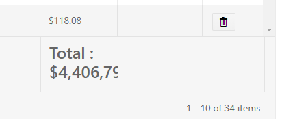
I want that "Total : " footer to start at that cell, but then continue on as needed into the other two cells to the right.
Please add a template about custom hierarchy cell template.
We have to add few icons in it and also before it and we would like to use angular native way.
Hello,
As discussed with Martin in support ticket 1429284, some of the column values in my grid might be the same, but with different letter cases. For example, column "First Name" could have the values "Elias", "elias", and "ELIAS".
When grouping, Kendo grid grouping treats those values as 3 separate groups because its case sensitive. Our users expect those values to be grouped as 1 to avoid confusion.
The workaround provided might affect other dependent features and make the code a bit messy.
I would appreciate it if you could add in a future version, a built in option to ignore case when grouping without changing the original displayed values.
Regards,
Elias
Please, please, please! We have scrollBottom event. It works like a charm. Add the same event for loading prev page on scroll top in [Kendo UI for Angular Grid], plese.
We recently had an ask to limit the number of columns that could be selected, and were not able to find an out of the box solution (nor was support).
Something like this would be great, which is the same implementation as the kendoGridFilterMenuTemplate which allows you to override just the content of the column chooser, and not have to manually create your own menu entry by overriding the whole kendoGridColumnMenuTemplate
<ng-template kendoGridColumnChooserMenuTemplate let-service="service">
    <our-custom-chooser-component></our-custom-chooser-component>
</ng-template>
or, alternatively, if we were able to specify a grid parameter for a max number of columns as a grid level [maxColumns], that would work as well.
Any plans on creating a Distinct Filter for the grid?

One like Wijmo has?  https://ibb.co/fo7gwQ