Currently when I click the horizontal scrollbar button which is present at the left side or right side of the scroll bar then the columns are scrolled as a regular table.
It will be nice to move from one column to another column instead.
Hi Team,
Requesting a feature to grid rows merge like the below example,
| Col1 | Col2 | Col3 | Col4 | Col5 | Col6 |
| Row1 | Row1 | Row1 | Row1 | Row1 | Merge1 |
| Row2 | Row2 | Row2 | Row2 | Row2 | |
| Row3 | Row3 | Row3 | Row3 | Row3 | Merge2 |
| Row4 | Row4 | Row4 | Row4 | Row4 | |
| Row5 | Row5 | Row5 | Row5 | Row5 | |
| Row6 | Row6 | Row6 | Row6 | Row6 | Merge3 |
| Row7 | Row7 | Row7 | Row7 | Row7 | |
| Row8 | Row8 | Row8 | Row8 | Row8 | Merge4 |
| Row9 | Row9 | Row9 | Row9 | Row9 |
Thanks!
Currently, the NumericFilterMenuComponent has a default filterDelay of 500ms. So, in some scenarios where a value is entered and the Enter key is pressed very quickly, the component may not be able to catch the new filtering condition and create a new filter descriptor with the entered value.
It would be great if the component is enhanced to take into account the last entered value in such scenarios despite the defined delay.
When grouped data contains a large number of columns, processing the aggregates takes significant time resulting in freezing for a couple of seconds when grouping virtualized Grid by certain column fields, e.g.:
https://stackblitz.com/edit/angular-7zdydotc-h3caizxo?file=src%2Fapp%2Fapp.component.ts
Hi,
It will be a nice feature to have the ability to customize the drag hint of the built-in row reordering similar to the hintTemplate.
It would be nice to have a feature to remove some operator from the grid filter built-in functionality as a global setting so that they apply across all grid columns without needing to repeat this customization for each column.
I understand that Kendo supports this functionality as described, but my expectation is to configure it as a global setting rather than on an individual basis. This would significantly simplify configuration in cases where multiple grids or columns are involved.
Add a locale formatting option to the Grid pager elements, similar to the functionality available in the DropDownList within the Grid pager.
Workaround using the pager template - https://stackblitz.com/edit/angular-rvvry94x-8jfbjfbp
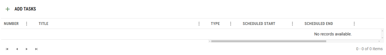
When rendering a "No records available" message or template, this should be centered, not stuck in the scrollable columns section.
Hi, Team!
I would like to request the introduction of the Ctrl + A keyboard shortcut as an approach for selecting all rows inside the Grid component.
Could we have a turnkey solution which allows to disable a row selection which takes care of disabling only the relevant selection checkboxes and handle properly the "Select all" checkbox state (in header).
With CheckboxColumnComponent field which allows providing dataItem field name or predicate function.
<kendo-grid-checkbox-column showSelectAll="true" disableSelection="isDisabled">
</kendo-grid-checkbox-column><kendo-grid-checkbox-column showSelectAll="true" [disableSelection]="isDisabledPredicateFunction">
</kendo-grid-checkbox-column>OR
If you don't want to add more selection concerns into CheckboxColumnComponent this field could be specified in your SelectableSettings as well:
public selectableSettngs: SelectableSettings = {
    enabled: true,
    checkboxOnly: false,
    mode: 'multiple',
    cell: false,
    drag: false,
    rowEnabled: mySelectableRowPredicateFunction
}
rowEnabled field could something like this:
export declare type RowEnabledSelectionFn = (context: RowArgs) => boolean | boolean;

export interface SelectableSettings {
    //...
    /**
     * Determines if row selection is allowed.
     *
     * @default true
     */
    rowEnabled?: RowEnabledSelectionFn;
}
Thank you
Currently, there is only an option for setting a label for the filter cell operators DropDownList available in the CustomMessagesComponent:
Provide a similar property for setting a custom value for the title attribute of the filter cell operators DropDownList through the custom messages attribute bindings.
As the FilterInputWrapperComponents set currentOperator(value: string) uses a hard coded list of operator values (isnull isempty isnotnull isnotemty), it is impossible to create a custom FilterOperator that has no search string - so we can't have isnullorempty isnotnullorempty (or isblank/isnotblank).
Please introduce a requiresSearchValue on the FilterOperatorBase class and make sure FilterInputWrapperComponents does decisions based on that.
Please introduce a isnullorempty/isnotnullorempty filter operator (for strings).
Additional context/sample usage:
 <kendo-grid-column title="Employee / Prospect" field="Name" width="160">
            <ng-template kendoGridCellTemplate let-field let-value let-dataItem>
                <span *ngIf="dataItem.IsProspect" class="pull-left">{{dataItem.Name}}
                    <p class="prospect-indicator pull-right" data-letters="P"></p>
                </span>
                <span *ngIf="!dataItem.IsProspect">{{dataItem.Name}}</span>
            </ng-template>
            <ng-template kendoGridHeaderTemplate let-column>
                <span title={{column.title}}>{{column.title}}</span>
            </ng-template>
            <ng-template kendoGridFilterMenuTemplate let-filter let-column="column" let-filterService="filterService">
                <kendo-grid-string-filter-menu
                    [column]="column"
                    [filter]="filter"
                    [filterService]="filterService">
                    <kendo-filter-eq-operator></kendo-filter-eq-operator>
                    <kendo-filter-neq-operator></kendo-filter-neq-operator>
                    <kendo-filter-contains-operator></kendo-filter-contains-operator>
                    <kendo-filter-not-contains-operator></kendo-filter-not-contains-operator>
                    <kendo-filter-startswith-operator></kendo-filter-startswith-operator>
                    <kendo-filter-endswith-operator></kendo-filter-endswith-operator>
                    <kendo-filter-isblank-operator></kendo-filter-isblank-operator>
                    <kendo-filter-isnotblank-operator></kendo-filter-isnotblank-operator>
                    <kendo-filter-isempty-operator text="xIs blank"></kendo-filter-isempty-operator>
                    <kendo-filter-isnotempty-operator text="xIs not blank"></kendo-filter-isnotempty-operator>
                </kendo-grid-string-filter-menu>
            </ng-template>
        </kendo-grid-column>
Currently the Grid checkbox column selection does not allow for selecting a range of rows via shift-click.
As this seems to be a behavior that users expect, based on a similar experience with popular applications like for example Outlook and Gmail, we can consider introducing this behavior in the Grid too.
For example:
When we click on a check box and Shift+click on another checkbox all the rows in between these rows should be checked. Ex: click on 2nd row and shift click on 8th row, all the rows in between 2nd and 8th should be selected.
There is already checkbox column and check/select all on header level, but it will be great to see checkbox on group level header too, so we can select/deselect all items in the group.
Currently, when using the kendoGridInCellEditing directive of the Grid, the cell enters edit mode with a single mouse click. The only approach for modifying the default behavior is by manually implementing the editing functionality and handling the HTML dblclick event, as demonstrated in the following article:
Please provide an option that enables specifying whether the in-cell editing is activated upon a single or double click when using the kendoGridInCellEditing directive.
Hello,
In the documentation it says that sticky columns are not available while using virtual columns. It is really important for us to virtualize columns, when there's a lot of them in the grid, but also being able to use a sticky column at the same time.
Can you please consider implementing sticky columns while virtual columns are also enabled?
Best regards,
Boris
This will allow developers to target a specific element where they want to render the popups, similar to the Grid POPUP_CONTAINER. This will help render the popup at Grid container level which will display then inside the FullScreen API.
This is regarding the row and column reordering as they append to the body.
Similar to the HintSettings appendTo property:
https://www.telerik.com/kendo-angular-ui/components/utils/api/HintSettings/