Currently it is possible to override certain messages of the kendo grid with the KendoGridMessages component.
However, this applies the message to the entire grid at once.
For example assume I have a grid with 2 boolean value columns, I would like to override the filter menu IsTrue & IsFalse messages to another string.
This is entirely possible with the KendoGridMessages component.
After the columns in my grid I might put something like this:
This would work if I wanted both boolean filter menus to display Yes & No.
But lets suppose I have set a template for cells in one of the columns like so:
the cells in this column would now display 'Validated' or 'Not Validated' instead of true/false.
It would make more sense for this column filter menu to have 'Validated' & 'Not Validated' instead of the Yes/No message that has been set to the entire grid.
Currently I would have to choose between one or the other strings for the boolean filter, either Yes/No or Validated/Not Validated.
This is a simple example, and in this case using the Yes/No messages for both wouldn't cause a user too much head-ache, but there are plenty of other more complex use cases where not having individual grid messages could cause confusion.
Here is a Stackblitz where I have mocked the grid:
https://stackblitz.com/edit/angular-qynsrr?file=src%2Fapp%2Fapp.component.ts
In the above Stackblitz I've mocked what I would expect it to work like.
I would expect that you can add a KendoGridMessages in the grid to set a default, and then on each column override it as necessary with another component or another KendoGridMessages.
Implementing this functionality would greatly benefit applications that heavily rely on grid usage. Currently, each usage of the grid component requires a custom implementation to override default behavior.
Currently, we can specify which columns to be included in the exported PDF file or Excel file:
It would be also convenient to have a property such as excludeFromPDF (or similar) for scenarios when only a single column should be removed from the PDF file.
Right now this is possible but defining the rest of the columns between <kendo-grid-pdf> tags which in scenarios with more columns drastically increases the HTML template.
Hi, Team!
I would like to request functionality that would allow the developer to determine whether single or multiple items are expanded at the same time inside the Grid's Column Menu.
It would be helpful to have a filter option inside the ColumnChooserComponent.
In some use cases we have around 30-50 items inside the list, it's hard to scroll through the small window to find your entries.
A simple textbox to search through the entries would be enough.
The feature request affects built-in filter cell components for primitive types such as StringFilterCellComponent, NumericFilterCellComponent, etc.
The built-in filter cell components currently allow to hide operators, but doesn't allow to hide clear button, which is being shown when a user provides some input to these filters. The workarounds are in the current moment possible, but seems to be not very maintainable, as the most obvious workaround is to control with the CSS the internal stylings of the components, which can change with any patch. I would hope for some toggle, which can control hide/display of the clear button.
The use-case in which someone might want to achieve this, is when the filtering is being cleared only globally for the whole grid. and local clearing is not necessarily desired.
The behavior can be tested on an example or provided example in official docs.
There is already checkbox column and check/select all on header level, but it will be great to see checkbox on group level header too, so we can select/deselect all items in the group.

Currently, there is only an option for setting a label for the filter cell operators DropDownList available in the CustomMessagesComponent:
Provide a similar property for setting a custom value for the title attribute of the filter cell operators DropDownList through the custom messages attribute bindings.
Hi, Team!
I would like to request the introduction of the Ctrl + A keyboard shortcut as an approach for selecting all rows inside the Grid component.
When rendering a "No records available" message or template, this should be centered, not stuck in the scrollable columns section.

It would be nice to have a feature to remove some operator from the grid filter built-in functionality as a global setting so that they apply across all grid columns without needing to repeat this customization for each column.
I understand that Kendo supports this functionality as described, but my expectation is to configure it as a global setting rather than on an individual basis. This would significantly simplify configuration in cases where multiple grids or columns are involved.
When grouped data contains a large number of columns, processing the aggregates takes significant time resulting in freezing for a couple of seconds when grouping virtualized Grid by certain column fields, e.g.:
https://stackblitz.com/edit/angular-7zdydotc-h3caizxo?file=src%2Fapp%2Fapp.component.ts
Currently, the NumericFilterMenuComponent has a default filterDelay of 500ms. So, in some scenarios where a value is entered and the Enter key is pressed very quickly, the component may not be able to catch the new filtering condition and create a new filter descriptor with the entered value.
It would be great if the component is enhanced to take into account the last entered value in such scenarios despite the defined delay.
Provide a built-in feature to collapse or expand child columns of the group column similar to ag-grid.
Workaround using the header template: https://stackblitz.com/edit/angular-orwl7wza
https://stackblitz.com/edit/angular-obj4gecf
If you click the first 2 cells in column "UnitPrice", the first one reports column 2 (which is correct), the second reports column 1.
I suspect rowSpan causes this, rows without rowSpan seem to work.
It would be great to have column highlighting in the Grid, so when a user hovers over a cell, the entire column, including the header, is highlighted. Something similar to the example below, but built-in, would provide a better experience for both users and developers.
https://stackblitz.com/edit/angular-ink98nn6?file=src%2Fapp%2Fapp.component.ts

Provide a built-in column menu component (like in the Grid and TreeList) for the base column menu functionalities - filter, sort, sticky. This way, custom column menus can be easily created when you want to keep some of the default options.
Right now, I need to create all components, even those for filter and sort, from the ground up, but available as:
kendo-grid-columnmenu-filter
kendo-grid-columnmenu-sort
is the Grid.
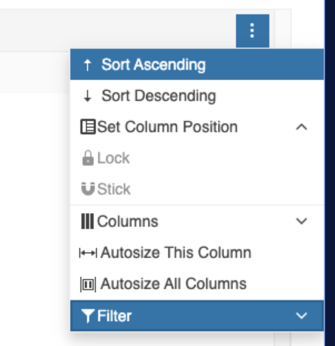
Highlight the Filter option in the Column Menu when a filter is applied to the column, similar to how the Sorting option is highlighted. This helps users recognize when a filter is active and keeps the design consistent with the sorting highlight.
Workaround - https://stackblitz.com/edit/angular-2ugqhdk3
Current rendering:
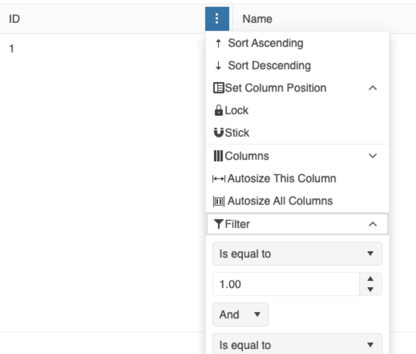
Desired rendering: