It would be helpful to have the ability to set maximum row height for the cells in a column so that resizing the column cannot put he grid in an undesirable state, with one row taking up the entire grid.

If a column has text in it with word wrapping enabled, when the column gets narrow, the wrapping makes the cell grow vertically as much as it needs to display everything.  If the column is made very narrow, soon that row will be the only row in the grid.  I don't think a user would ever want this to occur.

If the maximum height could be specified, then it would be possible to prevent the grid from ever getting in this rather broken state.  Ellipses, or some other indicator, should show when the content is truncated because the dimensions of the cell are too small to show the entire content.
When assigning data to a grid dynamically (ie: not specific columns to a grid) the Grid Columns should autosize to the width of the headers. Currently the only workaround is to use grid.AutoFitColumns() and wrap it in a timeout function. This causes erratic jumps in grid rendering and looks unprofessional.
Users should have the option to set gridColumnAutosize = true in the grid component. Then if users dynamically assign the grid data source without explicitly assigning columns then the grid columns will autosize to the width of the column header name.
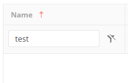
Here is an example of the grid trying to squeeze in all data into the visible area. When it should autosize and create a scrollbar for anything that cannot fit on the page.
https://stackblitz.com/edit/angular-9jogrg?file=app%2Fcustomers.ts
Add "between" grid filter row operator similar to DevExpress for angular one.
Example here:
https://js.devexpress.com/Demos/WidgetsGallery/Demo/DataGrid/Filtering/Angular/Light/
https://docs.telerik.com/devtools/wpf/controls/radgridview/features/search-as-you-type
Hi There,
We started using Kendo Grid extensively. We came across below requirement and confirmed with your support team that the feature is currently not available. We think this would really allow users customise their display.
Requirement analysis:
We would be using a common wrapper class across the org.
We will be displaying list of records from the DB, at times, there are columns which contains a JSON, we need to use a custom template to display the JSON. I understand I can go with an if condition in the template html of grid, but, that would lead me to end up having N number of conditions since we do not have a limited such use cases, each such instance would need to be rendered with different template.
The same is the case with row editing as well, for instance, for columns which accepts a description, we want to show a custom popover which would allow the user to specify the data in the way the customer wants (rich text with lot of customisation)
At a high level if we nail down into steps of the behaviour
1) Columns definition will come as a JSON which would also contain a template reference for any of the columns.
To elaborate more, If firstName and lastName are the columns at the DB level but for grid view I want to show them as a single column.
2) The JSON we are constructing will have a type attribute which would indicate me on whether to use a user defined template or regular one.
3) Corresponding data will be a JSON with possible keys required for the template.
Hey Kendo Team,
you already have a solution in jQuery for my problem (https://docs.telerik.com/kendo-ui/knowledge-base/grid-group-remove-footer-header-one-record).
Unfortunately this solution did not work in Angular.
Desirable solution would be a flag in GroupHeaderTemplate which removes header if group size is one.
Another solution could be; allow a class field in GroupHeaderTemplate, so that we can set display to none if group size is one.
Best regards,
Matthias
Our application uses grouped grids but doesn’t use the built-in collapse feature. We instead hide the collapse arrow to disable the option. This leaves an empty space to the left of the parent grid label (where the collapse arrow would normally sit) and an empty column on the left side of all child grids. We’re looking for a more “official” and supported way of achieving the effect that removing ‘[group]=“groups”’ currently achieves. We’d like to minimize the amount of nonstandard code we’re introducing to our Kendo implementation as well as minimize unintended consequences of altering the grid code.
Kendo Grids for Angular has the ability to remove operators by using `[showOperators]="false"`, however this keeps the button visible.
We would like the option to also hide/remove the clear button.
Currently when I click the horizontal scrollbar button which is present at the left side or right side of the scroll bar then the columns are scrolled as a regular table.
It will be nice to move from one column to another column instead.
Proposal
CellCloseEvent<T> should provide dataItem: T
Why
Currently the CellCloseEvent dataItem is typed as any. This could be the default, but adding a generic type here would allow strong typing in the event handler.
Currently the Grid Filter menu logic is "and" and there is no built-in option for changing it even when using the configurable filter menu components in the Filter menu template.
It would be nice having an option to configure the default logic as well as to limit the list of options to only "And"/"Or" or prevent the end user from changing the programmatically set filtering logic.
As a workaround for setting the initial logic, the developer can use the logicChange method, e.g.:
https://www.telerik.com/forums/default-filter-menu-logic#4935605
Currently, the Selection feature behaves strangely with the Keyboard Support enabled, see [demo](https://plnkr.co/edit/hTOg7Flx5Fnm63jJ6CgX?p=preview):
* Enter, Ctrl+Enter and Shift+Enter select the rows, but do not function if the cell has focusable components
* Space works only on the checkbox column
* Ctrl+Space, Shift+Space do not work at all
Ideally, the Grid should support the following shortcuts when the Selection and KB Navigation are enabled:
* Select the current row on Space, regardless of the cell content
* Support Ctrl and Shift modifiers for Space
* Shift + Up/Down Arrow for adding/removing the next/last row to the selection.
Similar to the TreeList KB navigation:
https://www.telerik.com/kendo-angular-ui/components/treelist/keyboard-navigation/
Hi , Can we have autocomplete feature in a Kendo GRID for angular so that when a user clicks on edit button to edit fields of a row ,the auto complete feature can be triggered on individual fields , also if this feature exists can some one please let me know about it . I couldn't find it in kendo grid documentation.
When user empty the filter field relative filter state must be spliced and not -> fieldfilter filtteraction emptystring and relative clear button disappear. If someone want to filter based emptystring there is specific action (isempty or notisempty) so no need to send to remote server a request with a value empty and make user confused about filters in action.
Grid should allow multiple rows to add dynamically
The grid needs a ton of work. It just looks bad, the API is poor (having to do weird css selects just to find a selected row for example).
When having multiselect in kendo grid and clicking on a row you now deselect all the other choices unless you hold shift or control. It would be nice to have a parameter to either have "advanced" or "simple" select, so you have the option to click a row to select/deselect it only affects the clicked row and not the whole table.