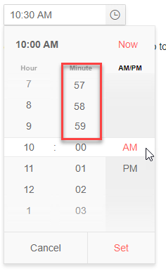
In the TimePicker (and other Date Input controls) you can in the input field use the arrow keys or mousewheel to go endless through the options. E.g. for minutes you can go directly from 00 to 59 using the down arrow. Especially with large ranges like minutes this is handy.
But in the popup you can't do that. It would be nice that the user can scroll directly from 00 to 59, 58 and so on. See composed image below.
(This should not be done when there are less options than the size of the popup, else you whould get duplicate options visible. That would be confusing for the user.)
Would be a usefull feature, especially when using this control on touch devices.
Hello dear Telerik-Team,
I have a problem with the timepicker: We have same nightshifts and there are time-intervals that go over midnight. The available dates in the timepicker should lay between the min and max borders.
https://stackblitz.com/edit/angular-ktai17?file=app/app.component.ts
Provide support for overnight time range.
Hi,
Many of my users complain that when clicking the the time component in the "empty" space, the focus is automatically set to the minutes area.
See image for example (clicking where the arrow is pointing).
This is very confusing for them and causes them to make a lot of mistakes.
Is it possible to disable this behavior?
Thanks,
Shahar

