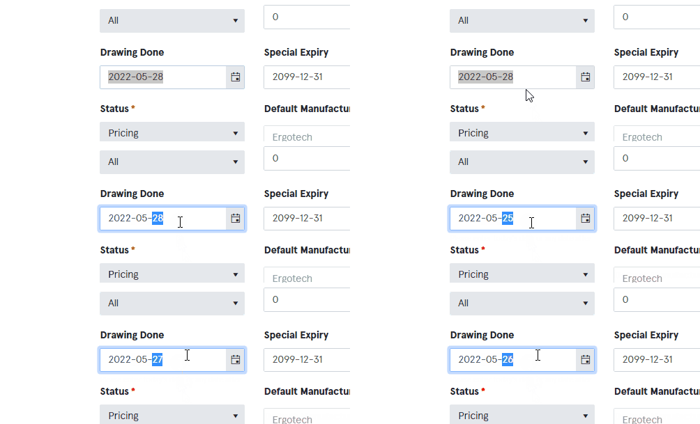
We face some issue with the with keyboard inputs. The current behavior is that the kendo tries to help us the dates right. For example if you have entered the 28th of February and you start to type another new date which should be the 31.12.2019 for example, after typing the first "3" the is immediately jumping to the month after hitting the first number because there is no date in February which has two digits on a day and starts with a "3". So it tries to get the dates right but the user maybe wants to replace the whole date and just want to continue writing the date.
We need a functionality that the not validate the date the way he does it right now, overtake the validation, like turn it off or anything like that?
Disable certain days of the week in the Angular 2+ Datepicker. E.g I want to say disable every Weekend day. Currently only support is max or min date
Currently there is no way to reposition the popup calendar from the date input in the date picker component. We would like to be able to set the alignment attributes like that with the popup component.
It should be possible to disable the user input on the Datepicker and the calendar pop-up only shows up if the user clicked on the "calendar button".
I suggest to extend the date picker with a few new options
-Allowed weeks days for selection
-Allowed Dates for selection
-Not allowed dates for selection
If the cursor is over the input after changing a date scrolling with the mouse wheel makes the value change.
We need a property just like this one:
https://www.telerik.com/kendo-angular-ui-develop/components/inputs/api/NumericTextBoxComponent/?&_ga=2.113010244.1182956334.1653485754-1241247116.1645472843#toc-changevalueonscroll
Hi, Team!
I would like to request both prefix and suffix templates that would allow users to display various elements as adornments in the Date Inputs components.
I have only noticed this when using the Kendo UI controls in an Angular project.  On touch devices when tapping a show/hide toggle button (like the calendar button on a date picker) it causes the calendar to quickly open and close.  There seems to be an issue in angular causing the click event to fire twice.  I have more notes about the issue and a workaround using a directive to band-aid this for now, but it would be nice if the fix were integrated into a future Kendo UI build.  Please refer to ticket 1033999 for more information.

http://www.telerik.com/account/support-tickets/view-ticket?threadid=1033999
Datepicker open calendar in targeted element by template id.
If a DatePicker input is set to not required and a user enters an incomplete date like 05/day/2018, the component does not recognize the value and the input is null. This behaviour is ok, the problem is, that no validation is triggered.
In such a case, a validation error should be thrown such as "incomplete date" or "invalid", but nothing happens. To allow the form validation of an incomplete date, such a validation is needed.
It would be helpful to allow for a plug-in point in the date-related input components for enabling custom parsing of the entered value before it's formatted.  The format would be consistent after the parsing completes, but there are cases where parsing text and converting it are helpful.  A few examples might be:
- "today" translates to 8/27/2018.
- "yesterday" translates to 8/26/2018.
- "1" translates to the first of the current month: 8/1/2018.
- "nov01/18" translates to 11/1/2018.
Hi team,
It will be a nice addition to Kendo UI for Angular[DatePicker, DateTimePicker, DateRange] components to have the ability to replace the Calendar with a custom component like in the following counterparts in Kendo UI for React:
1. DatePicker- https://www.telerik.com/kendo-react-ui/components/dateinputs/datepicker/custom-rendering/#toc-customizing-the-calendar
2. DateTimePicker - https://www.telerik.com/kendo-react-ui/components/dateinputs/datetimepicker/custom-rendering/#toc-customizing-the-calendar
3. DateRange - https://www.telerik.com/kendo-react-ui/components/dateinputs/daterangepicker/custom-rendering/#toc-customizing-the-calendar
Thanks.
Hi,
Currently when setting a date range with the min and max input properties and typing an out-of-range value won't fire an error. According to the documentation, this is the desired behavior and to prevent this, I should put the date component in a read-only state:
https://www.telerik.com/kendo-angular-ui/components/dateinputs/datepicker/date-ranges/
I'd really love it if by typing an out of range value, the DatePicler fires an error instead of preventing the user of typing values by making him go through the calendar.
Thank you
Hi Team,
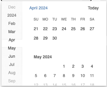
Currently, the month of January is not displayed in the navigation section of the DatePicker component and is instead represented by the respective year:
I would like to request functionality that allows me to display January separately and not beneath the year.
Datepicker have choice for navigation bar with month instead of fullyear name for the first month

in file : "node_modules\@progress\kendo-angular-dateinputs\dist\es\calendar\services\month-view.service.js"

line 96, function "navigationTitle()" we can have a boolean to say: ' i want to display month name instead of fullYear for the first month'

i don't want to do a monkeyPath to do this ;-) thx a lot
We would like to use the Angular DatePicker with Fast Navigation Bar style and would like to change the height and width of the monthly view to expand to the size of the device and show multiple months.
https://www.telerik.com/kendo-angular-ui/components/dateinputs/datepicker/sidebar/
After communicating with support we learned this was not currently possible so we are requesting it be added as a feature.
This is going into a mobile application and we would like to use all of the screen to display a calendar control. If it helps to understand conceptually, it would be similar to the Apple Calendar, on Apple Devices, with a few differences but having the months span the entire screen.
We are looking for a calendar control to work in a mobile app written with Angular and using Cordova to deploy as a native application. Since it's a mobile app, it will need to work on a variety of different devices and we want the user experience to be the same for all.
We are implementing something similar to the Apple Calendar. It will have a weekly view at the time, implemented with an in-house control, and clicking on the Month's Name in the top left will open the monthly view which is where we were hoping to use the Telerik control.
We would like the calendar view to fit to the viewport so you do not see any of the app behind the calendar. If in Portrait view, it should be responsive in width but not display any additional data. It's height should expand to see additional weeks, or months if there's enough room.
We don't know exactly what we'll do for Landscape view yet. One thought is that it should be responsive in height but not display more than one month vertically. It should expand in width displaying additional months if the entire month can fit in the viewport. The latter scenario is open to design changes. It could also be implemented similarly to Landscape view.
Hello
Currently the datePicker and probably other controls that implement the rangeValidation property do not listen to changes on the rangeValidation input.
This is preventing whether range validation is enabled based on other form input changes during user interaction with the form.
Can this be changed so it listens on ngChanges?
When i select a date in Kendo-datepicker it gives me a date which is with the local timezone.
Now if the same thing is opened in different timezone the date differs.
So i would need how do i show the same date irrespective of timezone.


