

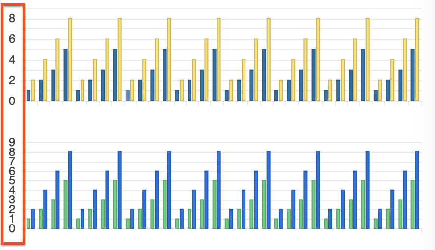
We have noticed that the labels on the y-axis are rendered too close together, almost touching each other. This can be configured by setting the step option.
However, it could be ideal in such cases for the step to be determined automatically by the Chart based on the available space (similar to the rotation option which rotates the label, but in this case to control the step).
Please provide an option to automatically render the labels based on the available space.
Hi team,
Please provide an animate property part of the Tooltip interface and all tooltip-related components:
https://www.telerik.com/kendo-angular-ui/components/charts/api/TooltipComponent/
https://www.telerik.com/kendo-angular-ui/components/charts/api/ValueAxisCrosshairTooltipComponent/
https://www.telerik.com/kendo-angular-ui/components/charts/api/SeriesTooltipComponent/
..etc
Currently, the tooltip animations can be disabled through the tooltipInstance.tooltip property of the Chart reference:
@ViewChild('chart') public chart: ChartComponent;
ngAfterViewInit() {
    this.chart.tooltipInstance.animate = false;
}

Currently, the width property is available only for horizontally oriented legend:

Provide an option to set the width of the legend when orientation is set to vertical.
Hi Kendo Theme,
The current behavior will re-render the Chart and the tooltip or crosshair disappear and the user will need again to hover over the series. This behavior can be observed in the following example:
https://stackblitz.com/edit/angular-dmpexe-sf8zoj?file=src%2Fapp%2Fapp.component.ts
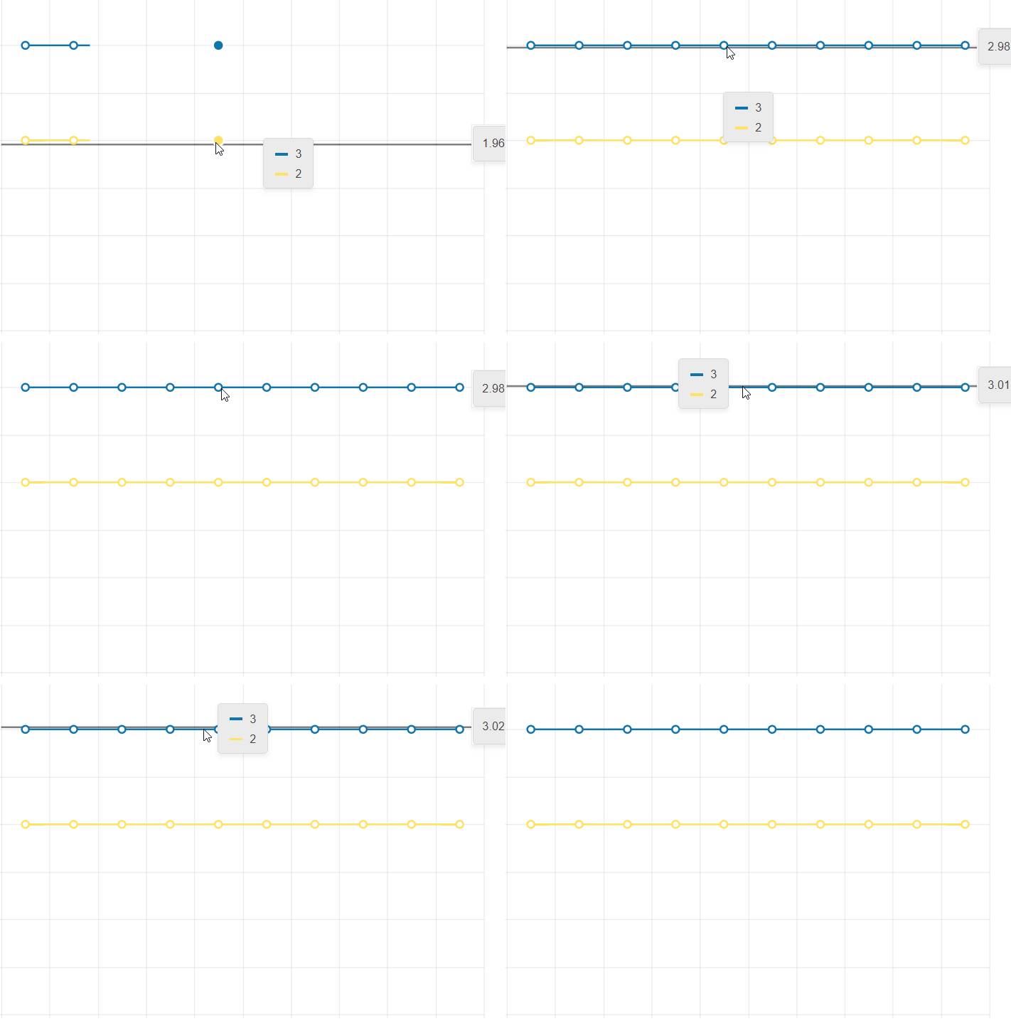
The desired behavior would be to keep the popup open or the crosshair present when updating the data.
Thank you for your consideration.
Hi,
Please provide an option that allows forcing the chart to use whole numbers for its value axis when zooming in or out. It's not something uncommon to have charts that can't have decimals (eg. number of people).
Thank you
Hello,
The feature applies mainly to scatter plots and is as follows:
* The user has the ability to select individual data points by clicking on them after which they are highlighted.
* The user has the ability to select regions of points by clicking and dragging. These regions can be a lasso, rectangle, oval, free form, or any other shape.
* The user has the ability to select multiple points or regions of points simultaneously (i.e. previously selected points/regions don't "unselect" when the user selects new ones).
An example of this is this Lightning Charts example: https://lightningchart.com/lightningchart-js-interactive-examples/edit/lcjs-example-0040-customLassoInteraction.html?isList=true
I'm also attaching a script that you can copy and paste into the example above which shows the ability to select rectangular regions and individual data points.
It will be a good addition to the chart types if the Marimekko Chart was introduced. This chart type is useful for visualizing categorical data distributions with variable column widths.
Severity: Sev2 (High)
Test Environment: OS: Windows 11 22H2
OS Build: 23620.1000
Pre-Requisite: Set browser zoom level to 400% and display resolution: 1280x1024 (or) In dev Tools set the resolution to 320*256.
Repro steps:
1.Open URL: http://www.telerik.com/kendo-ui in edge browser.
2.Navigate to 'Kendo UI for Angular ' tab item and invoke it.
3.Navigate to the Angular chart control and invoke it.
4.In left navigation pane click Scatter control under 'series types'.
5.Navigate to 'Scatter Plot Chart'.
6.Verify whether X-axis is getting overlapped while resizing the page upto 400% of zoom or not.
Actual Result:
X-axis is getting overlapped while resizing the page upto 400% of zoom.
Expected Result:
X-axis should not get overlapped when browser zoom level set to 400%.
Hi,
Please provide an ability to set the axis range in the drag/zoom events.
Thanks

Please provide the Charts selection functionality for vertical category axis as well.
thank you
I want to align the Chart Plot Area on the left side (similar to the position property of the Legend component).
Currently, the same can be achieved only with the Drawing API in render event handler. Here is an example:
https://stackblitz.com/edit/angular-ucwo6p
Providing a built-in position option for alignment of the Plot Area will be an easier and intuitive appraoch.
Thanks.
It would be great if your pan and zoom had sliders to more easily navigate a long duration chart.
See these couple examples: https://www.amcharts.com/demos/line-chart-with-range-slider/ https://www.amcharts.com/demos/zoomable-value-axis/
Please provide a global Charts font property that allows to set the font for all Chart elements.
Thank you.
Using a line chart, using date in the category axes, it will be useful to use the format "week number".
See your example: https://47hbw1.run.stackblitz.io
It doesn't look available from this list: https://github.com/telerik/kendo-intl/blob/develop/docs/date-formatting/index.md
We have a case with a chart with values: Date-Value that only applies to working days.
Non of the current options of missingValues ("gap" | "interpolate" | "zero") suits us. Interpolate is the closest option but it pretends to have 2 additional points (Sat & Sun) between Friday and Monday while we prefer just to connect directly Friday and Monday so both label and chart-line shape showns that 4 weeks (28 days) data based chart is based on 20 points and not 28 points (20 real points and 8 interpolated points).
Can this be achived currently? If not can you extend missingValues with additonal option (eg. "ignore") to do as explained above?
Thanks,
Tomasz
Component kendo-chart-navigator has to be usable also with other chart types not only stockchart.
We think that could be really useful to move it from StockChartModule  to ChartModule and find a way to use it in a new way!

See for example:

http://plnkr.co/edit/CYTIcQYcx3SqSLEFCA59
Please see the attached screenshot.
On the leftmost side, the donut chart on the top has dark blue color (Oil). And i am using the same color for the bubble chart below. But the color on the bubble is not showing dark blue but lighter one. Interestingly if i mouse over on the bubble. the color turns dark blue. how can we make it show the right color(dark blue)? and only show lighter blue when mouse over?
this is my template in case you need it.
<kendo-chart (seriesClick)="onSeriesClick($event) " style="height:800px">
<kendo-chart-series>
<kendo-chart-title text="Efficent Hedging: M-risk by Commodity ({{position}} Portfolio)" [font]="font"></kendo-chart-title>
<kendo-chart-series-item [labels]="{ visible: true, content: 'test', color: 'white', background:'none'}" [color]="barColor" type="bubble" [data]="data" xField="x" yField="y" sizeField="y" categoryField="category">
<kendo-chart-series-item-tooltip>
<ng-template let-value="value" let-category="category" let-dataItem="dataItem" style="white-space: pre-line">
<div style="white-space: pre-line">{{tooltip(dataItem )}} </div>
</ng-template>
</kendo-chart-series-item-tooltip>
</kendo-chart-series-item>
<kendo-chart-x-axis title="xx">
<kendo-chart-x-axis-item [title]="{ text: 'Liquidity Premium (cost in cents to hedge 1$ of M-risk) ', font: font }" [labels]="{ format: '{0:N0}' }">
<kendo-chart-x-axis-item-labels format="{0:N0}" [skip]="1" rotation="auto">
</kendo-chart-x-axis-item-labels>
</kendo-chart-x-axis-item>
</kendo-chart-x-axis>
<kendo-chart-y-axis title="yy">
<kendo-chart-y-axis-item [title]="{ text: 'M-risk ($MM) ', font:font }" [labels]="{ format: '{0:N0}' }">
</kendo-chart-y-axis-item>
</kendo-chart-y-axis>
<kendo-chart-legend [visible]="true">
</kendo-chart-legend>
</kendo-chart-series>
</kendo-chart>
Enabling Shift-key zooming in the stockChart produces an exception when the user Zooms.
I was told by T. Tsonev that this feature is not supported in the stockChart.
Here is a example:
https://stackblitz.com/edit/angular-gmoekv-rwu28c?file=app/app.component.ts
When the chart is configured to use the selection zoom. One must press the Shift-Key and select an area inside the chart to zoom.
I the chart shows tooltips, in most cases the tooltip pops up under the cursor and it is not possible to select an area.
The tooltip shoud be disabled, when the shift-key (or the configured key) is pressed inside the chart area.