Currently, the Radar Chart cannot be zoomed in/out. Please, provide a zoomable property that would allow the developer to achieve this functionality.
Hi,
Can you improve the behaviour of AxisDefaultLabels content to automatically use multiple lines when labels are overlapped instead of split them manually by using the function ?
Actual :

Expected :
Thank you for your consideration.
Please see the attached screenshot.
On the leftmost side, the donut chart on the top has dark blue color (Oil). And i am using the same color for the bubble chart below. But the color on the bubble is not showing dark blue but lighter one. Interestingly if i mouse over on the bubble. the color turns dark blue. how can we make it show the right color(dark blue)? and only show lighter blue when mouse over?
this is my template in case you need it.
<kendo-chart (seriesClick)="onSeriesClick($event) " style="height:800px">
<kendo-chart-series>
<kendo-chart-title text="Efficent Hedging: M-risk by Commodity ({{position}} Portfolio)" [font]="font"></kendo-chart-title>
<kendo-chart-series-item [labels]="{ visible: true, content: 'test', color: 'white', background:'none'}" [color]="barColor" type="bubble" [data]="data" xField="x" yField="y" sizeField="y" categoryField="category">
<kendo-chart-series-item-tooltip>
<ng-template let-value="value" let-category="category" let-dataItem="dataItem" style="white-space: pre-line">
<div style="white-space: pre-line">{{tooltip(dataItem )}} </div>
</ng-template>
</kendo-chart-series-item-tooltip>
</kendo-chart-series-item>
<kendo-chart-x-axis title="xx">
<kendo-chart-x-axis-item [title]="{ text: 'Liquidity Premium (cost in cents to hedge 1$ of M-risk) ', font: font }" [labels]="{ format: '{0:N0}' }">
<kendo-chart-x-axis-item-labels format="{0:N0}" [skip]="1" rotation="auto">
</kendo-chart-x-axis-item-labels>
</kendo-chart-x-axis-item>
</kendo-chart-x-axis>
<kendo-chart-y-axis title="yy">
<kendo-chart-y-axis-item [title]="{ text: 'M-risk ($MM) ', font:font }" [labels]="{ format: '{0:N0}' }">
</kendo-chart-y-axis-item>
</kendo-chart-y-axis>
<kendo-chart-legend [visible]="true">
</kendo-chart-legend>
</kendo-chart-series>
</kendo-chart>
Hi Kendo Theme,
The current behavior will re-render the Chart and the tooltip or crosshair disappear and the user will need again to hover over the series. This behavior can be observed in the following example:
https://stackblitz.com/edit/angular-dmpexe-sf8zoj?file=src%2Fapp%2Fapp.component.ts
The desired behavior would be to keep the popup open or the crosshair present when updating the data.
Thank you for your consideration.
Enabling Shift-key zooming in the stockChart produces an exception when the user Zooms.
I was told by T. Tsonev that this feature is not supported in the stockChart.
Here is a example:
https://stackblitz.com/edit/angular-gmoekv-rwu28c?file=app/app.component.ts
Hi,
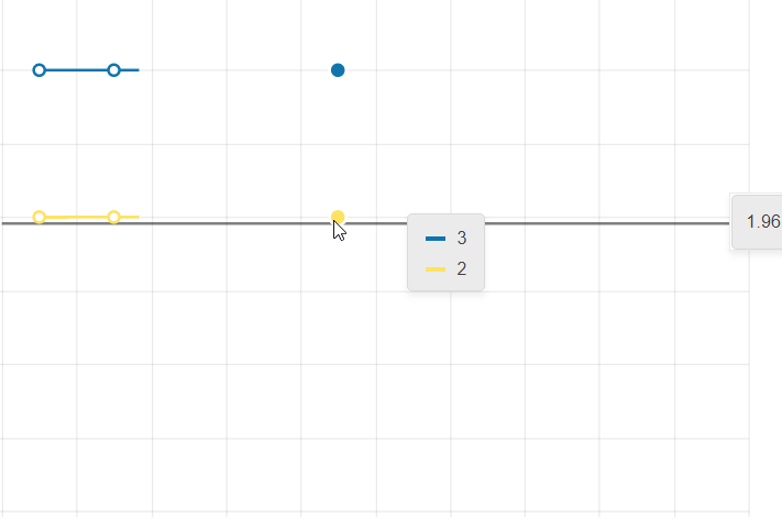
Is it possible to have synchronized crosshairs for the category axis when there are two or more chart panes in the same chart?
The desired effect I would like to have would look something like this (attached in kendo crosshair.png). Even better if a tooltip can also appear in the other chart pane at the same time (the one not being hovered over).
So far, I have seen that this isn't possible based on this post elated post for jQuery: https://www.telerik.com/forums/stacked-plot-with-separate-y-axis
What I have tried so far to no avail is to take the chart's plotAreaHoverEvent: https://www.telerik.com/kendo-angular-ui/components/charts/api/PlotAreaHoverEvent/, grab the instance of the chart (event.sender) and try to look for a way to make the other chart pane's crosshair appear, but it appears this isn't doable as the crosshair appears to only be rendered when the mouse enters the chart pane area.
Thanks!
When the chart is configured to use the selection zoom. One must press the Shift-Key and select an area inside the chart to zoom.
I the chart shows tooltips, in most cases the tooltip pops up under the cursor and it is not possible to select an area.
The tooltip shoud be disabled, when the shift-key (or the configured key) is pressed inside the chart area.
Currently, the width property is available only for horizontally oriented legend:

Provide an option to set the width of the legend when orientation is set to vertical.
Hi,
Please provide an option to render a Legend for the Chart Pane components.
thanks
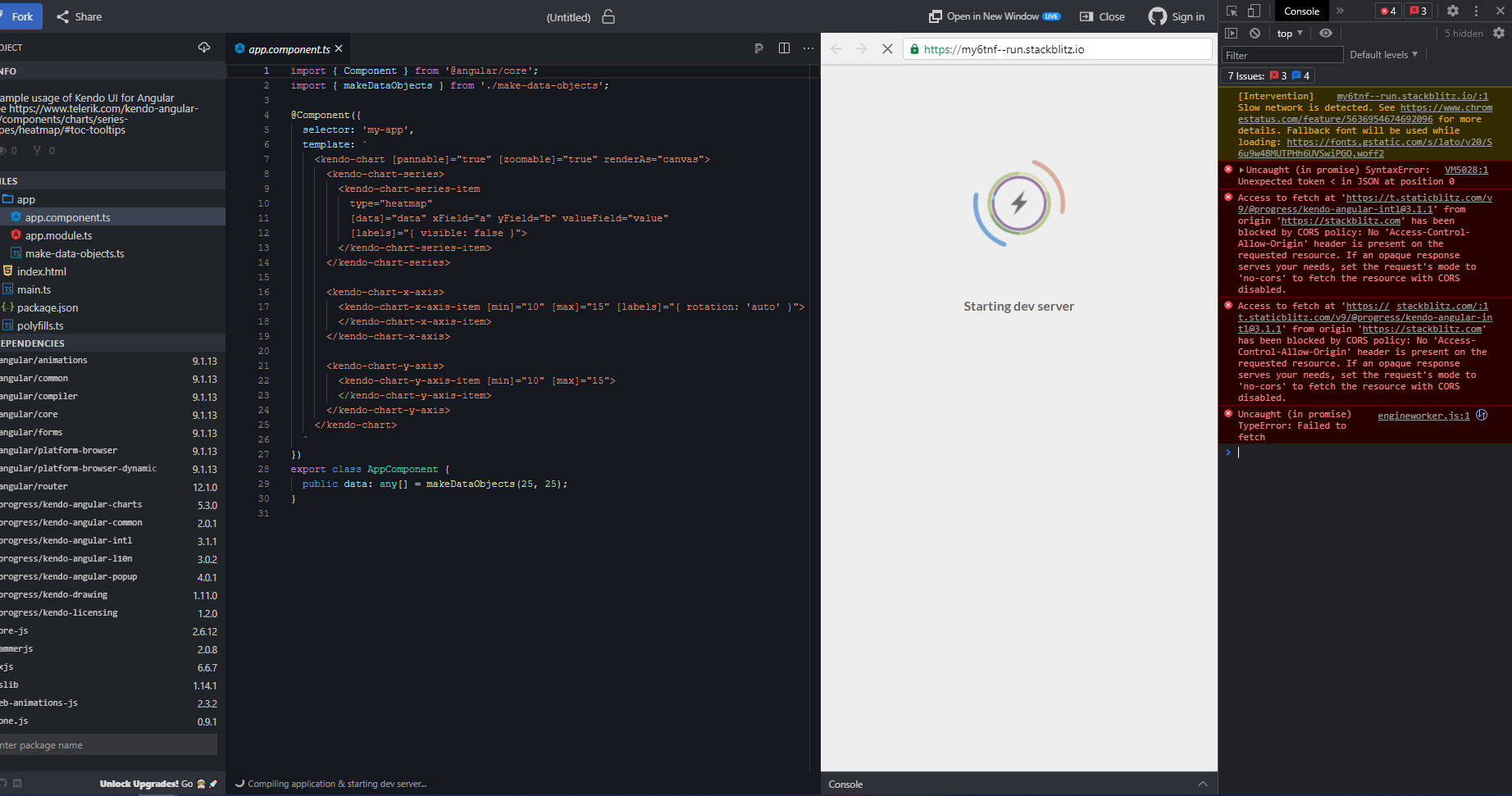
Hi,
This documentation Stackblitz demo is broken (see screenshot below for details).
For our line chart it would help a lot to be able to display the date (category) along with the value when the user hovers over with the mouse.

If dataItem was added to ChartSeriesTooltipTemplate then that would allow full flexibility, which would be nice.

http://www.telerik.com/kendo-angular-ui/components/charts/api/TooltipComponent/#toc-format

http://www.telerik.com/kendo-angular-ui/components/charts/api/SeriesTooltipTemplateDirective/
Organisation Chart Like Web form. kindly provide this control very helpful
I would like to have two-way data binding on some properties that are set by components themselves. Currently no output is offered for things like the min and max values of axes. It seems they can only be set, not read.

Ideally, I would like to do something like this:
        <kendo-chart-y-axis-item [(max)]="yMax" [(min)]="yMin">
        </kendo-chart-y-axis-item>

    <input type="number" [(ngModel)]="yMin" />
    <input type="number" [(ngModel)]="yMax" />
It would be great to have some support for charting hierarchical data in the Angular 2 Components.  It would be especially nice to see something like the old TreeMap widget brought into the library and extended such that the data visualization could change (specifically a sunburst chart option would be really nice).  Additionally, it would be great if there were native functionality in the component to drill deeper into the hierarchy rather than always having to look at the top level view (i.e. clicking a sub node would "zoom in" to view it as the new root level node).

This example treemap and sunburst (implemented using d3.js) are along the lines of what I'm suggesting.

http://mbostock.github.io/d3/talk/20111018/treemap.html
http://bl.ocks.org/mbostock/4348373
Can you implement a new chart like the below reported?
It's a bubble chart without considering the xaxis


https://bl.ocks.org/alokkshukla/3d6be4be0ef9f6977ec6718b2916d168
Charts that use one or more value axis should expose the means to specify which values on that axis are labeled, instead of basing the labels on the min value of the axis and the major unit.

Ex, using the Angular syntax:

<kendo-chart-value-axis-item
  min="0"
  max="10"
  [labelsAt]="[2.5, 4, 7]"
>

yielding an axis like

----------|------|------------|------------
          2.5     4             7
Provide the animation once select or deselect the legend the visible line in chart should rerender with animation