Please provide kendo Gantt chart supporting for angular 5
We have a case with a chart with values: Date-Value that only applies to working days.
Non of the current options of missingValues ("gap" | "interpolate" | "zero") suits us. Interpolate is the closest option but it pretends to have 2 additional points (Sat & Sun) between Friday and Monday while we prefer just to connect directly Friday and Monday so both label and chart-line shape showns that 4 weeks (28 days) data based chart is based on 20 points and not 28 points (20 real points and 8 interpolated points).
Can this be achived currently? If not can you extend missingValues with additonal option (eg. "ignore") to do as explained above?
Thanks,
Tomasz
Using a line chart, using date in the category axes, it will be useful to use the format "week number".
See your example: https://47hbw1.run.stackblitz.io
It doesn't look available from this list: https://github.com/telerik/kendo-intl/blob/develop/docs/date-formatting/index.md
Expected: Clicking on an item in the legend is supposed to toggle it's visibility.
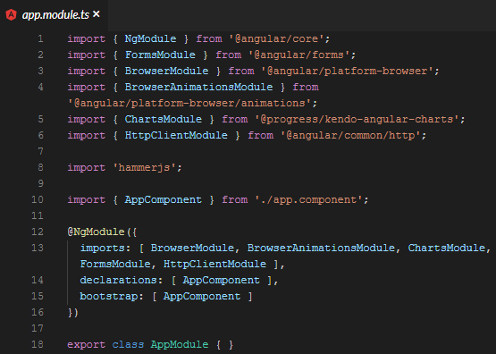
Using kendo-angular-charts 5.1.0, if you add a series input, this does not happen. A full, minimal reproduction of this issue is available At the StackBlitz link below. The top chart has no issues (hides series upon clicking) while the bottom does.
https://stackblitz.com/edit/angular-5it8qu?file=app%2Fapp.module.ts
Screenshots of above repro:
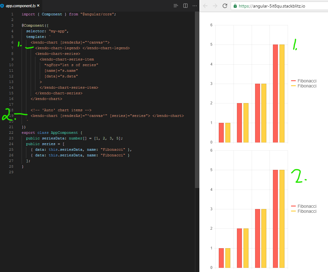
It appears that there is a line deep in the codebase that says:
const seriesComponent = this.seriesComponents.get(index);
if( !seriesComponent ){ return; }
seriesComponent.toggleVisibility();
And the seriesComponents array is empty when you use the [series] binding.
We even went so far as to bind to the legend click event and toggle the visibility myself, but it is 100% ignored.
It was something like:
public onLegendClick(event: LegendClickEvent){
  event.series.visibility = !event.series.visibility;
  event.source.refresh();
  event.source.changeDetector.markForCheck();
}
Calling refresh did redraw the chart, but it was still visible/enabled. Even though digging into it with ng.getComponent on the kendo-chart, and looking at the series, it clearly showed series[0].visible to be false.
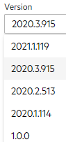
I had to make an assumption on version for this ticket since the dropdown on the bug report doesn't list 5.1.0. I wouldn't mind tips on understanding how to match up your marketing version name with your npm version. I spent 20 minutes looking around for that, but your versioning doc and release history don't seem to have anything about the actual version numbers used by package management.
I need to change the background of an area chart at certain values.
I want to display critical threshold. It could be like in the attached photo with some gradient but normal color blocks or even just some straight lines at the thresholds would be okay. Is there any option to achiev something like that?
It will be a good addition to the chart types if the Marimekko Chart was introduced. This chart type is useful for visualizing categorical data distributions with variable column widths.
Currently, the width property is available only for horizontally oriented legend:

Provide an option to set the width of the legend when orientation is set to vertical.
We have this feature in Kendo Grid:
<ng-template kendoGridNoRecordsTemplate>
  <fa-icon [icon]="faCloudXmark" class="fa-2x"></fa-icon>
  <p>There is no data to display.</p>
</ng-template>Hi,
Please provide an option that allows forcing the chart to use whole numbers for its value axis when zooming in or out. It's not something uncommon to have charts that can't have decimals (eg. number of people).
Thank you
This feature request is already logged in the Kendo UI for jQuery portal and upon implementation would be nice to bring the feature also to Kendo UI for Angular Charts.
https://feedback.telerik.com/kendo-jquery-ui/1358671-support-quarters-in-date-series-just-like-weeks
In a line chart where markers are set to be not visible.
There is no way to increase the hit box of a marker (or line) to be hit if I want to trigger the tooltip of the marker.
The mouse hover obviously works better from it's inherent logic (a click not beeing involved), but triggering the tool tip with a touch gesture seems quite fumbly. One has to hit the line very exactly. Up to a point where one has to try several times to make it happen, which makes it very impractical for new users who might not even know that there are tooltips to be displayed.
For further infos here is my forum thread with more details:
As described there, increasing the marker size does only work when markers are visible.
Making the line thicker might help a little but comes with unwanted optical changes which are impractical for most usecases.
Best Regards,
Leo Härdle
Currently, the label renders to the right:
However, it would be good to have an option to manage the alignment to the left, similar to the RTL mode:
Adding a Parallel Sets chart type would enhance data visualization capabilities. This type of chart effectively displays categorical data flows and relationships, making it useful for comparative analysis.
https://datavizcatalogue.com/methods/parallel_sets.html
The introduction of an Alluvial Diagram chart type would be beneficial. This type of chart helps visualize changes in categorical data over different stages, supporting insights into process flows and transitions.
https://datavizproject.com/data-type/alluvial-diagram/
The introduction of an Alluvial Diagram chart type would be beneficial. This type of chart helps visualize changes in categorical data over different stages, supporting insights into process flows and transitions.
https://datavizproject.com/data-type/waterfall-plot/
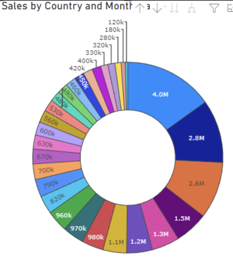
Provide support for dynamic label positions for the Donut chart.
Some labels to be displayed inside the Donut, and other (which couldn't fit) to be outside, similar to:
When setting the color using a function, a TypeScript error will occur because the property expects a value of type string.
Type '(e: SeriesLabelsContentArgs) => string' is not assignable to type 'string'.The color properties of the Chart components should support a callback to prevent such errors, as this is a valid feature to implement. The current workaround is to skip type checking.
          <kendo-chart-series-item-labels
            [color]="$any(labelColor)"
          >
add native support for displaying the series stack label.
as for today doing so is a work around using the labels property of seriesDefaults.