I want to align the Chart Plot Area on the left side (similar to the position property of the Legend component).
Currently, the same can be achieved only with the Drawing API in render event handler. Here is an example:
https://stackblitz.com/edit/angular-ucwo6p
Providing a built-in position option for alignment of the Plot Area will be an easier and intuitive appraoch.
Thanks.
Please provide the Charts selection functionality for vertical category axis as well.
thank you
Please take a look at this following example: https://stackblitz.com/edit/grouped-bar-chart-missing-values?file=app/app.component.ts
Problem:
The 2nd and 3rd series don't have data for 1/16/2020, but the chart still creates placeholders for where they would have been if there was data for those points.
If there are many missing values in the middle of the group, the outermost values appear as if they belong to the adjacent groups (they are visually closer).
Desired behaviour:
I would like the option to omit the blank space created for each missing value. The end result should be that missing values don't generate gaps and all the existing values cluster directly adjacent to each other. Clarifying example below.
I understand that this is not a bug and that it can be useful to have the placeholders for missing data, but would like to have the ability to not have them take up space. Over multiple dates and with 10-15+ series the chart can start looking very confusing with which date the bar actually belongs to.
This is somewhat related "missingValues", but differs in that instead of replacing a missing value with something (even a gap), here we want the component to behave as if it never existed.
The behaviour could be optional and toggle-able through a property binding, e.g. [hideMissingValues]="true".
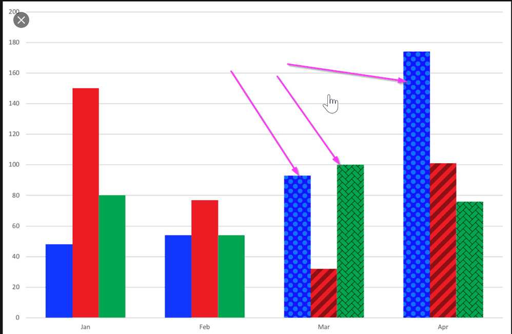
I would like to be able to use a texture, a pattern, or an image as the background of a Kendo chart.
One use-case where this would come handy is a stacked bar chart where all segments of the bar have the same color. A way to visually separate them could be via different textures.
See image below for an example reference:
It would be great if your pan and zoom had sliders to more easily navigate a long duration chart.
See these couple examples: https://www.amcharts.com/demos/line-chart-with-range-slider/ https://www.amcharts.com/demos/zoomable-value-axis/
Please see the attached screenshot.
On the leftmost side, the donut chart on the top has dark blue color (Oil). And i am using the same color for the bubble chart below. But the color on the bubble is not showing dark blue but lighter one. Interestingly if i mouse over on the bubble. the color turns dark blue. how can we make it show the right color(dark blue)? and only show lighter blue when mouse over?
this is my template in case you need it.
<kendo-chart (seriesClick)="onSeriesClick($event) " style="height:800px">
<kendo-chart-series>
<kendo-chart-title text="Efficent Hedging: M-risk by Commodity ({{position}} Portfolio)" [font]="font"></kendo-chart-title>
<kendo-chart-series-item [labels]="{ visible: true, content: 'test', color: 'white', background:'none'}" [color]="barColor" type="bubble" [data]="data" xField="x" yField="y" sizeField="y" categoryField="category">
<kendo-chart-series-item-tooltip>
<ng-template let-value="value" let-category="category" let-dataItem="dataItem" style="white-space: pre-line">
<div style="white-space: pre-line">{{tooltip(dataItem )}} </div>
</ng-template>
</kendo-chart-series-item-tooltip>
</kendo-chart-series-item>
<kendo-chart-x-axis title="xx">
<kendo-chart-x-axis-item [title]="{ text: 'Liquidity Premium (cost in cents to hedge 1$ of M-risk) ', font: font }" [labels]="{ format: '{0:N0}' }">
<kendo-chart-x-axis-item-labels format="{0:N0}" [skip]="1" rotation="auto">
</kendo-chart-x-axis-item-labels>
</kendo-chart-x-axis-item>
</kendo-chart-x-axis>
<kendo-chart-y-axis title="yy">
<kendo-chart-y-axis-item [title]="{ text: 'M-risk ($MM) ', font:font }" [labels]="{ format: '{0:N0}' }">
</kendo-chart-y-axis-item>
</kendo-chart-y-axis>
<kendo-chart-legend [visible]="true">
</kendo-chart-legend>
</kendo-chart-series>
</kendo-chart>
Please provide a global Charts font property that allows to set the font for all Chart elements.
Thank you.
Hi,
Is it possible to have synchronized crosshairs for the category axis when there are two or more chart panes in the same chart?
The desired effect I would like to have would look something like this (attached in kendo crosshair.png). Even better if a tooltip can also appear in the other chart pane at the same time (the one not being hovered over).
So far, I have seen that this isn't possible based on this post elated post for jQuery: https://www.telerik.com/forums/stacked-plot-with-separate-y-axis
What I have tried so far to no avail is to take the chart's plotAreaHoverEvent: https://www.telerik.com/kendo-angular-ui/components/charts/api/PlotAreaHoverEvent/, grab the instance of the chart (event.sender) and try to look for a way to make the other chart pane's crosshair appear, but it appears this isn't doable as the crosshair appears to only be rendered when the mouse enters the chart pane area.
Thanks!
Hi Telerik,
Is there way to have more configuration options on chart series DashTypes? For example, we'd like to use just dash (no dot), but with the capability of configuring how long the solid/white parts are. Currently, we are limited to 2 options: dash and longDash. We'd like to have more, e.g.,
1, _________ ____________ _____________
2, ______ _______ _______ _______ _______
3, ___ ___ ___ ___ ___ ___ ___ ___ ___
4, __ __ __ __ __ __ __ __ __ __ __ __
Hi,
I'd it would be great if Kendo offered a way to build 2D density plot, even myabe somthing similar to a seaborn https://python-graph-gallery.com/82-marginal-plot-with-seaborn/
When the chart is configured to use the selection zoom. One must press the Shift-Key and select an area inside the chart to zoom.
I the chart shows tooltips, in most cases the tooltip pops up under the cursor and it is not possible to select an area.
The tooltip shoud be disabled, when the shift-key (or the configured key) is pressed inside the chart area.
Hi,
We really like the Kendo for Angular suite. We were trying to see if the kendo-stockchart could fit our needs with some customization. But this might be difficult to achieve.
We are looking for rendering multiple items within a horizontal timeline.
Unfortunately, we didn't find a good component yet that provides what we are looking for.
Here an example of the kind of functionalities we are interested in.
http://www.simile-widgets.org/timeline/
Is there any plan to provide such component in the near future? or perhaps there is a way we can customize the Kendo chart to do a similar.
Thanks.
-Patrick
Enabling Shift-key zooming in the stockChart produces an exception when the user Zooms.
I was told by T. Tsonev that this feature is not supported in the stockChart.
Here is a example:
https://stackblitz.com/edit/angular-gmoekv-rwu28c?file=app/app.component.ts
Request to allow control of SVG dimensions from exportSVG options
Ideal behavior:
export class AppComponent {
this should produce a 600x300 svg. ChartComponent.prototype.exportSVG does not pass options into ChartComponent.prototype.exportVisual in the kendo-angular-charts library. I request that it pass these options in to allow for SVG dimension specification. I have modified the code manually and it behaves as expected.
We have a case with a chart with values: Date-Value that only applies to working days.
Non of the current options of missingValues ("gap" | "interpolate" | "zero") suits us. Interpolate is the closest option but it pretends to have 2 additional points (Sat & Sun) between Friday and Monday while we prefer just to connect directly Friday and Monday so both label and chart-line shape showns that 4 weeks (28 days) data based chart is based on 20 points and not 28 points (20 real points and 8 interpolated points).
Can this be achived currently? If not can you extend missingValues with additonal option (eg. "ignore") to do as explained above?
Thanks,
Tomasz
Can you implement a new chart like the below reported?
It's a bubble chart without considering the xaxis


https://bl.ocks.org/alokkshukla/3d6be4be0ef9f6977ec6718b2916d168
Colour gradient on AreaChart would look great - see workaround below:

https://stackblitz.com/edit/angular-x1vrhq?file=app/app.component.ts
Please provide kendo Gantt chart supporting for angular 5
Charts that use one or more value axis should expose the means to specify which values on that axis are labeled, instead of basing the labels on the min value of the axis and the major unit.

Ex, using the Angular syntax:

<kendo-chart-value-axis-item
  min="0"
  max="10"
  [labelsAt]="[2.5, 4, 7]"
>

yielding an axis like

----------|------|------------|------------
          2.5     4             7