

I'm experiencing an issue with the Kendo Grid when using virtual scrolling.
If I lock any column, scroll down, and then navigate to another page, the locked column disappears. It only reappears after I scroll the grid again.
I've attached the relevant code and a video demonstrating the issue.
A ticket regarding this specific issue has already been opened on GitHub (https://github.com/telerik/kendo-angular/issues/4962) , but I wanted to bring it to your attention here as well. We would appreciate your support in resolving this matter as soon as possible.
The typing for Telerik events in Angular that I have seen so far is generally quite mixed in quality. There is heavy use of EventEmitter<any> for some commonly used components, which is a code smell in TypeScript.
It makes it considerably more difficult/risky to develop using these events, as you don't quite know what to expect until you try running it a few times and/or playing around with it on the website sandbox. Furthermore, the sandbox has its own issues too, such as not always making it clear if a value is null/undefined vs an empty string (which does make a difference for how you handle it), so I typically have to make a dummy component and debug it myself just to find out.
See for instance:
Others have a mix of typed and un-typed
A component that does this well by contrast is the Map one, where the events are all strongly typed, making them much easier and safer to use.
In certain cases (e.g. Comboboxes), where a value change emits the selected object/string, or "undefined" (at least as far as I can tell), could it not use generic typing to infer the type based on the type of the provided data, and default to "any" otherwise?
For focus/blur events, at least the switch component provides typing that lets me know it refers to the original DOM event (though it still has "any" on the valueChange - which seems unusual as I'd intuitively expect it to be a boolean).
Even if it is truly impossible to get typing for certain events, there should at least be clearer documentation on the API reference of what you should typically expect to get/where the event comes from.
Component libraries should not require you to guess or figure out what to expect for exported events. Please can you make this a priority in new releases.

Hi Team,
Currently, the Kendo UI for Angular library relies on SVG icons as default icons. This means that developers would have to use a service to change the default icons inside components. This approach, however, does change all icons inside the project and is not suitable for cases where only a particular icon in a single component should be changed.
Therefore, I would like to request a designated property or a specific approach that would allow developers to change particular icons inside particular components.
Hi,
This works with Angular 20, must be a change related to that.
If I assign data to the TreeView synchronously, it works, but e.g. in a setTimeout, it doesn't any more. (I assign the full array, change detection is set to eager.)
Reproduction can be found here: https://codesandbox.io/p/devbox/mutable-glade-39twhs?workspaceId=ws_P4gPDf6RC2r5W8xExWQehV
Best regards,
Michael
Hi,
We've noticed a discrepancy between the Theme Builder and the Angular Grid component regarding size options.Current Behavior:
In the Theme Builder, the Large size property can be selected for Grid components. However, in the Angular package, only the sm and md sizes are currently supported.
Proposed Enhancement:
We would like to request support for the Large size option in the Angular Grid components to ensure design consistency with the Theme Builder.
We are developing an enterprise-scale software application and actively utilizing your products, including the Theme Builder, as efficiently and effectively as possible. Because of this, ensuring consistency across our design and implementation systems is critical for us.
Has anyone else faced this, or is there an existing workaround or planned update for this?
Thanks, and looking forward to your feedback!

Currently, the supported approach for setting values for the input properties of the Kendo UI for Angular components is by binding them to a DOM property.
Please provide support for the ability to set values for the input properties programmatically.

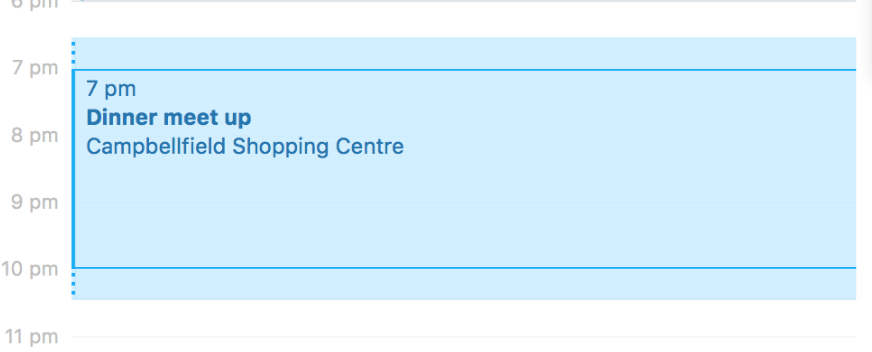
In some calendar apps like Apple it's nice to extend appointments with a travel time (or preparation time).
Please extend Kendo Scheduler with such an event preparation-time and also a follow-up time, which looks like this:
<ion-row class="modalHeader">
<ion-col size=11>
<span class="modalheaderTitle"> {{'rfwireport.titleptw' | translate}}</span>
</ion-col>
<ion-col class="cursor-pointer">
<div (click)="closeDialog()">
<ion-icon class="modalheaderTitle" title="{{'general.dialogclose' | translate }}" name="close">
</ion-icon>
</div>
</ion-col>
</ion-row>
</ion-header>
<ion-row class="listpage-content ion-no-padding" style="width: 100%;">
<ion-col class="ion-no-padding">
<ion-content class="content-tag" style="height: 530px;--background: white;">
<ion-row>
<ion-col size=1></ion-col>
</ion-row>
<!-- <kendo-pdf-export #pdf paperSize="A4"> -->
<kendo-pdf-export #pdf >
<div id="PDFReportptw" >
<ion-grid class="ion-no-padding grid-bordered">
<ion-row class="ion-align-items-center tableheader tableBorder even-color">
<ion-col size="10" class="ion-text-center com-logo-height md hydrated">
<ion-col class="ion-text-center" style="font-size: 20px;">
{{selProject}} </ion-col>
</ion-col>
<ion-col size="2" class="ion-text-left md hydrated">
<div style="height:60px; width:100%">
<img id="orgimgid" [src]="orgImageUrl" (error)="setDefaultPic()">
</div>
</ion-col>
</ion-row>
<ion-row class="ion-align-items-center ">
<ion-col size="12" class="ion-text-center fontsubheader"> DAILY PERMIT TO WORK With PTW No -
{{data.eptwcode}}
</ion-col>
</ion-row>
<ion-row class="ion-no-padding tableRows">
<ion-col class="ion-no-padding">
<ion-row class="ion-no-padding ">
<ion-col size="2" class="ion-text-left value"> Excavation </ion-col>
<ion-col size="4" class="ion-text-left fontBold"> {{selTrade}}
</ion-col>
<ion-col size="2" class="ion-text-left value">Form Ref No </ion-col>
<ion-col size="4" class="ion-text-left fontBold"> TBD
</ion-col>
</ion-row>
</ion-col>
</ion-row>
<ion-row class="ion-no-padding tableRows">
<ion-col class="ion-no-padding">
<ion-row class="ion-no-padding ">
<ion-col size="2" class="ion-text-left value"> RA Ref No </ion-col>
<ion-col size="4" class="ion-text-left fontBold">{{data.rareferencenumber}}
</ion-col>
<ion-col size="2" class="ion-text-left value">SWP No </ion-col>
<ion-col size="4" class="ion-text-left fontBold">{{data.swpnumber}}</ion-col>
</ion-row>
</ion-col>
</ion-row>
<ion-row class="ion-no-padding tableRows">
<ion-col class="ion-no-padding">
<ion-row class="ion-no-padding ">
<ion-col size="2" class="ion-text-left value"> FPP No </ion-col>
<ion-col size="4" class="ion-text-left fontBold">{{data.fppnumber}}
</ion-col>
<ion-col size="2" class="ion-text-left value">Machine ID </ion-col>
<ion-col size="4" class="ion-text-left fontBold">{{data.machineid}}
</ion-col>
</ion-row>
</ion-col>
</ion-row>
<ion-row class="ion-no-padding tableRows">
<ion-col class="ion-no-padding">
<ion-row class="ion-no-padding ">
<!-- <ion-col size="2" class="ion-text-left value">{{'createrfwi.description' | translate}}
</ion-col> -->
<ion-col size="12" class="ion-text-left fontBold">This permit is valid only for the period stated below.
The conditions of issue must be complied with throughout the duration of work. This permit may be
revoked at any time. You are responsible for the copy of this permit to display at work location till
completion of the above work or expiry or revocation of permit and must produce it on request. Ensure
relevant checklists are completed & submitted with this PTW application.
</ion-col>
</ion-row>
</ion-col>
</ion-row>
<ion-row class="ion-no-padding tableRows">
<ion-col class="ion-no-padding">
<ion-row class="ion-no-padding " style="background-color:#939393">
<ion-col size="12" class="ion-text-left fontBold">
PART 1: APPLICATION - BY PERMIT REQUESTER
</ion-col>
</ion-row>
</ion-col>
</ion-row>
<ion-row class="ion-no-padding tableRows">
<ion-col class="ion-no-padding">
<ion-row class="ion-no-padding ">
<ion-col size="4" class="ion-text-left value"> Contractor Name </ion-col>
<ion-col size="8" class="ion-text-left fontBold">TBD</ion-col>
</ion-row>
</ion-col>
</ion-row>
<ion-row class="ion-no-padding tableRows">
<ion-col class="ion-no-padding">
<ion-row class="ion-no-padding ">
<ion-col size="4" class="ion-text-left value"> Location of work </ion-col>
<ion-col size="8" class="ion-text-left fontBold">{{data.levelname}}
</ion-col>
</ion-row>
</ion-col>
</ion-row>
<ion-row class="ion-no-padding tableRows">
<ion-col class="ion-no-padding">
<ion-row class="ion-no-padding ">
<ion-col size="4" class="ion-text-left value"> Permit Validity period </ion-col>
<ion-col size="2" class="ion-text-left fontBold">From
</ion-col>
<ion-col size="2" class="ion-text-left fontBold"> {{data.plannedstarttime | date:'dd-MMM-yyyy hh:mm'}}
</ion-col>
<ion-col size="2" class="ion-text-left fontBold">To
</ion-col>
<ion-col size="2" class="ion-text-left fontBold"> {{data.plannedendtime | date:'dd-MMM-yyyy hh:mm'}}
</ion-col>
</ion-row>
</ion-col>
</ion-row>
<ion-row class="tableheader tableBorder" style="padding: 0 !important;"
*ngIf="checkLists[0] && checkLists[0][0]">
<ion-col size="6">
</ion-col>
<ion-col size="6" *ngFor="let stages of checkLists[0]">
<ion-row class="ion-no-padding">
<ion-col *ngFor="let stage of stages.stages" class="ion-text-center tableBorder value">
{{stage.stagecode}}
</ion-col>
</ion-row>
</ion-col>
<ion-col size="6">
<ion-row>
<ion-col class="ion-text-center" style="font-size: 25px;font-weight: bold;">{{'rfwireport.checklist' | translate}}
</ion-col>
</ion-row>
</ion-col>
<ng-container *ngIf="checkLists[0] && checkLists[0][0]">
<ion-col size="6" *ngFor="let chelist of checkLists[0]">
<ion-row class="ion-no-padding">
<ion-col *ngFor="let status of chelist.status" class="ion-text-center tableBorder value">
{{status.name}}
</ion-col>
</ion-row>
</ion-col>
</ng-container>
<ion-col size="6">
</ion-col>
</ion-row>
<ion-row class="ion-no-padding tableheader tableBorder" *ngIf="!isQuesExist">
<ion-col size="12">
<ion-row class="ion-no-padding tableheader">
<ion-col class="ion-text-center value"> {{'reports.noques' | translate}}
</ion-col>
</ion-row>
</ion-col>
</ion-row>
<ng-container *ngIf="checkLists[0] &&checkLists[0][0]">
<div *ngFor="let items of checkLists">
<ion-row class="ion-no-padding " *ngFor="let sec of items[0].sections;let secIndex = index">
<ion-col size="12">
<ion-row class="ion-no-padding tableheader even-color ">
<ion-col class="ion-text-center ">{{sec.name}}
</ion-col>
</ion-row>
<ion-col size="12">
<ion-col size="6">
<ion-row class="ion-no-padding " *ngFor="let ques of sec.questions;let quesIdx = index">
<ion-col class="ion-text-left tableheader tableBorder ">
<span class="" style="font-size:15px;">{{ques.label}}</span>
</ion-col>
<ion-col>
<ion-row class="ion-no-padding ">
<ion-col *ngFor="let stage of checkLists[0][0].stages;let stageindex = index"
class="ion-text-center fontBold1">
<span *ngIf="getStatus(secIndex,quesIdx,stageindex) else nozone"
class="add-icon material-icons mdi mdi-check active-status"
style="font-size:25px;"></span>
</ion-col>
</ion-row>
<ng-template #nozone>
<ion-col class="ion-text-center ">
<div class="add-icon material-icons inactive-status" style="font-size:25px;"></div>
</ion-col>
</ng-template>
</ion-col>
</ion-row>
</ion-col>
</ion-col>
</ion-col>
</ion-row>
</div>
</ng-container>
<ion-row class="ion-align-items-left">
<ion-col size="12" class="ion-text-cener ">
<ion-row class="ion-no-padding tableRows">
<ion-col class="ion-no-padding">
<ion-row class="ion-no-padding " style="background-color:#939393">
<ion-col size="12" class="ion-text-left fontBold">
PART 1 a: PTW APPLICAT DECLARATION
</ion-col>
</ion-row>
</ion-col>
</ion-row>
<ion-card class="project-card cursor-pointer">
<ion-card-content>
<ion-row class="ion-align-items-center">
<ion-col class="ion-text-center ion-no-padding">
<ion-row class="ion-align-items-center">
<ion-col class="ion-text-left">
I ensure that necessary safety precautions are taken and in place for above mentioned work
activity at all time during the validity period of the permit. I must inform Project
Manager/ Authorized Manager immediately if there is any incompatible work carried out
nearby or significant changes in the work
process or work environment. I shall also display a copy of the approved PTW at the work
location.
</ion-col>
</ion-row>
</ion-col>
</ion-row>
</ion-card-content>
</ion-card>
</ion-col>
<ion-col size="12" class="ion-text-cener ">
<ion-card class="project-card cursor-pointer">
<ion-card-content>
<ion-row class="ion-align-items-center">
<ion-col class="ion-text-center ion-no-padding">
<ion-row class="ion-align-items-center">
<ion-col class="ion-text-center">
<ion-card-header class="card-header ">
<ion-card-title class="ion-text-center">Appointed PTW</ion-card-title>
</ion-card-header>
</ion-col>
</ion-row>
<ion-row class="ion-align-items-center card-font">
<ion-col class="ion-text-center date-col">
<ion-row class="ion-align-items-center ion-no-padding">
<ion-col class="ion-no-padding">
<ion-row class="ion-align-items-center ion-no-padding">
<ion-col class="ion-no-padding ion-text-start">
<!-- <div *ngIf="checkLists[0] && checkLists[0][0] && checkLists[0][0].status[0]"> -->
<div>Name & Signature</div>
</ion-col>
</ion-row>
</ion-col>
</ion-row>
</ion-col>
<ion-col class="ion-text-center date-col">
<ion-row class="ion-align-items-center ion-no-padding">
<ion-col class="ion-no-padding">
<ion-row class="ion-align-items-center ion-no-padding">
<ion-col class="ion-no-padding ion-text-start">
<div style="height:75px; width:100px">
<img *ngIf="regSigPath" id="approverSig" height="75px" width="100px"
[src]="regSigPath" (error)="setDefaultPic1()">
</div>
</ion-col>
</ion-row>
</ion-col>
</ion-row>
</ion-col>
<ion-col class="ion-text-center date-col">
<ion-row class="ion-align-items-center ion-no-padding">
<ion-col class="ion-no-padding">
<ion-row class="ion-align-items-center ion-no-padding">
<ion-col class="ion-no-padding ion-text-start">
{{data.createdAt | date:'dd-MMM-yyyy hh:mm'}}
</ion-col>
</ion-row>
</ion-col>
</ion-row>
</ion-col>
</ion-row>
</ion-col>
</ion-row>
</ion-card-content>
</ion-card>
</ion-col>
<ion-col size="12" class="ion-text-cener ">
<ion-row class="ion-no-padding tableRows">
<ion-col class="ion-no-padding">
<ion-row class="ion-no-padding " style="background-color:#939393">
<ion-col size="12" class="ion-text-left fontBold">
PART 1 b: DECLARATION BY MAIN CONTRACTOR WORK IN CHARGE
</ion-col>
</ion-row>
</ion-col>
</ion-row>
<ion-card class="project-card cursor-pointer">
<ion-card-content>
<ion-row class="ion-align-items-center">
<ion-col class="ion-text-center ion-no-padding">
<ion-row class="ion-align-items-center">
<ion-col class="ion-text-left">
I shall also ensure that PART 1a statement is complied with and I will ensure that
housekeeping is carried out before closing the PTW
</ion-col>
</ion-row>
</ion-col>
</ion-row>
</ion-card-content>
</ion-card>
</ion-col>
<ion-col size="12" class="ion-text-cener ">
<ion-card class="project-card cursor-pointer">
<ion-card-content>
<ion-row class="ion-align-items-center">
<ion-col class="ion-text-center ion-no-padding">
<ion-row class="ion-align-items-center">
<ion-col class="ion-text-center">
<ion-card-header class="card-header ">
<ion-card-title class="ion-text-center">PART 1 CONTRACTOR</ion-card-title>
</ion-card-header>
</ion-col>
</ion-row>
<ion-row class="ion-align-items-center card-font">
<ion-col class="ion-text-center date-col">
<ion-row class="ion-align-items-center ion-no-padding">
<ion-col class="ion-no-padding">
<ion-row class="ion-align-items-center ion-no-padding">
<ion-col class="ion-no-padding ion-text-start">
<!-- <div *ngIf="checkLists[0] && checkLists[0][0] && checkLists[0][0].status[0]"> -->
<div>Name & Signature</div>
</ion-col>
</ion-row>
</ion-col>
</ion-row>
</ion-col>
<ion-col class="ion-text-center date-col">
<ion-row class="ion-align-items-center ion-no-padding">
<ion-col class="ion-no-padding">
<ion-row class="ion-align-items-center ion-no-padding">
<ion-col class="ion-no-padding ion-text-start">
<div style="height:75px; width:100px">
<img *ngIf="regSigPath" id="approverSig" height="75px" width="100px"
[src]="regSigPath" (error)="setDefaultPic1()">
</div>
</ion-col>
</ion-row>
</ion-col>
</ion-row>
</ion-col>
<ion-col class="ion-text-center date-col">
<ion-row class="ion-align-items-center ion-no-padding">
<ion-col class="ion-no-padding">
<ion-row class="ion-align-items-center ion-no-padding">
<ion-col class="ion-no-padding ion-text-start">
{{data.createdAt | date:'dd-MMM-yyyy hh:mm'}}
</ion-col>
</ion-row>
</ion-col>
</ion-row>
</ion-col>
</ion-row>
</ion-col>
</ion-row>
</ion-card-content>
</ion-card>
</ion-col>
<ion-col size="12" class="ion-text-cener ">
<ion-row class="ion-no-padding tableRows">
<ion-col class="ion-no-padding">
<ion-row class="ion-no-padding " style="background-color:#939393">
<ion-col size="12" class="ion-text-left fontBold">
PART 2: EVALUATION AND ASSESSMENT OF HSE COMPLIANCE - BY SAFETY ASSESSORS
</ion-col>
</ion-row>
</ion-col>
</ion-row>
<ion-card class="project-card cursor-pointer">
<ion-card-content>
<ion-row class="ion-align-items-center">
<ion-col class="ion-text-center ion-no-padding">
<ion-row class="ion-align-items-center">
<ion-col class="ion-text-left">
I have inspected & assessed the location and its surroundings together with the permit
requester and ensured that all reasonable, practicable measures have been taken and are
put in place to carry out the hazardous work safely. The said location is safe for the
intended work at height.
▪ I have informed the contractor that a stop work order will be implemented immediately
should any of the conditions change.
</ion-col>
</ion-row>
</ion-col>
</ion-row>
</ion-card-content>
</ion-card>
</ion-col>
<ion-col size="12" class="ion-text-cener ">
<ion-card class="project-card cursor-pointer">
<ion-card-content>
<ion-row class="ion-align-items-center">
<ion-col class="ion-text-center ion-no-padding">
<ion-row class="ion-align-items-center">
<ion-col class="ion-text-center">
<ion-card-header class="card-header ">
<ion-card-title class="ion-text-center">PART 2 CONTRACTOR</ion-card-title>
</ion-card-header>
</ion-col>
</ion-row>
<ion-row class="ion-align-items-center card-font">
<ion-col class="ion-text-center date-col">
<ion-row class="ion-align-items-center ion-no-padding">
<ion-col class="ion-no-padding">
<ion-row class="ion-align-items-center ion-no-padding">
<ion-col class="ion-no-padding ion-text-start">
<!-- <div *ngIf="checkLists[0] && checkLists[0][0] && checkLists[0][0].status[0]"> -->
<div>Name & Signature</div>
</ion-col>
</ion-row>
</ion-col>
</ion-row>
</ion-col>
<ion-col class="ion-text-center date-col">
<ion-row class="ion-align-items-center ion-no-padding">
<ion-col class="ion-no-padding">
<ion-row class="ion-align-items-center ion-no-padding">
<ion-col class="ion-no-padding ion-text-start">
<div style="height:75px; width:100px">
<img *ngIf="regSigPath" id="approverSig" height="75px" width="100px"
[src]="regSigPath" (error)="setDefaultPic1()">
</div>
</ion-col>
</ion-row>
</ion-col>
</ion-row>
</ion-col>
<ion-col class="ion-text-center date-col">
<ion-row class="ion-align-items-center ion-no-padding">
<ion-col class="ion-no-padding">
<ion-row class="ion-align-items-center ion-no-padding">
<ion-col class="ion-no-padding ion-text-start">
{{data.createdAt | date:'dd-MMM-yyyy hh:mm'}}
</ion-col>
</ion-row>
</ion-col>
</ion-row>
</ion-col>
</ion-row>
</ion-col>
</ion-row>
</ion-card-content>
</ion-card>
</ion-col>
<ion-col size="12" class="ion-text-cener ">
<ion-row class="ion-no-padding tableRows">
<ion-col class="ion-no-padding">
<ion-row class="ion-no-padding " style="background-color:#939393">
<ion-col size="12" class="ion-text-left fontBold">
PART 3a: REVIEW AND APPROVAL- BY PROJECT MANAGER / AUTHORISED MANAGER
</ion-col>
</ion-row>
</ion-col>
</ion-row>
<ion-card class="project-card cursor-pointer">
<ion-card-content>
<ion-row class="ion-align-items-center">
<ion-col class="ion-text-center ion-no-padding">
<ion-row class="ion-align-items-center">
<ion-col class="ion-text-left">
I am satisfied that there has been a proper evaluation of the risks involved, that there
will be no incompatible work running concurrently in the vicinity which may pose a risk to
personnel, that all reasonably practicable measures will be taken to ensure the safety,
health of personnel, and that all personnel have
been made aware of the hazards associated with the work.
</ion-col>
</ion-row>
</ion-col>
</ion-row>
</ion-card-content>
</ion-card>
<ion-card class="project-card cursor-pointer">
<ion-card-content>
<ion-row class="ion-align-items-center">
<ion-col class="ion-text-center ion-no-padding">
<ion-row class="ion-no-padding tableRows">
<ion-col class="ion-no-padding">
<ion-row class="ion-no-padding ">
<ion-col size="4" class="ion-text-left value"> The permit to work is </ion-col>
<ion-col size="3" class="ion-text-left fontBold">Approved
</ion-col>
<ion-col size="1" class="ion-text-left fontBold">
</ion-col>
<ion-col size="3" class="ion-text-left fontBold">Rejected
</ion-col>
<ion-col size="1" class="ion-text-left fontBold">
</ion-col>
</ion-row>
<ion-row class="ion-no-padding ">
<ion-col size="4" class="ion-text-left value"> The Reason for rejecttion </ion-col>
<ion-col size="8" class="ion-text-left fontBold">
</ion-col>
</ion-row>
</ion-col>
</ion-row>
</ion-col>
</ion-row>
</ion-card-content>
</ion-card>
</ion-col>
<ion-col size="12" class="ion-text-cener ">
<ion-card class="project-card cursor-pointer">
<ion-card-content>
<ion-row class="ion-align-items-center">
<ion-col class="ion-text-center ion-no-padding">
<ion-row class="ion-align-items-center">
<ion-col class="ion-text-center">
<ion-card-header class="card-header ">
<ion-card-title class="ion-text-center">PART 3 CONTRACTOR</ion-card-title>
</ion-card-header>
</ion-col>
</ion-row>
<ion-row class="ion-align-items-center card-font">
<ion-col class="ion-text-center date-col">
<ion-row class="ion-align-items-center ion-no-padding">
<ion-col class="ion-no-padding">
<ion-row class="ion-align-items-center ion-no-padding">
<ion-col class="ion-no-padding ion-text-start">
<!-- <div *ngIf="checkLists[0] && checkLists[0][0] && checkLists[0][0].status[0]"> -->
<div>Name & Signature</div>
</ion-col>
</ion-row>
</ion-col>
</ion-row>
</ion-col>
<ion-col class="ion-text-center date-col">
<ion-row class="ion-align-items-center ion-no-padding">
<ion-col class="ion-no-padding">
<ion-row class="ion-align-items-center ion-no-padding">
<ion-col class="ion-no-padding ion-text-start">
<div style="height:75px; width:100px">
<img *ngIf="regSigPath" id="approverSig" height="75px" width="100px"
[src]="regSigPath" (error)="setDefaultPic1()">
</div>
</ion-col>
</ion-row>
</ion-col>
</ion-row>
</ion-col>
<ion-col class="ion-text-center date-col">
<ion-row class="ion-align-items-center ion-no-padding">
<ion-col class="ion-no-padding">
<ion-row class="ion-align-items-center ion-no-padding">
<ion-col class="ion-no-padding ion-text-start">
{{data.createdAt | date:'dd-MMM-yyyy hh:mm'}}
</ion-col>
</ion-row>
</ion-col>
</ion-row>
</ion-col>
</ion-row>
</ion-col>
</ion-row>
</ion-card-content>
</ion-card>
</ion-col>
<ion-col size="12" class="ion-text-cener ">
<ion-row class="ion-no-padding tableRows">
<ion-col class="ion-no-padding">
<ion-row class="ion-no-padding " style="background-color:#939393">
<ion-col size="12" class="ion-text-left fontBold">
PART 3b: REVOCATION AFTER APPROVAL - BY PROJECT MANAGER / AUTHORISED MANAGER (if required)
</ion-col>
</ion-row>
</ion-col>
</ion-row>
<ion-card class="project-card cursor-pointer">
<ion-card-content>
<ion-row class="ion-align-items-center">
<ion-col class="ion-text-center ion-no-padding">
<ion-row class="ion-align-items-center">
<ion-col class="ion-text-left">
I have determined that the permit should be revoked for the following reasons:
</ion-col>
</ion-row>
</ion-col>
</ion-row>
</ion-card-content>
</ion-card>
</ion-col>
<ion-col size="12" class="ion-text-cener ">
<ion-card class="project-card cursor-pointer">
<ion-card-content>
<ion-row class="ion-align-items-center">
<ion-col class="ion-text-center ion-no-padding">
<ion-row class="ion-align-items-center">
<ion-col class="ion-text-center">
<ion-card-header class="card-header ">
<ion-card-title class="ion-text-center">PART 3b CONTRACTOR</ion-card-title>
</ion-card-header>
</ion-col>
</ion-row>
<ion-row class="ion-align-items-center card-font">
<ion-col class="ion-text-center date-col">
<ion-row class="ion-align-items-center ion-no-padding">
<ion-col class="ion-no-padding">
<ion-row class="ion-align-items-center ion-no-padding">
<ion-col class="ion-no-padding ion-text-start">
<!-- <div *ngIf="checkLists[0] && checkLists[0][0] && checkLists[0][0].status[0]"> -->
<div>Name & Signature</div>
</ion-col>
</ion-row>
</ion-col>
</ion-row>
</ion-col>
<ion-col class="ion-text-center date-col">
<ion-row class="ion-align-items-center ion-no-padding">
<ion-col class="ion-no-padding">
<ion-row class="ion-align-items-center ion-no-padding">
<ion-col class="ion-no-padding ion-text-start">
<div style="height:75px; width:100px">
<img *ngIf="regSigPath" id="approverSig" height="75px" width="100px"
[src]="regSigPath" (error)="setDefaultPic1()">
</div>
</ion-col>
</ion-row>
</ion-col>
</ion-row>
</ion-col>
<ion-col class="ion-text-center date-col">
<ion-row class="ion-align-items-center ion-no-padding">
<ion-col class="ion-no-padding">
<ion-row class="ion-align-items-center ion-no-padding">
<ion-col class="ion-no-padding ion-text-start">
{{data.createdAt | date:'dd-MMM-yyyy hh:mm'}}
</ion-col>
</ion-row>
</ion-col>
</ion-row>
</ion-col>
</ion-row>
</ion-col>
</ion-row>
</ion-card-content>
</ion-card>
</ion-col>
<ion-col size="12" class="ion-text-cener ">
<ion-row class="ion-no-padding tableRows">
<ion-col class="ion-no-padding">
<ion-row class="ion-no-padding " style="background-color:#939393">
<ion-col size="12" class="ion-text-left fontBold">
PART 4: NOTIFICATION OF COMPLETION OF WORK BY CONTRACTOR PTW APPLICANT
</ion-col>
</ion-row>
</ion-col>
</ion-row>
<ion-card class="project-card cursor-pointer">
<ion-card-content>
<ion-row class="ion-align-items-center">
<ion-col class="ion-text-center ion-no-padding">
<ion-row class="ion-align-items-center">
<ion-col class="ion-text-left">
Work completed & housekeeping has been carried out.
</ion-col>
</ion-row>
</ion-col>
</ion-row>
</ion-card-content>
</ion-card>
</ion-col>
<ion-col size="12" class="ion-text-cener ">
<ion-card class="project-card cursor-pointer">
<ion-card-content>
<ion-row class="ion-align-items-center">
<ion-col class="ion-text-center ion-no-padding">
<ion-row class="ion-align-items-center">
<ion-col class="ion-text-center">
<ion-card-header class="card-header ">
<ion-card-title class="ion-text-center">PART 4 CONTRACTOR</ion-card-title>
</ion-card-header>
</ion-col>
</ion-row>
<ion-row class="ion-align-items-center card-font">
<ion-col class="ion-text-center date-col">
<ion-row class="ion-align-items-center ion-no-padding">
<ion-col class="ion-no-padding">
<ion-row class="ion-align-items-center ion-no-padding">
<ion-col class="ion-no-padding ion-text-start">
<!-- <div *ngIf="checkLists[0] && checkLists[0][0] && checkLists[0][0].status[0]"> -->
<div>Name & Signature</div>
</ion-col>
</ion-row>
</ion-col>
</ion-row>
</ion-col>
<ion-col class="ion-text-center date-col">
<ion-row class="ion-align-items-center ion-no-padding">
<ion-col class="ion-no-padding">
<ion-row class="ion-align-items-center ion-no-padding">
<ion-col class="ion-no-padding ion-text-start">
<div style="height:75px; width:100px">
<img *ngIf="regSigPath" id="approverSig" height="75px" width="100px"
[src]="regSigPath" (error)="setDefaultPic1()">
</div>
</ion-col>
</ion-row>
</ion-col>
</ion-row>
</ion-col>
<ion-col class="ion-text-center date-col">
<ion-row class="ion-align-items-center ion-no-padding">
<ion-col class="ion-no-padding">
<ion-row class="ion-align-items-center ion-no-padding">
<ion-col class="ion-no-padding ion-text-start">
{{data.createdAt | date:'dd-MMM-yyyy hh:mm'}}
</ion-col>
</ion-row>
</ion-col>
</ion-row>
</ion-col>
</ion-row>
</ion-col>
</ion-row>
</ion-card-content>
</ion-card>
</ion-col>
<ion-col size="12" class="ion-text-cener ">
<ion-row class="ion-no-padding tableRows">
<ion-col class="ion-no-padding">
<ion-row class="ion-no-padding " style="background-color:#939393">
<ion-col size="12" class="ion-text-left fontBold">
PART 5: Closing of PTW by Project Manager
</ion-col>
</ion-row>
</ion-col>
</ion-row>
</ion-col>
<ion-col size="12" class="ion-text-cener ">
<ion-card class="project-card cursor-pointer">
<ion-card-content>
<ion-row class="ion-align-items-center">
<ion-col class="ion-text-center ion-no-padding">
<ion-row class="ion-align-items-center">
<ion-col class="ion-text-center">
<ion-card-header class="card-header ">
<ion-card-title class="ion-text-center">PART 5 CONTRACTOR</ion-card-title>
</ion-card-header>
</ion-col>
</ion-row>
<ion-row class="ion-align-items-center card-font">
<ion-col class="ion-text-center date-col">
<ion-row class="ion-align-items-center ion-no-padding">
<ion-col class="ion-no-padding">
<ion-row class="ion-align-items-center ion-no-padding">
<ion-col class="ion-no-padding ion-text-start">
<!-- <div *ngIf="checkLists[0] && checkLists[0][0] && checkLists[0][0].status[0]"> -->
<div>Name & Signature</div>
</ion-col>
</ion-row>
</ion-col>
</ion-row>
</ion-col>
<ion-col class="ion-text-center date-col">
<ion-row class="ion-align-items-center ion-no-padding">
<ion-col class="ion-no-padding">
<ion-row class="ion-align-items-center ion-no-padding">
<ion-col class="ion-no-padding ion-text-start">
<div style="height:75px; width:100px">
<img *ngIf="regSigPath" id="approverSig" height="75px" width="100px"
[src]="regSigPath" (error)="setDefaultPic1()">
</div>
</ion-col>
</ion-row>
</ion-col>
</ion-row>
</ion-col>
<ion-col class="ion-text-center date-col">
<ion-row class="ion-align-items-center ion-no-padding">
<ion-col class="ion-no-padding">
<ion-row class="ion-align-items-center ion-no-padding">
<ion-col class="ion-no-padding ion-text-start">
{{data.createdAt | date:'dd-MMM-yyyy hh:mm'}}
</ion-col>
</ion-row>
</ion-col>
</ion-row>
</ion-col>
</ion-row>
</ion-col>
</ion-row>
</ion-card-content>
</ion-card>
</ion-col>
<ion-col size="12" class="ion-text-cener ">
<ion-row class="ion-no-padding tableRows">
<ion-col class="ion-no-padding">
<ion-row class="ion-no-padding " style="background-color:#939393">
<ion-col size="12" class="ion-text-left fontBold">
Personal Involved in this activity
</ion-col>
</ion-row>
<ion-row class="ion-no-padding tableRows">
<ion-col class="ion-no-padding">
<ion-row class="ion-no-padding ">
<ion-col size="2" class="ion-text-left value"> S.No </ion-col>
<ion-col size="4" class="ion-text-left fontBold">Name of Employee
</ion-col>
<ion-col size="3" class="ion-text-left fontBold"> NRIC/ FIN / WP No
</ion-col>
<ion-col size="3" class="ion-text-left fontBold">Designation
</ion-col>
</ion-row>
<ion-row class="ion-no-padding ">
<ion-col size="2" class="ion-text-left value"> </ion-col>
<ion-col size="4" class="ion-text-left fontBold">
</ion-col>
<ion-col size="3" class="ion-text-left fontBold">
</ion-col>
<ion-col size="3" class="ion-text-left fontBold">
</ion-col>
</ion-row>
<ion-row class="ion-no-padding ">
<ion-col size="2" class="ion-text-left value"> </ion-col>
<ion-col size="4" class="ion-text-left fontBold">
</ion-col>
<ion-col size="3" class="ion-text-left fontBold">
</ion-col>
<ion-col size="3" class="ion-text-left fontBold">
</ion-col>
</ion-row>
<ion-row class="ion-no-padding ">
<ion-col size="2" class="ion-text-left value"> </ion-col>
<ion-col size="4" class="ion-text-left fontBold">
</ion-col>
<ion-col size="3" class="ion-text-left fontBold">
</ion-col>
<ion-col size="3" class="ion-text-left fontBold">
</ion-col>
</ion-row>
<ion-row class="ion-no-padding ">
<ion-col size="2" class="ion-text-left value"> </ion-col>
<ion-col size="4" class="ion-text-left fontBold">
</ion-col>
<ion-col size="3" class="ion-text-left fontBold">
</ion-col>
<ion-col size="3" class="ion-text-left fontBold">
</ion-col>
</ion-row>
</ion-col>
</ion-row>
</ion-col>
</ion-row>
</ion-col>
</ion-row>
</ion-grid>
</div>
</kendo-pdf-export>
</ion-content>
</ion-col>
</ion-row>
<ion-footer class="modalHeaderheight modalfooterheight">
<div class="paddingLetf5px modalFooter">
<ion-row>
<ion-col size-md="6"></ion-col>
<ion-col size-md="2" class="ion-no-padding ion-text-end">
<ion-button class="submitbutton button-highlight" (click)="pdf.saveAs('demo-content.pdf')" expand="block">
Kendo
</ion-button>
</ion-col>
<ion-col size-md="2" class="ion-no-padding ion-text-end">
<ion-button class="submitbutton button-highlight" (click)="generatePdfLarge()" expand="block">
Large
</ion-button>
</ion-col>
<ion-col size-md="2" class="ion-no-padding ion-text-end btnpadding30">
<ion-button class="cancelButton button-highlight" (click)="closeDialog()">
{{'general.dialogclose' | translate}}
</ion-button>
</ion-col>
</ion-row>
</div>
</ion-footer>
Currently it is not possible to touch-scroll the locked section of the Grid on mobile devices - this is a known limitation:
https://www.telerik.com/kendo-angular-ui/components/grid/columns/locked/#toc-known-limitations
Please provide the opportunity for touch-scrolling the locked section of Grid and TreeList similar to the one available on other devices via the mousewheel.
Currently toODataString constructs the entire query string used to make a request. When API endpoints are automatically generated (using swagger/OpenAPI for example), this makes toODataString less helpful. I would like a function that exposes the individual properties generated by toODataString
For example, toODataString currently produces something like
'$skip=0&$top=20&$orderby=quantity&$filter=date ge 2020-01-01T00:00:00.000Z'I'd like something like toODataObject that produces something like
{$skip: 0, $top: 20, $orderby: 'quantity', $filter: 'date ge 2020-01-01T00:00:00.000Z'}so that I could pass individual properties as parameters to generated API functions.
Thanks.
The nodeViews feature of proseMirror can't be used if not exposed as an input as it should be set in construction of the EditorView which is done internally the component.
We would like to supply it as an input to your component
Hi team,
It will be a good addition to the library to have a MultiColumnDropDownList component similar to the already existing MultiColumnComboBox.
Thank you.
Hi
I've started using Filter component since your recent editorTemplate feature makes is more usable when it comes to selecting predefined list of values.
One problem with this is that majority of values for filterable fields are based on predefined list of values that we put in dropdown list.
So our component template has many repeated templates like this
</ng-template>
Writing these editor templates with handlers for valueChange that differs only in the source list and using onInit to set these as editorTemplate seems inefficient.
Our component ended up with mostly filter editor templates just in order to use filter component.
I am aware that this could be all done in markup but using filters property on Filter is more flexible as filters can be driven from server side.
It would be a good that FilterExpression type has some property like valuesListData: {text: string, value: any}[].so that dropdown get generated automatically.
I assume that picking from the dropdown is the mostly used scenario and would satisfy majority use cases.
So this is a feature request:
As a developer I would like to be able to set a list of objects on FilterExpression object so that Filter component create dropdown for value editor with the provided list.
Hi Kendo Angular team,
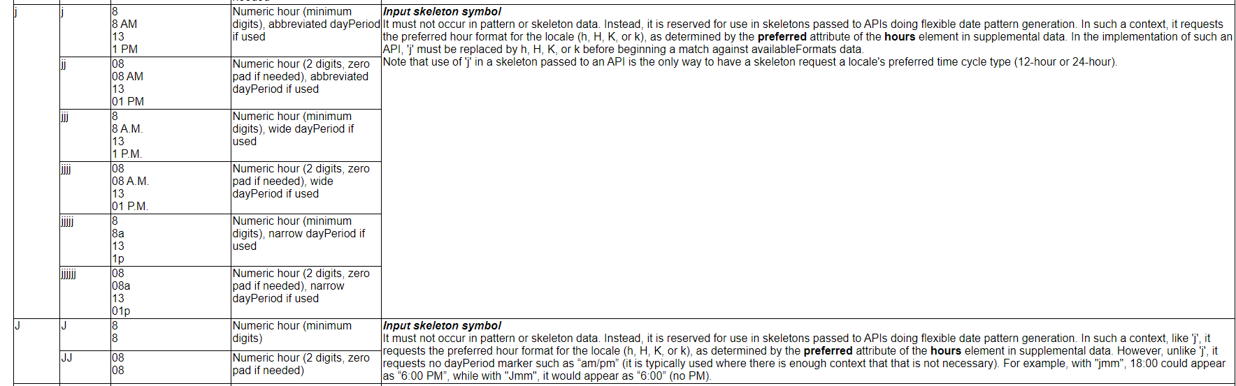
It will be a good addition to the Kendo UI internalization to add support for the 'j' input skeleton symbol.
https://www.unicode.org/reports/tr35/tr35-dates.html#dfst-hour

Thank you for your consideration.
The TextBox component allows us to specify a template for the prefix and suffix areas by applying the TextBoxPrefixTemplate and TextBoxSufffixTemplate directives to an ng-template.
I would also like to able to specify a template for the actual input area itself.
My use case for this is that I have a directive that I use within my application that I would normally apply to the <input> tag to ensure some custom processing is undertaken during user input. With the current TextBox component I am unable to do this.
Additionally I would like to specify the autocomplete attribute for the <input> tag to alow the browser to autocomplete things such as shipping-address etc. or even to disable the browser autocomplete completely by setting this to "off". Again this is not possible with the current TextBox but would be easily achievable if I could specify the template for the input area.
If this was implemented as requested I would expect my angular HTML to look something like:
 <kendo-textbox>
   <ng-template kendoTextBoxPrefixTemplate>
       <button kendoButton look="clear" icon="image"></button>
   </ng-template>
   <ng-template kendoTextBoxInputTemplate>
       <input myDirective [autocomplete]="myValue" />
   </ng-template>
   <ng-template kendoTextBoxSuffixTemplate>
       <kendo-textbox-separator></kendo-textbox-separator>
       <button kendoButton fillMode="clear" icon="calendar"></button>
       <kendo-icon name="bell"></kendo-icon>
    </ng-template>
 </kendo-textbox>
Tab Key: When you press the TAB key, the editor loses control of the focus. It is intended to give tab space rather than leave editor control. The indent space actually differs greatly from the tab space.
Current behavior
ToolbarComponent, DropDownButton and SplitButton utilize the PopupSettings of type:
interface PopupSettings {
    animate?: boolean;
    appendTo?: 'root' | 'component' | ViewContainerRef;
    popupClass?: string;
    anchorAlign?: Align;
    popupAlign?: Align;
    width?: number | string;
    height?: number | string;
}
For the overflow popup, they all work fine, but for the buttons:
- popupAlign
- anchorAlign
- height
- width
properties don't work.
https://stackblitz.com/edit/angular-jqhp2d?file=app/app.component.ts
Currently, the DropDownButton and SplitButton popup alignment can be changed, by using the align property of the Buttons PopupSettings type
https://stackblitz.com/edit/angular-jqhp2d-smtyhp?file=app/app.component.ts
Expected behavior
Create separate PopupSettings interface for the DropDownButton and SplitButton components to:
isolate the width and height options
to unify the PopupSettings of the Toolbar SplitBtn and DropDownBtn with the updated Buttons PopupSettings:
interface PopupSettings {
animate?: boolean;
appendTo?: 'root' | 'component' | ViewContainerRef;
popupClass?: string;
anchorAlign?: Align;
popupAlign?: Align;
width?: number | string;
height?: number | string;
}
Hi,
This feature request considers the Kendo Angular UI Grid component.
We use the builtin drag & drop columns reordering functionallity. When we try to drag a column to the edge of the visible part of the grid with a horizontal scroll the scroll does not adjust automatically so we cann't drag to column to a place outside of the horizontal visible area.
It would be nice if you could enable automatic horizontal Grid scroll when a grid column is reordered and dragged to the edge the visible column area.
Thanks,
Shai