Greetings.
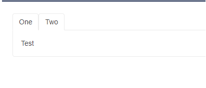
I think I found a minor bug when using the TabStrip component. If you have something like this:
<TelerikTabStrip>
	<TabStripTab Title="First tab">
		<p>First content</p>
	</TabStripTab>
	<TabStripTab Title="Second tab">
		<p>Second content</p>
	</TabStripTab>
	<TabStripTab Title="Third tab">

	</TabStripTab>
 </TelerikTabStrip>
And you click the tab without content, it stays selected.
Regards
Reproduction: https://blazorrepl.telerik.com/QHFuExbc57Wq6HVG28.
Description
When the user selects an empty tab and then switches to another tab, the empty tab remains highlighted (appears as if it's still selected).
Reproduction
Reproduction: https://blazorrepl.telerik.com/mRkVczaV02S9QkmJ28
Steps:
1. Select the second tab (which has no content).
2. Select the first tab.
Both tabs are highlighted as selected.
Here is a REPL test page. If the user navigates forwards and backwards via the Wizard buttons, the TreeView checkboxes persist their state. If the user navigates via the Stepper, the checkbox state is not retained.
The issue is triggered by the TabStrip.
A possible workaround is to prevent Stepper clicks with CSS:
.k-tabstrip .k-wizard .k-stepper .k-step {
  pointer-events: none;
}
Accessibility issue for TelerikTabStrip (3.6.0)
Issue is found in the attached png file.
<TelerikTabStrip TabPosition="@TabPosition.Top">
<TabStripTab Title="Handoff">
<VideoHandoff></VideoHandoff>
</TabStripTab>
<TabStripTab Title="Handoff Status">
<VideoHandoffStatus></VideoHandoffStatus>
</TabStripTab>
</TelerikTabStrip>
I am using the Telerik TabStrip and am trying to make the tabs scrollable while also showing additional tabs once a button is pressed.
When the additional tabs are shown, the tabs are not scrollable. Notice that when you toggle the visibility of the tabs, the new tabs being shown do not make the tab list scrollable.
=====ADMIN EDIT=====
Here is a possible workaround for the time being - REPL link.
The TabStrip throws ArgumentOutOfRangeException if the first tab is not Visible.
<TelerikTabStrip>
    <TabStripTab Title="A" Visible="false">
        Tab A
    </TabStripTab>

    <TabStripTab Title="B" Visible="true">
        Tab B
    </TabStripTab>

    <TabStripTab Title="C" Visible="true">
        Tab C
    </TabStripTab>
</TelerikTabStrip>
ActiveTabIndex works as expected when tabs are always Visible, but when you set the Visible property to false, then back to true, the ActiveTabIndex does not work.
<TelerikTabStrip @bind-ActiveTabIndex="@ActiveTabIndex" PersistTabContent="true">
<TabStripTab Title="Tab 0 Always Visible"><TabStripTab Title="@TabTitle" Visible="@IsTabVisible" >
..
IsTabVisible = true;
ActiveTabIndex = 1;
I encountered this behavior in both v2.30.0 and v3.2.0
See attached screen shot.
Sample code:
<TelerikTabStrip>
<TabStripTab Title="Tab 0" Visible="true">
content 0
</TabStripTab>
<TabStripTab Title="Tab 1" Visible="false">
content 1
</TabStripTab>
<TabStripTab Title="Tab 2" Visible="true">
content 2
</TabStripTab>
<TabStripTab Title="Tab 3" Visible="true">
content 3
</TabStripTab>
</TelerikTabStrip>
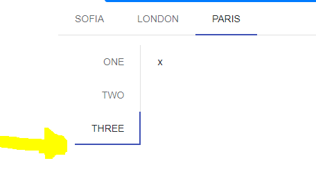
<TelerikTabStrip TabPosition="TabPosition.Top">
<TabStripTab Title="Sofia">
</TabStripTab>
<TabStripTab Title="London">
</TabStripTab>
<TabStripTab Title="Paris">
<TelerikTabStrip TabPosition="TabPosition.Left">
@foreach (var item in new string[] { "one", "two", "three" })
{
<TabStripTab Title="@item">x</TabStripTab>
}
</TelerikTabStrip>
</TabStripTab>
</TelerikTabStrip>
Content inside the tabs is narrow and elements float next to each other. For example, charts or other divs have limited width (screenshot of the issue at the end of this post).
@using Telerik.Blazor@using Telerik.Blazor.Components.Chart@using Telerik.Blazor.Components.TabStrip@*WORKAROUND 1*@<style> .k-tabstrip .k-animation-container-relative { width: 100%; }</style>@*WORKAROUND 2<style> .k-tabstrip .k-animation-container-relative { display: block; }</style>*@<TelerikTabStrip> <TelerikTab Title="First"> First tab content. <div style="border: 1px solid red;">some div that must be as wide as the tab strip</div> Chart follows and it should also be as wide as the tab <TelerikChart> <TelerikChartSeriesItems> <TelerikChartSeries Type="ChartSeriesType.Line" Name="Product 1" Data="@series1Data"> </TelerikChartSeries> <TelerikChartSeries Type="ChartSeriesType.Line" Name="Product 2" Data="@series2Data"> </TelerikChartSeries> </TelerikChartSeriesItems> <TelerikChartCategoryAxes> <TelerikChartCategoryAxis Categories="@xAxisItems"></TelerikChartCategoryAxis> </TelerikChartCategoryAxes> <TelerikChartTitle Text="Quarterly revenue per product"></TelerikChartTitle> <TelerikChartLegend Position="ChartLegendPosition.Right"> </TelerikChartLegend> </TelerikChart> </TelerikTab> <TelerikTab Title="Second" Disabled="true"> Second tab content. This tab is disabled and you cannot select it. </TelerikTab> <TelerikTab Title="Third"> Third tab content. </TelerikTab></TelerikTabStrip><TelerikChart> <TelerikChartSeriesItems> <TelerikChartSeries Type="ChartSeriesType.Line" Name="Product 1" Data="@series1Data"> </TelerikChartSeries> <TelerikChartSeries Type="ChartSeriesType.Line" Name="Product 2" Data="@series2Data"> </TelerikChartSeries> </TelerikChartSeriesItems> <TelerikChartCategoryAxes> <TelerikChartCategoryAxis Categories="@xAxisItems"></TelerikChartCategoryAxis> </TelerikChartCategoryAxes> <TelerikChartTitle Text="Quarterly revenue per product"></TelerikChartTitle> <TelerikChartLegend Position="ChartLegendPosition.Right"> </TelerikChartLegend></TelerikChart>@code { public List<object> series1Data = new List<object>() { 10, 2, 5, 6 }; public List<object> series2Data = new List<object>() { 5, 8, 2, 7 }; public string[] xAxisItems = new string[] { "Q1", "Q2", "Q3", "Q4" };}