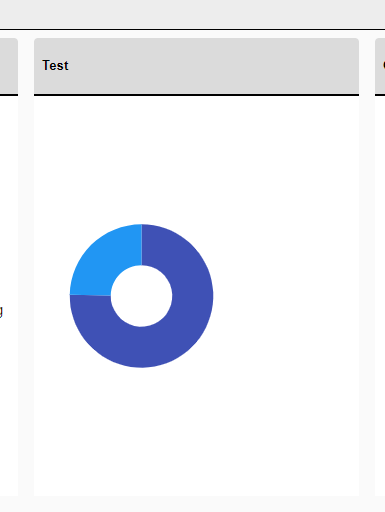
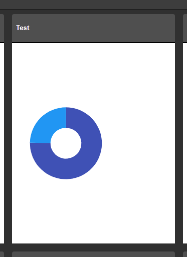
Our Site supports multiple themes that we have built using the SASS Theme Builder. For all Telerik Components we have used so far the theme changes on them as expected when using the example found here (Change Theme at Runtime). The problem seems to be the chart component will not adhere to the newly applied theme after its initial load. Seems like this is because it is shown as an SVG with hardcoded attributes on the element. Is there a workaround for this (other than reloading the components entirely)?
Before & After Theme Change:
To reproduce the problem, hover over the last value of the series. While the Tooltip enters, it causes horizontal and vertical scroll and flickers. Then, it is positioned correctly.
The issue is better observed if you increase the transition speed of the Tooltip wrapper.
Reproduction: https://blazorrepl.telerik.com/cREDloaV42j7Z19G13.
===
ADMIN EDIT
===
A possible workaround for the time being is to alter or stop the Tooltip animation with CSS. Here is a runnable sample demonstrating the approach: https://blazorrepl.telerik.com/QnEjvIOC04hXA6W709
The Scatterline Chart is flipped upside down if the Height is under 100px.
Reproduction1. Run this REPL
2. Set the height of the Chart to 90px
3. The chart is rendered upside down
Hi,
We are implementing chart control in our application and we noticed spikes in the chart when we are using time series that contains UTC timestamps with milliseconds that are divisible by 100. The issue is reproduceable on Telerik REPL as well and I am attaching the REPL link as well
I was wondering if you guys can provide some insight from your end as to whether that is indeed a bug and some work arounds and timeline on when we can resolution from your end.
Cheers,
Danish Shahid
Currently, the Chart does not plot anything when zero values are included in the dataset on a logarithmic axis.
Reproduction: https://blazorrepl.telerik.com/cdYgkWFH23W9PVon54
At least the "Success" data should be plotted.
I am trying to programmatically update the Chart data during runtime to display live data. The Chart does not seem to refresh and show this change in the viewport.
I've tried:
- using an Observable Collection;
- creating a new collection instance and reassigning the Data parameter;
- calling the Refresh method;
The result is the same - the Chart does not react to the data change. This applies to other component parameters as well.
===
ADMIN EDIT
===
A possible workaround for the time being is forcing the Chart to re-render. To do so, you may wrap the Chart in a custom component and call StateHasChanged() in this component when the data is updated.Here is a runnable sample: https://blazorrepl.telerik.com/wxEzwxbJ24WDjnMp11.
Hi,
Just a bug I have found. I have found something similar before with the DateTime format of a category axis.
Please note the single lowercase 't' in the below appears to be being interpreted by the compiler as 'time' identifier (AM or PM). In this case, it is printing on the chart label as 'a'.
<ChartValueAxes>
     <ChartValueAxis AxisCrossingValue="@AxisCrossingValue">
          <ChartValueAxisLabels Format="@("{0}" + " a b c d e f g h i j k l m n o p q r s t u v w x y z")"></ChartValueAxisLabels>
    </ChartValueAxis>
</ChartValueAxes>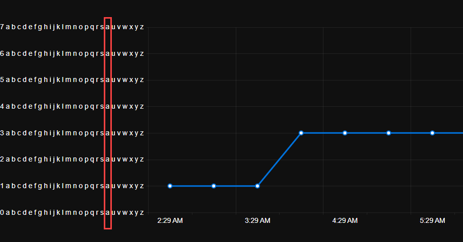
I discovered this as my original unit was 'Count' which was being displayed at runtime on the chart as 'Couna'.
I am trying to customize the format of the ChartCategoryAxisLabels to render the abbreviated name of the day of the week using the following format:
<ChartCategoryAxisLabels Format="ddd dd/MM HH:mm"/>While it is a valid format, it seems that it doesn't work for the category labels.
---
ADMIN EDIT
---
For the time being, you can use the following to render the abbreviated name of the day of the week in the ChartCategoryAxisLabels:
<ChartCategoryAxisLabels Format="{0:EEE dd/MM HH:mm}"/>After updating the chart data, some elements remain in the DOM. This can clutter the browser if the data updates come in on intervals and the chart remains in operation for a while. A screenshot is attached below.
MCVE:
@using Telerik.Blazor@using Telerik.Blazor.Components.Button@using Telerik.Blazor.Components.Chart<h3>Chart</h3><TelerikButton Primary="true" @onclick="AddDataPoint">Add data point</TelerikButton><TelerikChart Transitions="false"> <TelerikChartSeriesItems> <TelerikChartSeries Type="ChartSeriesType.Line" Name="CPU Usage Data" Data="@simpleData"> </TelerikChartSeries> </TelerikChartSeriesItems> <TelerikChartValueAxes> <TelerikChartValueAxis Max="100" Color="black"></TelerikChartValueAxis> </TelerikChartValueAxes> <TelerikChartTitle Text="CPU Usage"></TelerikChartTitle> <TelerikChartLegend Position="Telerik.Blazor.ChartLegendPosition.Bottom"> </TelerikChartLegend></TelerikChart>@code { void AddDataPoint() { Random random = new Random(); var _val = Math.Round((random.NextDouble() * 100), 3); if (simpleData.Count >= 60) { simpleData = simpleData.TakeLast(59).ToList(); } simpleData.Add(_val); //StateHasChanged(); } public List<object> simpleData = new List<object>();}
The additional functionality of the stock chart (crosshairs, navigator) fits our needs very well, but our data is not currency formatted. As far as we have found, we have not seen a way to remove currency as a default format. I'm not sure if this is a bug, or intended functionality; but it's preventing us from rolling charts with that extended functionality.
Can the dev team comment on any known reasons why Charts (I think both SVG and Canvas) might not display when a blazor page is rendered from an automation tool like Chromium, Puppeteer, etc.? (e.g., https://developers.google.com/web/tools/puppeteer).
I have a standard blazor page that I can manually from a standard Chrome window, and it works fine and the Telerik chart displays.
But the same page, when launched either headless or with a GUI browser window, from a tool like Chromium or Puppeteer (with javascript enabled of course), it seems like the DOM is never dynamically updated to include the chart.
---
ADMIN EDIT
Screen recording attached below, code to reproduce it too.
---
The Chart Tooltip does not render correct values for the data points when the chart is bound to a model, has multiple series and Template is used. The DataItem does not seem to work as expected.
ADMIN EDIT:
If the Chart is bound with Independent Series Binding the FormattedValue will get the correct values.
If the Chart has no Template the correct values for the data points will be displayed
I have a line chart I am using to plot two related series of data. When these two series have the same values, or very similar values, the series that is second in the render order completely covers up the first line. This makes it look like the first line isn't being rendered, and makes it impossible to access the tooltips for the first series. I need a way to disambiguate overlapping data.
Thank you
The context DataItem is null for subsequent ChartSeries. It receives the correct object for the first ChartSeries, but for the rest is null.
<Admin Edit>
A workaround, for the time being, would be to remove the Template and let the Tooltip display the default value, which will be correct.
</Admin Edit>
Reproduction code:
<TelerikChart>
    <ChartTitle Text="Unrecoverable Errors Per Minute vs. Signal Level" />
    <ChartCategoryAxes>
        <ChartCategoryAxis Type="@ChartCategoryAxisType.Category" />
    </ChartCategoryAxes>
    <ChartValueAxes>
        <ChartValueAxis>
            <ChartValueAxisLabels Visible="true" />
        </ChartValueAxis>
    </ChartValueAxes>

    <ChartTooltip Visible="true">
        <Template>
            @{
                var data = context.DataItem as ModelData;
                <div class="card" style="font-size: 0.8rem; color: black">
                    <span>@($"{data.Value}")</span>
                    <span>@($"{data.Type}")</span>

                </div>
            }
        </Template>
    </ChartTooltip>

    <ChartSeriesItems>
        <ChartSeries Type="ChartSeriesType.Line"
                     Data="@ChartData1"
                     CategoryField="@nameof(ModelData.Type)"
                     Field="@nameof(ModelData.Value)">
        </ChartSeries>
        <ChartSeries Type="ChartSeriesType.Line"
                     Data="@ChartData2"
                     CategoryField="@nameof(ModelData.Type)"
                     Field="@nameof(ModelData.Value)">
        </ChartSeries>
        <ChartSeries Type="ChartSeriesType.Line"
                     Data="@ChartData3"
                     CategoryField="@nameof(ModelData.Type)"
                     Field="@nameof(ModelData.Value)">
        </ChartSeries>
    </ChartSeriesItems>

</TelerikChart>

@code {
    public class ModelData
    {
        public string Type { get; set; }
        public double Value { get; set; }
    }

    public List<ModelData> ChartData1 = new List<ModelData>() { new ModelData() { Type = "S1", Value = 1 } };
    public List<ModelData> ChartData2 = new List<ModelData>() { new ModelData() { Type = "S2", Value = 5 } };
    public List<ModelData> ChartData3 = new List<ModelData>() { new ModelData() { Type = "S3", Value = 9 } };
}