The `Multiple` property is always set to `false` (see code below); one can drag & drop multiple files to the dropzone but only one is uploaded at a time.
Our customers won't accept this behavior as it makes uploads of multiple files very cumbersome. This "detail" makes the `TelerikFileManager` unsuitable for our application.
Please make the `Multiple` property configurable via the `FileManagerUploadSettings`.
(You may also want to consider making `AutoUpload` configurable while you're at it).
__builder2.OpenComponent<TelerikUpload>(266);
__builder2.AddAttribute(267, "AutoUpload", (object?)RuntimeHelpers.TypeCheck(value: true));
__builder2.AddAttribute(268, "SaveUrl", (object?)RuntimeHelpers.TypeCheck(UploadSettings.SaveUrl));
__builder2.AddAttribute(269, "SaveField", (object?)RuntimeHelpers.TypeCheck(UploadSettings.SaveField));
__builder2.AddAttribute(270, "RemoveUrl", (object?)RuntimeHelpers.TypeCheck(UploadSettings.RemoveUrl));
__builder2.AddAttribute(271, "RemoveField", (object?)RuntimeHelpers.TypeCheck(UploadSettings.RemoveField));
__builder2.AddAttribute(272, "WithCredentials", (object?)RuntimeHelpers.TypeCheck(UploadSettings.WithCredentials));
__builder2.AddAttribute(273, "Multiple", (object?)RuntimeHelpers.TypeCheck(value: false));
__builder2.AddAttribute(274, "AllowedExtensions", RuntimeHelpers.TypeCheck(UploadSettings.AllowedExtensions));
__builder2.AddAttribute(275, "MinFileSize", RuntimeHelpers.TypeCheck(UploadSettings.MinFileSize));
Code example:
Possible:
private List<DateTime> _disabledDates = new();
<TelerikDatePicker DisabledDates="_disabledDates">

Not Possible (Requested Feature)
private List<DateTime> _disabledDates = new();
<TelerikDateTimePicker DisabledDates="_disabledDates">
Please consider adding built-in support for a TextTruncationWithAction or TruncateWithButton mode on GridColumn components. This feature would display long text as truncated with ellipsis (...) and a button or icon to reveal the full content, such as in a modal or popover.
Why This Is Needed
In enterprise applications like ERP, cutover planning, or audit logs, we often display descriptions, notes, or comments that can span multiple lines. However:
- Wrapping ruins compact grid layouts.
- Truncating with ellipsis alone hides valuable content.
- Users need quick, inline access to full text without leaving the grid.
I have come across a few instances where it would be awesome if the Data Collection on a MultiSelect, or even a DropDown could have a dynamic property to denote if the option in the collection is selectable. The use case is around items being disabled but remain intact on historical records. If I remove the item currently from the collection then the component no longer shows the item as selected because it isnt in the collection. If I leave the item in the collection, then it shows, but, can then be selected on future items, which I dont want. Would be awesome if I could pass a component parameter, similar to TextField, which is the bool property for if the option in the dropdown is selectable/disabled. This would then make it so that the item could be REMOVED, but not readded or selected on future records unless the value for the property was set back to true.
Please add a property (e.g., OpenOnFocus or AutoOpenOnEdit) to dropdown-based components (such as DropDownList, ComboBox, or inline grid editors) to automatically open the dropdown when the component gains focus or enters edit mode.
Why This Matters
In data-dense UIs — like inline grid editing, cutover task assignment, or status changes — users often need to:
- Quickly select from a known list, such as Status, Owner, or Type.
- Tab rapidly through form fields without needing extra clicks.
- Use keyboard-only navigation efficiently.
Currently, dropdowns often require an additional manual click to open — which slows down power users and disrupts workflows in editable grids.
Grids honor the [DisplayFormat(DataFormatString ... )] annotation for column content, but the FilterMenuType.CheckBoxList filter menu and the TelerikCheckBoxListFilter component don't. This is particularly noteworthy for formatting that truncates the contents such as DateTime which frequently tracks data smaller than user's care about, which can generate many visually identical checkboxes. To go along with the requested change, it would be nice if the filter matched off of the DisplayFormat string considering that is what the user sees and would therefore be referencing, since again, many DataFormatStrings can truncate data.
Because the TelerikCheckBoxListFilter component requires the field to match the data type of the grid's field, there isn't a way for the programmer to choose to show the filter menu with a checklist that matches the displayed values without building a fully custom FilterMenuTemplate with their own foreach loop and then figuring out a way to construct a CompositeFilterDescriptor filled with bracketing FilterDescriptors to account for the range of matching values. This is doubly troublesome since using the structure of CompositeFilterDescriptors needed to do that is not supported in the FilterMenuTemplate without also having to override the FilterMenuButtonsTemplate.
Generally speaking, it would make more sense to the users if the default options in the filter logically and visually matched with the default displayed values.
Reference material:
Grid column contents: https://www.telerik.com/blazor-ui/documentation/components/grid/columns/display-format
Checkbox List: https://www.telerik.com/blazor-ui/documentation/components/grid/filter/checkboxlist
Alternate FilterDescriptor shapes not supported: https://feedback.telerik.com/blazor/1681745-clear-button-in-grid-filtermenu-not-properly-clearing-custom-filter
Example Repl: https://blazorrepl.telerik.com/mJOSuxQw117zM1h321
can you provide a initial File click event handler attribute?
I want the user to be able to click on an initial file to download the file.
We still have some problems with printed pdf quality after the updates in 6.0.0. When pdf is printed using Telerik PDF viewer it seems it gets processed/rasterized and loses quality.
We need a formal, Accordion component. This is missing like a sore thumb !
The Accordion should be the first component in the component list.
Using the panel bar is not the same as the functionality of Accordion. So, do not mark this request as a duplicate of a panel bar enhancement request.
This is a simple component and I request you to prioritize and release it urgently in the next release.
Thanks.
<ColumnMenu>
<ColumnMenuFiltering/>
<ColumnMenuSorting/>
....
</ColumnMenu>
On a grid grouped by a field (using GroupDescriptors) where the amount of records exceed the page limit, therefore generating multiple pages, provide an option to keep the collapsed/expanded states of the groups when navigating through the pages.
In-house we implemented the following approach to mitigate this issue: when calling OnRead event, after processing the data (order, filter, group, etc) we're mapping the groups and subgroups to its corresponding indexes. When page changing, we then store the current state of the groups, alongside its keys (aka the label of the group). After page changing and mapping the groups and subgroups again, we just match the group names stored in this temporary state with the group names of the new page and restore the state.
For example: start with all groups initially collapsed, page 1 has groupA and groupB and user expanded groupB, changed to page 2, which has the remaining records of groupB and groupC. In this case it will restore groupB as expanded while groupC keeps collapsed.
Example to demonstrate the issue: https://blazorrepl.telerik.com/melmEeFi43owNZBe50
On a grid grouped by one or more fields, provide an option for end users to expand/collapse all rows at will. The following image is a suggestion of where this option (most likely a button) should appear:
When I am dynamically adding or removing tabs I am hitting a variety of problems targeting:
The active tab is not correctly set
the focus is not always set to the active tab
upon adding/removing a tab all tabs are re-created and their content is not persisted
This is causing some data loss, picklist filter loss, lag time when opening and closing tabs
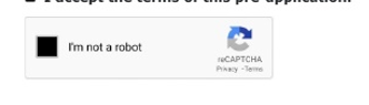
Hi Team,
I am looking for captcha component to verify user as human like below screenshot. Please let me know if this feature is available