

I'd like to have a data virtualization feature (similar to the OnRead event), so I can load only small chunks of data (appointments) specifically for the current page/view.
===
ADMIN EDIT
===
Currently, you can achieve similar functionality by handling the DateChanged and ViewChanged events of the Scheduler to load only the relevant appointments for the selected period.
You can find an example here: Load Scheduler Appointments on Demand.
The Timeline view currently does not provide the "Show business hours" option as in the other views.
Please add that for the Timeline view similar to the jQuery version of the component.
===
ADMIN EDIT
===
For the time being, you can achieve this functionality with a custom approach by programmatically setting the StartTime and EndTime of the view to equal the WorkDayStart and WorkDayEnd.
Here is a basic example: https://blazorrepl.telerik.com/QyEhvjbO07j1ZvID42.

I want to be able to limit the Scheduler to a minimum and/or maximum date.
---
ADMIN EDIT
---
This request could be revised in two separate tracks:
- Min and Max parameters on component level regardless of the selected view
- Min and Max parameters for the separate views ( Day, Week, Month etc.)
Please share your thoughts on how you'd expect it to be implemented.
Now that we can have more than 2 events in a day in Month View, we need to add an AppointmentHeight parameter to be able to make the appointments taller in height to accommodate longer titles.
ADMIN EDIT
An alternative for the time being is to show the longer content by using the appointment templates and the Tooltip component. For example:
https://github.com/telerik/blazor-ui/tree/master/scheduler/appointment-tooltips

I want to hide the 'All Day slot' - I don't want to offer this functionality.
At the moment, you could try CSS like this, but ideally this would be a parameter (maybe on the view):
        .no-allday .k-scheduler-head .k-scheduler-group:last-child{
            display:none;
} <div class="no-allday">
<TelerikScheduler Data="@Appointments" @bind-Date="@StartDate" @bind-View="@CurrView" Height="600px" Width="800px">
<SchedulerViews>
<SchedulerDayView StartTime="@DayStart" />
<SchedulerWeekView StartTime="@DayStart" />
<SchedulerMultiDayView StartTime="@DayStart" NumberOfDays="10" />
</SchedulerViews>
</TelerikScheduler>
</div>

I am really looking to try to do something like this in Blazor: ASP.NET MVC Scheduler Hierarchical Grouping Demo | Telerik UI for ASP.NET MVC
In MVC, this feature is implemented with the dataParentValueField.
Current behavior:
When I click on an empty slot in the Scheduler the Start and End DateTimePickers are set to the default value of a DateTime object - 1/1/0001.
Expected/Desired behavior:
When I click on an empty slot in the Scheduler, the Start and End DateTimePickers should be set to the start and end date and time of the clicked slot.

I want to easily print the Scheduler calendar - month view, week view and more.
===
ADMIN EDIT
===
A possible approach for the time being is to implement printing functionality for the Scheduler in a similar fashion to how the Grid is printed here https://github.com/telerik/blazor-ui/tree/master/grid/print.
The approach relies on using JavaScript to invoke the browser print() method. Using CSS and @media print, you can customize the page and specify which elements should be visible when printing. For example, you may hide the toolbar and footer of the component, so only the calendar is visible.
Here is a runnable sample that demonstrates the approach: https://blazorrepl.telerik.com/cnutklOC55T5sV0J15.
I want to add more fields to the scheduler create/edit popup. Currently, this is possible by creating a custom edit form. However, this customization would be easier if the Scheduler exposed a Popup Form Template similar to the Grid.
===
ADMIN EDIT
===
A necessary prerequisite for exposing this is to first add a State feature in the Scheduler. This will allow programmatic control over the edited item.

I am trying to create event series with the following RecurrenceRule:
RecurrenceRule = "FREQ=HOURLY; BYHOUR=8,9,10"
Based on the RFC5545 specification, this rule should create three events occurring every hour - at 8, 9 and 10 o'clock.
However, only one event is created for the day.
Support the recurrence rule to create multiple appointments per time slot. Examples of such rules are:
FREQ=DAILY;BYDAY=MO,TU,WE,TH,FR,SA,SU;BYHOUR=08,09,10,11,12,13,14,15,16;BYMINUTE=50
Is there a way to customize the resource grouping's header (i.e. Alex, Bob, Charlie)? I understand it displays the text from the Resource, but I would like to be able to customize the HTML displayed so that I can add a tooltip. Would you have a suggestion as to how I can accomplish this?
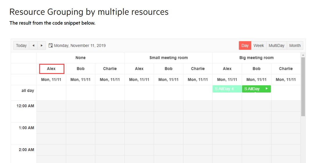
Other schedule controls have an 'agenda' view that has a chronological list of appointments back to back stacked vertically colored by resource.
It would be great for the telerik scheduler to have a view like this.
Our current implementation of the JQuery version of the scheduler uses custom views. I understand that custom views are going to be a difficult if not impossible task for Blazor rendering. The goal for our custom view is simple, we override the calculateDateRange function to supply an ordered date range that allows us to have a "TimelineTwoWorkWeekView", thus showing Monday-Friday then Monday-Friday again. We also had a use case that was never implemented but would be addressed the same way; to show all "mondays this month".
Therefore, the request is a "TimelineCollectionView", displaying a timeline view for dates specified in an IEnumerable<DateTime>.
Any other ideas or feedback would be greatly appreciated.